Skip to content
DevMeme
4740 of 7435
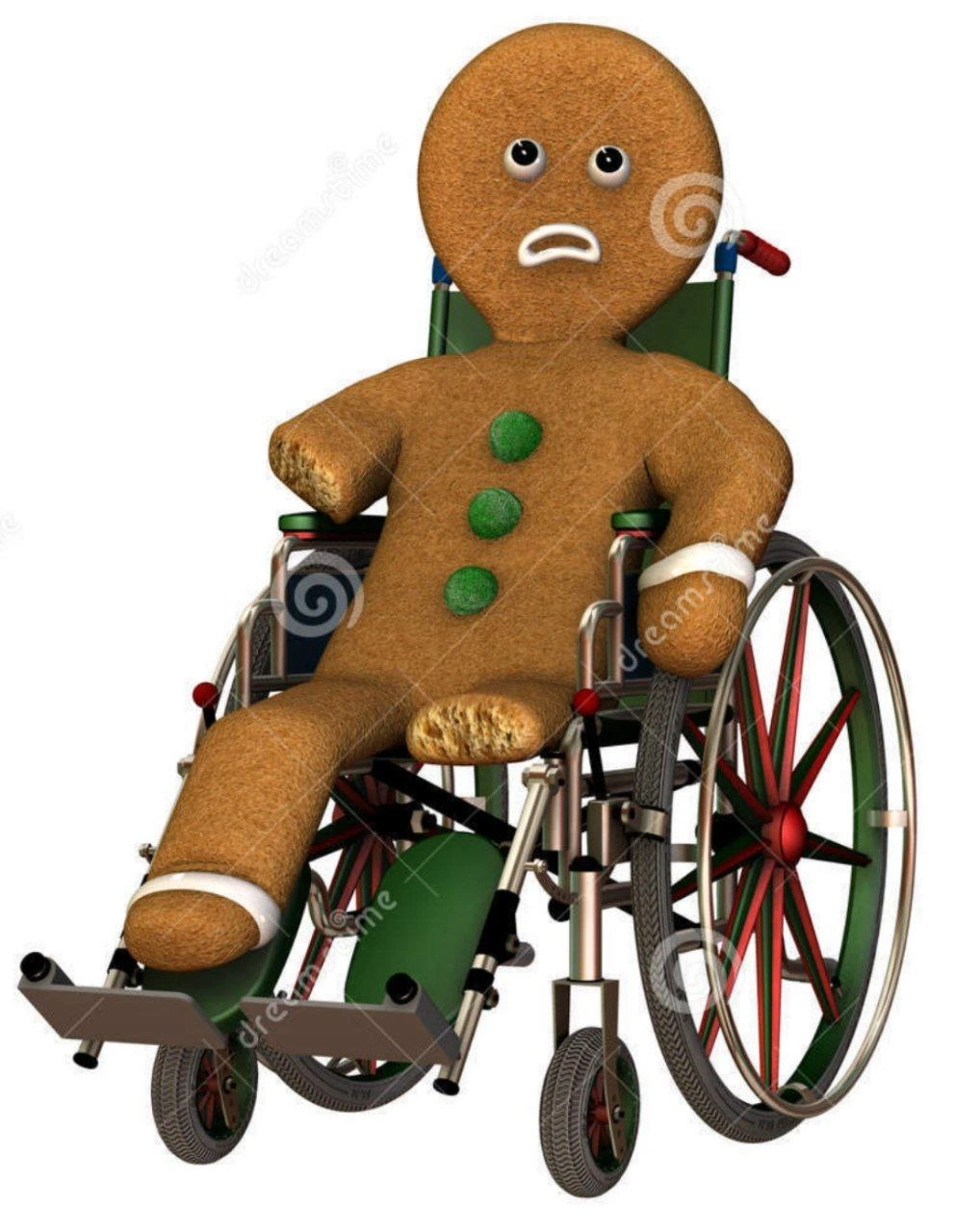
Design team literally bakes accessibility into every gingerbread cookie for UX demo
UX UI Post #5195, on May 13, 2023 in TG

Design team literally bakes accessibility into every gingerbread cookie for UX demo

Why is this UX UI meme funny?

Level 1: Cookies for Everyone

Imagine you’re baking cookies for all your friends, and you want everyone to enjoy them. If one friend has a peanut allergy or another friend uses a wheelchair, you’d make sure your cookies are safe and fun for those friends too, right from the start. You might use ingredients that everyone can eat (no peanuts for the allergic friend) and maybe even shape a cookie in a playful way that celebrates your friend in the wheelchair. That’s exactly what’s happening in this picture! The cookies have little wheels built into them, so even a gingerbread person who uses a wheelchair is included. It’s like saying, “Hey, these cookies are for everyone, nobody is left out.” It’s funny and heartwarming because usually when people say “bake in accessibility,” they are speaking about software design in a figurative way – but here, the design team actually did it literally with cookies! Think of it as making sure no one is left out of the treat. Just as you’d stir sugar into the batter (instead of sprinkling it only on one cookie at the end), these designers put the idea of inclusion right into the recipe. The result? Cookies for everyone, where each cookie shows that from the very beginning, they thought about every friend who might want a bite.

Level 2: Baked-In Accessibility

This meme shows UX design dedication in a delightfully literal way. The image has gingerbread cookies shaped like little people who have a built-in wheelchair on one side. It’s referencing the familiar wheelchair symbol used to indicate accessibility (like on signs for wheelchair ramps or accessible restrooms). By merging that symbol with a gingerbread man, the meme creators convey “accessibility is part of our creation from the beginning.” In software terms, they’re saying a product should have accessibility features included from the start (baked in), not added later like frosting. This resonates with web developers and designers because we often talk about making sites usable for everyone — including people who can’t see, can’t hear well, or can’t use a mouse. The design team in the meme actually baked cookies to prove the point during a UX demo, which is both funny and admirable. It’s a down-to-earth example of inclusive design – where you plan for all kinds of users early on.

Let’s break down the key ideas and terms for someone new to WebDev and accessibility:

  • Web Accessibility (A11y): Accessibility (often abbreviated a11y, with 11 standing for the 11 letters between ‘a’ and ‘y’) means making websites and apps usable by people with disabilities. This includes folks who are blind, have low vision, are deaf or hard of hearing, have motor difficulties, or cognitive differences. The goal is that everyone, regardless of ability, can perceive, understand, navigate, and interact with the website. “Baking accessibility in” means you design and code your site with these users in mind from the get-go. This cookie metaphor humorously shows that concept – build it into the product (or cookie dough) rather than trying to sprinkle it on top later.

  • ARIA Roles and Attributes: ARIA stands for Accessible Rich Internet Applications. These are special attributes you add in HTML, like role, aria-label, aria-hidden, etc., to give screen readers more information. For example, a visually impaired user might use a screen reader (software that reads the content of the screen out loud). If you have a decorative icon or an unlabeled button, a screen reader might announce something confusing or nothing at all. By adding an attribute like aria-label="Search" to a magnifying-glass icon button, you’re baking in a label that only assistive tech will use. The meme’s mention of “ARIA roles” is basically talking about writing HTML so that these tools know what each element is supposed to be. It’s like putting a little note inside the code that says “Hey, this is a search button!” for those who can’t see the icon. The design team’s gingerbread cookies have a visual label of accessibility (the wheel), just like good code has ARIA labels where needed.

  • Contrast Checks: This refers to color contrast – ensuring that text stands out against its background so people with low vision or color blindness can read it. There are guidelines (from AccessibilityStandards like WCAG) that say, for instance, normal text should have a contrast ratio of at least 4.5:1. Imagine dark gray text on a black background – that’s hard for anyone to read, and likely impossible for someone with vision impairments. So designers will check color combinations. “Contrast checks” might involve using tools or just the good old eyedropper to measure contrast ratio. When we say the team bakes accessibility in, we mean they choose colors and design elements from the beginning that meet these contrast rules, rather than painting a super colorful UI then scrambling to adjust colors at the end because people complain it’s unreadable. The meme doesn’t show color, but the idea extends to all design decisions including color choices.

  • Keyboard Navigation: Not everyone uses a mouse; some people might navigate a website using the keyboard (by pressing Tab, Enter, arrow keys, etc.), or using assistive switches or voice commands that essentially emulate key presses. For a site to be keyboard-friendly, all interactive elements (links, buttons, form fields) should be reachable by pressing the Tab key to cycle through them, and you should be able to activate them with Enter or Space. Also, visible focus indicators (like a highlight outline) are important so you know which item you’re on. If you’ve ever seen a website where you open a menu and then you can’t close it with the keyboard, or you get “trapped” because you can’t Tab out of a modal dialog, that’s a keyboard navigation fail. Baking this in means when developers build a modal or a dropdown, they code the focus trap and escape-key handling intentionally, from the start. It’s much easier than retrofitting after someone finds they can’t navigate. The gingerbread cookie with a wheel can be seen as a nod to mobility devices – and by extension, to designing for those who navigate differently (wheels instead of legs, or keyboards instead of mice).

In summary, this meme is a lighthearted take on UXDesignPrinciples of inclusive design. It simplifies a serious idea: designers and developers should include everyone in their thinking from day one. The cookies are funny because they’re cute and literal, but they carry a real message that junior devs are often taught early now: don’t treat accessibility as an add-on. Just like you mix key ingredients into dough before baking, you mix accessibility features into a product during design and development. This proactive approach saves a ton of time (and headaches) later. Plus, it’s the right thing to do ethically and often legally. New developers learning about accessibility standards can look at this meme and instantly get the concept: if even a gingerbread man can have an accessibility feature built-in, so can your app! It encourages a mindset of always considering users with disabilities whenever you craft a UI. And who can forget a lesson delivered via gingerbread? It’s a sweet way to remember that accessibility should be part of the recipe, not just an optional topping.

Level 3: WCAG-Compliant Cookies

At the highest level, this meme tickles veteran UX developers with a literal take on a core UX design principle: “bake accessibility in from the start.” We often hear that phrase in web development meetings, meaning that web accessibility shouldn’t be an afterthought. Here, the design team humorously proves they get it by literally baking accessibility into gingerbread cookies. Each cookie is a gingerbread person whose leg flows into a spoked wheel, perfectly echoing the international wheelchair accessibility icon. This edible iconography is a playful visual metaphor for inclusive design. It’s as if the team said, “We didn’t just follow accessibility guidelines – we made them delicious.” 🍪

For seasoned developers, the sight of a gingerbread man with a wheel prompts a knowing grin. It represents the ideal scenario: accessibility seamlessly integrated, not bolted on at the end. In the real world, teams often scramble to add ARIA roles, alt text, and high contrast modes right before a release (or worse, after a complaint). That’s like realizing you forgot sugar after baking cookies – too late! This meme flips that script. The team’s UX demo includes actual cookies to drive home the point that accessibility is fundamental, not optional. It’s developer humor with a bite of truth: remembering the countless times we’ve seen accessibility treated as a “nice-to-have,” we appreciate the joke that here it’s front and center (and edible). The contrast between how it should be (baked-in accessibility) and how it often is (tacked on last-minute) is what makes this both funny and a tad cathartic for experienced folks.

On a technical note, those gingerbread cookies might as well be WCAG guidelines you can snack on. WCAG (Web Content Accessibility Guidelines) and other accessibility standards define how to make web content usable for people with disabilities. An image of a cookie with a wheelchair symbol is essentially a shout-out to supporting disabled users by design. It reminds us of things like: use proper HTML semantics (e.g., <header> for headers, <button> for buttons), provide text alternatives for images, ensure sufficient color contrast, and support keyboard navigation. Seasoned devs notice details: the wheel on each cookie is not just drawn on top like icing; it’s part of the cookie’s shape. That nuance slaps like a good punchline – accessibility isn’t an overlay or afterthought here, it’s baked into the structure. Similarly, in a well-built UI, accessibility features are integrated deep in the code structure (in the HTML/CSS/JS foundations), not just superficial fixes.

To illustrate, consider how we might “bake in” accessibility in code versus adding it later:

<!-- Without accessibility baked in (not recommended) -->
<div onclick="sendMessage()">📨 Send</div>

<!-- With baked-in accessibility from the start -->
<button onclick="sendMessage()" aria-label="Send Message">
  📨 Send
</button>

In the first snippet, a plain <div> is clickable but has no semantic meaning or assistive info – a screen reader would likely ignore it or just call it “text, send”. In the second, the proper <button> element is used, and we’ve added an aria-label. The button is inherently focusable and activates with keyboard by default, and the ARIA label ensures a screen reader says “Send Message” even if the icon or text alone wasn’t clear. This is what those UXDesignPrinciples look like in practice: thoughtful markup that considers everyone. Just as the gingerbread figure and the wheelchair wheel form one cohesive cookie, the visible UI and invisible accessibility features form one cohesive design. Senior devs chuckle because they know how satisfying (and rare) it is to see accessibility so well integrated that it’s actually part of the demo’s design language. It’s a DeveloperHumor gem that also doubles as a high-five to every dev who’s slipped alt="" or tabindex="0" into the codebase from day one. The meme’s message is clear: truly great design makes accessibility indistinguishable from the product itself – as natural as sugar in a cookie recipe.

Description

Photo of a metal cooling rack holding six gingerbread-man cookies on a dark countertop. Each cookie depicts a smiling person whose lower right side seamlessly blends into a large spoked wheel, visually echoing the international wheelchair-accessibility icon. No text appears in the image. The playful pastry mash-up humorously illustrates the idea of "baking" accessibility into a product from the start, a concept familiar to frontend and UX engineers who integrate ARIA roles, contrast checks, and keyboard navigation before release
Comments

6
Anonymous ★ Top Pick “We said ‘shift-left on accessibility,’ so the UX team shipped gingerbread people with built-in wheelchairs - WCAG 2.2 compliance you can eat, and QA still wants alt text for the sprinkles.”
  1. Anonymous ★ Top Pick

    “We said ‘shift-left on accessibility,’ so the UX team shipped gingerbread people with built-in wheelchairs - WCAG 2.2 compliance you can eat, and QA still wants alt text for the sprinkles.”

  2. Anonymous

    Our microservices architecture is so mature, we've finally achieved the dream: seven identical services that all look slightly different, need a cooling-off period after deployment, and will eventually crumble under load

  3. Anonymous

    This perfectly captures the lifecycle of every 'quick win' ticket: starts as a simple gingerbread person in sprint planning, but by the time it hits production, it's gained three microservices, a message queue, a caching layer, comprehensive observability, and somehow requires a database migration. The PM still insists it's the same 1-point story

  4. Anonymous

    “Bake accessibility in from day one?” Done - the gingerbread release ships with wheelchairs. The app still has div-buttons and a tab order that dies at the first modal

  5. Anonymous

    PM said “bake accessibility into the product and fix cookies”; we shipped wheelchair‑icon gingerbread while auth still sets cookies without SameSite=Strict or Secure

  6. Anonymous

    Rack::Cookies deployed hot from the oven - no middleware needed, just cool and serve

Use J and K for navigation