The Godfather Laments the Simplification of the Firefox Logo
Why is this UX UI meme funny?
Level 1: They Ruined My Favorite Toy
Imagine you have a favorite toy — let’s say a bright, detailed action figure or a stuffed fox with cool colors. You really love how it looks because it’s so unique and familiar to you. Now suppose one day the toy company changes it: they repaint your toy with just one plain color and take away its special markings and cute face. When you see it, you might feel upset and say, “Why did they change it? It was so much better before!” You feel like they messed up your beloved toy. That’s exactly the feeling this meme is joking about. Developers loved the old Firefox fox logo because it was fun and detailed. When the company made the logo super simple and plain, those developers felt like a kid who finds their favorite toy has been ruined. The meme shows a sad father from a movie saying “Look how they massacred my boy,” which is a dramatic way of saying “Oh no, look what they did to something I love!” It’s a funny exaggerated way for grown-up tech folks to express that child-like disappointment about the new Firefox logo.
Level 2: When Logos Lose Detail
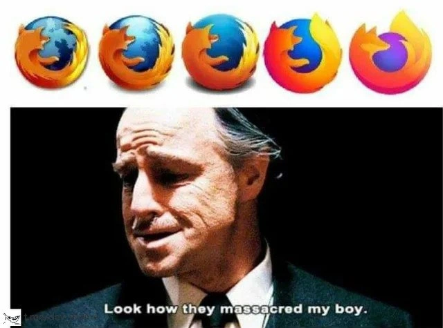
Firefox is a popular web browser (like Google Chrome or Safari) known for its iconic logo of a fox curled around a globe. Over the years, Mozilla (the company behind Firefox) has changed this logo several times in what’s called a logo redesign. The top part of the meme shows five Firefox logos in a row, from an older design on the left to the most recent on the right. At first, the Firefox logo was highly detailed: a blue Earth with an orange fox that had clear fur, a face, and even paws. It looked almost like a little painting or a cartoon scene. As time went on, Mozilla kept simplifying the logo. By the second and third versions, the fox and globe got flatter with less texture – they removed shadows and fine details, using simpler shapes and solid colors. This follows a big minimalist branding trend in tech: companies are making their logos more basic and flat. The idea in UX/UI design is that a simpler image is easier to recognize at small sizes (like on a phone screen or browser tab) and looks modern and clean. So the Firefox logo lost things like the fox’s eye and the Earth’s continents, becoming more of a stylized symbol. In the latest version (all the way on the right), the fox isn’t even fully visible – it’s mostly just a flame-like swirl of orange and purple. Many viewers at first didn’t even see a fox there! It’s basically an abstract shape now, with just a hint of a fox’s tail. The colors also changed from the classic blue-and-orange to a new purple-orange gradient.
The bottom part of the meme is from a famous movie, The Godfather (1972). The man shown is Don Vito Corleone, a Mafia boss played by Marlon Brando, and he’s painfully saying the line, “Look how they massacred my boy.” In the film he’s mourning his son who was killed by rivals. This scene has turned into a Godfather meme format on the internet. People use it to express sorrow or outrage (often in an exaggerated, humorous way) when something they love is changed or ruined. It’s a very dramatic scene, so using it for a browser logo is intentionally over-the-top and funny. Here, developers (and fans of Firefox) feel that the new ultra-simplified logo “massacred” their beloved old fox logo — of course, not literally, but in the sense that “they ruined it for us.” The text “Look how they massacred my boy” perfectly captures that feeling of dismay. It’s like the Firefox logo was the Don’s son, and the Mozilla design team did something terrible to him by stripping away his personality.
Why is this meme especially funny to developers and design enthusiasts? First, it’s referencing a common conversation in tech circles: every time a major app or site changes its look, people either cheer for the new design or hate it immediately. Tech folks often have strong opinions on UX design principles. Some agree with the minimalist approach, saying it’s cleaner and more professional. Others think it’s too generic and soulless — they miss the charm and uniqueness of the old designs. Firefox’s case was a big example of this debate (BrandingInTech was a hot topic when the new logo came out). Many developers grew up with Firefox as the “cool alternative” browser, so they feel nostalgic about that old globe-and-fox icon. Seeing it become just a swirl felt like losing an old friend. The meme exaggerates that sadness by comparing it to a Godfather grieving his son, which is a huge TechHumor leap that makes people laugh. It connects an everyday tech gripe (not liking a new logo) with a culturally iconic expression of grief. In short, the meme uses a legendary movie quote to say, “I’m really upset about this redesign,” but in a cheeky way that fellow techies will understand and find amusing.
Level 3: Massacred by Minimalism
In the top panel of this meme we witness a timeline of Firefox logos, a visual history spanning nearly two decades of design trends. Each successive icon sheds a bit more detail than the last, almost like a beloved open-source browser going on a crash diet of pixels. Early 2000s Firefox proudly sported a skeuomorphic emblem: a fiery fox with discernible fur and a sly eye, wrapped around a blue Earth. This was an era when icons were mini works of art, rich in color, depth, and character. Back then, even a tiny favicon.ico had gradients and gloss. By the mid-2010s, however, industry-wide UX design principles shifted towards flat design. Just as smartphones and high-DPI screens became ubiquitous, companies embraced simpler, bolder shapes that scale cleanly from app tiles to billboard prints. Firefox was no exception. The once-detailed fox and globe were gradually abstracted: the globe morphed into a plain circle, the fox’s features streamlined into swooshes and flames, and realistic blue-orange shading gave way to flat bursts of magenta-orange gradient. It’s a textbook case of the minimalist branding trend sweeping tech — the same phenomenon that made Microsoft’s Windows flag turn into flat squares and Google’s chrome orb lose its shine. From left to right in that top strip of logos, you can practically see the “great flattening” of modern UI art: each redesign boldly simplifies shapes and colors for clarity, but at the cost of beloved quirky details.
Why do companies do this? Partly, it’s about practicality and consistency. A simplified logo scales better to small app icons and renders more crisply on diverse backgrounds. It aligns with a brand identity that’s unified across products (Mozilla introduced a whole family of product icons with similar style). Minimal designs also convey modernity; they’re on trend with today’s clean aesthetic. The design teams are following the UX/UI mantra “less is more,” aiming for a logo that is instantly recognizable even in a tiny browser tab. But here’s the rub — in stripping away details, they also strip away nostalgia and personality. The Firefox browser isn’t just any app for many developers; it was the scrappy young upstart of the BrowserWars, the open-source champion that unseated Internet Explorer back in the day. Its logo, the cuddly fox encircling the world, symbolized innovation with a friendly face. As the fox got abstracted into a swooshy flame over the years, some veteran users felt like they were losing an old friend.
This meme captures that bittersweet reaction with a perfect dose of TechHumor and cinematic drama. The bottom panel shows Don Vito Corleone (Marlon Brando) from The Godfather, cradling his face in anguish. The overlaid text is the famous line, “Look how they massacred my boy.” In the film, it’s a heart-wrenching moment of a father mourning his son. In the meme, that boy is the Firefox logo — and the “massacre” is the bold redesign. It’s an absurd comparison that lands as comedy because developers mourn logo changes with exaggeration as if a family member got whacked by a mob hit. The Godfather meme format adds a layer of dark, almost mafioso irony: a UX/UI-minded developer looking at the new Firefox emblem and reacting like a godfather who lost a favorite protege. The humor works because so many in tech feel attached to branding. A logo isn’t code or functionality, yet it sparks real emotion. We poke fun at ourselves for caring (“they’re just logos, right?”) by framing it in an overly dramatic scene. It’s a tongue-in-cheek way to say, “Firefox’s new logo hurt me… but I know I’m being a bit overdramatic, so I’ll meme it.”
Experienced developers immediately recognize this pattern: one day your trusty tool or browser updates with a new minimalist icon and suddenly your desktop feels a little less familiar. There’s a collective groan — not because the product got worse (Firefox is still Firefox under the hood), but because branding in tech has once again killed a darling. The “massacred my boy” line has become shorthand in dev circles for “they ruined something I love.” We’ve seen it applied to everything from beloved APIs that get deprecated to popular apps that get UI overhauls. In this case, it’s aimed squarely at Mozilla’s branding team. Senior devs might even chuckle remembering similar uproars: like when Slack flattened its quirky hashtag logo into a blander blob, or when Instagram ditched its classic camera icon for a neon gradient. These changes often ignite debate on design forums and Twitter threads, pitting modern UX design rationale against sentimental attachment. The meme distills that debate into a single image and quote. It’s a senior-level nod to the cyclical nature of design: today’s “fresh modern look” will inevitably become tomorrow’s “why did they change it?!” flashpoint.
And let’s not forget the irony seasoned engineers see here. Developers, who deal in logical code and constant change, are getting emotional about icon art. It’s endearing and a bit ridiculous — which is exactly why it’s funny. The minimalist branding trend marches on across the industry, claiming victims (or making offers no brand can refuse) one logo at a time. A battle-hardened tech historian can’t help but grin at how a simple logo update can unite coders and designers in nostalgic grief. In true Godfather fashion, we pour one out for the old Firefox icon: it was a work of art, and they whacked it in the name of progress. Look how they simplified our boy. Rest in pixels, old friend.
Description
A two-panel meme that critiques the evolution of the Mozilla Firefox browser logo. The top panel displays a sequence of five Firefox logos, starting from the detailed, classic image of a fox embracing a blue globe, and progressively becoming more abstract and simplified, culminating in a minimalist, gradient swirl of orange and purple that barely resembles a fox. The bottom panel features the famous movie still of Vito Corleone from 'The Godfather', looking down with a sorrowful expression, with the subtitle reading, 'Look how they massacred my boy.' The meme humorously and dramatically expresses the disappointment and nostalgia felt by many long-time users over the trend of corporate logo simplification, where unique and detailed designs are replaced by generic, abstract shapes

Comments
7Comment deleted
The final Firefox logo looks like it went through three rounds of venture capital funding and a committee of product managers who insisted on 'making it pop' while removing any identifiable features
Pretty sure the branding team just ran the Firefox logo through webpack’s tree-shaking - each release kills another side effect until we’re left with a gradient swirl and a comment that reads // TODO: remove legacy fox
They removed so much detail from the Firefox logo that it now renders faster than the actual browser
Senior engineers watching Firefox's logo evolution is like watching your meticulously architected microservices get 'simplified' into a single Lambda function by the new VP of Engineering who just discovered serverless. Sure, it's technically still functional and loads 50ms faster, but you can't help but mourn the beautiful complexity that once existed - the fox isn't even recognizable anymore, much like your carefully crafted domain boundaries after the 'modernization' initiative
Firefox’s logo updates are the design equivalent of a rewrite: deprecate the fox, keep the fire, ship a gradient, and pitch it as “simpler architecture.”
That logo refactor went full premature abstraction - optimized for design tokens and 4K hero shots; at 16×16 the fox got garbage‑collected
Firefox logo redesign: the ultimate 'rm -rf' on 20-year brand equity, no git revert in sight