Skip to content
DevMeme
3730 of 7435
Explaining Machine Learning to Clients, Simplified
AI ML Post #4069, on Dec 26, 2021 in TG

Explaining Machine Learning to Clients, Simplified

Why is this AI ML meme funny?

Level 1: Strength in Numbers

Imagine you’re trying to solve a big puzzle and you only have one puzzle piece – that one piece by itself doesn’t show you much of the picture, right? But if you gather lots of puzzle pieces and fit them together, suddenly you can see the full image clearly. Machine learning works in a similar way: one piece of data alone isn’t very helpful, but a lot of data together can reveal a clear pattern.

Another way to think about it: suppose you and your friends are guessing how many candies are in a jar. Any one friend might guess wrong by a lot. But if you combine everyone’s guesses or take an average, you’ll usually get a guess that’s much closer to the real number. Why? Because when many sources of information come together, the mistakes people make tend to cancel out, and the good information adds up. In everyday terms, we say “There's strength in numbers” – a group can be stronger or smarter than any single individual.

Now, in the meme, instead of people or puzzle pieces, we talk about data (pieces of information). The joke shows two apes and uses the phrase “Data together strong,” which is a funny way of saying “when data is combined, it becomes powerful.” It’s like saying all the data points join forces to help the machine learning model make a good decision. This is humorous because it’s a very simple, almost caveman-like explanation for something that is actually pretty high-tech. But the heart of it is easy to grasp: just like a big team can do more than one person alone, a lot of data can teach an AI model to be smarter than just a little data could.

So, the meme is funny and relatable because it shows an engineer basically using a kid-friendly idea to explain a geeky concept. It reminds us that sometimes we explain complex things in super simple ways. And you know what? Often that simple idea – more help means better results – is true! In machine learning, feeding the algorithm more good examples is like giving it more practice, and practice makes perfect. In short, teamwork (or lots of data) makes the dream work. That’s “data together strong” in a nutshell – a silly phrase that actually captures the importance of working together, whether you’re apes, people, or pieces of data.

Level 2: Caveman Explanation

Let’s break down what’s going on in this meme in simpler, beginner-friendly terms. We have an engineer trying to explain a Machine Learning algorithm to a client who isn’t technical. A machine learning algorithm is basically a program that learns patterns from a lot of data (examples) instead of being explicitly programmed with rules. Think of it like training a dog: instead of telling the dog exactly how to do a trick, you show it lots of examples and reward it for getting it right – eventually, it learns the pattern on its own. Here, the engineer has built some ML model (it could be anything from a neural network to a random forest) that apparently works well, but how it works under the hood is pretty complicated.

Now, the client/stakeholder is someone, often a business person or a manager, who doesn’t write code or know the math, but needs to understand or be confident in the solution. They’ve asked, “Can you explain how your algorithm makes decisions?” That’s a fair question – it’s their data or their business on the line – but it puts the engineer in a tough spot. The truthful answer might involve a lot of technical jargon: terms like “feature extraction,” “model architecture,” “gradient descent,” or “ensemble averaging.” If the engineer starts talking about those, the client will probably get confused quickly. This mismatch of knowledge is what we call a communication gap: the engineer and the client don’t share the same technical language or background. The tags like CommunicationGap and StakeholderExpectations are all about this situation – where tech folks have to adjust how they speak so that non-tech folks can follow along.

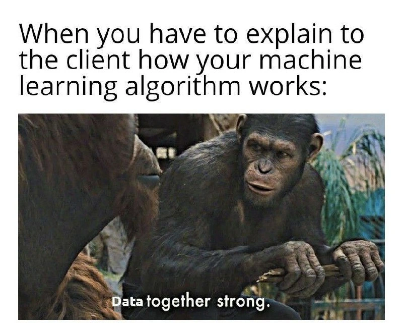
The meme offers a tongue-in-cheek solution: resort to a caveman-style explanation. The top text says: “When you have to explain to the client how your machine learning algorithm works:” – it’s setting up the scenario of an engineer in explanation mode. The bottom image shows two apes from a famous scene in Rise of the Planet of the Apes. In that movie, one intelligent ape rallies others with the phrase “Apes together strong.” It’s a very simplified but powerful way of saying we are stronger when we cooperate. This became a popular meme online; people use “Apes together strong” to humorously mean teamwork or unity gives strength.

In the meme image, they’ve edited the subtitle to say “Data together strong.” It’s a playful twist: instead of apes uniting, it’s data points uniting that make something strong. So what is it implying? It’s basically the engineer telling the client: “Our ML model works well because we have lots of data working together.” In other words, the more data, the better the algorithm performs. This is a gross oversimplification, but it’s something a non-technical client can nod along to. It’s a bit like telling a story in very simple terms so that anyone can get the gist without needing a technical education. The engineer in the meme has reduced all the complex inner workings of the algorithm to this one mantra: more data = stronger model.

Let’s connect this to real ML concepts in a straightforward way. In data science, it’s often true that having more quality data improves your model. Data is basically examples or records – for instance, if you’re building a model to recognize cats in photos, your data would be lots of labeled images of cats and not-cats. If you only have 10 images, the model might learn something weird or not generalize well (maybe all 10 cat photos happen to have the cat sitting, so the model thinks “sitting” is a defining cat feature). But if you have 10,000 images of cats in all sorts of positions and lighting, the model gets a much fuller picture of what a cat can look like, and thus it learns a better, more reliable pattern. That’s why an engineer might tell a client, “We trained the model on a huge dataset of examples – that’s why it works so well.” It’s a true statement and is easier to accept than an explanation about, say, how the model’s 50 layers of neurons adjust their weights. This is related to the tag AIHumor and DataScienceHumor – because insiders find it funny that we reduce everything to “we just threw a lot of data at it” when talking to outsiders. It’s like an inside joke about how we oversimplify out of necessity.

There’s also the issue of explainability. One of the tags is ExplainableAI. This refers to tools and methods that help us understand why a machine learning model made a certain decision. Some advanced examples include LIME or SHAP (as mentioned in the description). Without getting too deep, these methods produce things like importance scores or visual plots that try to show which parts of the input data influenced the model’s decision the most. For example, if an AI model predicts someone will default on a loan, an explainable AI tool might highlight that “high debt-to-income ratio” and “many missed payments” were key factors. However, imagine trying to show a client a SHAP beeswarm plot (a kind of complex colorful chart) or explaining Shapley values – you’d probably lose them. Even though these are created to bridge the gap, they often end up being too detailed or technical for a layperson audience. So in practice, data scientists sometimes still resort to narrative explanations: analogies or simple statements that capture the essence without the intricacies.

The meme captures the most extreme form of that simplification: cutting out everything except “the data makes it good.” It’s funny because of how primitive and blunt that explanation is. The image of a determined ape clutching a stick, with a subtitle in broken English, is a world apart from the high-tech, cutting-edge nature of machine learning. That contrast is exactly the joke. It’s saying: Look, explaining our advanced AI to a client sometimes feels like this – we end up sounding like cavemen making grand, vague proclamations. The phrase “Data together strong” is easy to remember and kind of silly, so it highlights the absurdity (and truth) that often, that’s all a client hears or understands: “If we pile all our data together, the AI gets strong.”

To a junior developer or someone new to data science, this meme is also a lighthearted cautionary tale about communication. It’s not enough to build a great model; you also have to explain it in the right way depending on your audience. When talking to fellow engineers, you can dive into technical details (TensorFlow, random forest, AUC scores, etc.). But when talking to clients or higher-ups with no technical background, you’ll find yourself stripping the explanation down to the bare basics. You might even use analogies like, “It’s like how a brain learns from experience – the more experience (data) it has, the better it performs.” That’s basically a more polished version of “data together strong.” It’s okay to do this – in fact, it’s a crucial skill in tech jobs – as long as the simplified story is accurate in spirit. The client walks away thinking, “Great, our investment in gathering all that data is why the AI works. Good job team,” and that’s often all they need to know. Meanwhile, you and your team chuckle privately because you know just how much more to it there really is, but hey, at least they’re happy and not confused! This meme is a nod and a wink to that whole process.

Level 3: Black Box Bluff

For seasoned data scientists and engineers, this meme hits right in the gut of shared experience. Picture a meeting where a non-technical stakeholder or client cheerfully asks, “So, can you walk us through how the algorithm actually figures this all out?” 😬. In that moment, every senior ML engineer recognizes the dilemma. Do you open the black box and attempt to describe the convoluted innards of your model – risking confusion and glazed eyes – or do you play the “black box bluff” and give a satisfyingly simple answer? More often than not, we choose the latter to preserve everyone’s sanity. The meme humorously portrays exactly that scenario: instead of attempting to detail multi-step preprocessing pipelines, neural network layer architectures, or ensemble voting mechanisms, the engineer resorts to a catch-all mantra: “Data together strong.” It’s the AI equivalent of a magician saying “It works by magic” – an answer that is technically shallow but pragmatically sufficient when faced with a client who really just wants reassurance that the system is sound.

Why is this so relatable (and funny) to those in AI/ML? Because we’ve all been there. The client expects an explanation that sounds logical and straightforward, something like “Oh, the system just looks for people who are similar to you and recommends what they liked” – a neat one-liner cause-and-effect. But what if the reality is that your recommendation engine is a deep neural network with hundreds of millions of parameters forming an abstract embedding space? Or maybe it’s a complex ensemble model blending gradient boosted trees, a collaborative filter, and a dash of deep learning on side features. In truth, even we might struggle to fully interpret why it outputs a particular result (hence the whole field of ExplainableAI trying to shed light on it). Telling the client “It’s a complicated statistical model with a high-dimensional non-linear decision surface” is both unwelcome and unhelpful. So you simplify: “We feed it a lot of data on past customer behaviors, and it learns patterns – basically, the more data we give it, the smarter it gets.” That’s essentially a polished, professional version of “Data together strong,” minus the meme charm.

The communication gap here is real and vast. Business stakeholders or clients often lack the technical background, and frankly, they don’t want a lecture on gradient boosting or CNNs vs RNNs. They want confidence and clarity. Seasoned engineers know how dangerously easy it is to lose your audience with one wrong jargon word. Mention “hyperparameter tuning” or “loss function” and you’ll see a CFO’s eyes dart towards the exit. Therefore, we engage in a bit of bluffing: we anthropomorphize and dumb it down in a way that’s not incorrect per se, but certainly glosses over 99% of the complexity. It’s a form of explanation theater. The meme’s top text sets this up perfectly: “When you have to explain to the client how your machine learning algorithm works:” – seasoned devs read that and already smirk, knowing whatever comes next is going to be an oversimplification. Sure enough, the bottom image punchline is the well-known scene of apes declaring unity: “Data together strong.” It’s a hilarious exaggeration of the kind of answer we wish we could give in a meeting without getting strange looks. In meme form, we embrace the absurdity: picture a straight-faced engineer in a suit telling a boardroom, in caveman grammar, “Data together strong” – it’s absurd, yet it captures the truth that often all the client cares to hear is that their pile of data is doing something good.

This speaks to a broader phenomenon in AI communication: the struggle to balance honesty with clarity. We want to be transparent about our models, but full transparency would involve diving into technical details that sound like sci-fi to non-engineers. Instead, we use analogies and boiled-down narratives. Sometimes we even use meme logic internally to cope – jokingly telling teammates “Well, boss wanted an explanation, so I went with the old data-make-model-good story.” It’s a bit of gallows humor among ML professionals: we poke fun at how we must sometimes play the role of a storyteller rather than a scientist. The tags like CommunicationGap and StakeholderExpectations are all about this mismatch in understanding. The client expects straightforward answers because in many other domains, explanations are straightforward (e.g., “the bridge stands because of strong steel beams”). But in AI/ML, the honest answer might be “the model found a complex statistical correlation in 100-dimensional space, but we’re not entirely sure which inputs led to this particular decision without running an exhaustive analysis.” That doesn’t exactly instill confidence, nor fit in a 30-second soundbite. So, enter the friendly fiction of “data together strong.” It reassures the client (“Oh, it works because we have a lot of data, got it.”) using a concept they’ve likely heard – big data = good. It’s not outright lying; more data generally does improve model performance. It’s just conveniently omitting the labyrinth of data preprocessing, feature engineering, model selection, and tuning that actually happened behind the scenes.

Another aspect of the humor is how it highlights the absurdly simplistic phrasing. The meme uses the famous line “Apes together strong” from Rise of the Planet of the Apes. In the movie, that line symbolized how unity gives strength. Within engineering teams, we’ve probably shared that meme image among ourselves whenever we talk about combining efforts or data aggregation: it’s short, visual, and everyone gets the reference. By substituting “Apes” with “Data,” it’s implied that data points united make a powerful force (a successful model). It’s ultimately a self-aware joke: as engineers, we know reducing our sophisticated ML solution to a grunting phrase is laughable, but that’s the point – sometimes that’s what explaining tech to non-tech folks feels like. You end up distilling it to almost a tribal slogan that would fit in a meme, because any deeper detail either confuses or bores them. It’s both cathartic and funny to see this acknowledged so plainly.

In a nutshell, Level 3 perspective recognizes the meme as a commentary on industry life in data science: building incredibly advanced AI models only to explain them with primitive analogies. It’s a nod to every data scientist who has sighed inwardly and given the “high-level summary” when asked about their work. The humor carries a slight edge of cynicism too – hinting that clients often don’t want the real story, just a comforting one. “Data together strong” is the comforting story we give, and the meme lets us laugh at how ridiculous that feels from the inside. After all, if we actually responded to a client’s query with the meme image on a slide, we’d likely get in trouble – but sharing it on a developer forum? That’s our little rebellious high-five, acknowledging the Explainability Struggle with a smirk.

Level 4: Weak Learners, Strong Ensemble

Deep inside that seemingly caveman-like explanation lurks some serious machine learning theory. Modern ML models – especially complex ones like ensemble methods or deep neural networks – operate as a kind of collective intelligence. In an ensemble (say a Random Forest or a Gradient Boosting model), you have many individual “weak learners” (simple decision trees, for example) that each make rough predictions. Individually, each is as limited as a lone ape with a stick. But when you aggregate their votes or outputs, you get a far more accurate and robust predictor – essentially weak learners together, strong ensemble. This is analogous to the meme’s tagline: “Data together strong.” Each single model or data point might be noisy or weak, but combined they can overcome individual weaknesses. There’s even theoretical backing: ensemble techniques reduce variance and avoid overfitting by averaging out quirks of individual models. It’s like the Wisdom of Crowds principle in action – multiple opinions averaged out can outperform the best single expert, just as many models' outputs combined can outperform the best single model. The meme cheekily compresses all that into the image of unified apes, hinting that cooperation yields power, whether among primates or predictive models.

Under the hood of a sophisticated ML pipeline, there’s also intense mathematics at play. If the algorithm in question is a deep neural network, explaining its mechanics means delving into layers of linear algebra and calculus. The model “learns” by adjusting millions of weights via gradient descent, a process where it nudges parameters in the direction that reduces prediction error. Formally, it’s iteratively solving an optimization problem in a high-dimensional space – not exactly easy cocktail party conversation. For example, the training process might involve minimizing a loss function $L(\theta)$ by updating weights with $\theta \leftarrow \theta - \eta \nabla_\theta L$ (gradient descent update rule). Telling a client that would likely result in blank stares. So instead, engineers resort to a simpler truth: “we showed the model a lot of examples, and it gradually figured out how to get things right” – which, in meme-speak, becomes “data make model strong.” This oversimplification hides the gritty detail that the model is basically solving a big numerical puzzle through hundreds of tiny steps.

Another hidden layer of complexity is Explainable AI (XAI) techniques like SHAP or LIME, which were hinted at in the description (“SHAP plots”). These are tools data scientists use to interpret black-box models. For instance, SHAP (SHapley Additive exPlanations) is grounded in cooperative game theory. It treats the prediction as a “payout” and features as “players” in a coalition, then fairly distributes credit to each feature based on its marginal contribution, using the concept of Shapley values (named after Lloyd Shapley). Calculating these involves considering every combination of features – an exponential number of possibilities – which is computationally complex. The result might be a fancy graph showing how each input factor pushes the prediction up or down. It’s powerful for a data scientist trying to understand a model’s behavior, but try explaining Shapley value theory to a business stakeholder without eyes glazing over. It would be like explaining quantum mechanics to someone asking why their coffee is cold – massive overkill. Thus, in practice, we often avoid diving into these esoteric details with non-technical folks. The meme acknowledges this with a wink: instead of detailing feature attribution methods or ensemble error reductions, the engineer just proclaims a primitive-sounding mantra, “Data together strong,” as if that alone accounts for the ML magic. Ironically, there’s truth in that mantra – in data science, a wealth of diverse, high-quality data often matters more than the specific algorithm used. (There’s a popular saying: “Better data beats fancier algorithms.”) From a theoretical perspective, more data points provide better coverage of the underlying pattern or distribution, which often leads to improved generalization due to the Law of Large Numbers smoothing out noise. In plain terms, as the dataset size $N$ grows, the variance of our estimates shrinks (roughly on the order of $1/\sqrt{N}$ in many cases), meaning the model’s performance gets more reliable. So yes, at a fundamental level, feeding the algorithm vast amounts of data is a big part of why it works well – the meme just reduces that idea to a delightfully primal slogan.

In summary at this deep-dive level: the humor lands because “Data together strong” is a ridiculously dumbed-down catchphrase for concepts that are in reality highly sophisticated. It nods to ensemble learning (many models working in unison) and the critical importance of big data, alluding to how these principles strengthen AI models. At the same time, it hints at the struggle of explainability: we have cutting-edge math to demystify the “whys” of a model’s predictions, yet explaining those whys to a layperson can be as futile as an ape trying to explain a calculus problem. So we end up summarizing complex AI/ML dynamics with something simple and primal that anyone can grasp – more data = better results. The meme’s genius is that it captures the absurdity of that simplification and the communication gap it’s trying to bridge, all in one image of apes banding together.

Description

This meme captures the challenge of explaining complex technical concepts to a non-technical audience. The top text reads, 'When you have to explain to the client how your machine learning algorithm works:'. Below this is a still image of Caesar, the intelligent ape from the movie 'Rise of the Planet of the Apes.' Caesar is shown in a thoughtful pose, communicating a simple but profound idea. The subtitled text at the bottom reads, 'Data together strong.' The humor comes from the gross oversimplification. Instead of delving into the intricacies of neural networks, gradient descent, or feature engineering, the explanation is reduced to a primal, broken-English phrase that is comically basic yet, in essence, true. For data scientists and ML engineers, it's a deeply relatable scenario of bridging a massive knowledge gap with stakeholders who need a high-level concept, not a technical deep dive
Comments

14
Anonymous ★ Top Pick Client: 'So it's like a super-smart Excel macro?' Me: '...Yes. A very, very strong macro.'
  1. Anonymous ★ Top Pick

    Client: 'So it's like a super-smart Excel macro?' Me: '...Yes. A very, very strong macro.'

  2. Anonymous

    Some days you craft a 50-page LIME report; other days you channel Caesar and declare, “Data together strong,” and somehow the QBR slides themselves converge

  3. Anonymous

    After 20 years in the industry, you realize the hardest distributed system to debug isn't your Kubernetes cluster or your eventual consistency model - it's the distributed understanding of what your ML model actually does across the C-suite, where each executive has their own strongly consistent but completely wrong mental model of 'AI magic.'

  4. Anonymous

    'Data together strong' is honestly a more accurate explanation of gradient descent than most slide decks - and unlike the model card, the client understood it

  5. Anonymous

    When your carefully architected ensemble of gradient-boosted decision trees with hyperparameter-tuned regularization gets reduced to 'we put the numbers together and they tell us things' because explaining cross-validation to a VP would require a three-hour workshop they don't have time for

  6. Anonymous

    When asked how it works, I say 'data together strong,' then show a SHAP plot - our post‑hoc regularizer that minimizes stakeholder loss without changing the model

  7. Anonymous

    We translate our regularized gradient-boosted ensemble with SHAP calibration into 'data together strong' and suddenly the SOW gets signed

  8. Anonymous

    Ensemble methods distilled: one model's a chump, but data together strong - like a committee of weak learners finally shipping to prod

  9. @ZgGPuo8dZef58K6hxxGVj3Z2 4y

    Machine learning is shit for precision stuff

  10. @ZgGPuo8dZef58K6hxxGVj3Z2 4y

    Lets use it reverse hashing

    1. @qwnick 4y

      why?

    2. @qwnick 4y

      if hash length is limited, then there is unlimited amount of possible results for each hash. We can use ML to select actual results among trash tho, if it's text, for example

      1. @CcxCZ 4y

        If it's text you're unlikely to need very complex recognizer. Statistically speaking it's unlikely you'd get many plain-text collisions that are sensibly small. Something like compressed images maybe.

        1. @qwnick 4y

          yes, thx for proof

Use J and K for navigation