The Great Scrollbar Glow-Down: 1988-2012 and the 2006 sweet spot
Why is this UX UI meme funny?
Level 1: Just Right
Imagine you have three different drinking cups over the years. The first cup, from a long time ago, is like one of those big, colorful sippy cups with giant handles – you can’t miss it and it’s super easy to hold. The newest cup, from today, is like a very slim, plain cup with no handle at all – it looks sleek and grown-up, but if your hands are small or unsteady you might struggle to grip it, and you might even overlook it on a cluttered table because it’s so plain. Now, the cup in the middle – think of one from a few years back – has a modest handle that fits just right and a nice design that isn’t too loud or too plain. When you pick that one up, it feels comfortable and looks good without being hard to use.
This meme is saying the same thing, but about the little bars you use to scroll on a computer screen. In the past, the scroll bar was big and obvious – like the big sippy cup handle, you couldn’t miss it and it was easy to grab. Today, some scroll bars are tiny or even hidden, like that sleek cup with no handle – it looks nice and clean, but sometimes you can barely find it when you need it! The year 2006 scroll bar (the one in the middle) was just right: it looked nice and you could still use it easily. The meme joke is that 2006 was the “sweet spot” when the scroll bar design had the perfect balance, just like Goldilocks finding the porridge that was neither too hot nor too cold, but just right. So it’s funny because we’ve all seen things go from one extreme to another, and we appreciate when something finds the happy middle – even if it’s as simple as a scroll bar feeling perfectly comfy to use.
Level 2: The Incredible Shrinking Scrollbar
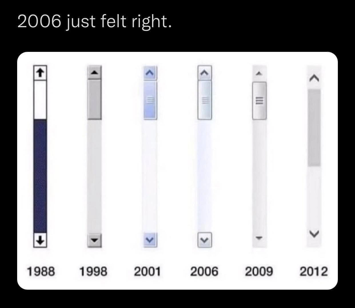
Let’s break down what this meme is showing in simpler terms. We have a series of six scrollbars, each labeled with a year (1988, 1998, 2001, 2006, 2009, 2012). A scrollbar is that vertical bar on the side of a window or webpage that you use to scroll up and down through content. It usually has a track (the background bar), a thumb (the portion you can drag up or down), and sometimes arrow buttons at the top or bottom that you can click to scroll a little at a time. The meme images depict how the design (look and feel) of scrollbars changed over the years, becoming steadily slimmer and more minimal. The caption “2006 just felt right” suggests the person who made the meme thinks the 2006-era design was the best compromise between the old and new styles.
To visualize the changes, here’s a quick rundown of each year’s scrollbar and its key features:
| Year | Scrollbar Look & Style | Notable Features |
|---|---|---|
| 1988 | Thick, dark blue bar on a light track. Big black arrow icons at both top and bottom. |
– Very high contrast (blue stands out). – Arrows at both ends for up/down. – Thick thumb (easy to grab with a mouse). |
| 1998 | Gray, slightly slimmer bar on a gray track. Black/gray arrows, smaller than 1988’s. |
– More neutral color (gray blends with typical OS chrome). – Still fairly thick compared to today. – 3D-ish look (slight shading to appear like a physical button). |
| 2001 | Blue glossy thumb on a light colored track (white or light gray). Arrow icons perhaps blue or gray. |
– Introduced a gradient/gloss (this is the Windows XP style bright blue scrollbar). – Friendly color (light blue was easier on eyes than dark blue). – Still clearly defined and visible. |
| 2006 | Thinner, light-blue/gray gradient bar on a pale track. Small, subtle arrow icons. |
– Sleeker design (narrower width than prior years). – Light gradient or slight transparency (modern look, e.g., Windows Vista Aero or OS X). – Arrows are there but smaller and less obtrusive. |
| 2009 | Very thin, mostly flat gray bar on a white/light track. Tiny arrow icon (or none, depending on OS). |
– Minimalist style (almost no gradient or 3D effect). – Often a single color (flat). – Arrows might be reduced in size or removed in some designs. |
| 2012 | Ultra-thin, nearly invisible bar, often just a faint line on a transparent or very light track. No visible arrow buttons. |
– Barely-there appearance (you might not notice it at first glance). – Typically no arrows at the ends anymore. – Sometimes the bar auto-hides (appears only when you start scrolling or hover your mouse in the area). |
What does all that mean in plain language? Basically, in 1988 the scrollbar was super obvious and hard to miss. It was thick, colorful, and had big arrows – kind of like a toy with big buttons that says “Press here!” This made it very easy to use because you could instantly see how to scroll a page. By 2012, the scrollbar had become a tiny sliver that you might not even see on your screen unless you’re looking for it. The arrows to click for scrolling were gone, so the only way to scroll is either drag that tiny bar (if you can click it) or use something like a mouse wheel or touchpad gesture.
Now, why did this happen? A lot of it has to do with design trends in software and operating systems:
- In the early days (80s and 90s), people were new to graphical user interfaces. Designers made things look like physical objects (this is often called skeuomorphic design – basically imitating real-world knobs, buttons, etc.). The scrollbar looked a bit like a physical elevator control: a track with up/down buttons, something you can grab and slide. The focus was on clarity and usability – no one should struggle to figure out how to scroll.
- By the 2000s, people were very familiar with computers, and design started to become more about aesthetics (how things look). Windows XP (circa 2001) added color and gradients to the interface, which is why you see that blue shiny scrollbar – it was more cheerful and modern-looking. It still worked the same, it just was styling/decoration on top of the basic design.
- Around 2006, the styles got cleaner. If you’ve heard of Windows Vista or used a Mac, the look was more polished and semi-transparent. Scrollbars became a bit smaller to look slick, but they weren’t gone – you could still see them easily. Many consider this era a nice balance: the UI looked updated but everything was still clearly labeled and operable. That’s why the meme creator says “2006 just felt right.”
- After that, a big shift happened around the late 2000s into 2010s: the rise of smartphones and tablets. Touchscreen devices like the iPhone (first released in 2007) didn’t use traditional scrollbars because you use your finger to scroll, and having a big bar on a tiny screen would steal space. Instead, mobile OSes show a thin scroll indicator that appears briefly while you scroll and fades out. This introduced the idea that scrollbars don’t need to always be visible. Desktop Operating Systems (like Windows and macOS) started borrowing those concepts to look modern and minimalist. Also, flat design became the hot trend – that means no gradients, no 3D shadows, just flat colors and as few lines as possible, to give a very clean, open look. So by 2012 with Windows 8 and new versions of macOS, the scrollbars were flat, often only a few pixels wide, and sometimes hidden when not in use.
For a newer developer or someone learning UX/UI design, the meme is essentially a quick history lesson in GUI design choices. Each step in that history involved design trade-offs:
- Make it big and obvious (great for usability) vs. make it small or hidden (great for showing more content and looking clean).
- Keep consistent designs (so all apps look familiar) vs. customize/hide things (so each app or OS looks unique or uncluttered).
By highlighting 2006, the meme suggests that around that time we had an ideal middle ground. The scrollbar wasn’t eating up too much space or looking dated, but it also wasn’t so minimal that you’d struggle to click it or even find it. It’s a bit like Goldilocks saying, “This one is just right,” after trying ones that were too hot or too cold.
If you’re into frontend development, you might know that you can style scrollbars with CSS or via UI frameworks. For instance, web developers can use ::-webkit-scrollbar in CSS to adjust a scrollbar’s thickness or colors in browsers like Chrome and Edge. In the early 2000s, Internet Explorer even had special properties (like scrollbar-face-color) that let sites make custom-colored scrollbars (that was a brief trend: making your scrollbar match your website’s theme). Those were early attempts at custom styling. As design moved towards the minimalist side, many developers started to actually hide the default scrollbar in custom scrollable panels and replace it with slimmer, overlay scroll indicators (or sometimes nothing at all except maybe a fade effect at the bottom of a container to hint there’s more content). If you’ve ever used a modern design library or looked at fancy websites, you might notice that some have invisible scrollbars that only show up when you actively scroll. That’s exactly in line with the 2012 style shown in the meme.
Let’s also touch on the UXDesignPrinciples referenced by the tags: “affordance” is one such principle. An affordance is basically a clue in the design that tells you what you can do. The old scrollbars had strong affordances: arrows that afford clicking, a thumb that affords dragging (it even looked kind of like a grip). The newest designs have weak affordances: a thin bar doesn’t scream “drag me” – rather, you’re expected to know from experience that that area is for scrolling. This can make interfaces harder for beginners or less tech-savvy folks. Ever show a non-techie person an iPad and watch them not realize a page has more content because there’s no visible scrollbar? It happens! They might not scroll at all because nothing hints that the content continues off-screen. That’s a downside of minimal design.
On the flip side, the advantage of the newer minimal scrollbars is that they don’t distract from the content. When nothing is being scrolled, you effectively don’t see any UI there – it’s cleaner and lets, say, a photo or text span edge-to-edge without a chunky bar in the way. Designers also argue it looks more modern and less “old-school”. So it’s a classic UX/UI debate: visibility vs. aesthetics.
In summary, the meme gives a quick tour of scrollbar evolution, showing how something very simple changed over time along with design fashions and technology changes. For someone newer to tech, it’s a neat way to realize that even basic things like scrollbars have trends! And it humorously points out that maybe the middle point (mid-2000s) was the best of both worlds. If you’ve only ever used modern computers, you might find the older designs chunky or ugly, but you might also have experienced frustration with super thin scrollbars. The meme taps into that feeling – acknowledging that each design has its pros and cons, and a lot of developers kind of miss the happy medium.
Level 3: UI Goldilocks Zone
For seasoned developers and designers, this meme hits that sweet spot of nostalgia and “I’ve lived through this” recognition. It humorously captures how UI design trends swung from one extreme to the other over a couple of decades, with 2006 marked as the Goldilocks moment when things were “just right.” The scrollbar, a humble but essential UI component, is shown in six incarnations: from the chunky late-80s style to the nearly invisible 2012 version. If you’ve been around long enough to remember installing Windows 95 from floppy disks or tweaking CSS in the IE6 era, you likely recognize each of these designs on sight. The meme isn’t just about the visuals; it’s about the feeling each era of design gave us and the usability trade-offs involved.
Let’s translate those images and years into real products and eras that a front-end old-timer would know:
1988: Think early GUI environments like Windows 2.0/3.0 or classic Mac OS in the late 80s. Scrollbars were thick, blue (on Windows) with bold arrows. They looked like physical sliders on a machine. In 1988, a scrollbar needed to look like a physical object – users were new to graphical interfaces and every control had to announce itself. These were the days of skeuomorphic UI in a very practical sense: the scrollbar resembled a mechanical knob and arrows, because that’s what made sense to users migrating from the world of typewriters and paper. Also, monitors were low-resolution and not color-rich; a dark blue bar with stark arrows was a smart way to ensure high contrast and visibility. Engineers hadn’t yet worried about “wasting” 15 pixels on a scrollbar – heck, a lot of applications were used fullscreen at 640x480 resolution, and users were thrilled just to have scrollable windows at all.
1998: Fast forward a decade to the late 90s: the era of Windows 98 and Internet Explorer 4. The scrollbar became a bit slimmer and gray – overall more neutral. By now, users are accustomed to the idea of scrollbars, so the design doesn’t need to be screaming blue. The UI aesthetic of the 90s trended towards a standard gray toolkit look (think dialog boxes in Windows 95/98 or business applications on Unix with Motif GUI). We still have the arrows at both ends and a defined thumb, usually with a beveled 3D effect. The visual style is utilitarian. Inconsistent UIs were fewer because apps generally relied on the OS’s common controls, so a scrollbar looked the same in most software, and everyone recognized it instantly. If you did front-end in this era (like building a desktop app with VB6 or Java Swing), you didn’t stray from these defaults much – partly because customization was hard and partly because users expected the familiar look.
2001: Enter the early 2000s and the reign of Windows XP (launched late 2001) with its famous Luna theme. Suddenly, UIs got colorful and a tad playful. The scrollbar in the meme labeled 2001 shows a blue glossy thumb – that instantly recalls XP’s candy-colored interface. Microsoft decided computers didn’t have to be battleship gray and could actually be friendly. The scrollbars in XP were a lighter blue track with a medium-blue thumb. They even had a slight gradient and a pseudo-3D look that made the thumb appear like a rounded pill. It invited you to click and drag. This was skeuomorphism’s stylish cousin — still giving you a clear affordance (it looks pressable and distinct from the track) but also giving the OS some personality. Developers at the time either loved it or found it garish, but everyone remembers it. And importantly: it was still very usable. The scrollbar was reasonably thick; you could spot it easily in a busy interface.
2006: This is marked as the “just felt right” peak in the meme. Around 2006, a couple of notable things happened in UI design. Microsoft released Windows Vista (late 2006) with the Aero interface. Apple was in the era of Mac OS X Tiger/Leopard. Both companies were polishing their GUIs to look more modern, which meant somewhat cleaner lines and subtle effects, but not ignoring usability. The 2006 scrollbar shown is thinner than the earlier ones, with a light gradient. If it’s the Vista style, it was a semi-transparent gray/blue bar that would glow slightly when hovered – modern looking, but still definitely there on the screen. If it’s referencing OS X, Mac OS X had Aqua scrollbars earlier (bright blue) and by 2006 they were toned down to a graphite grey option – again, slicker but still visible with both arrows present (fun fact: old Mac OS X let you put both arrows together at one end or split between top/bottom as a preference). Either way, mid-2000s scrollbars achieved a nice balance: visually refined (no huge chunky arrows, no overly loud colors by default) yet discoverable and easy to grab with a mouse. As developers or users then, we rarely complained about the scrollbar – which is telling. It did its job without drawing too much attention or causing frustration. No one was calling it outdated yet, and no one was losing it in the interface either.
2009: By 2009, minimalism was really creeping in. This was the time of Windows 7 (which carried a cleaned-up Aero look from Vista) and the lead-up to mobile design influence. The scrollbar shown in the meme for 2009 is a skinny almost-all-white bar with a tiny arrow. Windows 7’s scrollbars were indeed more monochromatic – mostly light gray with a faint outline. The arrows were still there, but they’d become small triangles with less contrast. Also consider the rise of smartphones (iPhone in 2007, Android in late 2008) – mobile operating systems couldn’t afford big persistent scrollbars at all (touch scrolling gave a momentary overlay instead). Desktop designs were taking cues from that simplicity. Many applications (and websites via emerging CSS tricks) started to style away the traditional thick scrollbar in favor of a slick, minimal variant. A front-end developer around 2009 might recall using custom JavaScript/CSS scrollbars to match a design, often making them thinner or auto-hiding to look modern. It was a sign of the times: flat UI was on the horizon (Google’s design started flattening, and Microsoft was previewing its radical Metro UI). Essentially, the scrollbar was losing weight to fit in with the cleaner interfaces.
2012: By 2012, we’d hit the extreme: the ultra-thin, sometimes invisible scrollbar. Windows 8 launched in 2012 with the Metro design language (later renamed Modern UI), which was flat, bold, and had zero skeuomorphic details. Its scrollbars were flat rectangles with almost no standout styling; they often blended into the background until you interacted. Meanwhile, on macOS, if you follow Apple’s evolution, in 2011–2012 they not only made scrollbars thin and monochrome, they also hid them by default when you weren’t actively scrolling. Many users first noticed this after an OS update: you open a long webpage or document and… there’s no scrollbar on the side until you start scrolling, then a slim gray bar fades into view. The arrows for step-scrolling? Gone forever. This was jarring if you came from the old school. Sure, it looked clean and gave more screen space for content, but it also meant a key navigation element became a bit of an Easter egg hunt for the uninitiated. Plenty of power-users immediately dug through settings: “Where’s that checkbox to always show scrollbars?” The meme’s 2012 image, that nearly invisible sliver, captures this design philosophy: UI elements should get out of the way – even if that means the user might at first not see them at all. It’s a sort of “if you know, you know” design club.
Now, why do seasoned devs find “2006 just felt right” funny and relatable? Because it rings true. Those of us who endured these phases remember that around the mid-2000s, UI design had reached a nice equilibrium. Before that, things were clunky and dated; after that, things started getting too stripped down. It’s like we Goldilocks-tested scrollbar designs through the years: 1988’s was too heavy, 2012’s became too light, but 2006’s was just right. The joke is that after all the iteration, the one in the middle – that mid-2000s design – might have actually been the most practical blend of form and function. Yet, design trends don’t stop in the middle; the pendulum kept swinging.
There’s also an implicit jab at the design trend mentality. In tech, we often see pendulum swings where everyone jumps on a bandwagon. In the 2000s, it was glossy, “Web 2.0” styling (remember all the gel buttons and reflections?). By 2010s, it flipped to ultra-flat. The meme nostalgically points out that maybe we went a bit overboard. It’s amusing because anyone who has had to implement these design changes (say you’re a front-end developer updating an app’s look) has probably had thoughts like: “Do we really need to make it any thinner/invisible? It was fine a few years ago!” We’ve sat in meetings where a designer or a new OS guideline says, “Remove these scroll arrows, they clutter the UI,” and someone else (often an engineer concerned with usability or an older UX person) goes, “But some users rely on those!” Often, the minimalist approach won out, and indeed some users got confused or annoyed. So it’s a shared experience in the dev community: an almost facepalm “told you so” about design oversimplification.
UX Design Principles are also at play. A senior dev or designer will recall things like Nielsen’s usability heuristics or Tog’s law of interactive design which push for clarity and user control. Removing explicit scroll controls reduced clarity and fine control (harder to click precisely, harder to even realize something is scrollable without the visual cue). The FrontendDevelopment tag and DesignTradeoffs hint that this meme is a gentle critique of those trade-offs: the consistent, thick scrollbars provided great usability but looked old; the newer ones looked modern but hurt usability. We’ve lived that trade: for instance, web developers started hiding scrollbar tracks on custom modals to make them look cleaner, only to realize users didn’t know the content was scrollable. Inconsistent UIs also began to appear: some apps or sites would use a custom styled scrollbar (maybe a funky color or a special width) while others used the native one, meaning users had to adapt to different looks – a minor cognitive load but one that didn’t exist when everything used the OS default.
In practical real-world terms, there’s some developer pain (and humor) associated with each stage:
- In the old days, implementing a scrollbar meant using whatever the OS provided – it was heavy but straightforward. Maybe you remember using a library or OS API and getting that thick widget by default.
- By the mid-2000s, developers got more tools to customize UI (CSS3, WPF/.NET, Cocoa, etc.), and a lot of devs spent time making UIs look prettier or on-brand, including tweaking scrollbars. 2006’s style was like the golden template: slim enough to be modern, but not so custom that it broke conventions.
- Come late 2000s and 2010s, devs suddenly had to account for fancy scroll behavior. Think of all the JavaScript polyfills and CSS tricks to mimic the new auto-hiding scrollbars, or to style the scroll thumb. Web devs discovered
::-webkit-scrollbarCSS pseudo-elements (which only worked in certain browsers) to make scrollbars match a flat design theme. And if you did native mobile, you had to leave behind always-visible scrollbars entirely. It was a new mindset: scrolling became invisible until invoked. When working on apps, we’d get bug reports from users like “There’s no scrollbar, I can’t scroll” and we’d have to explain “just try scrolling, it will appear.” Seasoned devs chuckle because they’ve probably had to add a tooltip or onboarding hint for something as simple as “you can scroll here,” which never used to be needed when a big fat scrollbar was staring you in the face.
Another aspect is Tech Nostalgia. Let’s face it, part of the meme’s charm is the warm fuzzies of seeing that Windows XP-style blue bar or the old-school arrows. Frontend folks who grew up in the 90s/00s might even hear a little click sound in their head looking at the 1988 version (Windows used to play a tick sound when you clicked those arrow buttons!). It’s the same kind of nostalgia as hearing a dial-up modem sound or the Windows 95 startup chime. So when the caption says “2006 just felt right,” it’s also tapping into that sentiment: remember when GUIs felt solid and friendly, before everything became flat white and gray? It’s of course subjective – some might love the new minimalism – but collectively, a lot of devs did feel a twinge of “ugh, too far” when UIs went ultra-flat. This meme is essentially a nod among peers that, yes, the 2006 era scrollbar was a Goldilocks design.
In terms of industry storytelling, this progression also tells the tale of how frontend development and design philosophies evolved. The late 80s and 90s established baseline UI elements (scrollbars, buttons) with strong conventions. Early 2000s started experimenting with polish (animated effects, gradients). Late 2000s and beyond pushed for uniformity with content (hiding anything that isn’t content). A senior dev likely has war stories from each of these eras: maybe writing Win32 code to subclass a scrollbar control in 1998, then in 2008 writing custom CSS to undo the fancy OS theming for consistency, and by 2012 using a completely custom scroll library to get a thin overlay scrollbar in a web app because that’s what designers wanted. Each step had its headaches and its “wow” moments.
So, the humor has multiple layers for us veterans:
- It’s poking at the design hype cycle – we overshot on minimalism and kinda miss the era before it went extreme.
- It’s a bit of a “back in my day…” joke – where “my day” might be 2006, ironically not usually considered “old days,” but in UI terms it’s several generations ago.
- And it’s highlighting how something as mundane as a scrollbar can ignite a debate about user experience vs. sleek design. We’ve all been in that debate, whether on forums or in sprint planning.
To sum it up, from the senior perspective this meme is both a trip down memory lane and a wry comment on design trends. We chuckle because we know every pixel-wide reduction came with a discussion (or a grumble), and in hindsight, yeah, that 2006 scrollbar really did feel about right. Seeing them side by side, the contrast is hilarious and maybe a tiny bit tragic (for those of us who have squinted at a modern thin scrollbar thinking “why do we do this to ourselves?”). It’s a meme that says: we’ve seen some things change, not always for the better, and isn’t it ironic how the middle path was quite good? It’s a gentle ribbing of the UX/UI world, delivered in a format that only folks who’ve lived through those Windows and web evolution years might fully appreciate.
Level 4: Affordance Atrophy
At the highest level, this meme spotlights a classic tension in HCI (Human-Computer Interaction) between usability principles and aesthetic minimalism. Early graphical interfaces were built on explicit visual cues — known as affordances — that scream “I am interactive!” The 1988 scrollbar exemplifies this: it’s thick, has obvious arrow buttons at both ends, and a clearly defined draggable thumb. These features weren’t just stylistic; they were grounded in human factors research. Don Norman’s design theories from the 1980s (the same era as that first scrollbar) emphasized “knowledge in the world” – meaning the interface itself should clue you in on how to use it. A raised button or an arrow icon looks clickable because it’s supposed to be clicked. Back then, a scrollbar was essentially a mini UI control panel for scrolling: big arrows for step-wise movement, a thumb you can grab for big jumps, and a track you could click for page-wise scrolling. All of these are affordances 📎 – visual signals of how to interact.
By 2012, many of those affordances had withered away – essentially atrophied – in favor of ultra-minimalist aesthetics. The scrollbar shrank to an almost invisible sliver, often with no arrows at all, sometimes even hiding itself when not actively in use (as seen in macOS and mobile browsers of that era). This is a radical shift towards relying on “knowledge in the head” – assuming the user already knows they can scroll with a mouse wheel, trackpad gesture, or keyboard. In design terms, we moved from skeuomorphic design (making on-screen elements mimic familiar physical objects with 3D effects or textures) to flat design (removing almost all ornamentation and depth). The meme humorously labels 2006 as “just felt right,” implying that was a sweet spot before the affordance purge went too far.
From an ergonomic standpoint, the 2012 ultra-thin style flirts with defying Fitts’s Law. Fitts’s Law is a key HCI principle that mathematically models the time to point at a target (like a scrollbar thumb) as a function of the target’s size and distance. In formula form:
T = a + b \log_2\!\Big(1 + \frac{D}{W}\Big)
Where T is the time to acquire the target, D the distance to it, and W the width of the target. You don’t need to crunch the numbers to grasp the insight: narrowing that scrollbar (W getting smaller) or hiding it until mouse-over increases the interaction cost exponentially. By 2012, the scrollbar became a tiny, vanishing target – a near violation of this principle. In plain terms, tiny targets are hard to click, and if they disappear until you’re already scrolling, they fail to inform the user where to click at all. An HCI purist might playfully call the 2012 design a Fitts’s Law fiasco: form was trumping function.
So what drove this collapse of affordances? Part of it was the rise of new input paradigms and higher display densities. In 1988, users predominantly used a mouse with a single button, and screen resolutions were low (each pixel was a chunky dot on a 13” CRT). Making the scrollbar thick and obvious wasn’t just a design choice, it was a necessity — a larger clickable area and high contrast visuals ensured you could actually hit that control reliably. By the late 2000s, we had scroll wheels on mice, multi-touch trackpads, and later touchscreens (introduced with smartphones). Users were increasingly scrolling by flicking or two-finger swiping, not by meticulously clicking arrows. At the same time, screens got higher resolutions and UI design embraced content-first philosophies: interface chrome (window borders, buttons, scrollbars) was seen as taking away precious screen real estate from content. This led to the “chrome-less” or minimalist UI trend – basically the UI on a diet. The scroll bar’s visual prominence was a prime victim of this diet. On mobile devices, scrollbars became purely indicative (often just a transient overlay to show position) or disappeared entirely, because touch gestures handle the scrolling. Desktop OSes followed suit to look modern and clean. macOS Lion (2011) famously hid scrollbars by default to mimic the iPhone experience, startling desktop users who suddenly wondered where their scroll handle went. Similarly, Windows 8 (2012) introduced a flat “Metro” design language, toning down all skeuomorphic details – scrollbars became flat grey bars with minimal or no arrows, blending into the background of content.
There’s also an element of design fashion at play. In the timeline of GUI history, you can see design pendulum swings. The late ‘90s loved 3D-looking UI elements (shadows, beveled edges) to convey depth and interactivity; the early 2000s (eg. Windows XP’s Luna theme in 2001) went for friendly colors and gradients – still clearly delineating controls but less monotonous; by the early 2010s, influenced by print-style typography and minimalist aesthetics, the trend was to remove any “unnecessary” embellishment. The extreme end of that trend gave us things like the 2012 scrollbar: so minimal it’s almost nothing. It’s functionally elegant from a clutter perspective but arguably a usability regression. In design academia, this is sometimes joked about as “the invisibility irony” – the better a design element blends in, the harder it can be to find when you need it.
In summary, the meme’s scrollbar evolution encapsulates a decline in explicit UI affordances over time. The humor (especially for veteran designers and front-end developers) comes from recognizing that in pursuit of sleekness, we circled back to a UX problem that the old engineers of ’88 had already solved: making interactive elements obvious. 2006 is highlighted as that golden mean — modern enough to be sleek, yet still sufficiently usable. From an HCI viewpoint, it was a local optimum on the design curve before the industry perhaps overshot in favor of minimalism. Like an archeologist, one can “dig through” these scrollbars as sedimentary layers of design philosophy: from the robust, tool-like UI of the past to the ghost-like, figure-it-out-yourself UI of more recent times. That “great scrollbar glow-down” reminds us that progress in tech isn’t always a straight line; sometimes we subtract too much in the name of progress and end up with a UI that’s literally hiding the very tools to use it.
Description
Meme on a black background. At the top, white text reads "2006 just felt right." Below are six vertically aligned scroll-bar mock-ups, each inside a narrow white column and labeled underneath with the years "1988, 1998, 2001, 2006, 2009, 2012". The 1988 bar is thick, dark-blue, has full-height track and arrow buttons at both ends; 1998 is grey and slimmer; 2001 introduces a blue glossy thumb; 2006 is even thinner with a subtle blue gradient; 2009 shows a minimalist grey track with tiny arrows; 2012 is ultra-thin, almost invisible, with faint grey highlights and no discrete buttons. The progression humorously charts the move from skeuomorphic, affordance-rich UI toward today’s ultra-minimal scrollbars, evoking developer nostalgia for the UX balance circa 2006

Comments
16Comment deleted
2006 was the last commit where Fitts’s Law and Dribbble merged cleanly; every design sprint since has basically been `git rm scrollbar.*`
The 2006 scrollbar is like a well-architected microservice - just enough functionality to be useful, not so minimal that you need three Stack Overflow tabs open to figure out how to grab it with your mouse
Ah yes, 2006 - when scrollbars were still discoverable without a treasure map and you didn't need to wave your mouse around like a divining rod hoping to summon the scroll thumb from the void. Now we've achieved 'peak minimalism' where the scrollbar is so invisible it's basically Schrödinger's UI element: simultaneously there and not there until you accidentally trigger it. But hey, at least we saved those precious 15 pixels of screen real estate - totally worth sacrificing the affordance that's been teaching users 'this content scrolls' since the Xerox Alto
2006: When sliders had more depth and drop-shadow than our current monolith's dependency graph
UI history in one strip: 2006 was the last scrollbar that obeyed Fitts’s Law; after that it became an invisible overlay - PMs call it “delight,” a11y calls it “P0.”
2006 hit the sweet spot: big enough for Fitts’s Law, small enough to skip 9‑slice PNGs - yet the PM still wants identical scrollbars everywhere, so I ship ::-webkit-scrollbar, file a Firefox ticket, and call it “native.”
Honestly the 1988 version is my favorite. Comment deleted
1998 for me Comment deleted
2001 ❤️ Comment deleted
The beginning of the end. Comment deleted
2006 = Vista? 🤢🤮 Comment deleted
In comparison, what a neat scrollbar on Safari and Mozilla...) Comment deleted
English please Comment deleted
Look at android, it changes size while scrolling. Its unpredictive af Comment deleted
2012 for zoomers ❤️ Comment deleted
2012 and I even prefer a more modern version. Comment deleted