Skip to content
DevMeme
241 of 7435
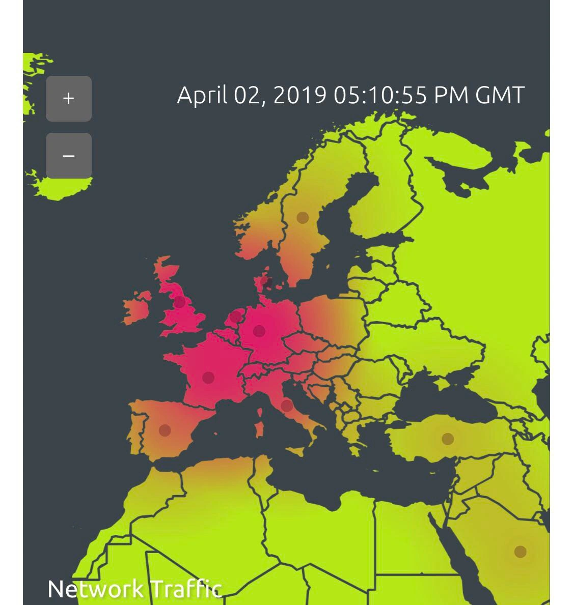
Heatmap of Major Internet Congestion in Europe
Networking Post #294, on Apr 2, 2019 in TG

Heatmap of Major Internet Congestion in Europe

Why is this Networking meme funny?

Level 1: When Everything Goes Wrong

Imagine you’re looking at a map of traffic for all the roads in Europe on your phone, and suddenly the entire map turns bright red. Red would mean huge traffic jams everywhere – like every road in France, Germany, Spain, etc., completely clogged. You don’t even need to know the details to guess that something is very, very wrong, right? Maybe there’s a gigantic snowstorm or all the stoplights went out at once. In any case, it’s a “drop everything” situation. That’s basically what this meme is showing, but for the Internet instead of roads. The red color on Europe means data isn’t flowing freely – kind of like all the cars are stuck. For the engineer watching this, it’s a bit like a firefighter seeing an entire city on fire on the control panel. It’s funny in a nervously laughable way because it’s just so extreme – usually problems aren’t that gigantic! The picture exaggerates the moment to make us smile: it’s saying “look, all of Europe is having a meltdown on my watch.” So even if you’re not technical, you can relate to that Uh Oh feeling – it’s like seeing a big red alert covering something you care about and thinking, “Yikes, we’ve got a big problem!”

Level 2: The Map is On Fire

Let’s break down what’s going on here in more straightforward terms. We have a monitoring dashboard – likely something like a Grafana dashboard – showing a map of Europe. This map is a heatmap visualization for a metric labeled "Network Traffic". In a heatmap, colors represent intensity: typically green means normal, yellow is moderate, orange is high, and red is critical. So seeing countries from Spain through Germany glowing hot pink and red means those places have extremely high network traffic (or possibly high network problems like latency or errors). Essentially, the system is telling us "Hey, something is really wrong with network activity in Europe!". The surrounding regions (like parts of Eastern Europe, North Africa, Middle East on the edges of the map) are green to yellow, meaning they’re relatively fine. The contrast makes Europe’s issue even more glaring – it’s like a big red blotch of uh-oh in the middle of the dashboard.

For a junior developer or someone new to Observability and MonitoringSystems, here’s what that implies: Our systems constantly collect data about how they’re performing – e.g., how many requests are flowing, how long those requests take (latency), how many errors occur, etc. In a Production environment (the live system users actually interact with), we use dashboards to watch these metrics. When everything is healthy, maps and graphs stay in the cool colors (green/blue). When something goes wrong – say a server goes down or, as in this case, network connections slow to a crawl – the metrics spike and the visualization turns warm colors (orange/red) as a warning. The image specifically shows a time around 5:10 PM GMT; it’s a snapshot in time when the issue is happening. The plus/minus buttons on the map indicate you can zoom in/out, just like on Google Maps, but here it’s for exploring the data on the map.

Now, why Europe, and why is it all red? In practical terms, maybe our application or service has users and servers globally, and Europe is one region served by a particular set of infrastructure. If Europe is all red, it could mean a network outage or overload in that region. Perhaps the Internet traffic in Europe suddenly spiked or got rerouted in a weird way – for example, if a major European data center or network line failed, all the traffic might be trying to squeeze through a smaller pipe, causing a jam (just like too many cars on a highway). Networking folks would say there’s high latency or packet loss: basically data isn’t flowing smoothly. From an on-call perspective, this triggers a loud alarm. When you’re OnCall, you’re responsible for reacting to such alarms. You might get a text or a call from an alerting system (like PagerDuty) saying “Network Traffic in Europe – Critical”. Your job is to respond quickly, figure out what’s wrong, and mitigate it. This often means checking if any recent changes were deployed (maybe someone pushed a bad config affecting Europe?), looking at logs (to see if errors spiked), and running diagnostics. If it’s network-related, an SRE (Site Reliability Engineer) might do something like a ping or traceroute from various regions to see where the connection is breaking. They’ll also check if the issue is within their application or something external.

In many cases, problems like this turn out to be something like a misconfigured router, a DDoS attack (where bad actors send tons of traffic to overwhelm the system), or a third-party service outage. For example, if your systems rely heavily on an ISP or cloud region in Europe and that goes down, your monitoring is going to light up red for Europe. The key terms in the tags give clues: geo_heatmap (the map by geography), europe_latency_spike (meaning the delay for data in Europe shot up), dashboard_outage_alert (the dashboard is alerting an outage), and color_gradient_alarm (the colors from green to red acting as the alarm signal). So essentially, this meme shows a worst-case scenario for the on-call engineer: a big, visually undeniable outage focused on Europe. If you’re new, imagine deploying your code and then seeing an entire region’s users start having issues – it’s scary! But the reason folks grin at this meme is because it’s a dramatization of that scenario. It’s like the system saying, “In case it wasn’t obvious, things are really bad right here!” It also highlights why observability tools are so crucial: without a map or graph, you might not notice the scope of the issue immediately. With this dashboard, even a junior dev can glance and understand “Red in Europe = big trouble in Europe.” Now the task is to learn why and fix it, which is where the real challenge (and learning) begins.

Level 3: Continental Red Alert

For a seasoned engineer, this meme triggers a very specific kind of déjà vu (the unpleasant on-call kind). The image of Europe bathed in warning red on a Grafana dashboard is both absurdly comical and palpably stressful. It’s the kind of screenshot you half-joke about in postmortems: "Remember that time we turned Europe into a red-hot zone of doom?" The humor here comes from the over-the-top scale of the problem. Usually we see maybe a single country or data center in trouble, but an entire continent lighting up like a Christmas tree (and not the festive green kind – we’re talking the blaring red of a meltdown) is the stuff of Operations folklore. It’s funny in the way that gallows humor is funny: only those who have survived similar ProductionIncidents laugh, while newbies stare in horror. This image basically says, "Well, pack your bags folks, it’s gonna be a long night." No minor glitch here – this is a SEV-1 incident with a capital "S."

This combination of elements – a geo heatmap_dashboard and Europe fully red – satirizes the moments when our fancy Observability tools turn into harbingers of doom. We set up these MonitoringSystems with pretty maps and color gradients to make issues obvious. And oh boy, is it obvious when Europe is at DEFCON 1. It’s humorously blatant: you don’t need to squint at a tiny graph or decipher a cryptic log; the system is literally showing you a continent on fire. Engineers who’ve been on-call know this sight all too well: that sinking feeling when a dashboard_outage_alert goes off and your world map view looks like a risk board where someone toppled a bucket of red paint over Western Europe. The meme gets a knowing chuckle because it’s an exaggeration of real war stories. Perhaps it reminds folks of the time a major cloud region went down – for example, when AWS eu-west-1 had an outage or a network_traffic_visualization lit up due to a massive DDoS attack originating in Europe. The shared experience: you’re peacefully drinking coffee, then one glance at the NOC (Network Operations Center) screen and you’re spitting that coffee out in sheer alarm.

OnCall veterans also recognize the implied panic mode. There’s an unwritten engineer lore that disasters love to strike at inconvenient times – say, late Friday or right before a holiday. The timestamp here (April 02, 2019 05:10:55 PM GMT) is ironically late in the workday. Cue the dark humor: “Guess I’m not going home for dinner… Europe’s on fire again.” The meme captures that systemic issue where critical incidents often have a habit of happening just when you thought it was safe to log off. And why is fixing it harder than it looks? Well, an outage of this magnitude is rarely under one person’s control. If an entire region is down, you’re likely dealing with external partners or infrastructure outside your immediate reach. Maybe a major ISP is having issues or a backbone fiber was cut by someone with a backhoe (oh yes, it happens disturbingly often). You can’t just git push a quick fix or reboot a server to resolve this one. Instead, the on-call SRE turns into a detective and a diplomat: coordinating with network providers, running traceroutes to pinpoint where packets are dropping, jumping on war-room calls with multiple teams (“Is it our app? No? Is it the data center power? No? Wait, looks like a routing issue – call the network guys ASAP!”). It’s an all-hands-on-deck scenario.

The systemic humor (and horror) is also about how these things get perpetuated. Why do we keep seeing continent-scale outages in the industry? Often it’s the result of complex systems coupling together in ways nobody anticipated until the failure happens. Maybe all of Europe’s user traffic was being funneled through a single CDN provider or network exchange that we assumed would never simultaneously fail. (Best practice says diversify, reality says that extra link costs money and “it’ll probably be fine.”) So we end up with a single point of failure wearing a "European Union" t-shirt. Smart people made what seemed like a reasonable decision (cheaper bandwidth contract with one provider, or a centralized traffic router for efficiency), and it worked great… until that component went belly-up and took half the continent with it. The meme’s bright red Europe is basically the industry’s collective facepalm: we know we should architect for resilience, yet here we are. Incentives in companies can be misaligned: resilience doesn’t get you a promotion, shipping new features does – until an outage happens and suddenly everyone’s asking why we didn’t invest in that backup network.

Let’s not forget the human factor. This image foreshadows the post-incident saga: the exhausted on-call engineer at 5:10 PM now staring at a long night of firefighting, followed by the dreaded Post-Mortem meeting the next day. There will be slides and graphs dissecting why "all of Europe went red." Action items will be dolled out: “Implement better geo-distributed failovers,” “Add multi-region synthetic monitoring,” “Update runbooks for network outages” – all good ideas that might or might not get done before memory fades. There’s an ironic bit: we have Observability tools to catch issues, but often only after the fact do companies commit to big fixes. Until then, we rely on our trusty dashboards (Grafana, Kibana, Datadog, what have you) like weather radars, praying not to see a Category 5 storm forming. So when an entire continent is flashing red on the map, it’s simultaneously a facepalm and a chuckle: facepalm because you know a ton of users are impacted and your night just got a lot longer; chuckle (a very dry one) because of course it’s Europe all red – the universe wouldn’t have it any other way. The meme nails that shared sentiment among engineers: “We’ve been there, it was brutal, but looking at it now... it’s a little funny how epic it was.” It's the laugh you emit only after surviving an ordeal, now bonding over it with other developers who know that pain all too well.

Level 4: Border Gateway Blowup

At the most granular technical level, this meme hints at a continental-scale network event – the kind of nightmare that gives veteran network engineers cold sweats. When an entire region like Europe turns bright red on a network heatmap, it suggests a fundamental failure in Internet routing or infrastructure. One likely culprit is a BGP misadventure. BGP (Border Gateway Protocol) is the Internet’s top-level route-sharing system, essentially the postal service of the Internet exchanging "who can reach what" information between ISPs. It’s powerful and notoriously fickle: a bad BGP route announcement can spread like digital wildfire. Imagine an ISP in Frankfurt accidentally claiming "I can deliver traffic to all of Europe!" due to a misconfiguration (known as a route leak). Instantly, huge volumes of packets get misrouted through an unprepared path. The result? Congestion collapse – routers overwhelmed, packets queueing and dropping, and metrics like latency and packet loss skyrocketing across the continent. On a geo-heatmap panel (say, a Grafana map), that manifests as Europe glowing angry red. This isn’t a single server issue; it’s a systemic routing failure at the Internet backbone level, a Routing Ragnarok where fundamental protocols falter.

Under the hood, BGP’s design trade-offs start to show their teeth. BGP operates on trust and incremental updates – there’s no central authority verifying routes in real-time. If one network advertises bad info, others dutifully propagate it (like gossip with real consequences). The protocol will eventually correct itself (networks withdraw the bad routes), but "eventually" can be many long minutes or even hours. During that convergence time, traffic is essentially taking wrong turns. TCP congestion control algorithms (like AIMD – Additive Increase Multiplicative Decrease) kick in per connection, desperately trying to adapt to the sudden packet loss. Picture thousands of data streams slowing down, timing out, then retrying in unison. This creates waves of packet bursts and back-offs – an oscillating traffic jam at the packet level. The whole situation exemplifies how a distributed system (the Internet) can experience a cascading failure due to one weak link, a textbook case of how complexity plus loose coordination (BGP’s eventual consistency in routing updates) leads to continental chaos.

From an Observability standpoint, capturing such an event in real-time is a feat of monitoring engineering. The heatmap itself is likely powered by aggregated metrics from numerous data sources: maybe a Prometheus query like sum(rate(network_errors_total[1m])) by (country) feeding a Grafana world map panel. Each data point on that map is an aggregate of thousands of individual measurements (ping latencies, packet counts, error rates) coming from servers or probes across Europe. The map’s color gradient – green to yellow to red – is calibrated to threshold values that represent normal vs. critical conditions. Europe turning red means those thresholds have been obliterated. Essentially, the monitoring system is screaming that key SLOs (Service Level Objectives) for network performance are being violated on a massive scale. At this level of severity, alerts would be firing off everywhere: pager notifications, SMS, emails, you name it. Amusingly (in a dark way), if the network is truly in shambles, even those alerts might struggle to route out to the on-call engineer – an observer effect where a network outage hampers the very telemetry and paging systems meant to report it.

This scenario also underscores a fundamental fragility in infrastructure. We often assume the Internet is this perfectly resilient, cloud-like entity, but physically it boils down to fiber-optic cables, routers, and undersea links. There are known bottlenecks – for instance, submarine cables carrying huge portions of intercontinental traffic. A single cable cut in the Mediterranean can slow down connectivity from Spain to the Middle East due to rerouting through longer paths. A historical example: in 2008, multiple undersea cable cuts caused widespread Internet slowdowns across Europe and Asia; network maps of that event looked eerily similar to this meme, with hot zones flaring up where data got detoured. There’s also the infamous YouTube/Pakistan incident, where a misguided attempt at censorship by Pakistan Telecom led to a BGP route leak that accidentally blackholed YouTube globally. For a while, users around the world experienced what essentially looked like an “Internet eclipse” on monitors. The common thread? Decentralized protocols and limited fail-safes – BGP will dutifully follow bad directions until humans intervene or better info eventually propagates. So when we joke about "Europe turning red," it’s grounded in real technical drama: monitoring tools are visualizing the hard limits of network design, where one misprinted address or severed link can send shockwaves through global connectivity. In essence, the meme’s humor lies in revealing how the high-tech Internet can still have an Achilles’ heel – a tiny configuration or hardware hiccup triggering a continental red alert that even the most seasoned SREs find equal parts terrifying and awe-inspiring.

Description

A screenshot of a network traffic monitoring tool displaying a heatmap overlaid on a map of Europe and North Africa. The date and time displayed is 'April 02, 2019 05:10:55 PM GMT'. A color gradient from lime green to bright pink indicates traffic intensity, with central Europe glowing pink, signifying a massive concentration of network issues. The bottom-left corner has the label 'Network Traffic'. This visualization isn't a meme but a serious depiction of a large-scale internet event. For engineers, this is the kind of dashboard that precedes a major incident report. The intense hotspot over central Europe suggests a core infrastructure failure, possibly a major CDN, cloud provider, or backbone router going down, causing a cascading failure that affects a significant portion of the continent's internet access. The caption 'Internet is about to die' confirms the severity


Comments

8
Anonymous ★ Top Pick The dashboard is red, the pagers are screaming, and somewhere a network engineer is blaming DNS. It's always DNS, even when it's BGP
  1. Anonymous ★ Top Pick

    The dashboard is red, the pagers are screaming, and somewhere a network engineer is blaming DNS. It's always DNS, even when it's BGP

  2. Anonymous

    If your heatmap paints the whole EU #ff0033 at 17:10 GMT, that’s not viral growth - that’s the canary pod accidentally announcing 0.0.0.0/0 to BGP again

  3. Anonymous

    Looking at this heatmap, I can pinpoint the exact moment our Eastern European team discovered they could route their Jenkins builds through Frankfurt's data center instead of waiting for local capacity

  4. Anonymous

    The map looks like a thermal scan of an on-call engineer: Western Europe is the amygdala at 17:10 GMT, and somewhere a BGP announcement is writing its blameless postmortem

  5. Anonymous

    Ah yes, April 2, 2019 at 17:10 GMT - the exact moment when half of Europe's developers simultaneously realized their meme-sharing infrastructure needed to route through Eastern European VPN endpoints. Notice how Western Europe glows pink like a deprecated API while the East lights up green like a successful CI/CD pipeline? That's not network traffic, that's the collective 'git push --force' of an entire continent's worth of engineers rage-committing to decentralized alternatives. The gradient perfectly captures the architectural decision every senior engineer faces: do we comply with the new regulations, or do we simply... route around the damage? Turns out, the internet interprets censorship as a latency spike and optimizes accordingly

  6. Anonymous

    Europe’s glowing red - our “multi‑region” apparently means Route53 flaps once and Anycast drags half the planet into eu‑west‑1. Legal calls it data residency; ops calls it a DDoS rehearsal

  7. Anonymous

    Multi-region HA? Nah, just watch everything funnel to Frankfurt like it's the only AZ that matters

  8. Anonymous

    The exec sees “Europe is red” and asks to zoom in; the on‑call wants per‑service burn rates - because one BGP flap in Frankfurt can paint the whole continent lava

Use J and K for navigation