Skip to content
DevMeme
240 of 7435
The 'Is It Just Me?' Moment of a Global Outage
OnCall ProductionIssues Post #292, on Apr 2, 2019 in TG

The 'Is It Just Me?' Moment of a Global Outage

Why is this OnCall ProductionIssues meme funny?

Level 1: All Rides Closed

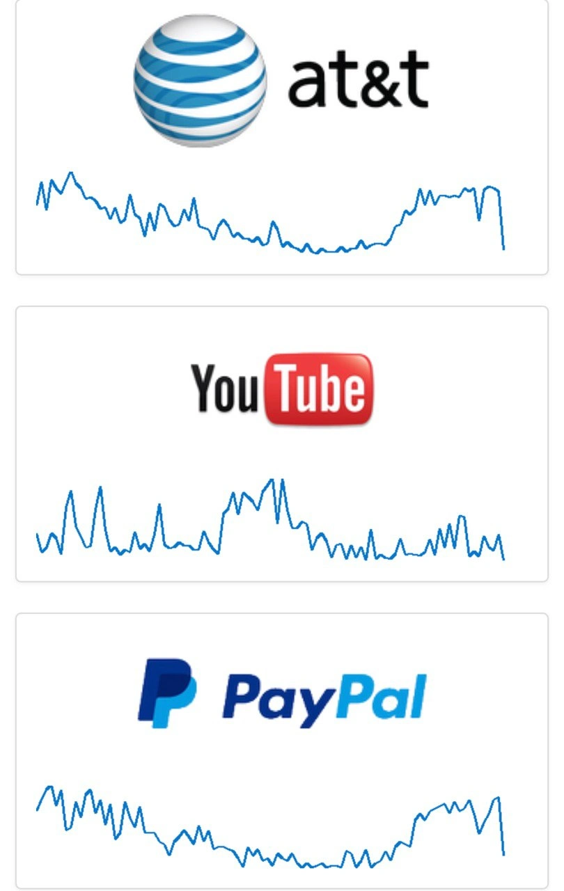
Imagine you’re at a big amusement park and suddenly all the most popular rides break down together. The roller coaster stops mid-loop, the Ferris wheel freezes, and even the food court cash registers quit working so you can’t buy snacks. It would feel like the whole park is in chaos, right? That’s what this meme is joking about, but with pieces of the internet. In simple terms: AT&T is like your phone network (and internet connection), YouTube is like your TV for watching videos, and PayPal is like the way you pay for things online. The meme shows that all three had big problems at the same time — their problem charts were going up and down wildly, like a crazy roller coaster ride.

It’s funny in a “oh no, everything is breaking!” kind of way. If just one of those had an issue, it’s a normal bad day. But all three at once? That’s so over-the-top that you can’t help but chuckle at the absurdity. It’s like the internet decided to throw a tantrum. The line “Internet is about to die” is exaggerating, of course. It means “uh oh, if these big services are all down, we’re in big trouble!” It’s a bit like seeing all the traffic lights in your city go out at the same time — you’d think, “Is the whole city broken?”

So, the heart of the joke is experiencing a ridiculous worst-case scenario and reacting with a half-panicked laugh. Even though it’s scary to imagine everything going offline, it’s presented in a way that we recognize as a joke. It reminds us that even the mightiest tech giants can have a bad day, and when they all have a bad day together, it’s so unreal that it becomes cartoonishly funny — like all the rides at the carnival breaking at once and everyone going, “Really? All of them?!”

Level 2: Status Page Rollercoaster

Let’s break down the meme in simpler terms. Those three panels show squiggly blue line graphs under the logos of AT&T, YouTube, and PayPal. They look a bit like a heart-rate monitor or, as the meme says, a roller-coaster track. What are these graphs exactly? They’re basically outage reports over time – think of them as the number of people saying “Service X is not working for me” plotted on a timeline. A well-known website called Downdetector produces graphs just like these. For each service (like AT&T or YouTube), Downdetector tracks user reports. If suddenly thousands of people all start complaining “I can’t make calls” or “videos won’t load” or “can’t log in to PayPal,” the line shoots up. So a calm, flat line = all good, and a big jagged spike = lots of problems.

Now the meme specifically picked AT&T (a huge phone and internet provider), YouTube (the massive video streaming site), and PayPal (a major online payment system). These are three very different services. On a normal day, an issue in one doesn’t automatically mean an issue in the others. So if all three have graphs that look wild at around the same time, something big or unusual is happening. It could be a coincidence of separate outages (rare, but never say never in tech), or more likely a common point of failure. Sometimes, for example, if a big internet provider has a failure, all the services that depend on that provider will look “down” to users on that network. For instance, imagine AT&T’s network (which millions use to reach websites) has a major glitch. That could make YouTube and PayPal seem offline to all those AT&T customers — so they report “YouTube is down!” and “PayPal is down!” when in fact the root cause was AT&T’s network issue. That’s one plausible way these graphs all ended up looking like roller coasters together.

From an on-call perspective (the engineer responsible for responding to problems at any hour), seeing your own company’s status dashboard light up is bad enough. But if you glance at public sites or Twitter and see others like YouTube and PayPal also having issues, your first thought might be: “Is it us or is the whole internet shaking?” Often, companies will quickly communicate behind the scenes in such cases. There are even emergency channels or group chats between big tech companies for industry-wide incidents – because if Google, AT&T, Cloudflare, etc. all notice widespread issues, they’ll share clues to pinpoint the cause. A junior engineer might not be directly in those chats, but they’d likely hear a senior person say, “Looks like a broader internet outage, not just us. Keep monitoring and sit tight for now.”

Let’s clarify some terms in the context of this meme:

  • Monitoring & Observability: This is all about keeping an eye on systems. Monitoring means using tools that track specific things (CPU usage, error rates, traffic, etc.) and alert us if something is off. Observability is a broader idea — designing systems so that you can understand their internal state just by looking at their outputs (logs, metrics, traces). Why mention this? Because when something goes wrong (like an outage), these are the tools and concepts engineers use to figure out what’s happening. In the scenario shown, each company’s monitoring tools would be lighting up internally, and observability would help diagnose if the issue is inside their system or due to an external dependency failing.
  • On-call: A rotation of engineers who are designated to handle emergencies. If you’re “on-call,” you carry a pager or phone that will wake you up if something breaks at 3 AM. This meme is basically an on-call person’s nightmare: multiple emergencies at once. Even if you only work for one of these companies, seeing multiple major services down can indirectly involve you (maybe your service relies on one of them, or the internet issue affects all services).
  • Downtime/Outage: Simply the period when a service isn’t working properly. Those spikes in the graphs indicate downtime periods – lots of people experiencing issues. “Production outage” means the problem is in the live system that real users use (as opposed to a test system).
  • Status Page: Many companies have an official status page (like status.paypal.com) where they post updates if there’s an outage. Often those have graphs or at least color-coded statuses. The meme references graphs that look like what you’d see on such status pages or on Downdetector. When it says they “look like roller-coasters,” it means instead of a flat, stable line (no issues), the line is going up and down sharply (issues coming and going).
  • Service Level Objectives (SLOs): These are targets for reliability. For instance, an SLO might be “99.9% uptime per quarter” for a service. If an outage is long or frequent (like big spikes in these graphs), the service might fail its SLO — basically, it was down more than acceptable. Companies care about this because it’s tied to user trust and sometimes formal SLAs (Service Level Agreements) which can include penalties or refunds if uptime isn’t met. In simple terms: those roller-coaster outages are blowing a hole in the promise of “we’ll be up almost all the time.”

In more day-to-day language: Have you ever been using YouTube and it just keeps buffering or giving errors? You might then check your phone and notice your mobile internet (maybe AT&T) isn’t working either. Later you try to buy something online and the payment (maybe via PayPal) won’t go through. If all that happened at once, you’d know something big is up. That’s exactly what this meme is showing, but from a developer’s viewpoint. It’s like three huge, normally reliable things all went crazy at the same time. The graphs looking like roller coasters means they shot way up (tons of problem reports) and presumably came down when things got fixed. It’s a graph shape you typically see for one company during an outage. Seeing three in a row is just... wow.

The meme caption “Internet is about to die” is obviously an exaggeration for effect. It jokingly suggests that if those key services all have major issues, the whole internet feels like it’s breaking. People working in tech find it funny because it’s a mix of truth (big concurrent outages do feel like an internet apocalypse) and hyperbole (the internet as a whole doesn’t actually die, it just has a really bad day). It also reflects a bit of on-call dark humor: when everything goes wrong at once, sometimes all you can do is nervously joke about the end of the world while trying to fix things.

Level 3: Downtime Trifecta

For the senior engineers in the room, this meme hits like PTSD wrapped in dark humor. Three major services simultaneously showing roller-coaster outage graphs? That’s the downtime trifecta nobody ever wants to deal with. It’s the kind of scenario that triggers flashbacks to infamous multi-service outages. Think of times when an AWS region went down and half the internet rode the struggle bus, or when a core internet exchange hiccuped and sent companies scrambling. Seeing AT&T (telecom backbone), YouTube (video streaming titan), and PayPal (payments giant) all blinking red together hints at one of those “the internet is on fire” days.

What makes this combination funny (in a laugh so I don’t cry way) is that it’s so bad it’s absurd. One service outage is a crisis; three at once is a circus of calamity. It suggests a monumental failure beyond any single team’s control, which is every on-call engineer’s nightmare and weirdly a bonding experience for the whole industry. You can bet that while these graphs were spiking, a swarm of exhausted engineers from each company was in their respective war rooms, coffee in hand, heart in throat. Perhaps the AT&T folks were yelling about a backbone fiber cut, the YouTube SREs were triple-checking if it’s their code or just half the country dropping offline, and PayPal’s ops were toggling through network dashboards praying it’s not a data breach or something equally awful. In moments like this, Twitter and Slack channels light up with cross-company chatter: “Anyone else seeing this? Is it just us or did someone nuke the internet?”

The roller-coaster analogy is spot on for the experience of managing an outage. There's the initial uphill climb of rising alerts and user reports (the “we have a problem” realization), then the sudden drop as systems fail and traffic nosedives (the “everything is on fire” moment). You might get a brief stabilization (a little plateau on the graph) giving false hope, only to have another spike of errors as a second wave hits or a patch doesn't hold. That emotional whiplash is real – hope, panic, relief, despair, all in rapid succession. OnCallHumor often depicts this as the on-call engineer riding a literal roller coaster of emotions at 3 AM, clutching a laptop instead of a safety bar.

Now, industry veterans have seen patterns in these chaos storms. One pattern is the shared dependency gotcha: many big-name services rely on common infrastructure under the hood. It could be a major CDN like Cloudflare/Akamai, a cloud provider, or even something like a popular authentication service. When one of those has a bad day, it’s a domino effect. Senior devs muse about how the internet has single points of failure hidden in plain sight. It’s ironic – we architect our individual systems for redundancy and high availability, but then all use the same few DNS services or the same handful of data centers. So a failure in one of them means a ton of “independent” systems fall down together. After every such incident, there are post-mortem meetings and grand promises: “We should really have multiple DNS providers, maybe multi-cloud deployments, better failovers...” All great on paper, but the trade-offs (cost, complexity) often mean many companies don’t fully follow through. Until the next big outage reminds everyone, oh right, this is why we talked about that.

There’s also an element of schadenfreude and empathy mixed together. When you’re a senior dev and it’s not your service on fire, you watch these things with a mix of relief and horror. Relief that you’re not the one getting paged for once, horror knowing exactly what torture those who are paged are going through. You might joke with colleagues, “Guess the internet decided to take an early weekend,” while internally feeling that knot in your stomach for the folks in the trenches. And if it is your service among them? Well, then you’re too busy to laugh at memes – you’re living the meme, fielding messages from every direction: customers, support teams, executives nervously asking for ETAs, and maybe even your own family texting to say “Hey, is YouTube down? My videos won't play.”

The Downdetector aspect is another senior-perspective chuckle. By the time Downdetector graphs look like this, any well-run service’s internal monitoring should have screamed bloody murder already. Downdetector is the external confirmation – when you see yourself trending on that site or (worse) on the front page of Reddit, you know the issue is massive. Some of us have the not-so-fond memory of discovering our service was down because Downdetector or Twitter told us, before our own alerts did. Talk about humiliating! That usually triggers an internal task: improve the monitoring so we’re not learning about our outages from random internet users again.

And let’s not forget the Service Level Objectives (SLOs) and those quarterly uptime reports. A triple-whammy outage like this means multiple companies are about to have some uncomfortable “post-incident” meetings. “So, about that 99.9% uptime promise... yeah, April wasn’t great for us.” There might also be contractual SLA penalties if certain uptime commitments aren’t met – another reason why seeing your graph do the Harlem Shake is ulcer-inducing for management. Senior folks are painfully aware of how one blip can cascade into lost user trust, media headlines, and days of cleanup.

In summary, at the Level 3 view, this meme is a perfect storm scenario that senior engineers joke about to mask the terror. It condenses a complex reality (internet-wide outages) into a single, relatable snapshot. The knowing smirks come from recognizing how rare yet how real this situation is. It’s funny because it’s true: somewhere, some poor souls literally watched these graphs in real-time and thought, “Well, guess the internet is about to die,” as they opened the incident war room and buckled up for a very long day (or night). If you’ve ever been that person, this meme is both comedy and tragedy at the same time.

Level 4: Backbone Breakdown

At the deepest technical level, this meme hints at a cascading infrastructure failure that spans multiple independent systems. When AT&T, YouTube, and PayPal graphs all spike and dive simultaneously, it suggests a shared underlying fault in the internet's core. Seasoned network engineers immediately think of internet backbone issues – maybe a major BGP route leak or a DNS meltdown. Imagine the internet as a web of highways (routers and fiber links). BGP (Border Gateway Protocol) is like the map that tells each router how to reach different destinations (YouTube’s servers, PayPal’s servers, etc.). If a big telecom like AT&T mispublishes those routes – a not-so-hypothetical scenario known to cause global chaos – traffic to many services can get lost or detoured. One infamous case was a small ISP accidentally claiming to be the best path to Google’s IP addresses, causing a huge chunk of internet traffic to reroute into a black hole. When BGP goes berserk, multiple services drop off the internet in one fell swoop. It’s the networking equivalent of an earthquake on those “highways,” and those shaky blue lines in the meme are essentially the seismograph readings.

Another suspect is DNS, the internet’s phonebook. A widespread DNS failure (like a DNS provider outage or a DDoS attack on DNS root servers) can simultaneously knock out access to numerous sites. Engineers have a dark joke, “It’s always DNS,” because so often a mysterious multi-site outage traces back to DNS misconfigurations or attacks. Picture everyone’s phonebook suddenly having blank pages for “YouTube.com” and “PayPal.com” – users can’t find the servers anymore, so they flood outage boards. On Downdetector’s graphs this shows up as a rollercoaster of panicked reports as people repeatedly try and fail to connect whenever DNS hiccups.

These roller-coaster graphs also hint at intermittency – maybe the network came back in spurts. A backbone link flapping or a major router rebooting on and off can cause traffic to alternate between normal and failed states, hence the graph looks like a series of peaks and drops. In distributed systems theory, we’d call this a form of cascading failure: one core component’s failure propagates chaos to many dependent services. No single microservice design or multi-data-center redundancy can save you if the entire path to your users is on shaky ground. It’s a harsh reminder of the internet’s shared fate – behind that illusion of “the cloud,” there are a few critical hubs making it all work. When one hub falls, many castles crumble.

From an observability perspective, this scenario is fascinating and terrifying. Each company (AT&T, Google/YouTube, PayPal) has their own internal monitoring, but none of them individually controls the entire stack of the internet. Engineers might be frantically checking their traceroutes and seeing timeouts at some common network hop. They might run dig to query DNS and find that nothing resolves. The telemetry they rely on is effectively telling them: “Our servers are fine, but users still can’t reach us – something upstream is busted.” It’s like having a plane in perfect condition, but the airport’s radar is down – your aircraft is healthy but can’t take off because the infrastructure around it is failing. For example:

$ traceroute youtube.com
 1  192.168.0.1           1.234 ms  0.987 ms  1.010 ms
 2  10.10.10.1           12.345 ms 13.678 ms 11.456 ms
 3  * * *                Request timed out
 4  * * *                Request timed out

$ dig youtube.com +short
;; connection timed out; no servers could be reached

(When core DNS or routing is broken, even basic network commands like traceroute or dig fail to find a path.)

Ultimately, those squiggly lines are a GUI representation of widespread system distress governed by the fundamental protocols of the internet. The meme’s humor lands because it implies a rare, dreaded event: multiple pillars of online infrastructure failing in tandem. In theory, the internet is decentralized and robust; in practice, a few misconfigured BGP announcements or critical DNS servers blinking out can send the whole thing off the rails. When that happens, all the fancy consensus algorithms and five-nines of uptime guarantees in individual systems are cold comfort – you’re stuck on the same wild ride as everyone else, watching graphs that look like heart monitors during a cardiac arrest. And somewhere, a battle-scarred network engineer is muttering “Who the heck unplugged the internet?” with a half-chuckle and a full-body sigh.

Description

The image is a composite of three separate panels, each displaying the logo of a major online service above a line graph that indicates its operational status. The first panel shows the AT&T logo, the second shows the YouTube logo, and the third shows the PayPal logo. In all three panels, the corresponding line graph underneath shows a dramatic, sharp dip, which on service monitoring sites like Downdetector signifies a massive spike in user-reported problems and a likely service outage. The image is clean, with each panel set against a white background. This image captures the dawning horror of a large-scale, cascading internet failure. The user-provided caption, 'Internet is about to die', perfectly encapsulates the feeling. For senior engineers, SREs, and operations staff, this is the visual representation of a 'P0' or 'Severity 1' incident. It's the moment pagers go off, war rooms are assembled, and the frantic search for the root cause begins. The humor is rooted in the shared, stressful experience of realizing the problem isn't a local bug but a fundamental piece of the internet's infrastructure breaking, affecting multiple, seemingly unrelated major services simultaneously

Comments

8
Anonymous ★ Top Pick The root cause analysis for this will be fun. It's the one time 'It's not DNS' is immediately followed by '...it's BGP, isn't it? Oh god, it's BGP.'
  1. Anonymous ★ Top Pick

    The root cause analysis for this will be fun. It's the one time 'It's not DNS' is immediately followed by '...it's BGP, isn't it? Oh god, it's BGP.'

  2. Anonymous

    AT&T, YouTube, and PayPal graphs free-falling in sync - either us-east-1 just invented a distributed /dev/null, or another BGP mis-advert got promoted to “global rollout.”

  3. Anonymous

    When three unrelated services go down simultaneously, you know someone at AWS just pushed a 'minor' networking config change to us-east-1

  4. Anonymous

    Three independent companies, one identical graph - nothing says 'redundant multi-vendor architecture' like everyone secretly sharing the same DNS provider

  5. Anonymous

    When your SLA depends on YouTube's API staying up, you're not doing distributed systems engineering - you're just gambling with extra steps and a Grafana dashboard to watch your bets fail in real-time

  6. Anonymous

    SRE bingo: AT&T hiccup, YouTube buffering, PayPal flaking - the cloud‑native trifecta of “not our fault.” Our SLO depends on three companies we can’t page

  7. Anonymous

    If AT&T, YouTube, and PayPal all spike together, stop redeploying - BGP is doing chaos engineering for you

  8. Anonymous

    SRE wisdom: YouTube graphs thrill VPs with 'growth'; PayPal's flatline cashes the checks

Use J and K for navigation