Riding the Highs and Lows of Market Volatility
Why is this FinTech meme funny?
Level 1: Grasping at Straws
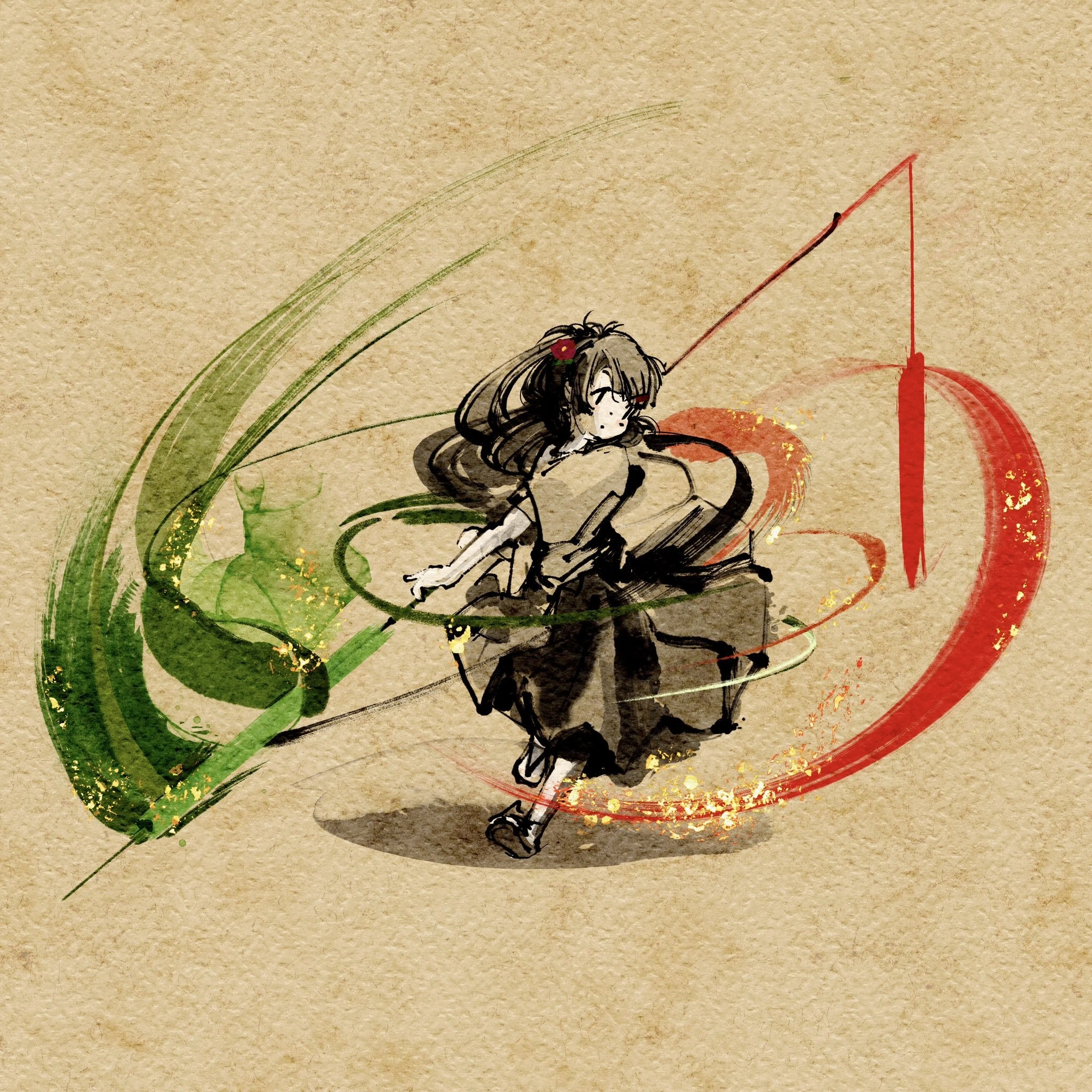
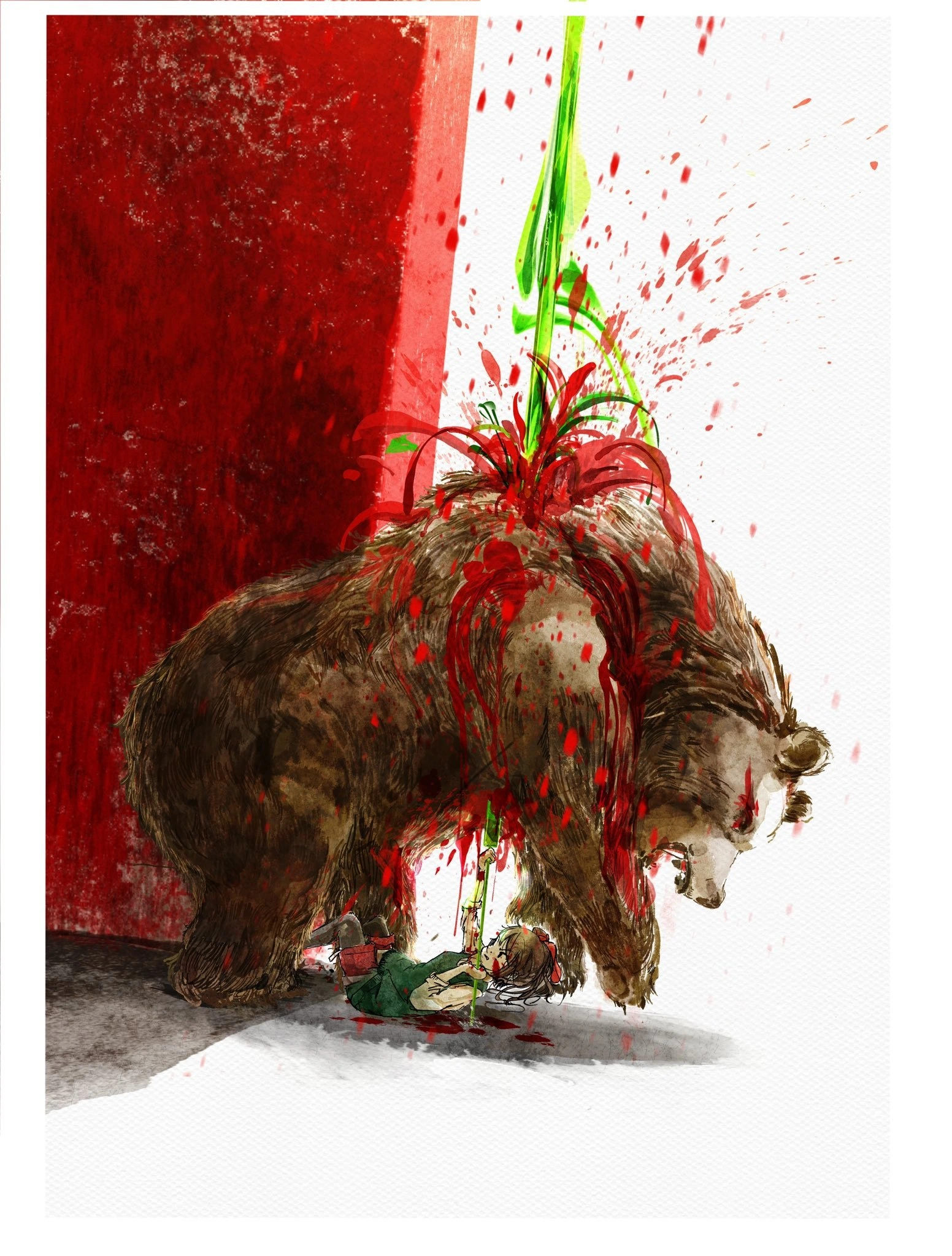
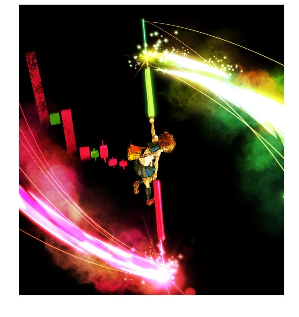
Imagine you’re sliding down a big hill really fast and it feels like you’re about to crash at the bottom. On the way, you see one tiny bump that makes you go up for just a split second. You get so excited thinking, “Maybe I won’t crash after all!” You grab onto that hopeful moment like a little branch sticking out of a cliff when you’re falling. But sadly, the hill keeps going down and you’re still zooming towards trouble. This picture shows a girl in a crazy colorful scene doing exactly that – holding on tight to a last bit of hope (a glowing green bar) while everything else is dropping around her in red. It’s funny because we all do this sometimes: when things are going bad, we cling to any small good sign and pretend everything will be okay. It’s like seeing one sunny patch of sky during a storm and hoping the whole storm will stop in the next minute. Deep down we know the big drop (or big storm) is still coming, but for that moment, we feel hopeful and a little bit heroic hanging onto our green bit of hope.
Level 2: Bulls, Bears & Candlesticks
Let’s break down the basics. The meme’s core is a candlestick_chart, which is a common DataVisualization in finance for tracking price changes over time (like for stocks or Cryptocurrency prices). Each “candlestick” has a body and maybe thin lines (wicks) sticking out. A green candle means the price went up during that time interval (it closed higher than it opened), and a red candle means the price went down (closed lower than it opened). In the image, small red and green candles on the left show prices mostly dropping overall – that’s the bearish trend (a “bear” market means prices going down). The girl is standing on a huge red candlestick that’s shooting downward like a rocket, symbolizing a big crash or bearish move accelerating. Red here is basically a red flag 🚩 indicating trouble.
Now she’s grabbing for an enormous glowing green candlestick above her. That green bar represents a sudden upward price jump – think of it as a brief rally where the price spiked up. In trading slang, a big green spike gets people excited; it’s like a moment of hope that maybe a bull market (rising prices) is back. “To the moon!” is a cheer in crypto communities meaning they believe the price will keep skyrocketing upward. The meme slyly calls this hopeful optimism green_candle_hopium. Hopium is a jokey word combining “hope” and “opium,” implying you might be getting high on unrealistic hope. Here, our character is literally high up, holding on to that green candle for dear life, as if riding on hope.
The phrase “before the crash deploys” is mixing tech and finance lingo. In software, when we deploy new code, we release it to production (to real users). Deploys can be tense because if there’s a bug, things crash (the system breaks). So “the crash deploys” suggests a crash is about to roll out inevitably. It’s like saying “the disaster is launching.” In the context of the chart, it implies that after this last green candle, a crash in price is coming next – almost like the crash is a feature being deployed to the market 🤣. The categories like FinTech and Blockchain hint that this is about crypto markets (which run on blockchain tech and often have crazy ups and downs). And indeed, crypto prices are notorious for market_volatility – big swings up and down, sometimes within minutes. One moment everyone’s bullish (optimistic, represented by green candles and the term “bull”), and the next moment they’re bearish (pessimistic, red candles, “bear”). That rapid back-and-forth is what the tag bull_bear_whiplash refers to – like getting whiplash from a rollercoaster that’s surging up then plunging down.
Even the anime_style_meme art is meaningful here. Anime, especially action-packed shōnen anime, is known for dramatic, colorful fight scenes with exaggerated emotions. By using that style, the meme equates watching a price chart or deploying code with being in an epic anime battle. The girl with a satchel could be a normal student (an everyperson, maybe the viewer or developer) suddenly thrown into this intense fight for survival between green “hope” and red “danger.” In simpler terms: the meme is saying “when everything is falling apart, we grab onto any tiny bit of good news like it’s a lifesaver”. It’s a feeling both new investors and junior devs might recognize — like when your project is failing but one test passes and you celebrate it, or when a coin’s price has been falling all day but ticks up for five minutes and Reddit explodes with “we’re saved!” posts. This combination of finance imagery with software deployment anxiety makes it a CryptocurrencyTrends meme that tech folks find both funny and painfully relatable.
Level 3: HODL On For Dear Life
For the experienced folks, this meme lands with painful accuracy. It mashes up the emotional rollercoaster of Cryptocurrency trading with the anxiety of a risky code release. The girl dangling from a giant green candlestick is basically every dev or trader clinging to a last shred of hope when all indicators are trending down. In trading lingo, that tall green candle represents a sudden price jump (perhaps on some semi-good news or pure speculative fervor) amidst a series of falling prices (the smaller red candles on the chart behind her). Everyone who’s ridden a crypto market_volatility wave recognizes this scene: an epic “to the moon!” surge that makes you believe the tide is turning, right before reality sucker-punches you with a flaming red crash. The meme knowingly labels that desperate optimism as hopium (hope + opium) – an addictive drug of belief that this green spike will save us. It’s the same energy as a dev team deploying a hotfix at 4 PM Friday and praying it’ll prop up the crashing system through the weekend.
Notice the anime_style_meme dramatization: what might be a drab stock chart is reimagined as a high-stakes shōnen anime scene. This resonates with tech veterans because it feels like life or death when you’re watching metrics in real time. The bull_bear_whiplash of alternating green and red bars becomes literal whiplash for our heroine riding a red candle rocket. It humorously literalizes the expression “hold on for dear life” (the origin of the crypto slang HODL): she’s literally holding on to that candle as if letting go means doom. This blend of DataVisualization iconography with over-the-top manga action satirizes how we experience tech hype cycles and deployment dramas — as wildly emotional, almost comic-book battles, even though we’re just staring at dashboards or terminals. For senior devs, there’s a knowing smile here: we’ve all seen a last-minute positive metric (a single green blip on an otherwise red graph) get overhyped only to be followed by a catastrophic failure. It’s poking fun at our tendency to ignore the broader downward trend (be it a buggy release or a failing startup) and latch onto that one good thing. In a blockchain startup, it might be a brief bump in token price after an announcement, even as user metrics sink. In a legacy system overhaul, it might be one successful test amidst a sea of failing builds that everyone cheers prematurely. The IndustryTrends_Hype angle underlying the meme is clear: we’re often so hungry for a win that we’ll mythologize any green tick upward, even as the red crash rockets are literally firing off under our feet. It’s hilarious and a bit tragic — a shared industry joke that whether you’re trading crypto or deploying code, hopium can be your undoing.
Dev watching metrics: "CPU usage is spiking red, but hey, one server’s latency improved in green... maybe we’re fine?"
Reality: All systems down. Rollback in 3… 2… 1…
Level 4: Volatility to the Moon
At a theoretical level, this meme touches on the chaotic dynamics of market volatility and our pattern-seeking impulses. A candlestick chart — originally devised by Japanese rice traders centuries ago — encodes four data points per time interval (open, close, high, low) in a compact visual form. That glowing green candle in the meme indicates a period where price soared upward, which statistical models might flag as an outlier or a precursor to a reversal. Seasoned quant developers know that volatility clustering (a concept from time-series analysis) means big price swings tend to come in packs: one large green uptick can be followed by an even larger red downtick. This phenomenon often manifests as a “bull trap” or the infamous dead cat bounce – a brief recovery giving false hope before the crash resumes. The meme’s explosive anime imagery exaggerates these concepts: the pink energy blast under the red candle hints at a momentum crash accelerating downward, while the heroine’s desperate grip on the green bar illustrates an almost mathematical inevitability – like trying to defy gravity or invert a negative feedback loop. In blockchain FinTech systems, we even see analogous cascades: one momentary network pump (say, a surge in DeFi token price after a protocol update) might trip automated selling algorithms, to_the_moon euphoria flipping to panic in milliseconds. It’s a high-frequency whiplash that feels as frenetic and lawless as a shōnen anime battle scene. The humor here is rooted in acknowledging those underlying rules of engagement: no matter how advanced our analytics or DataVisualization tools, human and algorithmic actors alike can be mesmerized by that one green candle, succumbing to green_candle_hopium right before the unforgiving physics of the market (or a production environment) deploys the crash. In the end, the only “moon” many get is a volatile ride through statistical noise that academics model with GARCH and devs experience as overnight pages on call.
Description
A dynamic and stylized digital artwork set against a black background, depicting a scene of intense market fluctuation. The central figure is an anime-style girl in a school uniform, who appears to be climbing or hanging onto a giant, glowing green bar of light that shoots upward, leaving a trail of golden sparks and a rainbow-colored energy wave. Her feet are braced against a massive, glowing red bar that plunges downward, emitting a similar trail of pink and red light. In the background, a series of smaller, more defined red and green bars are arranged to look like a financial candlestick chart, representing stock or cryptocurrency price movements. The artwork vividly captures the feeling of navigating a volatile market - the exhilarating climb of a 'bull run' (the green candle) and the terrifying drop of a 'bear market' or crash (the red candle). It's a metaphor for the high-risk, high-reward environment of trading, familiar to anyone in fintech, blockchain, or who follows the tech stock market
Comments
7Comment deleted
This is the average developer's emotional state after deploying a new feature to production. The green candle is the feature working, the red candle is the immediate discovery of a critical bug
This is exactly how I feel holding onto the one successful KPI while the other microservices form a red candle waterfall in Grafana
When your junior dev discovers WebSockets and suddenly every feature request becomes a real-time trading dashboard with particle effects, because apparently our B2B inventory management system needs to feel like defeating the final boss in a JRPG
When your algorithmic trading bot encounters a cascading sell-off and you have to manually intervene at 3 AM - armed only with your IDE, caffeine, and the desperate hope that your stop-loss logic actually works this time. The real battle isn't against the market; it's against the technical debt in your backtesting framework that somehow passed code review
Leadership said “ride the green candle,” and I had to explain it was the 99th‑percentile latency - context is our only stop‑loss
Crypto markets: the distributed system where CAP theorem eternally elects Partition - sharding your portfolio into HODL and rug-pull shards
Marketing calls it hockey-stick growth; SRE calls it error-budget liquidation - clinging to a Grafana green candle while the HPA dollar-cost-averages more nodes