Dropbox’s maze-captcha onboarding explains that missing monthly active cheese metric
Why is this UX UI meme funny?
Level 1: Puzzle at the Door
Imagine you have a cool new clubhouse, and you really want friends to come in and hang out. But when someone comes to the door, you make them solve a big maze puzzle to prove they’re your friend. Not just one maze – you give them five different mazes, one after another, before they can enter. Now, think about how people would feel: most will get frustrated or bored after the first maze and just walk away. Maybe one very patient kid will try, but five mazes is a lot, and it’s not fun anymore – it’s just annoying.
Now you start complaining, “Aww, how come no new friends are joining my club? This is so sad!” But it’s obvious to everyone else: you made it way too hard to join. It’s like you set up your own obstacle course and forgot that your guests might not enjoy jumping through all those hoops. The funny part is the silliness of the situation. You’re basically blocking the door to your own clubhouse and then whining that nobody is coming in. Of course they’re not – they don’t want to solve a bunch of puzzles just to be your friend! In the meme, Dropbox is doing the same thing: they want new users, but they put a crazy maze game in front of people who try to sign up. So the joke is like saying, “No duh you have no new users – you scared them off with your cheese maze!” It’s funny and a bit like a cartoon: the person (or company) complaining is the one who built the impossible puzzle in the first place. Everyone else can see why the new users (or new friends) aren’t coming, and that’s why we laugh.
Level 2: Captcha Chaos
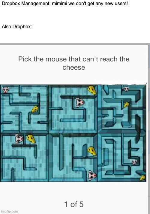
The meme shows a hilariously bad user onboarding example. At the top, it quotes Dropbox’s management complaining “we don’t get any new users!” – basically, they’re upset that not enough people are signing up for Dropbox. Right after that, it says “Also Dropbox:” and shows what looks like Dropbox’s own signup process: a weird CAPTCHA maze challenge that a new user has to solve. A CAPTCHA is a kind of test websites use to make sure you’re a real person and not a bot. For example, common CAPTCHAs might ask you to click all images with traffic lights or type some squiggly letters – tasks that are easy for humans but hard for computer scripts. In this meme, though, the CAPTCHA is extremely convoluted: the text says “Pick the mouse that can’t reach the cheese,” and you see six tiny maze drawings. Each little maze has a pink cartoon mouse and one or more pieces of cheese (little yellow wedges). Some mazes are solvable – meaning the mouse could find a path to the cheese – and one maze is unsolvable (the mouse is blocked by walls). The user must identify the maze where the poor mouse cannot reach its cheese. That’s one puzzle, and the kicker is, a label at the bottom says “1 of 5”. Yup, the user must pass five rounds of this! This image implies that to sign up for Dropbox, you’d have to go through five different maze puzzles in a row. Talk about OnboardingPain – it’s like turning signup into a mini Twitch-stream challenge. It’s clear why this is tagged as a UXFailure: most people will give up in frustration long before completing all five puzzles. In design terms, this signup flow has way too much friction.
Now, friction in user experience (UX) means anything that slows the user down or makes a process harder. A little friction (like a single simple CAPTCHA or an email verification) can be acceptable if it stops spammers or ensures security. But five complicated puzzles? That’s overkill. It’s a textbook example of Security vs Usability imbalance. Usability means how easy and pleasant something is to use, whereas security measures often add steps to keep bad actors out. Here, Dropbox (in the meme scenario) went all-in on security – maybe they were trying super hard to block bots – but they forgot about usability. Real users are not going to enjoy playing Mouse in the Maze five times just to create a cloud storage account. For context, every extra step in a signup funnel (the sequence of steps from “interested visitor” to “registered user”) causes some people to drop out. This concept is often called funnel churn or drop-off. If 100 people start signing up and you add a tough puzzle as step one, maybe only 70 get through it. Add four more puzzles, and the number of people who finish will shrink dramatically with each step. By step 5, only a tiny handful of very determined (or very bored) users remain. That means almost no “new user” at the end of the funnel, which is exactly what the management is complaining about. The meme basically says: Dropbox is causing its own new-user problem by making the entrance so hard. It’s like putting a dark pattern (a hostile or tricky design) right at the start, ensuring many users fail or give up. In reality, companies avoid this because it’s obviously bad for growth – so the meme is exaggerating to make a point. It’s using humor to highlight a real tension in tech: push too much security or needless UXDesign gimmicks, and you scare off the very humans you wanted to attract.
For a junior developer or someone new to these concepts, here’s some breakdown of key terms and why this is funny:
User Onboarding: This is the process of guiding a person through signing up and starting to use your app or service. Good onboarding is smooth and easy. In the meme, Dropbox’s onboarding is a gauntlet of puzzles. Imagine if a mobile app made you solve five riddles before you could create an account – you’d probably uninstall it. This is why we say the onboarding shown is bad.
CAPTCHA (Completely Automated Public Turing test to tell Computers and Humans Apart): A long name for a simple idea – it’s a challenge that only humans are supposed to solve easily. Websites use CAPTCHAs to block automated programs (bots) from doing things like creating fake accounts or spamming. The classic CAPTCHA is those scrambled letters you had to retype, or nowadays, clicking images. Here, the CAPTCHA is custom and over-complicated: a maze puzzle with mice and cheese. It looks fun in a retro way, but it’s actually pretty difficult to quickly figure out which mouse is stuck. Most CAPTCHAs aim to be a quick one-step check (“click the checkbox if you’re not a robot” or at most solve one puzzle). The meme’s fictional Dropbox CAPTCHA demands five steps, which is very user-unfriendly. So, the meme exaggerates a UX nightmare – a security check that’s so excessive it becomes comical.
Friction vs Security: Every time you add a security measure (like requiring a strong password, email verification, CAPTCHA, 2FA, etc.), you introduce a bit of friction – meaning some extra effort for the user. There’s always a trade-off. In practice, companies try to minimize friction on important flows like sign-up because that’s when users are most likely to give up. They might rely on behind-the-scenes security or smarter systems that don’t bother the user much. In our meme, it’s as if some well-meaning but misguided team at Dropbox got paranoid about bots and cranked the friction to max. The result: sure, maybe no bots get in – but no new humans do either! It’s an extreme example of SecurityVsUsability gone wrong.
Corporate Culture & “mimimi”: The text “Dropbox Management: mimimi...” is mocking the way management complains without understanding the root cause. “mimimi” is a sarcastic onomatopoeia for whining – like “boohoo poor us, we have no new users.” It implies management is acting like crybabies. Meanwhile, the Also Dropbox: part shows that it’s their own fault. This mismatch is a common joke about corporate culture: sometimes higher-ups blame external factors or the users (“maybe people just don’t appreciate our product!”) when in reality the problem is internal (a bad design, a policy, etc.). It’s CorporateHumor because many in tech have experienced bosses who don’t get the technical reasons behind a problem. In this case, any developer or designer can see the obvious reason new users aren’t signing up – the signup process itself is practically a brick wall.
Developer Experience (DX): While the meme’s main focus is the user experience, there’s a side note for devs. Imagine being the developer who had to implement this multi-maze CAPTCHA. It’s a quirky project for sure, but once it’s live, you might feel secondhand frustration seeing users struggle. Developers care about both security and a smooth user journey. A good DX is when devs can build things they’re proud of and that users love. Here, any developer with a sense of DeveloperExperience would cringe, knowing this feature will cause anger (and support tickets, and dropout rates). It’s a bit of DeveloperPainPoints humor: engineers often know a design is bad, but have to build it anyway due to orders from above.
In short, at this level it’s clear why the meme is funny: Dropbox’s signup process is like a maze game challenge – it’s ridiculously difficult for no good reason. So of course they’re not getting many new users! It’s a perfect example of a company accidentally sabotaging its own user onboarding. The image of tiny mice and cheese just makes it extra silly, almost like a video game instead of a signup form. For someone new to tech, you can laugh at the straightforward absurdity (why would any website make joining so hard?) and also learn the underlying lesson: Keep your onboarding simple, or you’ll end up like the company in this meme – lonely, with only your cheese.
Level 3: Funnel of Frustration
This meme skewers a user onboarding fiasco that only a corporate culture could cook up. The top text mocks Dropbox management whining “mimimi we don't get any new users!” while the image right below shows exactly why new users aren’t signing up: an absurdly over-engineered CAPTCHA maze challenge. It’s a classic case of a tech company shooting itself in the foot – a conversion funnel turned into a literal maze. The humor hits home for senior developers because we’ve all seen similar self-inflicted growth wounds. Management complains about missing the Monthly Active Users metric, yet they’re the ones who booby-trapped the signup. The meme’s title even jokes about a “monthly active cheese metric,” punning on MAU (Monthly Active Users). In other words, Dropbox might as well track how many cheese icons get clicked, since real user signups are falling off a cliff. It’s biting CorporateHumor with a dash of UX dark comedy.
Let’s talk about that CAPTCHA: “Pick the mouse that can't reach the cheese” (1 of 5). This isn’t your everyday “find the fire hydrants” check – it’s a pixelated 1990s-style mini-game served as a gatekeeper. The interface looks like a relic of early UXDesign: six tiny blue maze grids, each with a pink mouse and pieces of yellow cheese. Only one unlucky mouse is trapped by walls, unable to reach its cheese. The user’s task is to spot that one unsolvable maze. And if that’s not crazy enough, a progress bar ominously says “1 of 5”. Yes, five rounds of this retro game nonsense just to prove you’re human and worthy of a Dropbox account. It’s the ultimate OnboardingPain: the first puzzle likely frustrates or bores users, and knowing there are four more to go is a downright UXFailure. By the time a user completes all five, they deserve a trophy – but more likely, they’ll bail long before then. This is humor with a hefty dose of truth: every extra step in a signup flow acts like acid on your growth funnel, dissolving potential users at each stage. For seasoned developers, the phrase “1 of 5” in a signup CAPTCHA is both hilarious and horrific – you can practically hear the conversion rate plummeting.
From a senior engineer’s perspective, this scenario is a masterclass in SecurityVsUsability overkill. We get it: fighting spam bots and fake accounts is important. CAPTCHAs themselves exist for a good reason – to distinguish real users from scripts. But there’s a balance to strike. Here, Dropbox (in the meme’s universe) went off the deep end, introducing a Rube Goldberg-like security measure that keeps out more humans than bots. It’s like using a sledgehammer to crack a peanut – sure, the peanut is gone, but so is the table it was on. By Level 3 knowledge, we know each hurdle in front of a user acts as a filter: maybe 80% of visitors complete a simple form, then only 60% survive a basic CAPTCHA, and now imagine the drop-off after five brain-teaser mazes in a row. The growth_funnel_churn here would be catastrophic. DeveloperPainPoints include having to implement these puzzles and then watch the analytics dashboard as new user signups tumble. The meme resonates with experienced devs because it’s too real: we’ve dealt with VPs panicking over low signups while simultaneously marching in with mandates to add “just one more little verification step” (five times!). It’s a facepalm-inducing cycle that everyone in the room recognizes as self-sabotage – everyone except the executives creating it, apparently.
There’s also a CorporateCulture satire here. The text “Dropbox Management: mimimi...” paints leadership as petulant children whining for more users. Then Also Dropbox: [ridiculous maze]. It’s the “evil twin” juxtaposition: leadership’s stated goal versus the actual user experience they’ve approved. The meme’s humor comes from this stark contradiction. It’s like a restaurant owner complaining about no customers while posting a security guard at the door to quiz every entrant on obscure trivia. The dark_pattern_onboarding vibe is strong: whether through incompetence or intent, the onboarding is so hostile it feels like a dark UX joke. Seasoned devs have PTSD from stuff like this. We recall war stories: marketing demanding phone number verification “to increase engagement” (spoiler: it tanked signups), or legal insisting on a 3-page terms acceptance quiz. Each time, user numbers nosedived and everyone wondered why. This meme channels that collective memory. The monthly active cheese metric line wryly suggests management is measuring the wrong thing (cheese clicks) instead of the obvious UserOnboarding failure. It’s a cynical reminder that what gets measured gets managed – and if you’re measuring the wrong metric, you’ll make the wrong moves. Here Dropbox seems to measure something like “CAPTCHA completion rate” or “cheeses collected” instead of actual successful signups, which is as silly as it sounds.
In essence, the joke works because it’s a perfect storm of tech absurdity: a painfully overdone anti-bot measure, an oblivious management complaint, and the resulting ghost town of new users. It pokes at the eternal struggle between security and growth. Sure, no bot can navigate five mazes (probably), but no impatient human will either. The DeveloperExperience (DX) here must be dreadful as well – imagine being the engineer tasked with coding this maze-CAPTCHA and then fielding bug reports when users rage-quit. It’s a nightmare of our own making. The meme’s TechHumor lands so well because it exaggerates a real dilemma to cartoonish proportions. Seasoned devs laugh (maybe a bit bitterly) because they know someone, somewhere, once thought a multi-stage puzzle was a “great user engagement idea.” The veteran in us just shakes our head and mutters, “And they wonder why the activation rate is 0.01%….”
Description
The meme has two text lines at the top on a plain white background: “Dropbox Management: mimimi we don't get any new users!” followed by “Also Dropbox:”. Beneath this, a grey-framed screenshot shows a CAPTCHA-style challenge that reads “Pick the mouse that can't reach the cheese” with a pixelated blue labyrinth consisting of six small mazes. Each sub-maze contains a pink mouse head and one or more yellow cheese wedges; some routes are blocked by walls. A progress indicator at the bottom says “1 of 5”, implying four more puzzles before signup finishes. Visually it’s light-blue, grid-like, and cluttered, evoking 90s game graphics. Technically, the joke highlights how excessive anti-bot puzzles, security friction, and dark-pattern onboarding sabotage growth funnels even while leadership laments user acquisition numbers - an all-too-familiar UX failure for seasoned engineers
Comments
6Comment deleted
If your signup flow requires path-finding algorithms, don’t be surprised when the MAU metric converges to null
The same PM who insisted on A/B testing 47 variations of the signup flow is now wondering why our activation funnel looks like a distributed systems architecture diagram
Classic product management paradox: complaining about user acquisition metrics while implementing CAPTCHA flows that would make even legitimate users consider switching to competitor APIs. It's the enterprise equivalent of wondering why your microservice has no consumers after requiring OAuth2, mTLS, IP whitelisting, and a blood sacrifice for authentication. At least when we over-engineer our own systems, we only torture ourselves - Dropbox democratized the pain
If your signup flow makes people run BFS through five mazes, you’ve shipped growth-throttling as a feature - security theater with 99th‑percentile cognitive load
Nothing says “we need growth” like gating signup behind a five‑step A* pathfinding exam - great for bot precision, catastrophic for human recall and conversion
Dropbox growth: Dijkstra's algorithm on a graph where the target node's distance is infinity