Skip to content
DevMeme
2998 of 7435
The 'Upgrade' Fallacy: Making things worse, on schedule
UX UI Post #3311, on Jun 22, 2021 in TG

The 'Upgrade' Fallacy: Making things worse, on schedule

Why is this UX UI meme funny?

Level 1: New Keys Every Time?

Imagine if every time you got a new toy or gadget, all the buttons were in different places than before. Let’s say you have a favorite video game controller, and suddenly the “jump” button and the “duck” button swap places with each update. You’d try to play and keep hitting the wrong button because you remember the old way. Frustrating, right? That’s what this cartoon is joking about. It’s like if someone thought mixing up all the letters on your keyboard every six months would somehow make it better. Clearly, it wouldn’t — it would just confuse everyone and slow them down. In the comic, the company keeps changing their software in ways that confuse users, kind of like shuffling a keyboard’s keys. The joke is that the company doesn’t seem to care that they’re making things harder to use. In simple terms: constantly changing things that people have already learned is usually a bad idea, and it can be pretty silly — just like scrambling a keyboard for an “upgrade.”

Level 2: Muscle Memory Mayhem

This comic strip might seem silly at first, but it’s highlighting a real frustration in software development. Let’s break down the scene and the jargon:

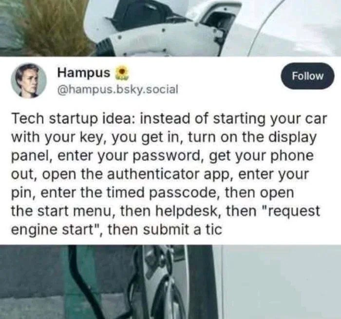
In the first panel, a marketing lady enthusiastically proposes a new keyboard design where every six months the keys are rearranged. Think about what that means: today your keyboard has the familiar QWERTY layout, but in a few months, all the letters move to new positions. You’d have to relearn how to type from scratch regularly! This idea is intentionally ridiculous, and the two engineers (Dilbert and his coworker) know it. One of them asks the obvious question: “Why would we do that?” Dilbert dryly responds, “To make it better.” He’s playing along with the corporate logic that newer is automatically better, even if common sense (and our poor fingers) would disagree.

In the second panel, the coworker points out the flaw: “That would only make it harder to use.” Exactly! Changing a keyboard’s layout so often would destroy your muscle memory. Muscle memory is a term for when you’ve done something so many times (like typing or riding a bike) that your body remembers how without conscious thought. Software developers and users develop muscle memory for interfaces too: we remember where buttons are, what menu to click, or which command to type. When an interface or tool suddenly moves things around, it’s confusing and slows us down. This is what the coworker means by “harder to use” — the usability of the keyboard would drop. In software terms, we call this a usability regression: something that used to be easy has become more difficult after an update (a regression means moving backward).

Now, the punchline comes in the third panel with a twist: instead of a person responding, the office building itself speaks (a quirky Dilbert comic technique to represent the company’s voice). The building says: “Exactly like our software upgrades. What’s your point?” Here’s the joke spelled out: the company’s software upgrades often make the software harder to use, just like rearranging keyboard keys would. The building (i.e., the company) is basically admitting, “Yes, every time we release new software, we make life harder for the user — and we’re okay with that.” This is a jab at the kind of CorporateCulture where delivering updates is valued more than making sure those updates are actually good for the user. It’s common in big companies or projects: there’s a schedule to release new versions or new features every so often, and marketing needs something shiny to announce. But if those changes aren’t carefully thought out, they can frustrate the very people using the software – developers included. That’s why this is tagged as DeveloperExperience_DX and ToolingFrustration: developers often feel this pain when their tools (like an IDE, framework, or API they use) suddenly change in a new version for no clear reason.

For instance, imagine you use a code library where a function doSomething() worked fine. In version 2.0 of that library, the team renames it to performTask() and moves it to a different module, without any real benefit. Now you have to hunt through documentation and refactor your code — essentially relearning something that wasn’t broken. That’s akin to someone changing your keyboard layout; it’s a pointless upgrade from the user’s perspective. It might be done in the name of “consistency” or “modernization,” but if it doesn’t actually improve the usability or functionality, it only wastes time and causes developer frustration. This comic resonates with developers because we’ve all been in that situation: an update comes out and suddenly our workflow is disrupted or our muscle memory is betrayed by a UI that looks familiar but isn’t. It’s as if the rules were changed on a whim.

So, in simpler terms: the Dilbert cartoon uses the goofy idea of a constantly changing keyboard to point out how silly and frustrating frequent unnecessary software changes can be. It’s a commentary on bad developer experience and puzzling corporate decisions. When tools, interfaces, or APIs shuffle things around every release, developers and users end up confused — just like you would be if your keyboard letters moved around regularly. The humor works because it’s taking a real tech-world annoyance and exaggerating it to a physical world absurdity. Any developer who’s struggled with ever-changing documentation or “where did that button go in the new update?” will chuckle (or maybe groan) at this because it’s so relatable. The comic essentially says: if we did to hardware (a keyboard) what we do to software interfaces, it would obviously be nonsense. And yet, this nonsense happens with software all the time.

Level 3: Chaos as a Feature

On the surface, rearranging keyboard keys every six months is an absurd idea. But seasoned developers immediately recognize this as a tongue-in-cheek metaphor for chaotic software release practices. In corporate environments, we've all seen so-called upgrades that scramble the user interface or modify APIs just for the sake of change. The Dilbert comic exaggerates it by suggesting a physical keyboard redesign each release. Why is this funny (and painful)? Because it nails a truth: frequent software updates often claim to "make it better" while actually making the product harder to use. The curly-haired marketing character proposing to "upgrade" the keyboard is effectively a parody of a product manager chasing novelty over usability. Dilbert's deadpan response, "To make it better," drips with irony here—he’s echoing the flimsy justification we hear every time a familiar tool’s layout is needlessly changed. It’s a satirical take on CorporateCulture where new is automatically assumed to mean improved, even when it degrades the user experience.

Behind the humor lies a developer frustration familiar to anyone who’s endured tools or libraries that break your muscle memory on each update. Imagine an IDE or framework where every minor version moves menus around or renames functions arbitrarily. Experienced devs have suffered through such pointless_upgrades:

  • UI overhauls that hinder productivity: e.g. an IDE update that relocates all your favorite shortcuts, forcing you to relearn basic operations. The release notes say “streamlined menu,” but to you it feels like someone scrambled the keyboard.
  • API changes with no real gain: how often have we seen a new library version that rearranges function names or parameters, introducing a learning curve with zero tangible benefit? This is a software-equivalent of moving the 'Enter' key to a different spot.
  • Frequent cosmetic revamps: corporate mandates to “refresh the look” every quarter result in shifting navigation or settings placement in internal tools. It’s change for change’s sake – an anti-pattern that undermines consistency and DeveloperExperience (DX).

The third panel’s talking office building delivers the punchline: “Exactly like our software upgrades. What’s your point?” This sarcastic comeback is the embodiment of dysfunctional CorporateCulture. It suggests the company is well aware its updates make things harder, yet it brushes off criticism with a cynical “so what?”. The building speaking (a classic Dilbert gag symbolizing the corporate entity) implies that making things worse with each release is basically business as usual. It’s dark humor: the company essentially admits, “We mess up our software every time, why should hardware be any different?”

From a senior developer’s perspective, the joke lands because it’s both outrageous and uncomfortably familiar. We rely on stable interfaces – whether physical keys or UI elements – to be productive. Constant reorientation kills efficiency. There’s even a serious design principle here: consistency in user interfaces is crucial for usability, much like a QWERTY keyboard stays consistent so typists can rely on muscle memory. Breaking that consistency isn’t an “innovation,” it’s a usability regression (going backwards in ease-of-use). Yet, in many corporate settings, there’s relentless pressure to deliver “new features” or visual refreshes to market, often on tight schedules (hello, quarterly targets and Agile sprints). Without careful thought, this leads to the “upgrade treadmill”: updates that tick a box for change but ignore user pain. The meme cleverly calls this out by comparing it to a keyboard whose keys are randomly shuffled under the guise of improvement. It’s absurdist humor hiding a sharp critique: too many software teams treat their users like guinea pigs for constant changes, leaving developers and users feeling disoriented and frustrated.

In fact, one could cynically write the pseudo-code for these kinds of upgrades:

def upgrade_keyboard_layout(layout):
    import random
    random.shuffle(layout)  # Shuffle keys because new is always better, right?
    return layout

# Corporate "innovation": scramble the interface every release
current_layout = list("QWERTYUIOPASDFGHJKLZXCVBNM")
new_layout = upgrade_keyboard_layout(current_layout)

This little snippet mocks the corporate mentality: in code form, randomly shuffling the keyboard layout suggests there’s zero rhyme or reason to the changes—exactly how capricious software updates can feel when they upend familiar workflows. The humor hits home for senior devs because we’ve debugged one too many “upgrades” where the only new feature was confusion. The meme’s scenario may be exaggerated, but it captures the spirit of real developer pain points: constant, thoughtless changes wreck usability and erode trust in the tools we use.

Description

A three-panel Dilbert comic strip by Scott Adams. In the first panel, Dilbert, sitting at a conference table with his pointy-haired boss and a female colleague, proposes, 'I HAVE AN IDEA FOR A KEYBOARD DESIGN THAT WE UPGRADE EVERY SIX MONTHS BY REARRANGING WHERE THE KEYS ARE.' In the second panel, the boss asks, 'WHY WOULD WE DO THAT?' and Dilbert replies, 'TO MAKE IT BETTER.' The third panel shows the office building from the outside, with a speech bubble saying, 'THAT WOULD ONLY MAKE IT HARDER TO USE.' followed by another, 'EXACTLY LIKE OUR SOFTWARE UPGRADES. WHAT'S YOUR POINT?' The comic satirizes the common corporate practice of releasing software 'upgrades' that, despite being marketed as improvements, often result in a worse user experience due to unnecessary changes, feature removal, or a steeper learning curve. This deeply resonates with senior engineers who have frequently witnessed or implemented pointless, disruptive changes driven by management or marketing rather than genuine user needs, leading to frustration for both users and developers

Comments

7
Anonymous ★ Top Pick We're sunsetting the v1 API because the v2 API is 'better.' All you have to do is rewrite your entire integration, learn a new auth system, and deal with 50% fewer features. You're welcome
  1. Anonymous ★ Top Pick

    We're sunsetting the v1 API because the v2 API is 'better.' All you have to do is rewrite your entire integration, learn a new auth system, and deal with 50% fewer features. You're welcome

  2. Anonymous

    Rearranging the keyboard every release? That’s semantic-versioning the hardware: bump the patch number, break all the typing, and call it “continuous improvement.”

  3. Anonymous

    The real enterprise keyboard would require a ServiceNow ticket to enable caps lock, three approvals to use function keys, and automatically scramble the layout whenever you finally memorize the shortcuts for that legacy Java app from 2003

  4. Anonymous

    This perfectly captures the enterprise software playbook: ship breaking changes disguised as 'improvements' to justify subscription renewals and force migration cycles. The keyboard metaphor is brilliant - imagine if every six months your IDE randomly swapped keybindings, but management called it 'enhanced developer experience.' We've all lived through the real version: major version bumps that break APIs for no functional gain, UI redesigns that bury power-user features three menus deep, and 'modernization' efforts that somehow make everything slower. The punchline hits because we know that PM somewhere has unironically pitched 'strategic friction' as a retention strategy

  5. Anonymous

    Reordering keyboard keys every six months: our upgrade philosophy in hardware - semver says patch, muscle memory screams major, migration guide: relearn typing

  6. Anonymous

    Keyboards nailed backward compatibility in 1878; software still ships 'surprise refactorings' to keep velocity metrics happy

  7. Anonymous

    If your UX sprint rebinds every hotkey, that’s not an upgrade - that’s a distributed denial of muscle memory

Use J and K for navigation