Skip to content
DevMeme
5469 of 7435
How to Frame a Tech Issue as a Major Success in Your Management Update
Communication Post #5994, on May 12, 2024 in TG

How to Frame a Tech Issue as a Major Success in Your Management Update

Why is this Communication meme funny?

Level 1: Only the Good News

Imagine you broke your mom’s favorite lamp one day, then the next day you managed to fix it with some glue. When you tell your mom about it, you only say, “Guess what, I fixed the lamp and now it’s even shinier!” but you don’t mention that you broke it yesterday. You make it sound like you did something amazing (fixing and improving the lamp) without telling the embarrassing part (that you caused the problem in the first place). Everyone claps and says “Wow, great job!” because they only heard the good part.

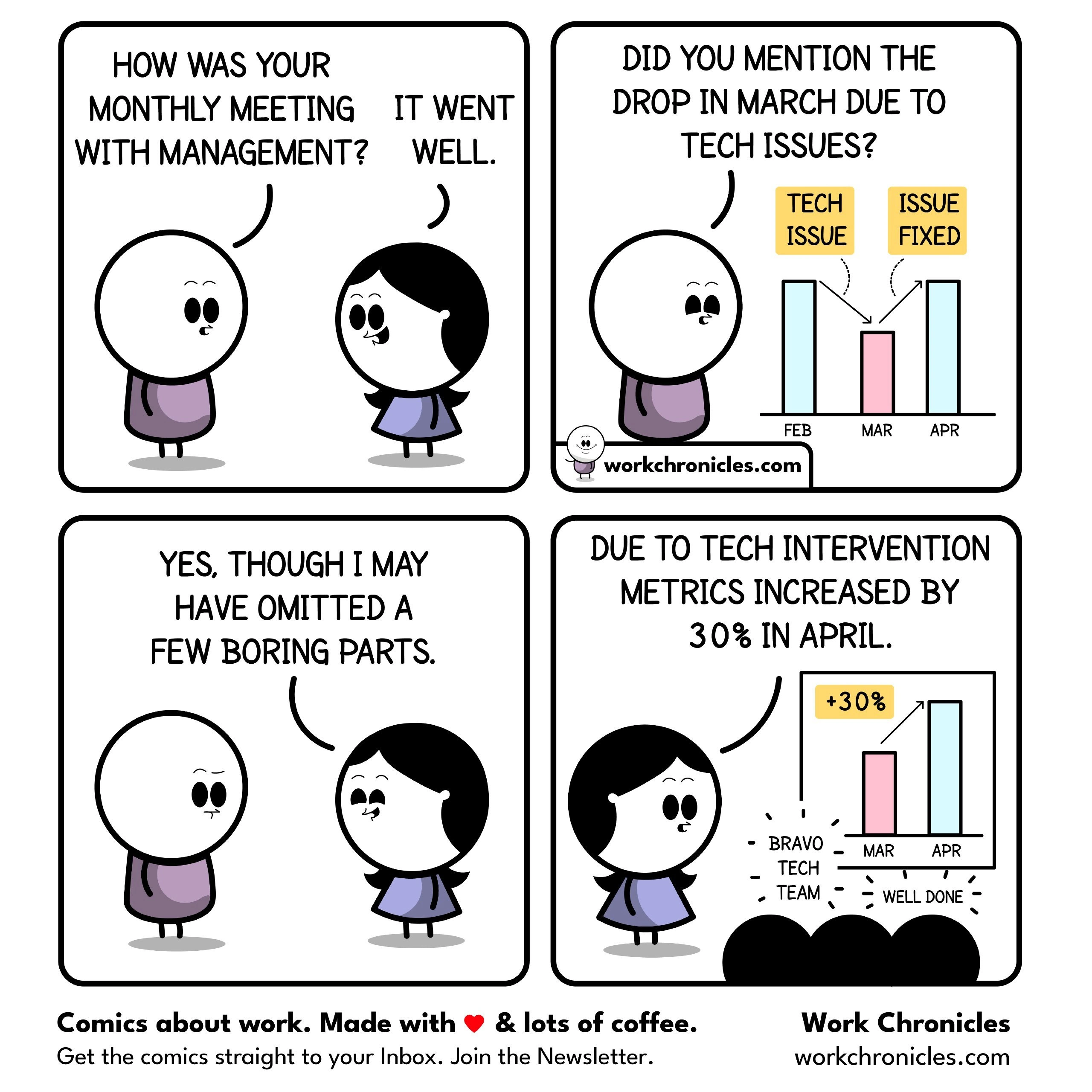
This is exactly what’s happening in the comic. The tech team had a bad day in March (something went wrong and their results went down). They fixed things in April (got everything back to normal). But when they talked to the bosses, they acted like April’s big improvement was all thanks to their hard work, and they didn’t really talk about the mistake in March. It’s like a little kid hiding the bad grade and only showing the good grade: they hide the bad news and share only the good news. That’s why it’s funny – we know they’re leaving out half the story!

Level 2: Cherry-Picked Charts

Let’s break down what’s happening in simpler terms. In the comic, an engineer is talking about a monthly metrics report. Metrics are just measurements of how well something is doing – for example, how many users a website had, or how fast the system responded. Here we have a bar chart showing three months: February (Feb), March (Mar), and April (Apr). In March, something bad happened – likely a tech issue (like a server outage or a major bug) – that made the performance drop. The bar for March is a lot shorter, meaning whatever they were measuring fell down in March. In April, the issue was fixed, so things went back up. In fact, April’s bar is much taller than March’s, showing a +30% change (an increase by about one-third).

Now, the funny (and slightly sneaky) part: when the colleague presented these numbers to management (the bosses or non-technical higher-ups), she didn’t emphasize the bad part (March’s drop). Instead, she focused on the bounce-back in April. This is called selective reporting – only reporting the pieces of information that make you look good or fit the story you want to tell. It’s like picking only the ripe cherries from a tree – hence “cherry-picking” data. The colleague admits casually, “I may have omitted a few boring parts.” Those “boring” parts are actually pretty important – they’re the context that March’s poor performance was due to a technical failure. But she assumes management will find that detail boring or inconvenient, so she leaves it out.

In the presentation (Panel 4), her slide’s title is framed positively: “Due to tech intervention metrics increased by 30% in April.” She’s basically telling the higher-ups: “Look, thanks to the tech team’s actions, our numbers went up 30%!” She turned the story into “We did something great!” instead of “We had a problem and then recovered.” The audience of managers or stakeholders claps and says “Well done,” because all they see is a big improvement. They might not even realize that the only reason April looks so good is that March was terrible. This scenario is a form of good news only reporting. In many companies (this is common in corporate culture), when you’re in a meeting with big bosses, there’s an unspoken rule to focus on solutions and successes. Teams sometimes gloss over failures unless asked directly. Here, the tech team did a tech intervention (probably fixing the outage) – that’s good – but by not openly talking about the initial failure, they make it sound like April’s success was entirely due to proactive brilliance, not just fixing a blunder.

For a junior engineer or someone new to these meetings, it might be surprising. You’d think you should always report everything honestly – and generally, you should. But the comic is poking fun at how, in real life, communications get “filtered.” Stakeholder expectations play a role: stakeholders (like executives or clients) expect continuous growth and good performance. Admitting a big failure can be embarrassing or have repercussions, so people feel pressure to put a positive spin on the data. This is also a CommunicationBreakdown moment: the full truth isn’t shared, so the higher-ups don’t get the complete story. The engineer in purple (likely a teammate) asks if the drop was mentioned – hoping the truth was told. The colleague essentially says, “Yeah, I mentioned it… sort of… but not really.” In other words, she acknowledged March had an issue but probably very briefly, then quickly moved on to brag about April’s increase. That’s the joke: everyone who’s worked in a larger organization has seen someone skate over the bad news to trumpet the good news. It’s a bit of a ManagementHumor trope – not because it’s the best practice, but because it happens under pressure.

In summary, this panel sequence is teaching us about data presentation antics in the workplace. Key terms to know from this:

  • Outage: a period when a system or service was unavailable or broken (March had this problem, causing metrics to drop).
  • Metrics: numbers that represent performance (the heights of those bars for each month).
  • Selective Reporting: only sharing the information that suits you, hiding the rest (focusing on April’s +30% and skimming over March’s –20% or whatever the dip was).
  • Stakeholders: people who care about the project’s results (managers, clients, etc., basically the audience in panel 4).
  • Stakeholder Pressure/Expectations: the feeling that you need to show good results to keep those people happy.

The comic exaggerates to make a point, but it’s rooted in reality – sometimes tech teams do become a bit like spin doctors when facing upper management, emphasizing how they saved the day while quietly sweeping their mistakes under the rug. It’s a gentle reminder (and a joke) about how communication in companies can be less than fully transparent.

Level 3: Slide-of-Hand Metrics

On the surface, this comic brilliantly skewers a familiar corporate culture maneuver: turning a self-inflicted outage into a triumphant comeback story. The engineer in the blue dress is effectively performing “sleight of hand” with metrics – hiding the ugly March outage and showcasing only April’s dramatic +30% rebound. Seasoned developers recognize this as classic selective reporting under stakeholder pressure. Why admit a fiasco in March when you can frame April as a heroic success, right? It’s a tongue-in-cheek reference to how management meetings often go: bad news gets a quick footnote (or none at all), while any rebound is celebrated with cake and confetti.

This is corporate ManagementHumor 101, and it lands because it’s too real. We see a simple bar chart for Feb, Mar, Apr with a tiny March bar labeled “TECH ISSUE” and April labeled “ISSUE FIXED.” Instead of a candid postmortem about the downtime, the presentation slide in Panel 4 crows, “Due to tech intervention metrics increased by 30% in April.” The stakeholders in the audience applaud wildly – “BRAVO – TECH TEAM – WELL DONE” – completely oblivious to the conveniently omitted context. It’s hilariously cynical: the tech team essentially caused the dip (or at least suffered it), then fixed it, and now they’re getting kudos as if they engineered growth. This is the good news filter in action – only the rosy part of the timeline reaches the executive ears.

For veterans, this meme hits a nerve. It echoes all those sprint demos and quarterly reviews where we’ve packaged communication breakdowns and outages as “learning experiences” or “momentum for improvements.” It’s humor rooted in experience: the unspoken dance of reporting where you spin the data just enough to survive the meeting. The comic exaggerates only slightly – many of us have sat through PowerPoints where a catastrophic downtime is glossed over as “a minor blip”, immediately followed by bold graphs showing recovery as if it were breakthrough growth. In reality, a 30% spike after a nosedive is just returning to normal, but under intense stakeholder expectations, teams often present it like a victory. There’s even a dark joke among engineers: “Never let a good outage go to waste – it can make next month’s metrics look fantastic!” 😈

Why do smart people resort to this? Often it’s because of perverse incentives in large organizations. Management might reward good news and shoot the messenger of bad news. So teams adapt by cherry-picking stats to highlight only the rebound, hoping to sanitize the chart of any embarrassing downtime. It’s a coping mechanism in companies that value optics over transparency. This meme cleverly exposes that dynamic: the purple-shirt engineer’s concerned question (“Did you mention the drop in March due to tech issues?”) is the voice of engineering ethics, quickly brushed aside by the colleague’s smirk and “I may have omitted a few boring parts.” Boring parts, indeed – like why April needed a heroic fix in the first place. The humor lives in that understatement. Every senior dev who’s prepped a slideshow for upper management can relate to this selective memory. The comic holds up a mirror to the “let’s spin it positively” mentality that we cynically joke about but also witness regularly. In short, it’s a witty jab at how CorporateHumor and reality diverge: the tech team’s fire is already forgotten, but their phoenix-like rise is front and center.

Description

A four-panel comic strip from 'Work Chronicles' illustrates a common corporate scenario. In the first panel, a character asks a female colleague, "How was your monthly meeting with management?", to which she replies, "It went well." In the second panel, the first character clarifies, "Did you mention the drop in March due to tech issues?", pointing to a bar chart that shows a dip in March labeled 'TECH ISSUE' and a recovery in April labeled 'ISSUE FIXED'. The third panel shows the woman admitting, "Yes, though I may have omitted a few boring parts." The final panel reveals her presentation to management, where she declares, "Due to tech intervention metrics increased by 30% in April," with the chart now highlighting the growth with a "+30%" label and celebratory notes like "BRAVO TECH TEAM" and "WELL DONE", completely omitting the initial failure. The technical context humorously critiques the art of 'managing up' within tech organizations. It satirizes how engineering teams can reframe a self-inflicted problem (a tech issue causing a metric drop) as a proactive success (a 'tech intervention' leading to a recovery). This is highly relatable for senior engineers and leaders who have experienced pressure to present positive narratives to stakeholders, often by strategically omitting the root cause of a problem and focusing only on the successful resolution. It’s a joke about corporate communications, storytelling with data, and the political savvy required to navigate stakeholder perceptions

Comments

7
Anonymous ★ Top Pick We don't call them 'production incidents,' we call them 'opportunities for dramatic metric improvement.'
  1. Anonymous ★ Top Pick

    We don't call them 'production incidents,' we call them 'opportunities for dramatic metric improvement.'

  2. Anonymous

    I just rebranded March’s Sev-1 meltdown as a “strategic error-budget burn” - now the +30 % in April makes us look like visionary capacity planners

  3. Anonymous

    The best architectural decision is choosing your baseline carefully - a 30% increase sounds way better than 'we finally got back to where we were two months ago after breaking production.'

  4. Anonymous

    The classic engineering move: turning a P0 incident that took down production into a 'proactive performance optimization initiative' with a 30% improvement metric. It's not lying to management - it's just choosing which baseline to measure from. After all, if you fixed the problem you caused, that's technically an infinite percentage improvement from 'completely broken.'

  5. Anonymous

    April’s +30% “tech intervention” was growth via rollback - undoing March’s regression. Leadership cheered; OKRs are easiest when your baseline is last month’s incident

  6. Anonymous

    Classic: 'Tech issue fixed' slide hides how our intervention cratered metrics - omitted for management's flow state

  7. Anonymous

    Translation: we caused a March SEV‑1, fixed it in April, called it “tech intervention,” and turned regression‑to‑the‑mean into a +30% KPI win - SLO breach quietly omitted

Use J and K for navigation