Skip to content
DevMeme
397 of 7435
My Design Docs: A Monument to Poor Planning
Documentation Post #462, on Jun 19, 2019 in TG

My Design Docs: A Monument to Poor Planning

Why is this Documentation meme funny?

Level 1: Missing Instructions

Imagine you get a brand new LEGO set for your birthday – it’s supposed to be a cool spaceship. You’re super excited to build it. You open the box, pour out all the pieces, and then start looking at the instruction booklet. But halfway through the booklet, you realize the instructions suddenly stop. Page 10 is just blank, and there are still a bunch of Lego pieces left unassembled. You’re left holding random pieces, wondering how the cockpit or the wings are supposed to go on the spaceship. The box promised an awesome model and showed a complete picture, but the guide that was supposed to help you make it is incomplete. It’s frustrating, right? And also kind of silly – like, how could they forget to include the whole plan for building it?

That feeling you have is exactly what this meme is joking about. It’s the same as a sign on a building that’s meant to say “Planning” but ends up split into meaningless halves. It’s like having a big label that says “I know what I’m doing!” when in fact, inside, there’s no clue of how to do it. We find it funny in a goofy way because the thing that’s supposed to provide clarity or guidance ends up causing confusion instead. It’s a bit like if a teacher wrote “Very Organized Lesson” on the board, but then their notes were all jumbled and missing important pages. You’d giggle because the title and the content just don’t match at all.

So, the meme is comparing that broken planning sign to a situation in software development. But even without knowing anything about coding, you can appreciate the joke: it’s pointing out the absurdity of forgetting to plan, in something that’s named “Planning.” It’s as if someone made a rulebook but forgot half the rules. It makes you shake your head and laugh because it’s so backward – the planner didn’t actually plan. The core humor is the irony: saying one thing and doing another. And whether you’re building a LEGO spaceship or writing a big technical document, when the guide doesn’t actually guide, it’s both funny and a little exasperating. We laugh because it’s a universal feeling – the “Wait, this was supposed to help… but it doesn’t!” moment. In simple terms, the meme is funny because it’s a big, relatable whoops! that anyone can understand.

Level 2: Planning Not Included

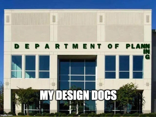
Let’s step back and explain the joke in simpler terms. The picture is of a building that likely houses a government office called the “Department of Planning.” Those words are meant to be one phrase on the facade. But a structural pillar divides the space, so the sign is split awkwardly: it reads “DEPARTMENT OF PLAN” on the left of the pillar and “NING” on the right. If you just look at it, you see two separate bits “PLAN” and “NING” instead of the word “PLANNING.” It’s a pretty glaring oversight — whoever put up the sign forgot to plan around the obstacle (the pillar). The sign literally failed at its only job: displaying the word “Planning” clearly. This is immediately ironic (and a bit funny) because you’d expect the Department of Planning, of all places, to have a well-planned sign! It’s as if a library had a misspelled “LIBRARI” sign – the very place known for attention to detail making a basic mistake. Here, the sign’s layout is so bad that it accidentally turns the word into gibberish. So that’s the setup: an obviously misplanned sign about planning.

Now, the meme caption superimposed on the image says, “MY DESIGN DOCS.” This means the person sharing the meme is joking that their own design documents look like that sign – in other words, poorly planned or lacking important pieces. In software development, a design document (often just called a design doc) is a written plan or blueprint for how you’re going to build a system or feature. It’s typically created by developers or architects before (or while) writing the actual code. A design doc usually describes the problem, the proposed solution, the architecture (the components/modules and how they interact), and any architectural trade-offs (decisions where you choose one approach over another and explain why). For example, a design doc might say, “We considered using a single database vs. multiple databases, and we chose a single database for simplicity, trading off some scalability.” Good design docs also often include diagrams, like boxes and arrows showing how data flows, or a step-by-step breakdown of components. The whole point is to do some planning up front so that the team knows what they’re building and can spot potential issues on paper before they become expensive problems in code.

So what does it mean that the design docs “forget the whole planning part”? It’s saying that the documents exist (there’s a file or a wiki page with the title “Design Spec” or “Architecture Plan”), but they’re missing key information – just like that sign is missing the middle of the word planning. The document might have sections with fancy titles like “Overview, Proposed Architecture, Conclusion,” but the actual content under those might be incomplete or nonsensical. This is a form of DocumentationHumor because it pokes fun at the often poor state of internal documentation in engineering teams. Many developers have seen a design doc that, for example, lists components without explaining how they connect, or says something vague like “we’ll handle security later.” It’s frustrating in real life, but as a shared joke it’s funny because it’s so common.

Let’s define a couple of terms here clearly:

  • Documentation: In software, documentation is any written text or illustrations that explain the code or the project. It can be user guides, API docs, or internal design docs. Here we’re talking about internal design documentation – the notes and write-ups that developers create to describe how they plan to build something. Good documentation is like a road map for developers and stakeholders. It should clarify the goals, how different pieces of the system will work, and why certain decisions were made.

  • Design Document: This is a specific type of documentation that outlines a proposed solution to a technical problem. For example, if your team is going to build a new feature (say, a user login system), someone might write a design doc describing how it will work: what database to use, what the data model looks like, what the API endpoints are, what the user interface flow is, etc. Think of it like an architect’s blueprint for a house, but for software. It’s supposed to cover everything important so that everyone is on the same page before coding. In practice, design docs vary in detail – some are very thorough, while others are just a page or two with bullet points.

  • Architectural Trade-offs: This phrase refers to the decisions you have to make when designing a system where each choice has pros and cons. In engineering, there’s rarely a one-size-fits-all perfect solution; every design involves trade-offs. For instance, imagine choosing a database: a SQL relational database (like MySQL) versus a NoSQL database (like MongoDB). A relational DB might guarantee you strong consistency (transactions) and well-structured data, but it could be harder to scale horizontally. A NoSQL DB might handle lots of traffic and big data easily, but you might sacrifice some data consistency or have more complex query logic. Deciding between them is an architectural trade-off: you weigh what’s more important for your case (consistency vs scalability, etc.). A good design doc will explicitly mention such trade-offs and what choice was made. When the meme says the docs forgot the planning, it implies maybe those trade-offs and details were never discussed or documented. It’s like if an architect drew a house but didn’t decide whether the house should be made of wood or brick – a pretty crucial detail to leave out!

  • Technical Debt: This is a term every junior developer eventually learns, sometimes the hard way. Technical debt is a metaphor comparing rushed or suboptimal code to financial debt. If you take shortcuts now (like skipping tests, or in our case, skipping thorough design), you “borrow” time, but you’ll “pay interest” on that later in the form of harder maintenance and potential problems. For example, not planning how different modules of an application will interface might save time up front, but later you might discover they don’t mesh well, and fixing that will take even more time (that’s the interest on the debt). When a design doc is incomplete, it often means the team will accumulate technical debt because they didn’t address certain issues early on. The humor in the meme is partly that the person’s design docs are so bad, they themselves are evidence of technical debt – like a messy plan you’ll have to clean up later.

So, putting it together in a straightforward way: the meme maker is joking that their design documentation is as messed up as a sign that literally chops the word “Planning” in half. It’s a self-deprecating joke. It says, “My planning documents are so poorly done, they basically forgot to include the actual plan!” This is a common theme in DeveloperHumor because almost every dev has seen (or unfortunately written) documentation that was incomplete. Maybe you’ve experienced this as a newcomer: you join a project, they point you to the design docs to get up to speed, and when you read them, you end up more confused than before because the docs are outdated or missing context. It’s like being promised a guide and then finding out the guide is blank or incorrect. There’s a sort of comfort in knowing this doesn’t only happen to you – it’s widespread enough to joke about. TechHumor often shines a light on these industry-wide quirks.

For a junior developer especially, this meme is a gentle warning wrapped in a joke. It hints at the importance of proper planning and documentation. The reason people find it funny is exactly because we know we should plan better, but reality often intervenes. Startups and agile teams sometimes move so fast that writing a detailed design doc feels like a luxury. You might begin writing one and then the project timelines change or you have to start coding immediately, and the doc remains half-done (like “PLAN” … “NING”, separated and incomplete). Alternatively, a less experienced engineer might write a design doc and simply not know how to flesh out all parts of the plan – some things might be left as “we’ll figure this out later” either implicitly or explicitly. Later, when looking back, it’s obvious those were gaps in the plan. Many of us have been in that exact situation: you think you’ve got everything covered, but you didn’t see the metaphorical pillar in the way. Only after you’ve built half the system do you realize, “Whoops, we never accounted for X,” just as that sign installer likely went “Uh oh, the big green letters don’t fit because of that pillar!”

The meme also quietly touches on team and process issues. Why would design docs forget the planning part? Possibly because the team treated writing the doc as a checkbox task rather than a thoughtful exercise. In some organizations, you literally cannot start coding until you have a design document reviewed and approved. To comply, developers might whip something up quickly – say, copying a template and filling in a few sections superficially – to get the approval and move on. In the rush, the “planning” (deep thinking about how everything will work) is barely done. This gets even more pronounced if the team is under pressure to deliver features yesterday. The attitude becomes “We’ll handle the details on the fly; let’s just satisfy the process by submitting a design doc.” And so you get a document that is, in spirit, as ill-conceived as the broken “Planning” sign. Everyone kind of knows it’s not great, but they hope it’s “good enough.” Later, when problems arise or new people read the doc, the flaws are evident and often mocked internally. This meme is basically making an internal gripe public in a humorous way.

On a lighter note, let’s appreciate the split_sign_humor here. Splitting words in funny ways (especially by physical objects) is a classic visual gag. In this case, “PLANNING” splitting into “PLAN” and “NING” accidentally creates two nonsense bits. It almost looks like “PLAN NING” is a separate thing. In software terms, it’s like an object name cut in half – it doesn’t compile, so to speak. It reminds developers of bad variable names or file merges gone wrong (imagine a config file where a long word gets split and breaks because someone didn’t escape a newline). The meme doesn’t explicitly say all that, but those who work with text and code all day subconsciously see an analogy. We’re trained to pay attention to detail in code, so a glaring typo or split word stands out and makes us cringe a little. The cringe turns to laughter when we realize the context – it’s the planning department. It’s such low-hanging irony that you can’t help but chuckle.

For someone newer to the field, the takeaway is: planning is important, but often overlooked. That’s the heart of this joke. The best practice is to have design docs that truly guide the team – imagine a thorough recipe you can follow. But in practice, you might encounter (or accidentally write) design docs that are more like an empty outline with a few jargon-y statements. The meme exaggerates it by comparing it to a hilariously botched sign, which drives home the point. It’s like the meme author is admitting, “My design docs are embarrassingly bad.” And other developers find it funny because they relate – they’ve seen embarrassingly bad docs too, so it’s a shared secret being aired out.

One famous adage comes to mind here: “Failing to plan is planning to fail.” This meme is essentially that phrase in picture form. The Department of Planning failed to plan their sign, and the sign failed. Likewise, if we don’t put real effort into planning our software design, the project can stumble later. It’s humor with a hint of a lesson. So, when you laugh at this, you’re definitely allowed to laugh with a bit of guilt or resolve, thinking, “I should double-check my next design doc to make sure I didn’t leave out something obvious!”

Level 3: Deadline-Driven Design

At first glance, this meme is a masterclass in architectural irony. We see a building proudly labeled Department of Planning, yet the word “Planning” is split awkwardly by a giant pillar – reading as “PLAN” on one side and “NING” on the other. In other words, the planning department sign itself wasn’t planned correctly. That’s the punchline: the very thing dedicated to planning failed to plan its own sign. The meme caption “MY DESIGN DOCS” bluntly equates that botched sign to the author’s software design documents. In seasoned developer terms, the joke lands because an architecture design doc, which is supposed to thoroughly lay out a plan, sometimes ends up as disjointed and half-baked as that split sign. It’s as if the document forgot about the “plan” in “planning,” just like whoever made that sign forgot about the pillar in “Planning.” The humor stings a bit, because who among us hasn’t seen documentation that’s comically lacking the one thing it promises – a coherent design?

This cuts deep into a familiar technical debt scenario. When teams rush or neglect the “planning part” of a design doc, they often produce a glossy PDF with lots of sections and diagrams… except the details that matter are missing or misaligned with reality. It’s like writing “We totally have a plan” at the top of a document and then never actually planning out the tricky parts. Why does this happen? Deadline-driven design is often the culprit. Under tight deadlines (or overeager management), teams might code first and document later, or hastily fill out an architecture template just to satisfy a process checkpoint. The result is an official-looking blueprint that is basically a plan justification for what was already built. In the worst cases, the doc is so out-of-sync or incomplete that it provides zero guidance – much like that “Planning” sign provides zero useful identification when split in two. DeveloperHumor like this resonates because we’ve all opened a so-called DesignDocument only to find sections titled “TBD” or obvious oversights that make you facepalm. It’s a shared industry joke: the bold title (“Department of Planning” / “Design Spec v1.0”) and fancy formatting are there, but the substance is conspicuously missing.

Let’s break down why this image is painfully funny. In software teams, a design doc is supposed to be the blueprint for building a system, analogous to an architect’s plans for a building. It should cover major components, data flows, DesignPatterns_Architecture choices, and important architectural trade-offs. Now picture an actual building blueprint where the architect forgets to account for a critical pillar – you’d end up with a bizarre layout or a nasty surprise during construction. In the meme’s building, that pillar bisects the sign text, screaming “we didn’t think this through.” In dev projects, the “pillar” could be a major constraint or integration point (say, an existing legacy system, or a requirement like data privacy) that the design doc glossed over. When reality strikes – the code or the structure runs smack into that ignored constraint – you get a split design that doesn’t make sense, just like “PLAN” / “NING.” The meme is basically a photograph of incomplete_planning, a concept every engineer recognizes: fail to consider one crucial element, and your grand design falls apart in a very visible way.

From a senior engineer’s viewpoint, this scenario is all too real and not just visual humor. We chuckle because we’ve survived the fallout of such “plan-less” plans. Consider a project where the design doc boldly announces, “We’ll build everything with microservices for maximum scalability,” but neglects to detail how those services will communicate or how data consistency will be handled. Fast forward to implementation: without those specifics hammered out, each team implements services in isolation and you end up with a tangled distributed monolith (the system is chopped into services in name, but tightly coupled in practice). The design doc might have a pretty diagram of 10 microservices with neat arrows, but if it “forgets” the whole planning part (like defining API contracts, load balancing, failover strategies), it’s no better than that broken sign. Everyone sees the buzzwords (microservices!) on paper, yet in reality, nothing works smoothly because the devilish details were left as an afterthought. This is a classic ArchitecturalTradeoffs fail: the doc didn’t discuss trade-offs of going microservice vs. monolith (start simple or split early?), and it certainly didn’t plan for the complexity introduced. The outcome? Lots of brittle glue code and late-night emergency patches – TechnicalDebt paid with interest.

We also recognize in this meme the common antipattern of “documentation theater.” That’s when a team produces a design doc just for show – to tick a box or satisfy a manager – rather than to truly plan. The facade of a plan is there, but the content is hollow or disconnected from what’s actually being built. It’s darkly humorous because it’s a bit of a self-own: we’re mocking our own bad habits. The text “MY DESIGN DOCS” implies the meme creator is poking fun at themselves (and by extension, their team or company). It takes a seasoned, slightly battle-hardened developer to openly admit, “Yep, our design docs look official but are essentially useless.” This honesty is cathartic and funny because it cuts through the nonsense we often deal with. It’s a form of DocumentationHumor that elicits a knowing laugh and maybe a pained groan.

To illustrate how a design doc can look impressive but say nothing, imagine cracking one open and seeing something like this:

## Proposed Architecture
We plan to use a microservices approach for everything (details TBD).

## API Design
We'll define the endpoints here:
- GET /data - returns data. 
(TODO: specify what data later)

## Error Handling
All errors will be logged. (Any strategy beyond that? We'll wing it.)

You might laugh at that snippet, but it’s uncomfortably close to reality. I’ve seen “design specs” that basically boil down to “We’ll do X… somehow.” In the snippet above, every important detail – how the microservices actually work together, what data they serve, how errors are handled beyond just logging – is punted down the road. The document has section headings and confident statements, but it’s devoid of true planning. This is the textual equivalent of the Department of Planning sign being split: the structure is there (sections, titles), but the meaning is broken. If you were an engineer trying to implement that spec, you’d be no better off than if you had no doc at all. In fact, sometimes a half-baked design doc is worse than none, because it can mislead you or give false confidence that things were thought through (just like seeing that building sign might mislead you until you realize the error).

Now, why is fixing this kind of issue harder than it looks? Can’t we just, you know, plan better? The cynical truth in many engineering teams is that planning falls victim to the “move fast” mantra. Thorough design takes time – time that product timelines or startup urgency often don’t allow. By the time the cracks show (e.g. the integration fails, or the site goes down because nobody planned for a surge of traffic), it’s too late. The team is in firefighting mode, learning the hard lessons that the design doc should have taught up front. Going back to correct the design (refactoring core modules, adding missing features, rewriting docs) is expensive and risky when the system is already live. It’s analogous to realizing the sign is wrong after the building is finished – at that point, fixing the sign (especially one built into the facade) is a non-trivial project. So people shrug and leave it as is, or slap a quick patch. In software, that “patch” might be a quick hack or an addendum to the doc that never quite integrates with the original plan. The TechnicalDebt accumulates: every time new developers try to understand the system, they stumble over the gap between what the design doc says (or implies) and what the code actually does. It’s a recipe for confusion and bugs.

This meme also hints at the organizational dysfunction that allows such ironic outcomes. Consider how that building sign likely passed through multiple hands – designers, builders, officials – and yet no one stopped to say, “Uh, guys, our Planning sign is badly planned.” Similarly, in a company, a design document might be reviewed by tech leads, managers, even an architect or two. But if everyone is too busy or too indifferent, they might give it a rubber stamp approval without digging into the details. Maybe there was an architecture review meeting that spent two hours bikeshedding on the font of the document or the code style guidelines appendix, but nobody noticed that the section on “Deployment Plan” was literally blank. It’s a scenario so absurd it becomes comic. The ArchitecturalTradeoffs analysis section might just say “TBD” or hand-wave critical issues, and yet somehow it gets approved. This happens when the culture values the appearance of planning over actual planning. Smart people, under pressure, will sometimes play along – they know the doc has holes, but addressing them means delaying the project or causing a stir. And who wants to be “that person” holding up progress? So, the plan with no plan sails through. Until, of course, reality strikes.

Historically, the pendulum has swung between over-planning and under-planning. In the old waterfall days, teams would produce enormous design docs (hundreds of pages of requirements and specifications) before writing a single line of code. Ironically, those could end up just as disconnected from reality once coding began, because no plan survives first contact with actual implementation. Agile methods reacted to that by favoring working code over comprehensive docs – “individuals and interactions over processes and tools,” and “responding to change over following a plan,” as the Agile Manifesto preaches. And hey, agility is great, but some teams took it to the extreme of “no design doc, just code it and see.” The happy middle ground is some planning – enough to catch obvious issues, not so much that you get analysis paralysis. This meme jokingly shows what happens when you don’t find that balance: you get a lightweight design doc that is essentially a facade. It’s minimal documentation that pretends to guide development but actually offers no real insight. We laugh because it feels like we’re looking in the mirror at our industry’s bad habit.

The shared experience underlying this humor is a mix of frustration and camaraderie. Every developer who’s been around the block has war stories: maybe you joined a project and read the existing design docs, only to discover they were woefully out-of-date or missing important sections. Or you were on-call at 3 AM, scrambling during an outage, and dug up the system’s architecture doc for answers – only to find it was essentially empty fluff, useless for diagnosing the problem. In that sleep-deprived moment, you might have chuckled darkly and thought, “This is as good as a Department of Planning with no actual planning.” The meme speaks to that collective “ugh, been there” feeling. We crack a smile because if we didn’t, we might cry. TechHumor like this is a coping mechanism: we make fun of the absurdity to stay sane in an environment where planning is preached more often than practiced.

In summary, “When your architecture design docs forget the whole planning part” is a meme that elicits a knowing grin from veteran developers. It highlights the absurdity of having documentation that doesn’t document and designs that lack design. The image’s visual gag – a literally mis-planned Planning sign – is perfectly matched to a chronic software engineering pain point. It’s a cautionary tale and a joke rolled into one. The reason it’s funny is the stark irony: a planning department’s sign isn’t planned, just like an architecture document sometimes isn’t architected. Seasoned devs nod and smirk because they’ve lived this – they know exactly how you end up with “Plan” on one side and “ning” on the other, both in buildings and in codebases. And while we laugh, we also silently vow: maybe next time, let’s actually do the planning. (Spoiler: next time there will still be a deadline…)

Description

The image displays the facade of a generic, beige, two-story office building under a clear blue sky. On the building, in green capital letters, is the sign "DEPARTMENT OF PLANN IN G". The letters "IN" and "G" are crudely tacked on at the end, vertically stacked and misaligned with the rest of the text, humorously undermining the building's supposed purpose. An overlay of white text with a black border at the bottom of the image reads "MY DESIGN DOCS". The meme uses the ironic image of a poorly planned sign on a planning department building as a metaphor for the author's own software design documents, suggesting they are equally ill-conceived, hastily amended, and flawed. It's a self-deprecating joke about the common struggle to create and maintain thorough and coherent technical documentation

Comments

7
Anonymous ★ Top Pick My RFC started as a well-architected blueprint. By the time it got through three committees, it looked exactly like this sign: the original idea, plus a bunch of misaligned additions that technically make it complete
  1. Anonymous ★ Top Pick

    My RFC started as a well-architected blueprint. By the time it got through three committees, it looked exactly like this sign: the original idea, plus a bunch of misaligned additions that technically make it complete

  2. Anonymous

    Our architecture docs follow the same principle as this sign: split at every structural column, call it “bounded context,” and hope the auditors can read between the gaps

  3. Anonymous

    The design doc was so thorough it covered everything except what happens after the happy path, which is why we're now maintaining a distributed monolith with 47 different error states that all return 200 OK

  4. Anonymous

    This is the architectural equivalent of a README.md that renders perfectly in your local editor but breaks spectacularly in production when the CI/CD pipeline enforces an 80-character line limit you forgot existed. The Department of Planning clearly didn't run their signage through a linter, and now they're living with a permanent 'TODO: fix text wrapping' comment visible to the entire city. At least when our design docs overflow their containers, we can blame CSS box model quirks - these folks have to explain why they couldn't measure their own building

  5. Anonymous

    My design docs implement CAP: Consistent, Accurate, or Published - pick two; after GA they eventually converge to whatever we actually shipped

  6. Anonymous

    Design docs: accruing orthographic tech debt before the first commit

  7. Anonymous

    My design docs: Department of Plan...ning - pages of boxes and arrows; the “ing” is deferred to post-MVP

Use J and K for navigation