Data Science: Academic Theory vs. Project Reality
Why is this DataScience meme funny?
Level 1: Velcro vs Laces
Imagine two kids getting ready to go play outside. One kid has sneakers with long laces and is convinced, “I must learn to tie the perfect double knot, or I can’t go play.” They’re sitting on the steps, tongue stuck out in concentration, working through a big book of “Advanced Shoe Lacing Techniques.” Now the other kid just slips on a pair of shoes with velcro straps. Zip! The straps go on in two seconds, and off that kid runs to play in the sun. The first kid is left fumbling with the laces, watching their friend already having fun. It’s a funny sight: one friend totally overthinking a basic task, while the other finds a super quick shortcut to achieve the same end (shoes on feet, ready to go). We laugh because we’ve all been the kid struggling with the laces at some point – making something harder than it needed to be – and we’ve also seen people who just skip the hard part and get things done the easy way. In the end, both kids have shoes on, but one took a lot more effort trying to do it the “proper” way while the other proved that sometimes a simpler solution (like velcro) works just fine. The joke is a gentle reminder that, in life, sometimes we don’t need to complicate things – a straightforward shortcut can save the day, and it’s kind of amusing how often that happens.
Level 2: Theory vs Practice
Let’s break this down in simpler terms. The meme joke is contrasting theory with practice in the context of becoming a data scientist. On the “Me:” side (the theory side), the person believes they must deeply learn Spectral Theory — which is an advanced math topic dealing with things like eigenvalues and eigenvectors. To explain those: if you have a big grid of numbers (a matrix, which could represent relationships in data), an eigenvector is a special direction or pattern in that grid that doesn’t change direction when the matrix acts on it, and an eigenvalue is a number that tells how much that special vector gets stretched or squished. It’s okay if that sounds confusing; the point is it’s higher-level linear algebra that one might encounter in a machine learning course. Spectral theory comes up in data science when you talk about methods like PCA (which finds important directions in your data by computing eigenvectors) or spectral clustering (which finds groups in data by analyzing a special matrix called a graph Laplacian). So our aspiring data scientist is essentially saying, “I need to learn this really hard math concept inside-out if I want to succeed.” That’s the learning curve talking – beginners often see a long list of hard topics (calculus, linear algebra, algorithm theory) and think they must conquer them upfront. It’s a form of academic overengineering: doing way more preparation or using a far more complex method than might be necessary for the task at hand.
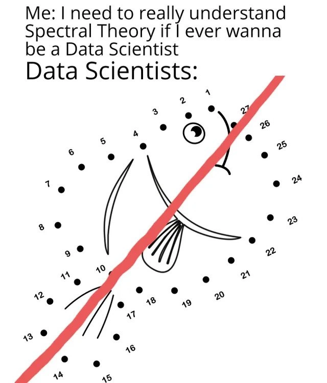
Now, look at the “Data Scientists:” part (the practice side). It shows what actual working data scientists supposedly do: in the image, instead of carefully connecting each dot from 1 to 26 to draw the fish, they just drew a big red line across the whole thing, completely ignoring the numbers. This is a humorous example of a quick and dirty analysis or solution. In real life, that might be like a data scientist saying, “I don’t have time to fine-tune a complicated model or derive formulas; I’m just going to use a simple tool or cheat to get an answer now.” The fish_shape_drawing with numbers 1 through 26 is like a little task or puzzle that has a proper step-by-step method, and the red slash line across it is basically someone skipping all those steps.
Why is this funny to people in data science and machine learning? Because it rings true! Often, a beginner imagines that professionals are doing extremely sophisticated math every day. In reality, a lot of day-to-day DataScience work is more about using existing software packages, writing straightforward code, and getting results quickly. For example, instead of painstakingly coding up a matrix eigenvalue solver (which would be applying spectral theory directly), a data scientist will use Python’s NumPy library or scikit-learn. They might write something like numpy.linalg.eig to get eigenvalues, or better yet, not worry about eigenvalues at all and just call a high-level function like PCA or SpectralClustering that hides all the math under the hood. The meme exaggerates this by showing an extreme shortcut – basically ruining the puzzle to get “some kind” of result immediately. It’s a playful jab at how practitioners sometimes find the fastest path to an answer, even if it’s not the textbook method.
Let’s put it in concrete terms. Suppose you have a dataset and you want to find some patterns. The academic approach might be: “Okay, let’s review linear algebra, compute the covariance matrix, find eigenvectors, project data onto those eigenvectors…” etc. That’s a lot of theory. The practical approach might be: “Let’s just call a library function that does PCA for me, then plot the result.” Both approaches use the same underlying idea (PCA uses spectral theory internally), but the practicing data scientist isn’t manually doing the math – they’re letting the computer do it. The meme’s joke extends this idea to an extreme: the data scientist in the image didn’t even bother to connect any of the 26 dots properly – they just drew one line. In a real scenario, that could be like someone not even using the complex model at all, and instead using a super simple approximation or a guess to answer a question. It’s tongue-in-cheek; actual data scientists wouldn’t literally ruin a puzzle or sabotage their analysis on purpose, but they often use the simplest method that yields a decent answer.
We can also interpret the fish puzzle metaphor in another way: Imagine the numbered dots are pieces of a complex problem (steps, data points, etc.). The proper way would be to tackle each piece in the right order (like methodically applying an algorithm). But what if you’re short on time or you just want a rough idea? You might draw a quick line of best fit through the whole mess – that’s our red line – to see a trend without detailing every nuance. This rough trend line idea is common in analysis: instead of a detailed model, try a simple one first. The OverEngineering tag attached to the meme hints that the “Me” in the text is overengineering the prerequisites (insisting on learning something quite advanced) for a job that might allow more straightforward approaches. Meanwhile, the actual data scientists might be under-engineering the solution in the picture, by doing something almost ridiculously simple.
For someone early in their career (or learning data science), this meme is a mix of reassurance and satire. Reassurance because it suggests “Hey, you don’t actually need to know every obscure math theory to start doing useful work – look, many people just use standard tools and sometimes even kludgy shortcuts.” And satire because it humorously exaggerates professionals as if they’re completely ignoring principles (which isn’t literally true, but it can feel that way when you first see how they operate). It’s highlighting a real gap between school/book knowledge and real-world AI_ML practice. Many junior developers or scientists have that first shock when they realize their senior colleagues might not derive formulas on a whiteboard daily; instead, they’re excellent at using libraries, frameworks, and a healthy dose of Google to solve problems efficiently.
Let’s clarify some terms from the tags to ensure everything’s clear:
- Spectral Theory: As mentioned, it’s a field of math dealing with eigenvalues and eigenvectors of matrices or operators. In simpler words, it’s about finding hidden “directions” or patterns in complex data transformations. It’s advanced stuff, often studied in the context of quantum physics or advanced algorithms, but also very relevant to machine learning techniques like PCA or spectral clustering.
- Eigenvalue & Eigenvector: These are the core concepts of spectral theory. If you have a transformation (like a matrix that when multiplied by a vector transforms it to another vector), an eigenvector is a special input vector that only gets scaled (stretched or squished) and not rotated or changed in direction by that transformation. The amount it’s scaled by is the eigenvalue. For example, if you have a big grid of numbers acting on a vector, and one particular vector just gets doubled (and not re-oriented), that vector is an eigenvector and 2 is the eigenvalue. These terms come up a lot in machine learning theory, and they’re fundamental to understanding how certain algorithms work under the hood.
- Data Science (and AI_ML, artificial intelligence & machine learning): These are fields that combine programming, statistics, and math to extract insights or predictions from data. Data scientists use techniques ranging from simple charts to complex models to understand data. The meme is rooted in data science culture, pointing out the difference between the scholarly view of the field vs. the practical daily grind.
- DataScienceHumor/MachineLearningHumor: These tags indicate the meme is a joke that people with knowledge in data science or ML will appreciate. It’s an inside joke about the habits of people in this field.
- LearningCurve: This refers to how much effort it takes to learn something. Data science is often said to have a steep learning curve because there are many topics (programming, stats, math, domain knowledge) to learn. The meme jokes about this by showing someone preparing to climb a very steep part of the curve (spectral theory) even before starting, whereas practitioners might zigzag up the curve using easier paths.
- OverEngineering: This means designing a solution that's far more complicated or fancy than necessary. In this context, the newbie is arguably overengineering their preparation by insisting on deep knowledge of spectral theory from the get-go. In contrast, the data scientist in the picture under-engineered the solution to the fish puzzle by just slashing a line through it. Both extremes are humorous when put side by side.
- Quick and dirty analysis: This phrase describes doing something quickly and without a lot of polish or rigor, just to get a rough answer. It might be a script written in 10 minutes that gives some okay result, but isn’t pretty or perfect. The red line is the epitome of “quick and dirty” – one stroke and done, accuracy be damned.
- Connect-the-dots puzzle: A simple children’s puzzle where you have numbered dots scattered on a page, and if you draw lines connecting them in numerical order (1 to 2 to 3 and so on), you reveal a picture – here it would have been a fish if done properly. It’s a step-by-step process, kind of like following an algorithm exactly.
- Fish shape drawing: In the meme’s image, the intended outcome of connecting all those dots (1 through 26) in order is a fish outline. The black dots and thin outline in the picture show what the fish would look like if you did it correctly. It represents the “correct solution” achieved by following all steps.
- Red slash line: This is the bold red line drawn from the lower left to the upper right of the dot grid, cutting through the fish. It represents the “solution” the depicted data scientists used. It ignores the puzzle instructions entirely. In a real analysis, this red line might be analogous to doing something like drawing a straight trend line through complex data without really capturing the details – basically a lazy or expedient move to claim a result.
So, putting it all together: The meme is funny because the emotional core is very relatable – it’s poking fun at the difference between what beginners think experts do (really complicated stuff) and what experts sometimes actually do (simpler, faster shortcuts using tools). If you’re new to the field, this meme might actually make you feel a bit relieved (and maybe a tiny bit disillusioned) to know that even those who proudly wear the “Data Scientist” title aren’t manually crunching crazy math every second. They know the math exists (someone has to program those library functions, after all), but they also know how to efficiently get things done.
For an early-career person or student: imagine you spent a week studying linear algebra proofs for machine learning, and then you join a project where your teammate solves the task in an afternoon by using an existing framework. You’d probably have a moment of “Wait, that’s it? I didn’t need to stress so much?” – followed by relief or laughter. That’s essentially the laugh this meme is going for. It’s not saying “don’t learn math” (knowing spectral theory is definitely beneficial long-term), but it is saying “the day-to-day reality might be less glamorous and complex than you think, and sometimes you just wing it.” In summary, theory vs. practice in data science can be dramatically different, and this meme captures that contrast with a simple visual gag of a puzzle solved the “wrong” way.
Level 3: Cutting Through Complexity
For those of us with some experience, this scenario prompts a knowing chuckle. It captures a classic reality of DataScience work versus how newcomers imagine it. The top text shows “Me” (the newbie) agonizing over mastering an advanced topic like Spectral Theory because they think it’s a prerequisite to becoming a data scientist. This rings true – many of us have been that newbie, staring at equations of eigenvectors in a textbook, thinking “I have to conquer this mountain of math to do anything useful.” It’s a form of overengineering one’s learning process: focusing on the most complex theory upfront. Meanwhile, the meme’s punchline is the “Data Scientists:” response – illustrated by that children’s connect-the-dots puzzle of a fish, where instead of properly connecting each numbered dot to draw the fish, someone took a thick red slash line straight across. This is a perfect metaphor for the pragmatic, maybe slightly sloppy shortcuts that real data scientists sometimes use to get the job done. In practice, when you’re racing a deadline or just exploring a dataset, you often favor a solution that’s “good enough for now” over a theoretically optimal one that might take vastly more effort. The DataScienceHumor here comes from the contrast between an idealistic approach and the reality of daily work.
Think about an everyday scenario in a data science job or project: You might have a ton of messy data and a question to answer by end of week. Are you going to derive the eigenvectors of a huge matrix by hand? Of course not – you’ll likely use a library or even choose a simpler method altogether. For example, maybe you recall that spectral clustering is a cool algorithm for grouping data by analyzing graph Laplacians (very math-heavy), but setting it up and explaining its math could be time-consuming. Instead, you might just run a quick K-Means clustering or throw the data into a Random Forest classifier to see results. It’s like drawing that red line straight through the problem – perhaps a crude approach, but fast and often surprisingly effective. In machine learning practice, there’s a saying: “Better a simple model with lots of data than a complex model with hardly any.” Seasoned data scientists know that spending weeks to squeeze out a theoretically optimal solution might not be worth it if a simpler model gives an answer that’s 90% as good today. That mentality leads to a lot of quick_and_dirty_analysis, especially in fast-paced business settings. We’ve all seen notebooks or scripts labeled “temp_solution.py” or “quick_hack.R” that ended up being used in production far longer than intended. This meme’s fish drawing is basically a quick hack visualized: they technically made a line that crosses all the dots (in some sense touching on all points of the problem) but flagrantly ignored the intended method. It’s the data science equivalent of saying “Eh, I’ll just do a linear fit through all this non-linear data and call it a day.”
The humor also taps into the LearningCurve of data science. Beginners often assume the curve starts at hardcore math and keeps climbing. Many experienced folks, however, remember that the real curve included a lot of on-the-fly solutions and using existing tools while gradually learning theory on the side. The meme exaggerates it to comic effect: spectral theory (heavy math) vs. connect-the-dots with a slash (childishly simple, even incorrect approach). Within teams, senior members might even joke about this: “Why reinvent the wheel? Just use the library function!” or “We can fine-tune the math later, let’s get a result now.” That attitude can be a double-edged sword. It’s often the correct call when you need a quick result, but it can become an anti-pattern if overused (just like if you only ever draw one line through every connect-the-dots puzzle, you’ll miss the picture completely!). The meme resonates because it’s MachineLearningHumor acknowledging that data scientists aren’t always the ivory-tower mathematicians outsiders imagine; a lot of times, they’re hackers and tinkerers, gluing things together with Stack Overflow code snippets and high-level APIs.
We should note the irony: Spectral theory is genuinely deep and important for many algorithms, but the day-to-day reality is that most working data scientists don’t derive those algorithms from scratch. They stand on the shoulders of giants — using libraries built by people who did understand the spectral theory. It’s a bit like magic: you call a function and it does some linear algebra jiu-jitsu internally. You get results without personally wrestling with a single eigenvector. That convenience shapes behavior. Why spend an afternoon proving the Perron-Frobenius theorem for matrices (a key spectral theory result for things like PageRank) when you could spend that time tuning hyperparameters on a random forest that you know will probably do the trick? The pressure of real-world problems often demands speed over elegance. OverEngineering a solution (or one’s preparation) isn’t rewarded when the boss just wants a graph by tomorrow. So the savvy data scientist learns when to cut corners. The fish_shape_drawing with the wrong line through it is a comical exaggeration of those cut corners. It’s saying, “Maybe we didn’t solve it correctly, but hey, we drew a line and it kind of looks like progress!”
The shared experience being satirized here is also that feeling of guilt or imposter syndrome among practitioners. Many data scientists will chuckle and think: “Yep, I worried about mastering linear algebra, and here I am copy-pasting code from GitHub.” It’s not that they’ll never need the math – sometimes a problem does demand digging into the spectral details, especially if something goes wrong or if you’re developing new algorithms. But on an average day, familiarity with your tools and data tends to beat out solving generalized eigenvalue problems on a whiteboard. In short, this meme is a light-hearted jab at the difference between theory vs practice in the data science world. We laugh because it’s true: the DataScience field lives in this tension between high-minded academic knowledge and roll-up-your-sleeves practicality. And if you’ve spent any time around a data team, you’ve likely seen both extremes – the intern obsessing over math proofs and the senior dev saying “Let’s just try this in Excel real quick.”
To visualize the contrast, consider the two approaches this meme juxtaposes:
Aspirant’s approach: Study everything thoroughly. The newbie imagines needing to derive the whole solution systematically (connect every dot in perfect order, master every formula from scratch). They might spend days on theoretical tutorials about eigenvectors and matrix decompositions before feeling “ready” to tackle a project.
Pragmatic Data Scientist’s approach: Get results with whatever works. The experienced pro will use a high-level library or a brute-force shortcut to solve the immediate problem, even if it’s not elegant. They connect just enough dots (or none at all!) to see a recognizable outcome. Why painstakingly draw a fish dot-by-dot when a bold stroke gets ink on paper now? In coding terms, they’d rather do:
# Instead of deriving complex math from scratch... import numpy as np eigen_vals, eigen_vecs = np.linalg.eig(big_matrix) # library does heavy lifting # ...they might use an even higher abstraction if possible: from sklearn.decomposition import PCA X_transformed = PCA(n_components=3).fit_transform(data) # one-liner for PCA (uses spectral theory under the hood)“Good to go, let’s plot these results!” – This quick approach ignores the finer details (just like the red line ignores the numbered sequence) but delivers something tangible fast.
The comedic genius of the meme is how it uses a connect_the_dots_meme format to encapsulate all of this. Connect-the-dots puzzles are supposed to be solved in order, revealing a clear image (here, a cute fish). That’s analogous to following rigorous steps in analysis or math to arrive at a correct insight. But the Data Scientists: panel vandalizes that notion – the red line spears through the dots, effectively saying “Forget the instructions, I’ll do it my way!” It’s a visual punchline that any programmer who’s ever written a quick hack can relate to. And it pokes fun at the data science community itself: we pride ourselves on math and algorithms, but often rely on quick scripts and black-box models to meet practical goals. It’s the same energy as a developer googling “it’s always DNS” when the server’s down – a wry acknowledgment of the gap between what we think we need to do (sometimes overthink) and what we actually do under pressure. In summary, the meme’s humor comes from shared insider knowledge: that being a data scientist typically requires a mix of solid fundamentals and knowing when to just draw a darn line through the problem and move on.
Level 4: The Spectrum of Solutions
At the highest level, this meme pits advanced mathematics against quick pragmatism. The aspiring data scientist is obsessing over Spectral Theory – a branch of linear algebra focused on analyzing linear transformations via their eigenvalues and eigenvectors. Spectral theory is powerful: it’s the mathematical backbone behind techniques like principal component analysis (PCA), spectral clustering, and even Google’s PageRank algorithm. In math terms, it’s all about decomposing a matrix or an operator into simpler parts by finding those special directions (eigenvectors) that a transformation just stretches or shrinks (by their eigenvalues) without changing direction. For example, in PCA we compute the eigenvectors of a covariance matrix to find the principal components – effectively the directions in which the data varies the most. The idea is rooted in the spectral theorem: for many matrices (especially symmetric ones common in data science), you can break them down into an “eigenspectrum” of factors that are much easier to analyze individually. This is heavy-duty Mathematics — the kind of thing you’d encounter in a graduate linear algebra course or a dense academic paper.
Why would a budding data scientist stress about this? Well, the field of AI/ML (artificial intelligence and machine learning) is built on algorithms that, under the hood, rely on a lot of linear algebra and calculus. The buzzwords like Eigenvalue and Eigenvector get thrown around in courses and interviews, so our eager learner figures they must master these CSFundamentals to be legit. And indeed, knowing the math can be incredibly useful: if you understand spectral theory deeply, you know why algorithms like spectral clustering work, what it means to find communities in a graph via the graph Laplacian’s eigenvectors, or how the Singular Value Decomposition (SVD) (a cousin of eigen-decomposition) can reduce a dataset’s dimensionality with minimal information loss.
However – and this is the kicker – in practice a lot of that intense theory is hidden behind high-level libraries. Computing eigenvalues isn’t something you typically code from scratch during a project meeting; instead you’d call a well-tested numerical routine (like numpy.linalg.eig or a function from MATLAB’s library). The AlgorithmComplexityAnalysis of finding eigenvalues (often an $O(n^3)$ operation for an $n \times n$ matrix) and the intricate numerical stability considerations have all been handled by the tool developers. So while our aspiring data scientist is mentally preparing to grapple with diagonalizing matrices and orthogonal eigenbases, the seasoned practitioner might just import a library and get on with it. This fundamental gap – between the theoretical ideal (deep understanding of spectral properties) and the practical solution (use what already exists) – is exactly what this meme humorously highlights. The spectrum of solutions in data science ranges from mathematically rigorous to quick-and-dirty analysis. Here, the poor fish in the connect-the-dots puzzle is a victim of that spectrum: the proper method (connecting every dot in sequence, akin to meticulously applying spectral theory) versus the brute-force hack (drawing one red line through everything, akin to using a catch-all quick fix). It’s an absurd oversimplification, which is why it’s funny. The math purist in us cringes – spectral theory involves elegant concepts like orthogonal projections and diagonal matrices, yet our “Data Scientist” in the meme just diagonalizes (literally draws a diagonal) in the most literal, goofy way possible. It’s a wink at the idea that while the mathematical foundations are beautiful and important, real-world data science often leaps over them to get results fast.
Description
A meme contrasting the perceived complexity of data science with its practical application. The top text reads, 'Me: I need to really understand Spectral Theory if I ever wanna be a Data Scientist'. Below this, the text 'Data Scientists:' introduces the punchline. The image is a connect-the-dots puzzle of a fish, with numbered points from 1 to 27. However, instead of following the numerical sequence to draw the fish, a thick red line is drawn directly from point 1 to point 27, creating a straight, diagonal line across the puzzle. The humor lies in the juxtaposition of the aspiring data scientist's belief that deep, complex mathematical knowledge (like Spectral Theory) is essential, while the reality for practicing data scientists is often to find the most direct, pragmatic, and sometimes oversimplified path to a solution, ignoring the intricate details along the way

Comments
12Comment deleted
Of course data scientists draw a straight line. It's the ultimate feature reduction: converting a 27-dimensional problem into a simple linear relationship. The fish was just noise in the data
I spent a week deriving Laplacian eigenmaps to reveal the data’s manifold; my coworker slapped y = mx + b across the scatter and execs called it “actionable.” Turns out the SVD of stakeholder patience has rank-one
After 20 years in tech, I've learned that the difference between a data scientist and a fortune teller is that the fortune teller admits they're just drawing lines through random points
Turns out the 'spectral decomposition' data scientists actually use is just decomposing their dataset into train, test, and 'we'll deal with this later' - no eigenvalues required, just pandas.sample() and a prayer that the distribution holds
Spectral theory? Data scientists been skipping straight to sklearn.decomposition.PCA since forever - proofs optional, Kaggle gold mandatory
Studied spectral theory for months; production data science was a red diagonal via LogisticRegression because “interpretable” - even when the scatter literally forms a fish
I spent the weekend revising the Laplacian’s spectrum, then shipped a forecast by wrapping np.polyfit(x, y, 1) in a class named SpectralRegressor and everyone called it AI
I didn't get it Comment deleted
Пояснительную бригаду, срочно Comment deleted
Spectral theory это разложение по базису собственных векторов In mathematics, spectral theory is an inclusive term for theories extending the eigenvector and eigenvalue theory of a single square matrix to a much broader theory of the structure of operators in a variety of mathematical spaces. Comment deleted
https://t.me/devs_chat/21715 As long as translation to English is present, you can talk in any language you want Разговаривай на любом языке, но не забывай про перевод на английский Comment deleted
Хуяк хуяк — logistic regression. Comment deleted