Skip to content
DevMeme
1232 of 7435
The Art of Procrasti-Plotting
DataVisualization Post #1376, on Apr 24, 2020 in TG

The Art of Procrasti-Plotting

Why is this DataVisualization meme funny?

Level 1: Drawing vs Doing

Imagine your teacher gave you a homework assignment to write a report. Instead of writing the report, you spend the whole evening drawing a super fancy cover page with lots of colors and even a funny cartoon of yourself on it. You’re having a great time making it look amazing, but you barely do any of the actual homework. In the end, you have a beautiful cover with your little self-portrait and maybe a cool title, but only a tiny bit of the real work done. It’s funny in a silly way, right? You put in tons of effort, but mostly on the wrong thing. That’s what’s happening in this picture: the person was supposed to analyze data (like doing the homework), but they got carried away making a pretty but goofy chart in Excel (like drawing the fancy cover). The big red and blue blocky characters are the “pretty cover,” and the tiny gray bit is the actual homework. We laugh because we all recognize this mix-up of priorities – doing the fun, artsy part instead of the important work. It’s like watching someone decorate a cake with intricate icing before they’ve even baked the cake. Silly, relatable, and a good reminder to focus on what matters first.

Level 2: Spreadsheet Picasso

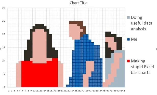
Let’s break down what’s happening here in simpler terms. We have an Excel spreadsheet being used in a very unusual way. Normally, Excel is a tool for organizing data in tables, doing calculations, and creating charts that help us see patterns in the data. A standard Excel bar chart would have solid bars showing, say, sales numbers or time spent on tasks. But in this image, the person literally colored each cell (those little rectangular boxes in the spreadsheet grid) to create a pixelated picture that looks like three blocky people. It’s as if Excel’s cells became the pixels of a digital drawing. One figure is big and red, the one in the middle is tall and blue, and the one on the right is smaller and gray-blue. They even left the light gray gridlines on, so it truly looks like some retro video game art or a spreadsheet_art mosaic. This is definitely not how you’re supposed to use Excel’s charting features!

Now, what do these colored figures represent? Excel charts usually have a legend – a little box that explains what each color stands for. In this meme’s legend (on the right side of the chart), the colors are labeled in a funny way:

  • The red color (big left figure) is labeled “Making stupid Excel bar charts.”
  • The blue color (tall middle figure) is labeled “Me.”
  • The light gray color (small right figure) is labeled “Doing useful data analysis.”

These labels are intentionally goofy and self-deprecating. Essentially, the chart is saying: I (blue) spent way more time making a stupid Excel bar chart (red) than I spent doing useful data analysis (gray). Instead of actually analyzing the data (which was the useful part of the job), most of the effort went into creating this silly art-project of a chart. And yes, they literally put themselves as one of the chart categories (“Me” in blue) – that’s part of the joke. It’s very meta: the person became a bar in their own bar chart to illustrate how they used their time.

This highlights a classic DataScienceHumor situation: someone got distracted by making a chart look fancy and lost focus on the actual data analysis. In the world of data science and analytics, you’re supposed to spend time exploring the data, finding trends, and drawing conclusions (that’s the “useful data analysis”). But tools like Excel also let you do all sorts of formatting and design. It’s easy, especially when you’re new or procrastinating, to spend too much time tweaking colors, fonts, or in this extreme case, coloring each cell to make pixel art. That’s what we call over-engineering or sometimes just plain timewasting_visualizations – doing something elaborate and unnecessary when a simple approach would work better. It’s like using Excel as a graphics program (think Microsoft Paint) instead of a spreadsheet.

Let’s define a couple of terms here:

  • Over-engineering: This means making a solution more complicated than it needs to be. In this meme, using Excel to manually draw pixel people is a comically extreme way to present information. A simple bar chart (or just a sentence saying “I spent more time doodling than analyzing”) would’ve gotten the point across. Over-engineering often happens when someone either wants to show off or is avoiding the real task.
  • Data visualization: This is the practice of showing data in a visual form like charts or graphs so that people can understand it easily. Good data visualization is about clarity – showing the data without distraction. Here the DataVisualization principle is kind of turned upside down: the visualization is so elaborate it actually hides or replaces the data! The “data” in this chart is basically a joke about the person’s time allocation.
  • Excel: A popular spreadsheet program that lots of businesses use for everything from budgets to simple databases. Because it’s so flexible, people sometimes push it beyond its limits. (Entire inventory systems or complex calculators in Excel? Seen it, done that.) There’s even a subculture of making art and games in Excel for fun, which this meme is referencing.

For a junior developer or analyst, the meme is a light-hearted warning. It’s normal early on to get a bit obsessed with making your output look perfect. Maybe you’ve spent an afternoon making an Excel spreadsheet super pretty – color-coding cells, adding fancy conditional formatting – or you’ve written code that generates ASCII art in the terminal, not because it’s needed but because it’s cool. We’ve all been there, tweaking the visuals instead of double-checking the results. This meme exaggerates that habit to an extreme for comedic effect.

Think of it this way: The person had data to analyze (perhaps some numbers they needed to crunch). Instead of focusing on that task, they turned the spreadsheet into a mini art project. The context_tags like excel_pixel_art_chart and chart_abuse exist because, yes, people actually sometimes create pixel art or games in Excel as a quirky challenge. It’s fun, but it’s definitely not “doing useful data analysis.” In a professional setting, if you told your boss you spent all day on a report and then showed this chart, you’d probably get a bewildered look (if not an eye-roll). The legend’s “Making stupid Excel bar charts” label suggests the meme’s author is poking fun at themselves. They know it was a silly misuse of time, and that self-awareness is what makes it DeveloperHumor. It’s funny to others because it’s a relatable mistake – spending far too long on the wrong thing.

In summary, this meme uses an exaggerated scenario to deliver a piece of wisdom: prioritize the important work (analysis) over the tempting visual embellishments. You can imagine an experienced mentor smiling and saying, “Cool picture, but did it help you get the answer you needed?” It’s a gentle ribbing of anyone who’s ever procrastinated by OverEngineering something in a spreadsheet (and there are plenty of us who have!).

Level 3: Pivoting to Pixelation

At first glance, this Excel masterpiece is a case of extreme over-engineering in data visualization. A seasoned data scientist or developer might chuckle (or cringe) at the sheer audacity of turning a spreadsheet into an 8-bit art canvas. Here we have what should be a simple bar chart of time allocation, but our enterprising analyst has literally colored each cell to create pixel-art silhouettes of people. This is Excel’s grid used as a low-res drawing board, a stunt that screams “I have too much time (and too many cells) on my hands.” It’s a perfect example of how a quick analysis task can balloon into a spreadsheet_art project worthy of a museum of misused software.

Why is this funny to experienced folks? Because it's chart_abuse at its finest. Imagine being in a data science team meeting: one team member was supposed to analyze the data, but instead they spent hours meticulously shading cells to produce a blocky portrait of themselves (blue series = "Me") standing next to the colossal red figure of wasted effort (red series = "Making stupid Excel bar charts") and a tiny gray figure of actual work done (light gray series = "Doing useful data analysis"). The legend_joke labels make it explicit: the time spent on real analysis is dwarfed by time spent on this absurd Excel art project. It’s a self-deprecating punchline that hits home for any developer who’s watched a simple task spiral into a rabbit hole of pointless tinkering. We've all seen ProductivityLoss like this—situations where someone burns an afternoon on decorative flair instead of delivering insights or features. The humor comes from that shared “I’ve been there, and it was ridiculous” feeling.

From a senior perspective, there’s an element of dark comedy in using ExcelSpreadsheets as your art supply while the actual DataScience gets timeboxed into oblivion. “Timeboxing” usually means allocating a fixed short period to a task—here it implies the person gave themselves a tight slot for analysis and used the rest to indulge in pixel art. This is the OverEngineering trope manifested visually: like writing 500 lines of code and a custom UI just to output "Hello World". In the realm of DataVisualization, it violates every principle of clarity and efficiency. Edward Tufte (the godfather of data visualization) would have a heart attack seeing this much chartjunk overshadowing the data. The default Chart Title still sitting atop the graph (oops, they didn’t even bother to name it!) is the cherry on top, showing that after all that effort on aesthetics, the basics got neglected. Seasoned developers recognize this pattern: focusing on timewasting_visualizations and polish before substance is a trap one falls into when the actual work either feels boring or when trying too hard to impress.

On a technical level, there's some grudging admiration: not everyone would think to exploit Excel’s grid to make pixel people. It's a bit like using a hammer’s blunt end to paint a picture on the wall – clever in a twisted way, but absolutely not what the tool is for. Excel is incredibly flexible (people have built entire to-do apps and even spreadsheet_art games in it), but with great power comes great temptation to over-engineer. An experienced engineer might dryly joke, “Sure, Excel can do that – but should it?” This meme nails that question. The absurdity of a bar_chart_people_meme highlights the misuse of a familiar tool: instead of using Python, R, or proper BI software for analysis, someone stuck to the comfort (or corporate mandate) of Excel and went wild. It’s both hilarious and painfully relatable when you’ve seen enterprises run critical processes on fragile Excel macros or analysts spending days making slides pretty. The industry has long-standing DataScienceHumor about this: Excel is often the duct tape of data analysis, holding together workflows in clunky ways. This image just takes that to the next level by turning duct tape into glitter art.

In essence, the humor resonates because it’s DeveloperHumor meets DataScience reality. It's a parody of our worst instincts: sacrificing actual progress for an overly-elaborate presentation. Senior folks have learned (often the hard way) that insight > aesthetics when it comes to data. But seeing someone literally paint that lesson onto a chart – with themselves as the blue “Me” bar looking at the towering red “wasted effort” bar – is next-level meta. It's the kind of joke you laugh at, then maybe forward to the team with a cautionary caption: "Don't be this person." And hey, at least this Excel pixel_art_chart didn’t bring production down at 3 AM – it merely murdered an afternoon’s productivity. Small mercies, right?

Description

A clever meta-meme where a bar chart is used to create a pixel-art representation of the classic 'Distracted Boyfriend' meme. The chart, titled 'Chart Title', is composed of many small, colored bar segments on a grid. These segments form the image of a man in a blue shirt looking back at a woman in a red dress, while his girlfriend in a light blue top looks on disapprovingly. A legend on the right clarifies the joke: the girlfriend represents 'Doing useful data analysis', the distracted boyfriend is labeled 'Me', and the woman in red is 'Making stupid Excel bar charts'. The humor lies in the self-referential act of spending an inordinate amount of time on a frivolous, unproductive task (making a meme in Excel) as a way to procrastinate on the actual, important work of data analysis
Comments

7
Anonymous ★ Top Pick They say a picture is worth a thousand words. This chart is worth a thousand rows of unanalyzed data and one very amused, but very unemployed, data scientist
  1. Anonymous ★ Top Pick

    They say a picture is worth a thousand words. This chart is worth a thousand rows of unanalyzed data and one very amused, but very unemployed, data scientist

  2. Anonymous

    We replaced the Hadoop cluster with a real-time Kafka → Flink → Snowflake pipeline, and the VP still exports to Excel to hand-paint a bar-chart self-portrait - turns out our BI bottleneck is pixel density

  3. Anonymous

    The real irony is spending 3 hours perfecting the pixel art in a chart about wasting time on charts, then realizing you could've built an entire dashboard in Tableau in half that time - but where's the fun in that when you can abuse Excel's cell formatting to create art?

  4. Anonymous

    This chart perfectly captures the Pareto Principle in reverse: 80% of your time goes into making the chart look presentable, 20% into the actual analysis. The real kicker? You're using Excel's default chart engine instead of matplotlib or D3.js, which means you'll spend another hour fighting with axis labels and legend positioning. At least when the stakeholder asks 'can you make it pop more?' you'll have already invested enough sunk cost to justify starting over in PowerBI

  5. Anonymous

    Pareto principle for data viz: 80% time formatting sparklines, 20% querying the actual data

  6. Anonymous

    We built Kafka→Spark→Snowflake; the dashboard is an Excel bar chart of our faces - apparently self‑service BI means making 8‑bit selfies

  7. Anonymous

    Enterprise analytics: six hours perfecting conditional formatting, zero minutes reducing variance - yet the slide deck claims our time‑to‑insight improved

Use J and K for navigation