Skip to content
DevMeme
7286 of 7435
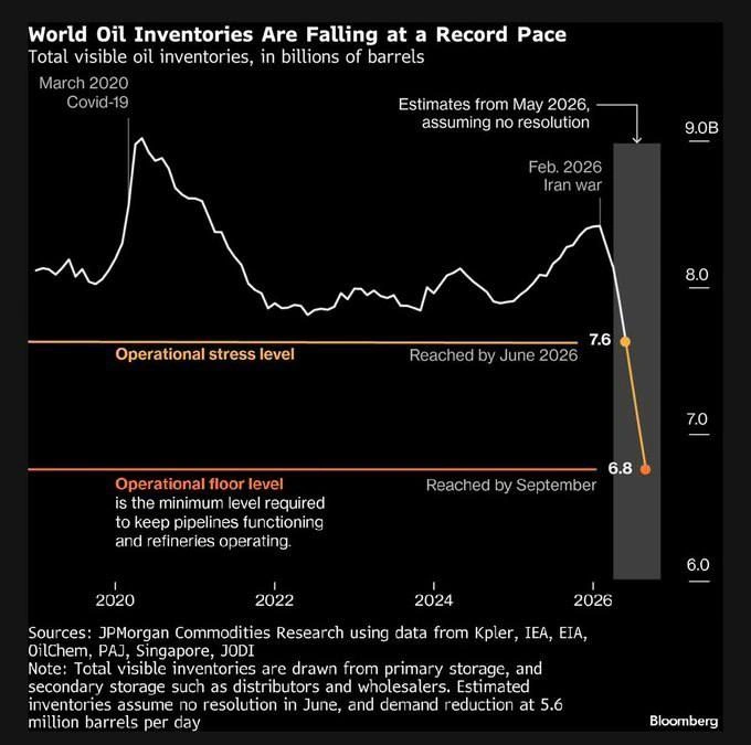
Bloomberg Chart: World Oil Inventories Plunging Toward Operational Floor by 2026
DataVisualization Post #7986, on May 10, 2026 in TG

Bloomberg Chart: World Oil Inventories Plunging Toward Operational Floor by 2026

Why is this DataVisualization meme funny?

Level 1: The Pantry Is Running Low

Imagine your family keeps a big pantry so dinner happens every night even when the grocery store has a bad week. This picture is a chart of the whole world's fuel pantry. It was overflowing in 2020 when everyone stayed home, and now, after a war started, it's emptying faster than ever. The orange line marks "we should worry," and the red line marks "the kitchen literally can't cook anymore." The chart predicts we hit worry by June and can't cook by September. The person sharing it added, basically: "hope you enjoyed your trips already" — gallows humor about gas pumps, the same nervous laugh you do when the snack drawer is down to one granola bar.

Level 2: Reading the Dashboard

Translating the chart's vocabulary for anyone new to either oil markets or monitoring:

  • Inventories are buffers — the global equivalent of a message queue between producers (wells) and consumers (cars, planes, factories). Buffers absorb shocks; when supply hiccups, you drain the buffer instead of halting consumers.
  • Operational stress level (orange, 7.6B) is the soft limit: the system still works, but with no slack. Think 85% disk usage — the pager warning that says act now while acting is still cheap.
  • Operational floor level (red, 6.8B) is the hard limit: below this, the machinery of distribution itself stalls. Equivalent to actual disk-full — writes fail, and the failure cascades.
  • The gray shaded region is a forecast, not data. The note spells out its assumptions, which is exactly what you should demand of any projection before panicking (or deploying).
  • The annotations ("Covid-19", "Iran war") tie inflection points to causes — the chart equivalent of linking a metrics spike to a deploy marker.

The channel poster's comment about travel is the joke layer: if the white line follows the gray projection, fuel gets scarce and expensive, and your vacation becomes the load that gets shed first.

Level 3: Capacity Planning for a Planet

This isn't a meme at all — it's a Bloomberg chart titled "World Oil Inventories Are Falling at a Record Pace", shared in a dev channel under an #offtopic tag with a dry "hope you already had enough enjoyment from traveling this year." But look at what it actually is, structurally: a production-grade incident dashboard for the largest distributed system humans operate. Every engineer who has stared at a disk-usage or connection-pool graph at 3 AM will recognize the grammar instantly.

The white time-series tracks total visible oil inventories in billions of barrels from 2020 to 2026. Two annotated events bound the story: the "March 2020 Covid-19" peak near 9.0B (demand collapsed, storage overflowed — the one time in history the buffer was too full, when oil futures briefly went negative because nobody had anywhere to put the stuff) and "Feb. 2026 Iran war", after which a gray-shaded projection band plunges the line through two horizontal thresholds. And those thresholds are pure SRE semantics: an orange "Operational stress level" at 7.6B ("Reached by June 2026") — your warning alert — and a red "Operational floor level" at 6.8B ("Reached by September"), defined right on the chart as "the minimum level required to keep pipelines functioning and refineries operating." That's not "low inventory"; that's the dead-letter floor. Below it, the system doesn't degrade gracefully — pipelines need minimum pressure and refineries need minimum throughput, the same way a database below a certain cache hit rate doesn't get slower linearly, it falls off a cliff.

The chart-craft itself is worth studying as data visualization: threshold lines with plain-language definitions attached, projections visually segregated in a shaded band with an explicit assumptions note ("assuming no resolution in June, and demand reduction at 5.6 million barrels per day"), sources enumerated (JPMorgan Commodities Research via Kpler, IEA, EIA, OilChem, PAJ, Singapore, JODI). Most internal dashboards fail every one of these practices — unlabeled red lines, forecasts drawn in the same style as measured data, zero stated assumptions. JPMorgan's analysts annotate their doomsday scenarios better than most teams annotate their staging metrics.

Description

A dark-themed Bloomberg line chart titled 'World Oil Inventories Are Falling at a Record Pace', subtitled 'Total visible oil inventories, in billions of barrels'. A white line tracks inventories from 2020 to 2026, with annotations for 'March 2020 Covid-19' (a peak near 9.0B) and 'Feb. 2026 Iran war', after which a steep projected drop (shaded gray, 'Estimates from May 2026, assuming no resolution') falls to 7.6B at the orange 'Operational stress level' line ('Reached by June 2026') and 6.8B at the red 'Operational floor level' line ('Reached by September'), defined as 'the minimum level required to keep pipelines functioning and refineries operating'. Footer cites JPMorgan Commodities Research using data from Kpler, IEA, EIA, OilChem, PAJ, Singapore, JODI, with a note that estimates assume no resolution in June and demand reduction at 5.6 million barrels per day. Not a developer meme - this is geopolitical/energy news content, though it exemplifies effective threshold-annotated time-series visualization
Comments

4
Anonymous ★ Top Pick Finally, a production system where 'running below operational floor level' isn't just our on-call dashboard - and their rollback plan is somehow worse than ours
  1. Anonymous ★ Top Pick

    Finally, a production system where 'running below operational floor level' isn't just our on-call dashboard - and their rollback plan is somehow worse than ours

  2. dev_meme 2mo

    And apparently nobody knows when Insider Trading Championship is ending 🤷‍♂️

    1. @NickNirus 2mo

      you're asking when the people whose "net worth" is going up are going to willingly stop that number from going up?

  3. @SamsonovAnton 2mo

    Who still needs real traveling when Google Maps with Street View are out there? 🤓

Use J and K for navigation