Skip to content
DevMeme
3878 of 7435
Customer Experience Analytics Goes Sideways
DataScience Post #4222, on Feb 17, 2022 in TG

Customer Experience Analytics Goes Sideways

Why is this DataScience meme funny?

Level 1: Words Bumped Together

It is like writing two normal words on a poster, but putting them so close together that people read a silly new word by accident. The company wanted to say something serious about understanding customers, but the spacing made everyone see the wrong phrase first. The joke is that one tiny layout mistake steals all the attention from the fancy business idea.

Level 2: Analytics Meets Kerning

Customer experience means how customers feel while interacting with a product, service, website, app, or company. Analytics means collecting and studying data to understand behavior. Put together, customer experience analytics usually means measuring things like satisfaction, user journeys, support issues, conversion paths, and drop-off points.

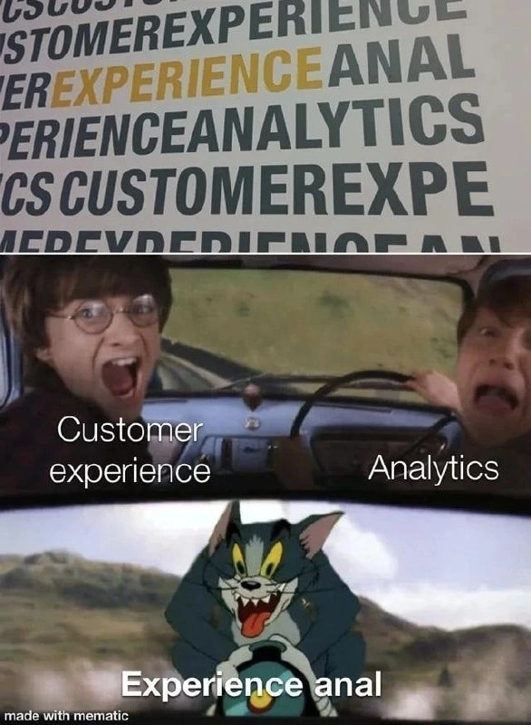
The image turns that serious phrase into a joke by showing how presentation can change meaning. The top wall graphic uses big uppercase words packed closely together. Because of where the crop and line break land, EXPERIENCE ANALYTICS becomes visually readable as EXPERIENCE ANAL. The bottom meme then labels the characters as if Customer experience and Analytics accidentally created that awkward third phrase.

For a junior developer, this is similar to building a responsive UI and only testing it on your own laptop. Everything looks fine until someone opens it on a smaller screen and the label Analytics Dashboard wraps in a way that makes the page look broken or ridiculous. That is why teams test real layouts, not just data models.

This connects naturally to data visualization, marketing tech, and business intelligence. These areas are full of labels, charts, dashboards, and executive-facing copy. A small visual mistake can overpower the actual analysis, because humans notice language accidents faster than they notice carefully prepared metrics.

Level 3: The Newline KPI

The top half of the image shows a corporate wall graphic where the intended phrases are variations of:

CUSTOMER EXPERIENCE EXPERIENCE ANAL EXPERIENCE ANALYTICS

The problem is not the concept of customer experience analytics. The problem is that the visual layout lets EXPERIENCE collide with the first four letters of ANALYTICS, creating the accidental phrase EXPERIENCE ANAL. The lower meme panel turns that typography bug into a chase scene: one character is labeled Customer experience, another is labeled Analytics, and Tom appears in the mirror labeled Experience anal.

That is painfully familiar to anyone who has shipped dashboards, BI reports, marketing pages, onboarding screens, or enterprise software with too much jargon and too little final review. Data analysis and customer relationship management are supposed to produce clarity. Here, the highest-signal finding is that the word wrap betrayed the brand team.

The humor is sharper because corporate analytics language already sounds manufactured. "Customer experience analytics" is the kind of phrase that can mean anything from serious behavioral instrumentation to a slide deck with three funnels and a heatmap nobody trusts. When the layout accidentally emphasizes the wrong substring, it reveals how fragile the polished presentation is. One bad break in a wall graphic turns strategic insight into office comedy.

This is also a quiet UX lesson. Text is interface. Spacing is interface. Line breaks, cropping, capitalization, and proximity all affect what users read first. A system can contain technically correct words and still communicate nonsense because visual hierarchy changed the parse. The meme is not really mocking analytics as a discipline; it is mocking the corporate habit of assuming that if the right buzzwords are present, the message must be clear. The font would like to file an incident report.

For developers, this belongs in the same family as accidental button labels, badly truncated filenames, table columns that spell something cursed when squeezed, and localization strings that expand beyond their containers. The code may have passed. The data may be accurate. The screenshot in production is still going to be what everyone remembers.

Description

The image combines a cropped corporate-style wall graphic with a meme from an animated car scene. The top text repeatedly shows fragments like "CUSTOMER EXPERIENCE", "EXPERIENCE ANAL", and "EXPERIENCE ANALYTICS", with the line break accidentally emphasizing "EXPERIENCE ANAL". In the lower meme panel, two characters in a car are labeled "Customer experience" and "Analytics", while Tom from Tom and Jerry appears in the rear-view mirror labeled "Experience anal"; a small "made with mematic" watermark appears at the bottom. The developer-adjacent humor is about business intelligence and customer analytics producing absurd outcomes when typography, naming, and corporate jargon collide.

Comments

2
Anonymous ★ Top Pick The KPI was customer insight, but the highest-signal metric turned out to be the newline.
  1. Anonymous ★ Top Pick

    The KPI was customer insight, but the highest-signal metric turned out to be the newline.

  2. @NiKryukov 4y

    made with mematic

Use J and K for navigation