Skip to content
DevMeme
481 of 7435
The Unholy Alliance of CSS Vertical Alignment and Existential Dread
Frontend Post #552, on Aug 13, 2019 in TG

The Unholy Alliance of CSS Vertical Alignment and Existential Dread

Why is this Frontend meme funny?

Level 1: Poster on the Wall

Imagine you want to stick a poster exactly in the middle of your wall. Sounds simple, right? But when you try, it’s always a little too high or too low, never just right. You measure one side, adjust the poster, then the other side looks off. You keep trying and trying, and it’s still not perfectly centered. It gets so frustrating that you almost want to scream or give up. This meme is joking that computer programmers feel the same way when they try to center something on a webpage. These are people who do super complicated things with computers, but this one little task – putting something right in the middle – makes them want to tear their hair out. It’s funny in a kind of oh no! way, because you wouldn’t expect experts to struggle with something so simple. It’s like seeing a teacher get stumped by a basic riddle that even kids find easy – you can’t help but chuckle. The meme even jokingly compares the frustration to feeling really, really awful (so awful it uses a dark joke about wanting to quit altogether). Of course, it’s an exaggeration – the humor comes from exaggerating how upset something small can make us. In the end, it’s funny because it’s so relatable: everyone has experienced being driven crazy by a task that seems easy but just won’t cooperate, and sometimes all you can do is laugh about how silly it is to get that upset.

Level 2: Stack Overflow Solace

Let’s unpack why all these images are focusing on CSS vertical alignment and why developers find it so challenging (and funny). CSS stands for Cascading Style Sheets, and it’s the language we use to style and lay out web pages (the “frontend” stuff users see). Now, “centering” in web design often means two things: centering something horizontally (left-right) or vertically (top-bottom). Horizontal centering in CSS is usually straightforward – for example, to center a block element, you can give it a fixed width and use margin: 0 auto; (which automatically divides leftover space equally on left and right). But vertical centering… that’s where the headache begins. For many years, there was no single obvious CSS property to simply center an element vertically within its parent container. Beginners would try something logical like vertical-align: middle on a <div>, only to discover it does nothing in that context. (Little detail: vertical-align only works for table cells or inline elements, not ordinary block containers.) This confusion has tripped up countless newcomers and even seasoned devs who just blank on it because they do it infrequently. It became one of those classic FrontendPainPoints you see asked over and over on forums. In fact, “How do I center a div vertically?” is a famously common question on Stack Overflow, which is a popular Q&A site where developers ask coding questions and share answers. Going to Stack Overflow for help is so routine that we jokingly call it seeking Stack Overflow solace – comfort in knowing someone out there has had the same problem and a solution is already posted.

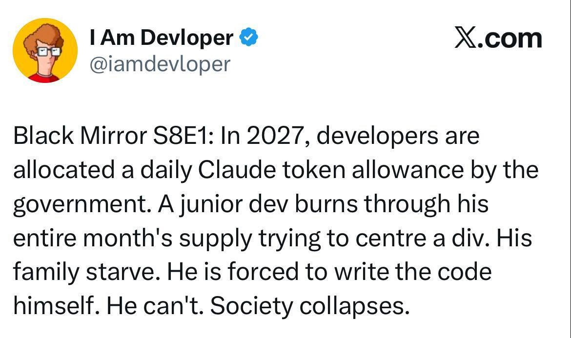
The meme’s Google Images screenshot shows a search query that’s… well, quite dark: “meme programming suicide”. The person presumably was searching for programming memes about extreme frustration (using “suicide” in a hyperbolic way). And Google responded by showing a bunch of FrontendHumor memes specifically about CSS vertical alignment. That implies a funny equivalence in the internet’s eyes: programmers being frustrated to the point of dark humor is strongly linked to vertical_alignment_woes in CSS. In those image thumbnails, we can identify the theme: they all joke about how something as simple sounding as aligning content to the middle can drive a developer up the wall. One image jokes that after achieving incredible feats like space jumps or moon landings, we humans still struggle with centering in CSS. Another is a mock scenario (drawn like an XKCD comic) where failing to solve vertical centering has dire consequences (like failing to defuse a bomb in time). These are obviously exaggerated scenarios for comic effect, playing on the idea that even senior developers can be brought low by this problem. It’s a very RelatableDeveloperExperience: everyone in web development has had that “why on earth is this not centering?!” moment. The developer experience (DX) of encountering this problem is often feelings of confusion, frustration, and a bit of embarrassment. That’s why memes about it are so popular – it’s cathartic to laugh at a shared struggle.

So, why was it so hard historically? Before modern CSS layout tools, developers had to use tricky pre-flexbox_hacks to center things vertically. For example, one common trick was to use an element with display: table-cell and then use vertical-align: middle; – effectively pretending your DIV was a table cell so the vertical-align property would actually center the content. Another hack: wrap the element you want to center in a container, and then use position: relative on the container and position: absolute on the child element to literally position it halfway down and halfway right, then use a transform to adjust (“translate”) by half its own width and height. It’s okay if that sounds a bit convoluted – it was! Here’s a quick look at what that might look like in code:

/* Old-school CSS centering hack: absolute positioning and transform */
.parent {
  position: relative;               /* Establish a positioning context */
}
.child {
  position: absolute;
  top: 50%; left: 50%;             /* move the child to the center of parent */
  transform: translate(-50%, -50%); /* adjust back by half the child’s size */
}

/* Modern solution: Flexbox centering (simpler and more intuitive) */
.container {
  display: flex;                   /* make the container a flex layout */
  align-items: center;            /* center items vertically in the container */
  justify-content: center;        /* center items horizontally in the container */
}

In the above snippet, the first .parent .child method was a common workaround for lack of a direct centering tool. The second .container style shows how CSS Flexbox simplifies things: just turn the container into a flex container and use align-items: center (for vertical centering) and justify-content: center (for horizontal centering). With flexbox (and likewise with CSS Grid), the CSS language finally gave us a straightforward way to center an element both ways. By 2019, Flexbox was well-supported in browsers, so developers had started using it widely. However, the meme suggests that despite these new tools, the topic “how to center with CSS” was still causing searches and jokes. This could be because not everyone had fully transitioned to the new techniques, or simply because the running joke persisted. It’s a bit of both: plenty of legacy projects still used older CSS layouts, and lots of devs just remember the pain so well that they joke about it reflexively. Also, even with flexbox, you need to remember the exact properties (align-items, etc.), and under stress it’s easy to forget and just Google it (especially if you’re a backend developer dabbling in frontend, for instance).

The DeveloperHumor aspect comes from how disproportionate the struggle feels. As a junior developer (or even an experienced one), you might be building something complex, yet you get absolutely stumped by something that sounds like it should be one line of code. It’s that moment of “Is it just me? Why can’t I do this simple thing?” When you discover there are dozens of memes and Stack Overflow threads on the exact same issue, it’s equal parts relieving and comical. You realize it’s not just you – aligning things in CSS has been a notorious problem forever. The humor is in the shared exasperation. In developer culture, we often cope with frustration by joking about it. So a meme saying “CSS IS AWESOME” in bold letters might actually be using sarcasm, implying the opposite (because at that point, the person might feel CSS is anything but awesome). When you see a meme that says “I hate CSS”, it’s expressing that love-hate relationship: CSS is powerful, but it has these quirks that drive people crazy. Frontend folks especially bond over these quirks. The term FrontendHumor just means jokes about front-end development – and CSS centering is one of its classic topics. All in all, what we see in that Google Images screenshot is essentially the internet’s collective laugh (and cry) about a tiny CSS problem that everybody knows too well. It’s both funny and comforting – funny because of the absurdly dramatic scenarios portrayed, and comforting because it’s a reminder that if you’ve struggled with this, you’re part of a very large club.

Level 3: Absolute Position, Relative Madness

By now you’d think something as basic as centering an element would be a solved problem in CSS – but reality laughs in our faces. The meme shows a Google Image search for “meme programming suicide”, and guess what comes up? An entire gallery of vertical alignment woes. It’s like Google itself confirms that centering with CSS is the ultimate trigger for DeveloperFrustration. All those thumbnails read like a support group for battle-scarred front-end devs. We see an XKCD-style comic where defusing a bomb depends on writing the correct CSS to vertically center an element – the poor dev has “ten seconds” and no help from Stack Overflow. (Spoiler: he fails. Boom. That’s the dark punchline.) Another meme dramatizes a real-life space jump (Felix Baumgartner’s skydive from the edge of space) captioned “Still can’t properly vertically align CSS”. There’s the classic rage face yelling “CSS Y U NO HAVE EASY VERTICAL ALIGNMENT”. Even a Moon-landing joke: “44 years ago we put a man on the moon, yet we still can’t vertically centre things in CSS.” This is TechHumor drawing on a painful truth: despite decades of web evolution, senior developers still find themselves humbled – nay, broken in spirit – by the simple task of centering content.

Why is this so hilariously brutal? It’s a perfect storm of historical quirks in CSS and shared trauma. In the early days of web design (think pre-flexbox era), HTML and CSS were not initially designed for complex page layouts. HTML was meant for documents, so vertically centering something in the middle of a page wasn’t a priority. We had a <center> tag in old HTML, but that only did horizontal centering (and is now deprecated for good reasons). Classic CSS (CSS2.1 and earlier) provided vertical-align: middle, but – here’s the catch – it only works inside table cells or for inline elements. So if you naively slap vertical-align: middle on a normal <div>, nothing happens. It’s a no-op, leaving you staring at the screen in despair. This is why countless devs have banged their head on the desk, thinking “Why is this so hard? Am I missing something obvious?” It’s practically an existential_css_crisis: “Am I even a real developer if I can’t center a freaking div?!” One of the images literally poses the question: “Am I real? Is the world real? Are we living in a computer simulation? And do our overlords have problems with aligning vertically in CSS?” – a tongue-in-cheek reference to how universe-level questions seem easier than CSS layout.

Over the years, FrontendPainPoints like this led to a plethora of pre_flexbox_hacks. Seasoned devs (with enough stack overflow karma to prove it) remember the dark arts required: wrapping content in extra containers with display: table-cell; vertical-align: middle; to fake a table structure, or the infamous absolute positioning trick (set the parent position: relative, child position: absolute; top: 50%; left: 50%; transform: translate(-50%, -50%);). These hacks felt like sacrificial rituals to appease the CSS gods – sometimes they worked, but often with side effects. Miss one detail (like forgetting to set the parent’s height or position context) and your element ends up hugging the top again, grinning at your misery. Many a relatable developer experience involves scouring forum threads at 3 AM, trying five different snippets from Stack Overflow answers to get that one pesky button centered in a modal. StackOverflow_solace is real: knowing others asked “How do I vertically center in CSS?” a thousand times over at least assures you you’re not alone.

Fast-forward to the modern era: CSSFlexbox and CSS Grid emerged as heroes to finally slay this particular demon. By 2019 (when this meme post appears), any senior dev should be using display: flex or grid’s nifty one-liners to center things. And indeed, Flexbox makes vertical centering as easy as align-items: center on a container. So why are we still joking about it? Because DeveloperExperience_DX is as much about mental habits and legacy code as new specs. First, not every project allows the luxury of ditching old CSS methods – you might be maintaining a legacy codebase with older browser support where flexbox isn’t fully viable. Second, even with modern CSS, humans forget exact property names or the required parent conditions. How many “senior” devs quickly Google “CSS center div” just to copy-paste the snippet, because who can recall the precise flexbox incantation under pressure? It’s a running joke that even the most experienced front-end engineers have their moments of Impostor Syndrome when a 5px misalignment drives them up the wall. A seemingly trivial task becomes a humbling reminder that DeveloperHumor often springs from truth: we build crazy complex apps, but a CSS alignment can still make us feel utterly incompetent. The meme’s dark hyperbole – equating CSS frustration with suicidal thoughts – taps into that shared feeling of hopelessness (in a very tongue-in-cheek way). It’s dark comedy: “vertical alignment in CSS and suicide are synonymous, right?” – obviously an exaggeration, but after you’ve spent an hour on a silly alignment bug, it kinda feels that dire in the moment.

In essence, this meme collage resonates because it satirizes a universal Frontend experience. The fact that typing a despairing query into Google returns exclusively CSS centering memes is comedic gold and a bit of an internet-age omen. It shows how deeply this vertical centering problem is ingrained in developer culture. We joke that we can deploy neural networks and launch rockets, yet aligning a <div> vertically can still break our will. The DeveloperExperience of CSS has improved (hello Flexbox/Grid), but the legend – and the laughs – live on. Even in 2019, the phrase “CSS is Awesome” appears in the search results as a sarcastic graphic, right next to “I hate CSS”. It’s a love-hate relationship. The senior perspective here is equal parts cynicism (“I’ve seen this nightmare before”) and commiseration (“oh boy, here we go again”). After all, every dev, no matter how advanced, has that kryptonite task that sends them crawling back to Google. And for front-end folks, historically, that task was centering something vertically. The meme just pours salt in the wound – and we can’t help but laugh at our own pain.

Description

A screenshot of a Google image search results page, taken on a mobile device. The search query in the bar at the top reads 'meme programming suicide', which is underlined in red, likely a spell-check artifact. The page displays a grid of various tech-themed memes, with the common thread being the extreme frustration associated with vertically aligning elements in CSS. Some visible meme titles or captions include 'Developer tries to align vertically with CSS, gets existential crisis instead,' 'MAN JUMPS FROM SPACE, STILL CAN'T PROPERLY VERTICALLY ALIGN CSS,' and a comic where a character fails to disarm a bomb because the instructions require CSS knowledge. This meta-meme captures the historical and cultural pain point within the web development community surrounding CSS layout challenges. It humorously implies that the difficulty of vertical alignment is so profound that it drives developers to dark thoughts, as evidenced by the search query itself and the resulting collection of memes

Comments

7
Anonymous ★ Top Pick They say modern CSS with Flexbox and Grid has solved vertical alignment. And yet, every senior dev still has a moment of cold-sweat-inducing PTSD when a designer says 'Can you just nudge that up a little bit?'
  1. Anonymous ★ Top Pick

    They say modern CSS with Flexbox and Grid has solved vertical alignment. And yet, every senior dev still has a moment of cold-sweat-inducing PTSD when a designer says 'Can you just nudge that up a little bit?'

  2. Anonymous

    We’ve shipped micro-frontends at scale, but the real zero-downtime migration will be the day we retire ‘margin-top: 50%; transform: translateY(-50%);’ from muscle memory

  3. Anonymous

    The real tragedy isn't that CSS vertical alignment was hard - it's that we spent years defending our table-cell hacks and negative margin calculations in code reviews, only to watch junior devs solve it with 'display: flex; align-items: center;' and wonder what all the fuss was about

  4. Anonymous

    The fact that 'meme programming suicide' autocompletes to CSS vertical alignment issues tells you everything about the collective trauma of an entire generation of frontend developers who lived through the pre-flexbox dark ages. We've sent rovers to Mars, trained neural networks to generate art, and built distributed systems spanning continents - yet for decades, centering a div vertically required either table hacks, absolute positioning with negative margins, or sacrificing a rubber duck to the browser gods. The real kicker? Modern solutions like flexbox and grid made it trivial, but the PTSD remains so strong that senior engineers still instinctively reach for `display: table-cell` before catching themselves

  5. Anonymous

    Before Flexbox, vertical centering was CSS’s CAP theorem: pick any two of pixel‑perfect, cross‑browser, and maintainable - the third involved a summoning ritual with translate(-50%, -50%)

  6. Anonymous

    CSS vertical centering is the distributed consensus of layout: you can have align-items:center, legacy support, and pixel-perfect design - pick two

  7. Anonymous

    CSS vertical centering: flexbox solved it for 95% of cases, leaving 5% to haunt your dreams like unmerged feature branches

Use J and K for navigation