When Your CSS Units Go Horribly Wrong
Why is this Frontend meme funny?
Level 1: Recipe for Disaster
Imagine you’re baking a cake and the recipe says “add 5 teaspoons of sugar,” but you accidentally add 5 cups instead. 😱 The cake would explode out of the pan and make a huge sticky mess! In this meme’s case, a programmer was “measuring” something on a webpage. They meant to use a small unit (like teaspoons), but they used a big unit (like cups) by mistake. The result was way too much size – their webpage design puffed up huge and crazy, just like a cake that rises so much it spills everywhere. The funny picture of the shocked lady is like the baker’s face when they see the gigantic messed-up cake. It’s a big oops moment. The lesson is simple: using the wrong units – whether in cooking or coding – can turn a small change into a huge surprise!
Level 2: Absolute vs Relative
Let’s break down the joke for newer developers. In CSS (Cascading Style Sheets), we use units to specify sizes. Two common units are px and em. The pixel (px) is an absolute unit – think of it like a fixed tiny square on your screen. If you say something should be 5px wide, it will be exactly 5 pixels wide on the screen, regardless of anything else. It’s like saying “5px” is 5 units of screen length, a fixed amount.
On the other hand, em is a relative unit. What is it relative to? It’s relative to the font size of the element (or its parent, depending on context). Essentially, 1em equals the current font size being used. If your page’s base font size is 16px (which is the default in many browsers), then 1em = 16px. So if you write 5em, that means 5 times the current font size. If the base is 16px, then 5em = 5 × 16px = 80px. That’s a lot bigger! And if an element is inside a larger text container (say a heading with font-size 20px), 1em there would be 20px – making 5em equal 100px in that context. Relative units scale with typography.
Now, the meme’s text says: “When you write 5em instead of 5px.” This implies the developer meant to use 5px (a small, fixed size) but accidentally used 5em. That one-letter difference completely changes the outcome. This is a common front-end bug or mistake. For example, imagine you wanted a small margin or padding around a button, just 5px of space. If you accidentally put 5em, the browser will interpret it as much more space – possibly 80px or more – which can push the layout apart dramatically. The result? The page design looks broken or exaggerated — essentially the layout “explodes” out of proportion.
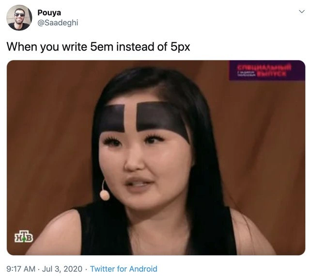
The image in the meme (a shocked woman on a talk show) is a reaction image conveying how a developer feels upon seeing their page after that mistake: utter shock. It’s like “Oh no, everything is huge and messed up, what did I do?!” The Russian text “СПЕЦИАЛЬНЫЙ ВЫПУСК” means “Special Episode,” adding a dramatic flair as if this bug is a special breaking-news disaster. This format (tweet text + reaction pic) is a popular meme style on tech Twitter to share humorous developer experiences. The humor comes from relatability: anyone who has done CSS has probably confused units or made a small typo that had big visual consequences. It highlights a Frontend humor and pain point: CSS can be very unforgiving with units and will happily turn a tiny request into a gigantic result if you use the wrong type of measurement.
To put it simply:
- 5px = five pixels, a fixed tiny size (like a few millimeters on the screen).
- 5em = five times the current text size, which is usually much larger (dozens of pixels).
Using the wrong one is like using the wrong scale for your design. The “layout explodes” part means the webpage’s structure broke in an extreme way – images or text might overflow, alignments break, or an element becomes comically oversized. It’s a classic responsive_design_mishap: mixing up relative vs absolute sizing. Beginners learn quickly that CSS units matter a lot. This meme is essentially a lighthearted warning: double-check your em and px!
Level 3: The Great Em-splosion
In the world of frontend styling, a tiny typo can unleash cascading chaos. When a developer accidentally writes 5em instead of 5px in their CSS, it’s like planting a bomb in the layout. Why? Because px (pixels) are an absolute unit – 5px is always exactly 5 little dots on the screen – but em is a relative unit that multiplies with font size. By default, most browsers set 1em = 16px (the default font size). So 5em isn’t 5 pixels – it’s 5 times the base size (often 5 × 16px = 80px). That’s sixteen times larger than intended! No wonder the layout “explodes.” A innocent-looking 5em can shove content off-screen, spawn giant gaps, or blow components out of their containers, triggering the dreaded infinite horizontal scrollbar. This meme nails a classic frontend pain point: using the wrong CSS unit and getting a hilariously disastrous result.
The tweet format sets the scene: “When you write 5em instead of 5px” – a scenario every CSS coder fears – and beneath it, a shock-faced woman from a Russian talk show. Her visibly shocked reaction mirrors the developer’s own horror when their interface suddenly scales to monstrous proportions. Imagine a button or text meant to have a tiny 5px padding; one stray “em” and that padding balloons relative to text size, perhaps pushing other elements around or breaking the responsive design completely. We’ve all had that heart-stopping moment seeing a UI in dev mode and going, “What on Earth happened to my layout?!” only to find a rogue CSS property using em where px was meant. It’s a rite of passage in web development: the em vs px slip-up. Senior developers chuckle because they know the struggle – one character off, and you’re debugging an “explosive” bug.
This highlights how CSS’s relative_vs_absolute_sizing can be a double-edged sword. Relative units like em (and its cousin rem) are powerful for responsive design – they scale with user settings and parent elements – but if they sneak in unintentionally, the scaling is unpredictable. For example, if a parent container has a larger font-size, that 5em expands even more, inheriting a bigger base. The effect compounds in nested elements (the infamous Russian nesting doll of font sizing), leading to layouts that either blow up huge or shrink unexpectedly. It’s a “Special Episode” of CSS mayhem, much like the Russian text “СПЕЦИАЛЬНЫЙ ВЫПУСК” on the meme image suggests. Experienced devs have learned (often the hard way) to double-check units because a single letter can invoke the CSS cascade of doom. They might quip, “Check your units – today’s 5px could be tomorrow’s 80px!” as a cautionary tale.
To visualize the bug, consider this snippet:
/* Base document font-size is 16px (common default) */
.container {
font-size: 16px;
}
/* Intended: a small fixed spacing or element */
.fixed-gap {
margin: 5px; /* 5 pixels margin, a tiny gap */
}
/* Oops: Relative unit used by mistake */
.relative-gap {
margin: 5em; /* 5 em margin = 5 * 16px = 80px gap! Layout goes boom */
}
In a real app, that .relative-gap might push other content so far apart that the whole page looks blown up or misaligned. The developer’s face ends up just like the woman in the meme: eyes wide, absolutely floored. The humor lands because anyone who’s wrestled with CSS knows how absurdly easy it is to cause an outlandish visual glitch with a simple unit mix-up. It’s the perfect storm of a trivial mistake yielding a massive visual bug, a scenario so common it hurts (and thus, we laugh). This meme speaks to developers with that shared “ugh, been there” feeling, turning a frustrating Frontend fiasco into a moment of communal DeveloperHumor.
Description
A screenshot of a tweet from user Pouya (@Saadeghi). The text of the tweet reads, 'When you write 5em instead of 5px'. Below the text is an image of a woman on what appears to be a TV show, evidenced by logos for the Russian channel NTV in the bottom left and a purple 'Special Edition' graphic in the top right. The woman has extremely large, thick, blocky, black eyebrows drawn on her face, creating a comical and unnatural look. The humor lies in the analogy to a common frontend development mistake. In CSS, '5px' is a small, fixed size, while '5em' is a relative unit equal to five times the current font size. If the font size is 16px, 5em becomes 80px, a massive difference. The woman's oversized eyebrows serve as a perfect visual representation of the disastrous result of accidentally using 'em' instead of 'px' for a small UI element

Comments
7Comment deleted
The junior dev writes 5em instead of 5px. The senior dev uses a design token that a junior dev changes to 5em in the theme file, breaking the entire component library in one commit
Mistype 5em for 5px and watch the badge swell to 80px - frontend’s reminder that “relative units” are basically distributed systems with typography
The difference between 5em and 5px is about the same as the difference between 'minor styling adjustment' in the commit message and the 47 broken viewports in production that somehow passed QA because everyone tested on the same screen resolution
The classic 'em' vs 'px' mistake - where your carefully crafted 5-pixel border suddenly inherits from a parent with font-size: 32px and becomes a 160-pixel monstrosity. It's the CSS equivalent of forgetting to normalize your units before production, except instead of breaking the layout, you've just given every element on the page eyebrows that would make Frida Kahlo jealous. Senior devs know: always check your computed styles, because relative units are like pointers in C - powerful when used correctly, catastrophic when you forget what they're actually referencing
5em instead of 5px: inheritance turns padding into recursion and your CTA into a billboard - this is why rem is adult supervision
Em units: inheriting font sins from parent selectors until your 'subtle' padding rivals a billboard
Type 5em instead of 5px and padding scales with the parent font-size; three nested components later you’ve implemented exponential growth - use rem with clamp() unless you collect horizontal scrollbars