Skip to content
DevMeme
1487 of 7435
The Magical World of CSS
Frontend Post #1666, on Jun 5, 2020 in TG

The Magical World of CSS

Why is this Frontend meme funny?

Level 1: Tea Party Gone Wrong

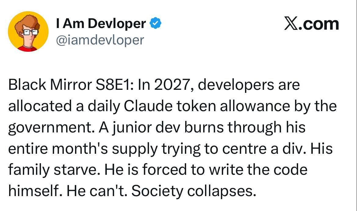
Imagine you’re setting up a pretend tea party. You have a cup, a saucer, and a teapot. Normally, you’d put the cup on the saucer and pour “tea” from the teapot right into the cup, right? Now picture a silly scene: the cup is on the floor far away from its saucer, and the teapot (in this case the girl is using a phone as a toy teapot!) is being tipped over nowhere near the cup. The little girl is smiling proudly as if everything is fine, but nothing is lined up – if this were real, the “tea” would spill all over the place because the cup isn’t under the teapot’s spout!

It looks funny and random. The parents on the couch notice this and at first they think it’s adorable that she’s playing pretend in her own way (the dad even says it’s like she’s playing with code, which is a joke because in real life her arrangement is as jumbled as bad computer code). But then they do a double-take because the setup is so odd. The dad jokes, “Who taught her CSS?” – now, you don’t need to know what CSS is to get the joke: basically he’s humorously blaming this goofy arrangement on someone teaching her something wrong. CSS is actually a computer language used to arrange things on a screen (like making a web page look pretty), and it’s famously tricky to get things to line up perfectly with it. So the joke is comparing the girl’s messed-up tea party layout to how a beginner’s code might mess up a web page layout. In super simple terms, it’s funny because the girl’s tea party is all messed up, and the parents pretend that she must have learned those “bad habits” from coding. It’s a playful way to say: lining things up can be hard – whether you’re a kid pouring pretend tea or a programmer arranging stuff on a website – and the result of doing it wrong is both humorous and a bit chaotic!

Level 2: Can’t Center a Div

This comic highlights a well-known struggle for web developers, especially those working on the front end of websites: getting things neatly aligned on a page. In the panels, a little girl is hosting a pretend tea party. But if you notice, her layout is all wrong – the teacup is nowhere near the saucer, and she’s “pouring” with a phone that isn’t actually over the cup. It immediately looks off. To someone who builds user interfaces, this scene screams “alignment issues!” It’s as if her toys are the HTML elements of a webpage, and they’re not lining up the way they should. The parents find it adorable at first (the dad even says, “Oh look, she’s playing with her code… cute.” in the second panel, equating her play to writing code), but then they suddenly realize her arrangement is pure chaos. That’s when the punchline drops: “Who taught her CSS?”

Why that line? Let’s unpack it. CSS stands for Cascading Style Sheets, which is the language developers use to style and position things on web pages. For example, if HTML puts a button or image on the page, CSS is what tells it “be red,” “be 200px wide,” or importantly, “sit right here on the page.” One of the first hurdles new front-end devs face is how to align elements – like centering a button or aligning an icon next to text. It sounds simple (just put it in the middle, right?), but historically it’s been surprisingly tricky. The phrase “center a div” (a <div> is a generic block element in HTML, often used as a container) has almost become a meme on its own. Early on, many of us tried seemingly logical things that just didn’t work. For example, a beginner might try something like:

  • Setting text-align: center on a container, which centers inline text but won’t center a block element like a div or an image (unless you do extra steps).
  • Or using vertical-align: middle hoping to center something vertically, not realizing that property only works in certain contexts (like table cells or inline elements, not on a standalone block by default).

The result of these misunderstandings? The element stays stubbornly off to the side or stuck at the top, much like the girl’s cup stubbornly sitting off away from the saucer. It’s a classic css_alignment_issue that every new developer wrestles with. The meme’s joke is basically: the girl’s chaotic tea set looks like a newbie’s attempt at CSS positioning.

Now, the tags CSSFlexbox and CSSGrid come into play as more modern solutions. As the field of front-end development advanced, the web community introduced new CSS modules to make layout easier. Flexbox (short for Flexible Box Layout) and Grid are two CSS systems designed to help with aligning and distributing space among items in a container. Here’s how they relate to the joke:

  • CSS Flexbox: Think of this as a one-dimensional layout tool – you can use it to arrange items in a row or a column and have fine control over how they spread out, align, and wrap. For example, if the girl’s teacup, saucer, and tumbler were three items inside a flex container (say a box representing the “table”), with the right CSS rules you could automatically space them evenly or center them together. Flexbox has properties like justify-content (which aligns items horizontally, e.g. to the center or spaced out) and align-items (which aligns items vertically in the container). A lot of “I can’t center this!” complaints went away once flexbox became widely used, because now you can center both horizontally and vertically with just a couple of CSS rules. If our little tea party host knew Flexbox, her cup and saucer would be neatly centered under the teapot phone!

  • CSS Grid: This is a two-dimensional layout tool – basically letting developers create a grid (think rows and columns like a spreadsheet or a table) and place elements into it precisely. Grid is super powerful for overall page layouts or complex arrangements. In the tea party analogy, if the floor was marked with a grid, the girl could place her cup in the exact cell under the teapot and the saucer right beneath the cup. Grid helps avoid misplacement by giving a structured layout framework. In developer terms, Grid has properties like grid-template-columns/rows to define the structure and grid-column/grid-row to place items. It’s like giving the child a playmat with specific spots for each item – much harder to go wrong.

Despite these tools, newbies (and even experienced devs working quickly) can still mess up alignment. If you don’t specify the right container or you misjudge how the browser calculates sizes, elements might not land where you expect. The misaligned_elements in the comic – cup away from saucer, etc. – perfectly represent the kind of result you get if you use CSS incorrectly. For example, forgetting to clear a float can make elements slip underneath each other, or not understanding the box model (how padding and margins work) can shift things unintentionally. A common early mistake is absolutely positioning multiple items without accounting for their parent container, which often leads to elements overlapping or drifting off, much like placing that tumbler far off to the side independently.

The parents’ reaction, especially the phrase “Who taught her CSS?”, is poking fun at how relatable this scenario is for developers. It’s as if they’re saying, “Only someone who’s been badly taught CSS would make things this misaligned!” It’s tongue-in-cheek: obviously no one taught the toddler CSS; she’s just playing. But the layout looks so much like a coder’s mistake that the parents jokingly act like she picked up bad coding habits. This hits home for developers because many of us learned CSS through trial and error, often teaching ourselves or copying snippets from the internet. In that learning process, it’s easy to develop some...shall we say, interesting habits that lead to messy layouts. The comic exaggerates this by implying even a child could inadvertently recreate those mistakes.

In terms of UX/UI, alignment is a fundamental aspect. Good user interface design demands that elements (buttons, text fields, images, etc.) line up in a logical and visually pleasing way. When things are out of alignment, users notice – it feels sloppy or confusing. In the tea party, the “user” (the little girl) is trying to interact (pour tea), but because her setup is off, it doesn’t work properly. It’s a funny analogy to a bad user experience caused by poor layout. If a real webpage had the login button off to the side and not under the form where it should be, people would be bewildered, much like the dad is bewildered by the off-kilter tea setup.

So, for a junior developer or someone just learning CSS, the takeaway from the meme is: alignment is a real skill in front-end development. It often feels as silly and frustrating as a wonky tea party when you start out. But now you know that tools like Flexbox and Grid exist to help. The comic is a lighthearted way to say “we’ve all been that little girl with the misaligned tea cups – but don’t worry, you’ll get better with practice (and proper tutorials!).” It’s relatable developer humor that also hints at the complexities of CSS. In the end, it’s both comforting and amusing: even something as simple as a child’s play can mirror the challenges of coding, and we can all laugh about how absurdly difficult centering a darn div used to be.

Level 3: Cascading Chaos

At first glance, the scene looks innocent enough: a little girl pouring pretend tea from a smartphone into a cup. But to an experienced developer, the misaligned elements of her tea set scream “CSS layout issue!” This four-panel comic brilliantly satirizes a classic Frontend nightmare – the notorious challenge of making things line up using CSS. The humor here stems from the juxtaposition of a child's play with a developer's pain: the girl's chaotic tea party layout is exactly what a web page can look like when your CSS styling goes off the rails. It’s a comedic nod to one of the classic FrontendPainPoints: aligning UI elements perfectly.

Why is this funny to a seasoned dev? Because we’ve all been that frustrated parent, wide-eyed at a screen, thinking “Who on earth wrote this CSS?!” In the comic, the father’s stunned face in Panel 4 – captioned “Who taught her CSS?” – mirrors a senior developer’s reaction on discovering a horribly misaligned page or a junior colleague’s quirky CSS. The parents are effectively saying, “How did she learn such questionable layout practices?” – as if CSS were a secret dark art corrupted her playtime. The joke lands because CSS layout is finicky; even professionals joke that CSS sometimes feels like it has a mind of its own (after all, how many of us have Googled “how to center a div” for the hundredth time?).

Under the hood, web layout has evolved through a series of hacks and solutions. Early on, positioning elements was handled by the normal document flow – basically, items just stack or line up as they come (like blocks naturally sitting one above the other). If you wanted something side by side or centered, you had to get creative. Old-school developers used to abuse the float property (originally meant for wrapping text around images) to create multi-column layouts. It worked but often resulted in unpredictable gaps or elements dropping to new lines if you forgot a clearfix. Vertical alignment was even more of a headache. In the wild west of early CSS, getting something perfectly centered vertically on a page felt like wizardry. We’d try things like setting position: relative on a parent and position: absolute on a child with magical top offsets, or using the dreaded vertical-align: middle on a block element and then scratching our heads when it did nothing. In fact, many beginners (and not a few veterans) have written code like:

.cup {
  vertical-align: middle; /* Trying to vertically center... but this only works on inline or table-cell elements, so here it's pointless */
}

…and then felt exactly like that little girl, proudly pouring tea beside the cup without realizing the mistake. The meme exaggerates this kind of innocent misalignment. The child’s cup is inches away from the saucer (like a <div> that isn’t where the designer wanted), and the phone “teapot” is tilted nowhere near the cup (like a mis-positioned parent container that’s not actually above its child element). To any developer who’s wrestled with CSS, this scene immediately recalls the frustration of elements that just won’t line up despite our best efforts.

The introduction of CSS Flexbox and CSS Grid in recent years was supposed to end these alignment nightmares. Flexbox is a one-dimensional layout model (one row or one column) that finally made centering things nearly trivial – at least once you remember the correct properties. Grid is a two-dimensional layout system that let us place items in a neat matrix. Yet, even with these powerful tools, it’s not foolproof. If you misapply them, you get layouts as wacky as a toddler’s tea party. For example, a developer might set a parent to display: flex but forget to add align-items: center or misunderstand how CSSGrid sizing works, resulting in elements that stubbornly refuse to align. The girl’s proud-but-off outcome is like a flex container where someone forgot justify-content: center – the pieces are present, just not centered at all!

Long-time devs see another layer of irony: historically, to center something perfectly, we resorted to some outright crazy tricks. One famous technique centered an element by moving it 50% from the top left and then pulling it back half of its own width and height. It felt like casting a spell! For instance, to truly center a box, you might write:

.center-item {
  position: absolute;
  top: 50%; left: 50%;
  transform: translate(-50%, -50%); /* old-school centering incantation: shift to midpoint, then adjust back by half size */
}

This code looks a bit like black magic to the uninitiated – much like a parent seeing their kid balance a phone as a teapot. The cascade in CSS (the first “C” in CSS) also means styles can override each other in complex ways. One stray rule in a stylesheet can throw off alignment site-wide, the way one misplaced saucer throws off the whole tea setting. Senior developers have been traumatized by seemingly minor CSS changes causing layout meltdowns. It’s a rite of passage to have an afternoon ruined by what seemed like a one-line change. So the father’s aghast expression – who exposed my sweet child to such arcane rituals? – is hilarious because inside every CSS veteran is a scarred soul jokingly saying, “I wouldn’t wish CSS alignment issues on my worst enemy, let alone my daughter.”

There’s also a subtle UX/UI angle here that senior folks appreciate. In user interface design, proper alignment isn’t just for looks – it affects usability and perceived quality. A button slightly off or a label not under its icon can confuse users or make an app feel sloppy. In the tea party metaphor, the misaligned cup means if this were real, tea would spill everywhere – a total failure of function! That’s exactly what a misaligned form or menu feels like on a website: messy and unusable. The parents’ exaggerated concern “Who taught her CSS?” hints that bad alignment is almost a bad influence. It’s as if writing sloppy CSS is akin to teaching the child poor manners at the tea table. For seasoned devs, this hits home because we often joke about how CSS can “ruin lives” when it breaks a page’s layout at 4 PM on Friday. It’s both a chuckle and a tiny pang of PTSD for those who’ve battled CSS for years.

In short, this meme packs a lot of inside jokes into a simple cartoon. It plays on the RelatableDevExperience of struggling with CSS – from the initial naive optimism (“aww, look at our code, how cute”) to the sudden horror (“oh no, everything’s misaligned!”). The father’s final bewilderment is every team lead reviewing a newbie’s hot mess of a style sheet, and the child’s proud oblivious grin is every newbie who just deployed their first CSS-laden page, unaware that half the elements are oddly spaced. The combination of a wholesome family scene with a deep-cut coding joke makes this meme a delightful bit of FrontendHumor. Experienced devs love it because it says: Yep, aligning stuff with CSS can be as weird and funny as a toddler’s tea party. We’ve all been there, and we can laugh about it now.

Description

A four-panel comic meme illustrating the often counter-intuitive nature of CSS. In the first panel, a young girl is seen playing on the floor, seemingly placing a cup on a table. In the second panel, a couple watching her comments, 'oh look, shes playing with her Code cute..'. In the third panel, the girl is happily holding a cup, while another cup floats mysteriously in mid-air, defying gravity. In the final panel, the couple looks on in horror, with wide, shocked eyes, and one asks, 'Who taught her CSS'. The humor lies in equating the inexplicable floating cup with the common frustrations developers face with CSS, where elements often behave in unexpected ways that seem to defy logic, much like magic. It's a relatable joke for anyone who has struggled with CSS positioning, floats, or the box model

Comments

7
Anonymous ★ Top Pick That's not a bug, it's a feature. The cup is just in a 'position: absolute;' container relative to a parent element that scrolled out of view
  1. Anonymous ★ Top Pick

    That's not a bug, it's a feature. The cup is just in a 'position: absolute;' container relative to a parent element that scrolled out of view

  2. Anonymous

    Her tea set is clearly rendering in quirks mode - everything’s got position: toddler !important, and even 20 years of CSS hacks won’t override that selector

  3. Anonymous

    She's already mastered the three stages of CSS debugging: it works perfectly in isolation, disappears in production, and somehow breaks the footer on a completely different page

  4. Anonymous

    The real question isn't who taught her CSS - it's whether she learned it before or after spending three hours centering a div. Every senior engineer remembers that rite of passage, back when `display: flex; justify-content: center; align-items: center;` felt like discovering fire, and we all pretended we knew what `float: left` was actually doing to the document flow

  5. Anonymous

    CSS: the only language where toddlers center divs without Stack Overflow therapy

  6. Anonymous

    That teacup is position: absolute with no positioned parent - CSS, where even gravity is just another stacking context to override

  7. Anonymous

    She’s clearly using position:absolute; the cup lost its containing block - just like half our modals in prod

Use J and K for navigation