Skip to content
DevMeme
844 of 7435
The CSS Pixel's Existential Crisis
WebDev Post #954, on Jan 4, 2020 in TG

The CSS Pixel's Existential Crisis

Why is this WebDev meme funny?

Level 1: Pixel Means Pain

Think of it like this: you have a measuring stick called a “pixel.” You assume one “pixel” on the stick equals one tiny dot on a screen. But surprise! Someone then tells you, “Actually, on different screens our ‘pixel’ on the stick stretches or shrinks – it’s not always one real dot.” 😕 It’s as if you learned in school that one foot equals 12 inches, but suddenly you find out a “foot” can secretly mean 15 inches somewhere else. You’d be pretty confused and annoyed, right? In this meme, the new developer feels that same kind of frustration. They were told “px” means pixel, but then they learn it doesn’t literally mean a single little screen dot anymore. It’s funny because we understand their anger – the term is misleading! It’s like being given a toy labeled “one size” and then finding out “one size” changes depending on the day. The older developer isn’t upset at the newbie’s angry response, because they totally get it. We laugh at the exchange because we’ve all been that confused person at some point, and we’re relieved to know it’s not just us. The joke shows that even something as small as a “pixel” can cause big pain when you discover it’s not what you thought.

Level 2: The DPI Dilemma

Let’s break down why this situation arises in plain terms. In CSS (Cascading Style Sheets), px is a unit for length, ostensibly short for “pixel”. In the past, on a typical screen, 1px in CSS did indeed correspond to 1 physical pixel dot on your screen. Pixel (short for picture element) is the tiniest illuminated square on a display. However, modern devices have different pixel densities. DPI stands for dots per inch (also called PPI, pixels per inch) – basically how many little pixels fit in a physical inch on the screen. Older monitors might have ~96 pixels per inch, while newer phones can have 300+ pixels in that same inch! If we didn’t adjust, a 100px wide div (which is about an inch wide on a 96 DPI screen) would appear only one-third of an inch on a 300 DPI phone screen – super small.

Device Pixel Ratio is the solution browsers use. It’s the ratio of physical pixels to CSS pixels. For example, a devicePixelRatio of 2 means each CSS “pixel” is drawn using 2×2 actual pixels on that screen. The device basically says: “I have so many pixels that I’ll treat 4 of my hardware pixels as one logical pixel so things look the right size.” Most high-resolution phones and laptops have a devicePixelRatio of 2 or even 3. This ensures that a CSS layout is roughly the same real-world size on all screens. When you write CSS like:

.box {
  width: 50px;
  height: 50px;
  background: teal;
}

On a standard monitor (devicePixelRatio = 1), .box will occupy 50×50 actual screen pixels. On a Retina display (devicePixelRatio = 2), the same .box still looks 50px wide in CSS terms, but it will use 100×100 physical pixels on that screen to appear that same size. The browser handles this scaling invisibly. We also often use a special meta tag on mobile pages – <meta name="viewport" content="width=device-width, initial-scale=1.0"> – to tell the phone “don’t pretend to have fewer pixels, just use your real device width and scale CSS pixels accordingly.” Without it, early mobile browsers would try to zoom-out layouts by default, causing further confusion.

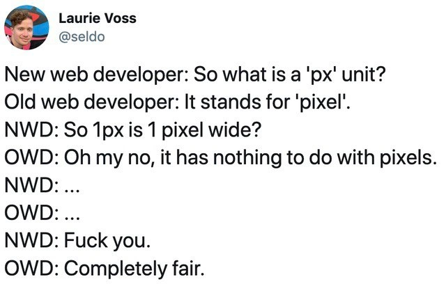
Now, in the meme’s dialogue the New Web Developer (NWD) asks what a ‘px’ unit is, and the Old Web Developer (OWD) says “It stands for pixel.” That’s true historically. Then the newbie asks, essentially, “So 1px equals 1 actual pixel on the screen, right?” and the experienced dev responds, “Oh my, no, it has nothing to do with real pixels.” Cue stunned silence. This is where the term reference pixel might come up: that’s what we call the CSS pixel unit now – it’s a reference length, not a single device dot. The newcomer's reaction (an exasperated swear) is an exaggeration of how frustrating this revelation can be. And the older developer saying “Completely fair” is just comedic acknowledgment: Yeah, I can’t blame you for being upset — it’s a crazy thing. It’s developer humor highlighting a real FrontendPainPoint: many things in web development aren’t as literal or logical as they sound.

To put it simply, CSS pixels are a “virtual” unit. They make web design more consistent across devices, but they confuse people at first. If you ever want to see this in action, you can check the window.devicePixelRatio in your browser console. For example, on a normal desktop monitor you might get:

console.log("Device pixel ratio:", window.devicePixelRatio);  // likely outputs 1 on a standard display

Whereas on a high-DPI or Retina device, the same code could output 2 (or 3). This number tells you how many physical pixels equal one CSS pixel on that device. So 1px in CSS is actually 2 or 3 real pixels long there. All of this is why a new dev might feel a bit betrayed by the terminology. But every web developer goes through this learning curve. The meme is RelatableDeveloperExperience because it’s practically a rite of passage in WebDev: at some point you ask a seemingly obvious question about CSS and get an answer that makes you go “Wait… what?!” And then you understand why px sometimes stands for pain.

Level 3: The Pixel Paradox

In the Frontend world, a seemingly simple question like “So 1px is 1 pixel wide?” can open a can of worms that only seasoned developers know about. This meme highlights a classic web_dev_generation_gap in knowledge: the new developer (NWD) innocently equates the CSS unit px with actual screen pixels, while the old developer (OWD) has a weary chuckle because they know the truth. The humor (and horror) here is that CSS 'px' — which everyone assumes stands for pixel — no longer means a literal device pixel in modern WebDevelopment. It’s a Pixel Paradox: the unit named after physical pixels is now an abstract reference pixel. The punchline lands when the newbie finds this out and drops an F-bomb, and the veteran responds with “Completely fair.” Every experienced front-end dev who’s wrestled with high-DPI displays nods in solidarity at that reaction.

Why did px stop meaning a hardware pixel? History and pragmatism. In the early days of the web, 1 CSS pixel corresponded directly to 1 device pixel on typical monitors. Back then monitors had a standard-ish density (around 96 DPI, dots per inch) and a CSS layout assumed that scale. But as display technology advanced, we got high-DPI screens (like Apple’s famous Retina displays) packing many more pixels into the same physical size. If browsers had kept 1 CSS px = 1 physical pixel, websites would have rendered tiny on these dense screens. Imagine your button that was 100px wide suddenly appearing half its intended physical width on a phone with double the pixel density – unusably small! The web’s solution was to redefine what a CSS pixel is. The W3C (the standards body for web specs) introduced the concept of a css_reference_pixel: roughly the visual size of a pixel on a 96 DPI display at arm’s length. In practice, this means browsers scale up CSS pixels on high-density devices. For example, on an iPhone with devicePixelRatio = 2, one CSS px is drawn using a 2×2 block of real screen pixels. The CSS spec even says that 1px is to be treated as 1/96 of an inch for consistency. So ironically, 'px' in CSS is an absolute unit in name, but under the hood it’s adjusted based on device characteristics – a quirk of FrontendPainPoints that newcomers must learn.

This redefinition was critical for DeveloperExperience_DX and usability: it let existing websites magically scale to new displays without looking microscopic. But it came at the cost of css_units_confusion. Seasoned developers remember the first time they encountered a high_dpi_display_bug – like fuzzy images or hairline borders disappearing on a Retina screen – and discovered the concept of devicePixelRatio. We learned that a “pixel” wasn’t literally a pixel anymore, and we had to use tricks like higher-resolution images or media queries (@media screens) to cope. It’s become part of frontend_tribal_knowledge. The old dev in the meme has probably explained this dozens of times to baffled juniors. Their polite “Oh my no, it has nothing to do with pixels” really means “Ah, we need to talk about how CSS units work now…”. And when the new dev drops a “F* you”** out of sheer frustration, the veteran just sighs “Completely fair.” – because honestly, who hasn’t felt betrayed by web tech naming conventions? 😅 (We’ve all been that new dev, wanting to curse the CSS gods.) The joke hits home as TechHumor because it’s a shared absurdity: a unit called “pixel” causing real DeveloperFrustration. The meme perfectly captures how front-end devs bond over these gotchas – laughing so we don’t cry, and agreeing that sometimes “px” might as well stand for pain.

Description

A screenshot of a tweet from user Laurie Voss (@seldo) that stages a conversation between a 'New web developer' (NWD) and an 'Old web developer' (OWD). The dialogue unfolds as follows: NWD asks what 'px' is. OWD says it's 'pixel'. NWD logically follows up, 'So 1px is 1 pixel wide?'. The OWD drops the bombshell: 'Oh my no, it has nothing to do with pixels.' After a moment of stunned silence from both, the NWD responds with 'Fuck you,' to which the OWD concedes, 'Completely fair.' This tweet perfectly captures the frustrating and counterintuitive nature of the CSS 'px' unit for developers new to the field. The humor lies in the absurdity that a unit named 'pixel' isn't tied to a physical hardware pixel anymore, due to varying screen densities (like Retina displays). It's a rite of passage for web developers to learn this distinction, and the old developer's calm acceptance of the newcomer's anger is a nod to this shared, universal pain


Comments

7
Anonymous ★ Top Pick The CSS `px` is the Schrödinger's cat of units: it's both a pixel and not a pixel until you inspect the device pixel ratio, at which point you realize you should have just used `rem`s from the start
  1. Anonymous ★ Top Pick

    The CSS `px` is the Schrödinger's cat of units: it's both a pixel and not a pixel until you inspect the device pixel ratio, at which point you realize you should have just used `rem`s from the start

  2. Anonymous

    Somewhere in the CSS spec: ‘px’ equals 1⁄96th of an inch - unless your browser, zoom level, or existential dread says otherwise

  3. Anonymous

    CSS pixels are like microservices naming conventions - they made perfect sense when we created them, but now we spend half our careers explaining why they mean the opposite of what they say

  4. Anonymous

    The CSS pixel is web development's greatest semantic betrayal - a 'pixel' that isn't a pixel, existing in a reference frame divorced from physical reality. It's the perfect metaphor for frontend development: a layer of abstraction so fundamental that explaining it to newcomers requires admitting the entire naming convention is a historical accident we're all stuck with. The OWD's 'Completely fair' is the resigned wisdom of someone who's explained devicePixelRatio to junior devs one too many times, knowing full well that the web's solution to display density was to redefine what a pixel means rather than change the unit name

  5. Anonymous

    CSS px: 'pixel' by name, '1/96th inch of vendor-defined suffering' by spec - 20 YoE later, still the web's perfect lie

  6. Anonymous

    The CSS px is distributed consensus among DPI, devicePixelRatio, user zoom, and meta viewport: eventually consistent, never linearizable

  7. Anonymous

    CSS taught me 'pixel' is an abstract suggestion - 1 px resolves to ceil(devicePixelRatio) hardware pixels, plus one Slack thread per stakeholder insisting it be exact

Use J and K for navigation