Skip to content
DevMeme
1884 of 7435
The Agony of Near-Perfect CSS Alignment
Frontend Post #2094, on Sep 26, 2020 in TG

The Agony of Near-Perfect CSS Alignment

Why is this Frontend meme funny?

Level 1: A Little to the Left

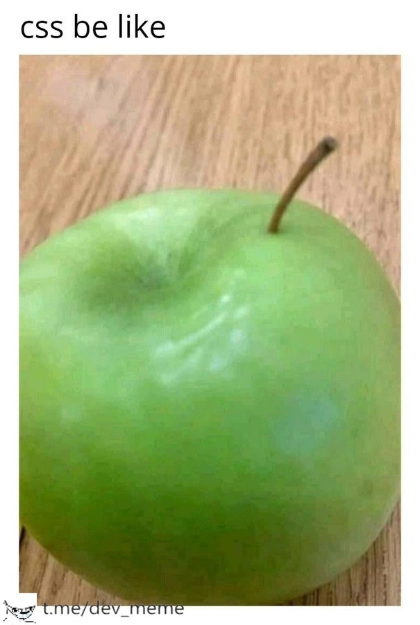
Imagine you’re hanging a picture on the wall, and you want it exactly in the middle. You measure and adjust, but when you step back, it’s a little to the left. It’s not huge – just enough that you notice it and it looks funny because it isn’t quite right. This meme is making the same point: putting something right in the center can be surprisingly hard. The apple with its stem off-center is like a goofy example – it’s as if the apple tried to put its stem in the middle and missed. We laugh because we know what it’s like when things aren’t perfectly in place, and it’s both frustrating and kind of comical. In simple terms, the meme is saying: “See how this apple’s stem isn’t centered? That’s what dealing with CSS can feel like!” Even if you’re not a coder, you can relate to how annoying (and funny) it is when something that should be centered just won’t cooperate.

Level 2: Why It Won’t Center

To a newcomer in WebDevelopment, it might be surprising that “centering in CSS” is a long-running joke. After all, how hard can it be to put something in the middle of the page, right? Let’s break down the basics that make this meme resonate with front-end folks:

  • CSS (Cascading Style Sheets): This is the language used to style web pages. It’s how we tell the browser whether things should be on the left, right, center, what color they should be, how big, etc. Alignment is one small part of CSS’s job, but it’s famously tricky at times.

  • Centering Elements: There are different kinds of centering. Horizontal centering (left-to-right) vs. vertical centering (top-to-bottom) are achieved with different techniques. Early on, you learn about margin: 0 auto; which is a common CSS trick to center a block-level element horizontally. In code, it looks like:

    .myElement {
      width: 200px;         /* give it some width */
      margin: 0 auto;       /* top/bottom margin 0, left/right margin auto */
    }
    

    That margin: 0 auto; line tells the browser: make the left and right margins automatically equal, effectively pushing the element into the middle of its container. This works great to center things horizontally (as long as you’ve specified a width). The meme’s text “css be like” hints at this kind of CSS code we write, expecting perfect centering.

  • Vertical alignment is a whole other story. For a long time, there wasn’t a simple one-liner for vertical centering. Newer CSS systems like Flexbox make it easier: you can turn the parent container into a flex container (display: flex;) and then use align-items: center; justify-content: center; to center the child both vertically and horizontally. But if you haven’t learned Flexbox yet, you might try things that don’t work: setting vertical-align: middle; (which only works under specific conditions like table cells or inline elements), or fiddling with padding/margins in confusing ways. Many of us ended up googling “how to center a div vertically” and finding multiple methods, none of which felt obvious at first. It’s a classic FrontendPainPoints situation.

  • Default quirks and offsets: Even when you apply the “right” CSS, sometimes elements still appear slightly off-center due to other factors. For example, images are inline elements by default and might have a few pixels of space under them (because they align to text baseline by default, not the bottom of their container). That can make an image look misaligned vertically until you fix it with CSS (vertical-align: middle; on the image or display: block;). Similarly, if an element has some default padding or if the parent container isn’t exactly the size you think it is, your centered item could appear off. These are the css_alignment_issues developers gripe about. The apple’s stem being off to one side is just like an element that should be centered but isn’t due to some hidden quirk.

  • The apple analogy: In the meme, the green apple represents an element (like a <div> or a button on your webpage) and the stem represents something you expect to be centered (maybe an icon or text). But the stem is shifted toward one side. This visual offset immediately reminds anyone who has struggled with CSS of that feeling: you double-check your code thinking “I told it to center, why is it still not centered?!” The apple is a clever everyday object to illustrate an awkward, unbalanced look—the same way a web page feels when something isn’t aligned properly. For users, an off-center element might just feel slightly “off” or less polished. For developers, it’s like an unsolved puzzle taunting you.

In summary, this meme is highlighting a common learning moment in Frontend development. Aligning things in CSS is possible (and much easier now with modern techniques), but it has historically been a source of confusion and laughter. New developers quickly learn that “just center it” can be one of the most deceptively difficult directives in UX/UI styling. The joke lands because nearly every web developer, junior or senior, has experienced the mini-despair of an element that refuses to sit perfectly centered despite our best efforts.

Level 3: Margin Auto Mirage

CSS has a notorious reputation among front-end developers for making simple things strangely difficult. The meme’s caption “css be like” paired with this off-center apple stem hits a deep FrontendPainPoints nerve. On the surface, centering an element should be trivial – just like you’d expect an apple’s stem to sprout dead center from the top. Yet in practice, achieving perfect alignment in CSS often turns into a mini-odyssey. Every experienced WebDevelopment veteran has a war story of spending hours coaxing a div or image to sit dead center, only to have it stubbornly stick a few pixels off. The apple’s stem emerging noticeably off-center in that dimple is a visual punchline: it’s the physical world saying “close, but not quite centered”, echoing the feeling when your carefully crafted CSS layout is just a bit off.

The humor here comes from the absurd relatability. We’ve all written what we thought was the correct CSS – margin: auto on the left and right to center a block, maybe text-align: center on a container – and then yelled “Why won’t this center?!” at the screen. The apple alignment analogy simplifies this frustration: even something as naturally occurring as an apple can’t get its center right, so what hope do we humans have with CSS? It’s a gentle ribbing of the language’s quirks. Front-end devs nod knowingly because CSS, despite all its power, has historically made them fight for something as conceptually basic as centering a child element within a parent. It’s a rite of passage to discover that horizontal centering and vertical centering are entirely different beasts in CSS. Before modern layout tools, vertical centering was an especially painful puzzle – you’d try funky hacks like exploring the mystical powers of display: table-cell and vertical-align: middle or resort to position: relative on a parent and position: absolute on the child with a transformative trick:

.parent {
  position: relative;
}
.child {
  position: absolute;
  top: 50%;
  left: 50%;
  /* magic offset to truly center */
  transform: translate(-50%, -50%);
}

These code incantations were akin to aligning that apple stem by force. Sure, they work, but it feels extra for something so basic. The meme teases this reality: you can eventually center things in CSS, but sometimes it takes a surprising amount of effort and some arcane knowledge of the CSS box model. And even after all that, just like the apple’s stem, something might still look awkwardly off due to an “offset element” or an unexpected default style.

Why is it so funny (and painful)? Because it’s true. This meme distills years of shared FrontendHumor: thousands of Stack Overflow questions titled “How do I center a div for real?” and the collective sigh of developers wrestling with css_alignment_issues. It pokes at the UX/UI irony that aligning content – a key aspect of good design – can be one of the most frustrating tasks in front-end coding. And as any seasoned dev will tell you, even with modern CSS like Flexbox (display: flex; align-items: center; justify-content: center;) or Grid, there’s always that one scenario or one pesky element that defies your alignment attempts (often at 3 AM, of course). In short, this meme is an inside joke: CSS is powerful but finicky, and getting things centered is sometimes as randomly off-kilter as nature deciding an apple stem’s position.

Description

The meme displays a close-up photograph of a green apple on a wooden surface. At the top, white text on a light background reads "css be like". The apple's stem is slightly off-center from the natural indentation at the top of the fruit. This visual gag serves as a metaphor for a classic frustration in frontend development: the difficulty of perfectly aligning elements using CSS. Developers often struggle to center items, with the result being just a few pixels off, much like the apple's misplaced stem. The image humorously captures the feeling of something being technically functional but visibly imperfect, a common occurrence that resonates deeply with anyone who has battled with CSS layouts

Comments

7
Anonymous ★ Top Pick I showed this to my browser's inspector. It said the apple is a block element, but the stem is an inline-block with a margin-left of 2px that nobody can explain
  1. Anonymous ★ Top Pick

    I showed this to my browser's inspector. It said the apple is a block element, but the stem is an inline-block with a margin-left of 2px that nobody can explain

  2. Anonymous

    After two decades, CSS still feels like the CAP theorem of layout: you can have horizontally centered, vertically centered, or consistent across Safari - pick two, the stem’s gone rogue anyway

  3. Anonymous

    After 15 years of wrestling with CSS, I've learned that 'border-radius: 50%' is just CSS's way of saying 'best I can do is octagonal on IE11, and your designer will still ask why the drop shadow clips through the pseudo-element you used for that gradient border hack.'

  4. Anonymous

    This apple perfectly captures the moment when you add 'margin: 0 auto;' and somehow your entire navbar ends up in the footer. CSS: where 'display: flex;' fixes everything except when it mysteriously creates a 3px gap that no amount of 'gap: 0;' or '* { margin: 0; padding: 0; }' can eliminate, and you eventually discover it's caused by inline-block whitespace from a comment you wrote six months ago

  5. Anonymous

    CSS: you architect a crimson button for prod, cascade delivers Granny Smith green across Safari - eternal specificity tax

  6. Anonymous

    CSS “centered”: absolute-positioned to a containing block you forgot existed, then nudged 1px by subpixel rounding - ship it because QA screens are non-retina

  7. Anonymous

    CSS: where align-items:center, a transformed ancestor, and subpixel rounding conspire so the stem renders 12px off and everyone swears it’s just the cache

Use J and K for navigation