Skip to content
DevMeme
4103 of 7435
The Futility of 'Self-Documenting' Code
Documentation Post #4472, on Jun 17, 2022 in TG

The Futility of 'Self-Documenting' Code

Why is this Documentation meme funny?

Level 1: All on One Side

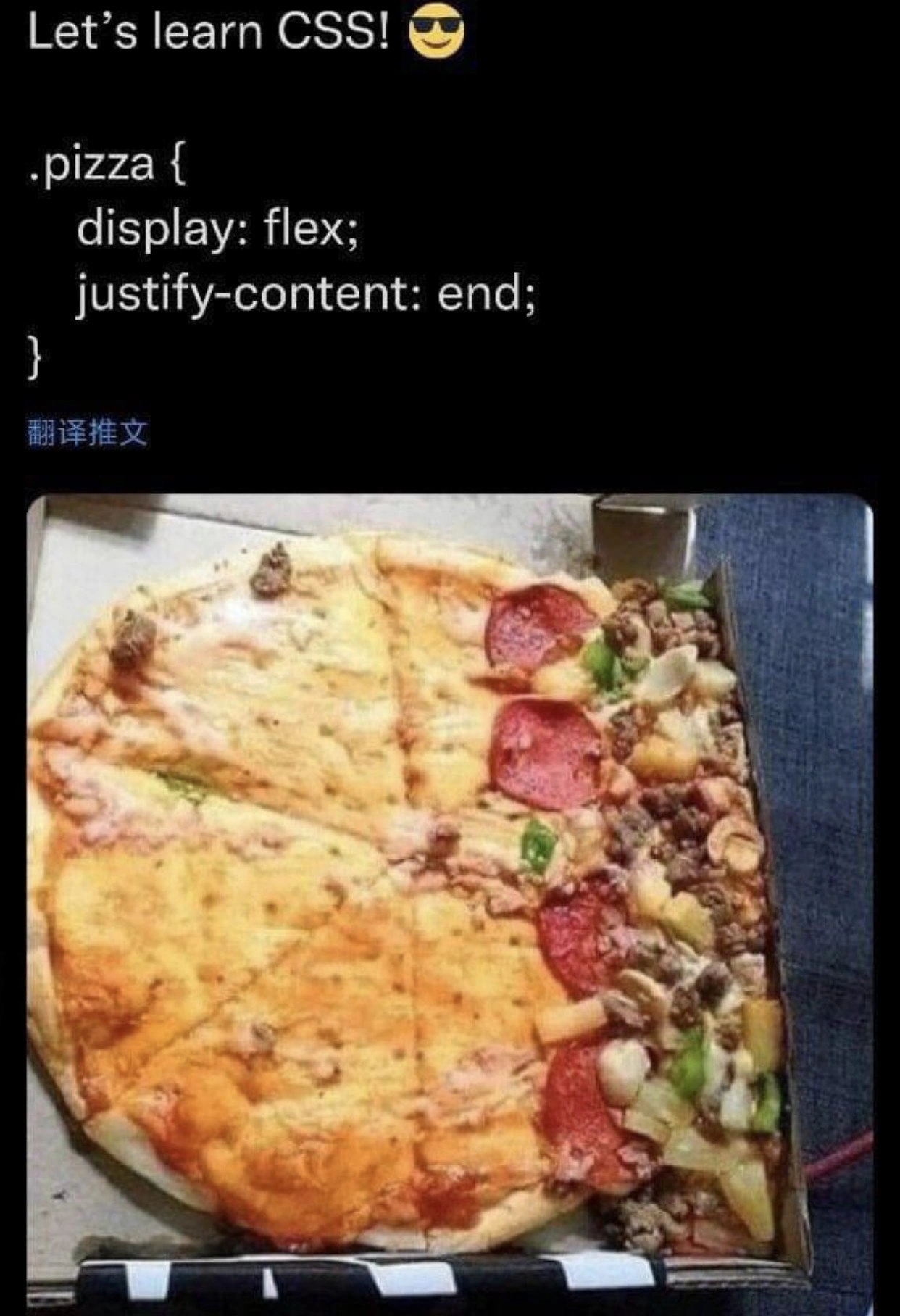
Think about what would happen if you told a group of friends to stand only at the far right side of a big room. They would all squeeze over to that right wall, and the rest of the room on the left would be completely empty, right? That’s exactly the funny idea here, but with a pizza. All the yummy stuff (cheese, pepperoni, veggies) got told to move to the right edge of the pizza! So instead of having toppings nicely spread out everywhere, they’re all piled up on one side, and the left side is just plain crust and sauce. It looks pretty silly, almost like the pizza was in a box that someone held sideways so everything slid over.

This picture makes people laugh because it’s a bit like a mix-up in giving instructions. In coding, if you give a wrong or too literal instruction, a computer (or in this case, our pretend pizza) will do exactly that, even if the result looks odd. Here the instruction was basically “put all the toppings on the right side,” and the pizza followed it to the letter! It’s funny and easy to understand: imagine opening a delivered pizza and seeing nearly all the toppings clumped on one edge – you’d probably laugh and think, “Whoa, everything ended up on one side!” The meme takes a complicated idea from web design (how we tell stuff where to go on a page) and turns it into a simple, goofy food picture that anyone can giggle at. In the end, it teaches a simple lesson: if you only arrange things on one side, it might look as lopsided as this one-sided pizza!

Level 2: Flexbox 101 – Pizza Edition

Let’s break down what’s happening in simpler terms. The meme is about CSS (Cascading Style Sheets), which is the language used to style and lay out web pages. In CSS, Flexbox is a layout module that helps arrange elements (like buttons, images, menus, etc.) in rows or columns and distribute space between them neatly. Developers often use Flexbox to align things horizontally or vertically without much fuss. However, to use it right, you need to understand properties like display: flex and justify-content.

In the code snippet shown, there’s a CSS rule targeting a class called .pizza:

.pizza {
    display: flex;
    justify-content: end;
}

Here’s what each part means:

  • display: flex; turns an element (in this case, something labeled as “pizza”) into a flex container. This means any child elements inside will automatically try to line up in a row (by default) like items on a conveyor belt.
  • justify-content: end; is telling that flex container how to position its child items along the main axis (the main axis is horizontal by default, since flex containers default to a row layout). “end” means push all the items as far to the end (right side) of the container as possible. It’s like saying, “Hey, pack everything to the right!”

Now, imagine a pizza as our container. The toppings on the pizza are like the child items inside that container. By applying these CSS rules to “.pizza”, it’s as if we’ve told all the toppings, “Alright folks, line up and move to the far right edge!” The photo of the pizza in the meme shows exactly that result: all the cheese, pepperoni, veggies, and meat have slid over to the right edge of the pizza. The left side of the pizza is almost empty – mostly just crust and sauce – because we “justified” all the content (toppings) to the right end. In web development terms, this is a visual gag of a UI bug (user interface bug). The interface here is a pizza, and it’s clearly “broken” from a normal expectation, since you’d want toppings spread evenly, not piled on one side!

Why would this happen in a real webpage? Let’s say a new developer is excited to use Flexbox and writes .pizza { display: flex; justify-content: end; } thinking it might do something cool (the meme’s caption “Let’s learn CSS! 😎” captures this excitement). They deploy their code to prod (short for production, meaning the live website), and suddenly notice that all the content inside that element is squished to one side. Oops! It’s funny on a pizza, but on a website it might mean, for example, that a navigation menu or gallery items are all aligned to the far right of their container, leaving a strange blank space on the left. This kind of mistake is a common frontend pain point when learning modern CSS layout techniques.

To put it simply: Flexbox is powerful for aligning elements, but you have to use the right settings. Some common justify-content values are:

  • flex-start (or just start) – put items at the left/start of the container,
  • center – put items in the center (usually what you want for balanced layouts),
  • flex-end (or just end) – put items at the right/end of the container (exactly what happened to our pizza toppings),
  • space-between, space-around, space-evenly – different ways to spread items out with spaces.

It looks like in the meme, the person used the “end” value, likely not realizing it would right-align all the toppings inside the pizza. In web design, if you misuse this, you might end up with something like a bunch of icons or buttons all clumped at one side of a panel, with an awkward gap on the other side. The meme exaggerates it with a pizza to make the lesson memorable. The Chinese text "翻译推文" seen in the image is just a Twitter interface button for “Translate Tweet,” meaning this screenshot likely came from someone’s humorous tweet. That detail isn’t crucial to the joke, but it tells us this scenario was being shared on social media for laughs and learning.

So, in summary: the CSS Flexbox code in the top half is positioning content to the far right. The bottom half image is a metaphor – it’s as if the pizza’s toppings obeyed that code. This makes the concept crystal clear: justify-content: end; will move stuff to the right end every time, even if that’s not what you intended visually. It’s both a funny sight and a useful reminder for web developers: always double-check your CSS alignment or you might end up with a “misaligned toppings” situation on your webpage!

Level 3: Flex-End Fiasco

Front-end veterans can practically taste the CSS Flexbox misadventure here. The meme’s top text "Let’s learn CSS! 😎" signals a newbie’s bold confidence, followed by the ill-fated CSS snippet:

.pizza {
    display: flex;
    justify-content: end;
}

This combination is a recipe for a layout disaster. In a flex container, justify-content: end (essentially flex-end) means “pack all items toward the far edge of the container”. The result? All content shoves to the right side, leaving a giant void on the left. The pizza photo on the bottom perfectly visualizes this: every topping (the flex items) has slid to the right crust (the container’s end), and about 80% of the pie is bare sauce and dough (empty space). It’s a literal edge-case alignment issue – emphasis on edge. Seasoned devs chuckle because we’ve all seen UIs with one tiny widget huddled in a corner while the rest of the screen is awkwardly blank. This meme captures that absurdity with a delicious metaphor.

Why is it funny? Because it lampoons a classic Frontend learning moment. The enthusiastic “Let’s learn CSS!” paired with the 😎 emoji is something every experienced developer recognizes – that naive optimism before CSS’s quirks humble you. Flexbox was supposed to simplify web layouts (no more chaotic floats or tricky CSS Grid learning curves), yet a single misunderstood property can still cause front-end pain points. The code above is essentially a one-line bug that any CSS rookie might push to prod (production) by mistake. It’s all too real: one minute you’re aligning a navbar or gallery, the next minute your content has migrated to the right edge of the page, just like those poor toppings. This pizza’s topping pile-up is the physical parody of a UI bug we’ve debugged at 2 AM – the kind where you open your site and wonder, “Why is everything squished to one side?!”

From an implementation standpoint, Flexbox’s layout algorithm distributes leftover space based on justify-content. Here, justify-content: end tells the browser: put all the free space at the start and push items to the end. In our pizza analogy, imagine the pizza base has more room than the toppings need – Flexbox piles all that extra “free” space as empty crust on the left, and bunches the toppings at the rightmost edge. It’s a hilariously literal visualization of how the browser interprets those CSS rules. For experienced devs, there's an extra layer of humor in seeing a real-world object obeying a programmatic command. We often joke that UIs have a mind of their own; here the pizza behaves like a div with misapplied flex styling. It’s as if the laws of the W3C spec momentarily took over the laws of physics – voilá, misaligned toppings as a metaphor for misaligned content.

The meme also pokes fun at how something seemingly minor can have big, noticeable consequences in design. In code review, a senior might instantly flag justify-content: flex-end on a container that shouldn’t have it – because they know it’s a common spacing anti-pattern that leaves interfaces lopsided. But a newcomer learning CSS might copy-paste this property (perhaps from a StackOverflow snippet meant for a different context) and not realize they’ve created a UI equivalent of a pizza with all toppings on one side. It’s a gentle roast of our early coding goofs. Every front-end dev has a war story of a layout bug like this: maybe a Bootstrap class or a rogue CSS rule caused content to hug one side of the screen. And of course, such quirks always show up in production or during a demo, much to our horror (and our team’s amusement later). This meme thrives on that shared experience – it’s a slice of comic relief topped with equal parts nostalgia and “oh no, I’ve been there.”

On a broader level, it highlights the precision of CSS: computers will do exactly what you tell them. Tell a web element “justify-content: end” without proper context, and it will obediently shove everything to the end, even if that’s the last thing you intended visually. We laugh because we’ve learned (often the hard way) that CSS is powerful but unforgiving. It’s a rite of passage to accidentally create layouts with huge blank areas, or to spend an afternoon scratching your head wondering why your items won’t center (only to discover you used the wrong property). The pizza meme charms us by turning an abstract coding mistake into a tangible, edible example. It’s a senior-level inside joke wrapped in mozzarella: amusing, a tad painful, but ultimately a learning moment you can’t forget (much like the first time you debugged a flex container). In short, this “Flex-End Fiasco” is both a punny visual gag and a nod to the collective journey of mastering CSS alignment.

Description

This meme features the 'Panik, Kalm, Panik' meme format. The first panel shows a panicked character with the text 'The code has no documentation.' The second panel shows the same character, now calm, with the text 'The code is self-documenting.' The third panel shows the character panicked again, with the text 'The code is lying.' This meme hilariously captures the myth of 'self-documenting' code, a concept that senior engineers know is often a euphemism for 'I didn't have time to write docs.' It’s a knowing joke about the importance of clear, concise documentation, and the fact that even the most well-written code can be misleading or difficult to understand without context
Comments

7
Anonymous ★ Top Pick Self-documenting code is like a politician's promise: it sounds great in theory, but you're probably going to get screwed
  1. Anonymous ★ Top Pick

    Self-documenting code is like a politician's promise: it sounds great in theory, but you're probably going to get screwed

  2. Anonymous

    Sure, Flexbox made the toppings pixel-perfect - now let’s add ‘align-items: center’ before the product manager files a P0 about empty whitespace calories

  3. Anonymous

    Finally, a CSS property that accurately represents what happens to all the business requirements after the product owner sees the MVP demo

  4. Anonymous

    When your product manager asks why all the features are crammed into one corner of the UI and you realize you've been literally applying 'justify-content: end' to your entire career - at least the pizza version ships faster than waiting for design approval on proper spacing

  5. Anonymous

    Proof that the most standards‑compliant alignment engine is gravity - ‘justify-content: end’ ships reliably when the delivery scooter hard-brakes

  6. Anonymous

    Flexbox's justify-content: end; - packing slices right like over-optimized caches, starving the start side just like your legacy API endpoints

  7. Anonymous

    Flexbox will happily push your toppings to flex-end - unless Safari treats ‘end’ as a suggestion; at least gravity ships with a deterministic layout engine

Use J and K for navigation