Skip to content
DevMeme
4492 of 7435
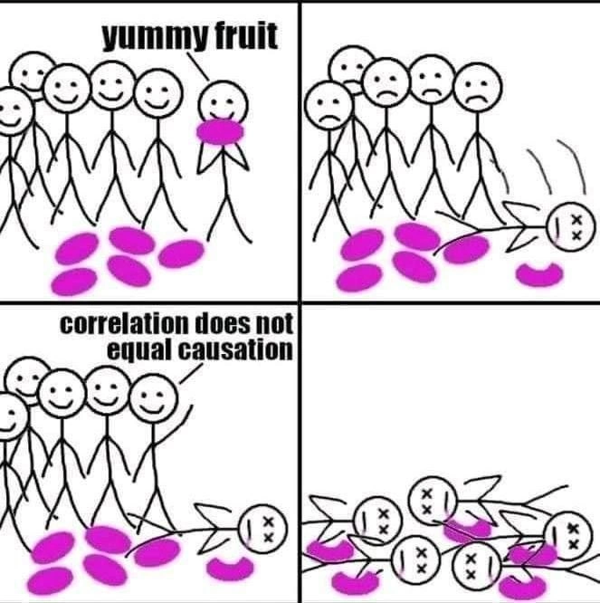
Ignoring causation caveats, entire dev team samples “yummy fruit” with fatal results
DataScience Post #4931, on Oct 13, 2022 in TG

Ignoring causation caveats, entire dev team samples “yummy fruit” with fatal results

Why is this DataScience meme funny?

Level 1: Don’t Eat That!

Imagine you and your friends find a bowl of strange purple candies. They look really tasty, so one friend decides to try a candy from the bowl. A few minutes later, that friend feels sick and falls down. You don’t know for sure if the candy caused it – maybe it was just bad timing. One of your other friends says, “Hey, just because they ate the candy and got sick doesn’t prove the candy is bad.” So, everyone else keeps eating the candies. What do you think happens? Naturally, all your friends who ate the candy also get terribly sick. 😢 It turns out the candy was poisonous, and the first friend’s collapse was a warning. The story is funny in a dark way because it’s obvious to us what was happening, yet the group ignored the evidence just because they weren’t 100% sure. It’s like watching someone touch a hot stove, get burned, and then everyone else says “Maybe it won’t burn me” and touches the stove too. The simple message: if you see a clear sign of danger after doing something, it’s probably a good idea to stop doing it right away!

Level 2: Correlation ≠ Causation

This meme uses a simple story to illustrate the famous idea that correlation is not the same as causation. In plain terms, just because two things happen together doesn’t mean one caused the other. Here’s what’s happening in each panel and the key concepts involved:

  • Correlation: A relationship or pattern between two things. If two events are correlated, they tend to occur around the same time or in some linked way. For example, if every time you deploy a new app version (Event A), error logs start rising (Event B), there’s a correlation – the events happened together.
  • Causation: A direct cause-and-effect link where one event makes the other happen. Using the same example, causation would mean the new app version actually caused the errors (maybe due to a bug in the code). Proving causation often requires more testing or evidence because you want to rule out other factors.
  • “Correlation does not equal causation”: This well-known phrase (even printed in the comic’s third panel) is a caution in data analysis. It reminds us that just seeing events together isn’t enough to be sure one caused the other. There could be coincidence or a hidden factor. In the comic, the team repeats this line after one member dies, implying “we’re not sure the fruit did it.”
  • A/B Testing: A practical way teams test causation. It means trying two versions (A and B) to see which one performs better or if one causes a different outcome. For instance, you might give half the users the new feature (fruit) and half no feature (no fruit) and compare results. If significantly more problems happen in the fruit group, that suggests causation. In real life, if an A/B test showed even one user getting a very bad outcome from version B, you’d stop and investigate. The comic exaggerates what happens if you don’t stop.
  • Postmortem analysis: In engineering, a “postmortem” is a retrospective report written after something goes wrong (an outage, a bug, etc.). The team analyzes what happened, why, and how to prevent it next time. It’s called postmortem (Latin for “after death”) because it’s done after the “death” of a system or project. In the comic, by the final panel there’s literally been a deadly outcome. If this were a real dev team, the postmortem analysis would clearly state: the experiment was a failure because we ignored the early warning signs that the fruit was dangerous. It’s a tongue-in-cheek way to show how misinterpretation of data (assuming the first death was unrelated) led to a disastrous result.

Now, tying it back to the four panels:

  • Panel 1: Everyone is happy and excited to try the new bright magenta “fruit”. This mirrors a team being eager about a new idea or feature. There’s no data yet to suggest anything is wrong.
  • Panel 2: One person in the crowd has eaten the fruit and now lies on the ground with X’s for eyes (a cartoon sign that they’re dead). The others look worried and sad. Here we have a correlation: one person ate the fruit and then died. That’s a big clue of causation (fruit might be poisonous!), but on its own it’s still just one event-pair. The rest of the team is unsure what to conclude.
  • Panel 3: The group is smiling again, and one points to the scenario while saying “correlation does not equal causation”. They’ve decided that just because the death happened after the fruit, they haven’t proven the fruit caused it. In a literal sense, they’re correct – one data point isn’t absolute proof. Maybe that person had a hidden health issue. The phrase they quote is a common statistical caution taught to avoid jumping to conclusions.
  • Panel 4: Now multiple stick figures are dead, strewn around the remaining fruits. This is the punchline: by ignoring the obvious warning and continuing the “experiment” (letting everyone eat the fruit), they gathered more data... and it tragically confirmed the cause. In other words, yes, the fruit was deadly, and now it’s painfully clear because everyone who ate it has perished. The correlation in panel 2 was actually indicating causation all along, and by panel 4 they proved it in the worst possible way.

For a new developer or analyst, the lesson is: be careful how you interpret data. If something bad happens right after a change you made, investigate it. Don’t just dismiss it outright by saying “could be a coincidence” without evidence. True, you shouldn’t immediately panic and assume causation from one event (that could be a statistical fallacy too), but you also shouldn’t keep doing the potentially harmful thing until disaster strikes. In experiments, especially involving people (or critical systems), you err on the side of caution. The comic uses dark humor to show what a flawed experiment looks like: no control group, no safety stop, just optimism until it’s too late. It’s a reminder that the slogan “correlation ≠ causation” isn’t meant to blind you to cause-and-effect; it’s meant to make you investigate deeper before drawing conclusions or, in this case, before everyone ends up on the floor.

Level 3: Casualties of Correlation

Seasoned engineers and data scientists immediately smirk (and cringe) at this comic because it captures a scenario we know too well. The stick-figure dev team is essentially us on a bad day: we roll out a new feature (tasting the “yummy fruit”), something goes horrifically wrong (one of the servers dies hard, just like the first stick figure in panel 2), and someone on the team confidently declares, “Well, let’s not jump to conclusions. After all, correlation vs. causation — this crash might be unrelated!” It’s the classic refrain in post-incident meetings: “Correlation does not equal causation, folks. It could be a coincidence.” This phrase, typically a cautious reminder not to blame the wrong thing, becomes laughably tragic here because they use it as an excuse to ignore a glaring red flag. In the meme, the entire team cheers up and continues chomping on the suspicious fruit right next to their fallen comrade. Likewise, in real projects, a team might continue a deployment or an A/B experiment despite an early warning, sometimes due to overconfidence or a desire for more data.

Real-world analogy: imagine deploying a big update on Friday afternoon (the tech equivalent of eating strange fruit). Minutes later, monitoring shows one database node crashing and burning. A prudent team might say, “Hold on, that’s scary – let’s rollback and investigate.” But our hypothetical heroes instead say, “One node down? Eh, correlation does not equal causation. Probably just a fluke. Push it to 100%!” By Monday, you have a full-blown outage – every node down, all services dead in the water. The initial correlation was causation, and ignoring it turned a minor glitch into a major disaster. The humor here is that we’ve all seen some version of this experiment design flaw. Perhaps it wasn’t as literal as people dropping dead, but the pattern is familiar: ignoring warning signs and plowing ahead turns a containable issue into a catastrophic failure.

This comic is poking fun at our industry’s sometimes robotic mantra-quoting. Yes, “don’t infer causation from correlation” is a cornerstone of data analysis wisdom – meant to prevent mistakes like blaming an innocent factor. But context is everything. Experienced folks have learned (often the hard way) that when stakes are high, it’s better to be safe than scientifically certain. A/B testing platforms and continuous deployment systems even have automated guards: for example, some will abort an experiment or roll back a release if metrics cross a danger threshold (say, user errors spike by 300% after a feature rollout). That’s basically a system saying, “We saw something really bad immediately; we’re treating it as caused by the change until proven otherwise.” In contrast, our comic’s dev team had no such guardrails — just blind optimism and a misinterpretation of data. The result? They learned the truth through a postmortem analysis in the most literal sense (since everyone is post mortem by the end!). It’s dark humor, but it resonates because it takes a scenario every on-call engineer or data scientist dreads and exaggerates it: ignoring possible causation leads to total ruin.

From an organizational perspective, this is also commentary on cognitive bias and culture. Perhaps the team wanted the fruit to be safe (it did look yummy and exciting, like a promising new tech or a juicy dataset). That desire can lead to confirmation bias – downplaying evidence that contradicts our hopes. We’ve seen managers or teammates rationalize: “That user complaint after the update, it’s probably unrelated.” The meme’s third panel – all smiles and “probably fine” energy even as a colleague lies dead – satirizes that delusional optimism. Everyone’s had that meeting where despite a pile of evidence that something’s wrong, someone says, “Correlation, not causation. Let’s wait for more data.” Often, by the time you prove causation definitively, the damage is done (the system is down, users are furious, or in this comic’s case, the entire team is facedown on the floor). At that point, everyone is dead certain what the cause was, pun intended.

To drive the point home for the senior crowd, the comic is effectively a postmortem report for a project gone awry, told in four panels. The “root cause” is obvious in hindsight: the fruit was poison. The statistical fallacy was using “lack of proof” as an excuse to continue rather than as motivation to investigate. It’s a cheeky reminder that while we should avoid jumping to wrong conclusions (no knee-jerk blame game), we also shouldn’t ignore obvious signals of danger. In production, when a new deployment coincides with a severe issue, wise engineers treat it as guilty until proven innocent. The team in this meme did the opposite – and the result was a complete system failure (with actual fatal results for the “users,” i.e., themselves). It’s a humorous exaggeration that nonetheless carries a real lesson that any senior dev or data scientist has probably learned: correlation may not guarantee causation, but it sure can scream “hint, hint – check this!”. Or put more bluntly: if one person drops dead after eating the fruit, maybe take a pause before declaring a production-wide fruit buffet. 😅

// Pseudocode of the team's flawed logic in production
if (firstVictim.isDead && !confirmedFruitIsCause) {
  console.log("Probably unrelated. Let's keep going!");  // classic last words
  team.continueEatingAllTheFruit();
}

Level 4: Causation Conundrum

In the world of data science and statistical analysis, one of the first principles we learn is that correlation does not imply causation. This means just because two events occur together (or one after the other), we cannot be sure one caused the other without deeper investigation. Correlation is a mathematical relationship (often measured by a coefficient like Pearson’s r) that is symmetrical: if X is correlated with Y, Y is correlated with X. But causation is directional and requires a mechanism: X produces Y. Determining causation rigorously is hard – it demands careful experiment design, controls, and often a pinch of theoretical insight. There’s even a classic Latin warning, post hoc ergo propter hoc (“after this, therefore because of this”), cautioning us not to mistake sequence for consequence. In statistical terms, seeing one stick figure eat a yummy fruit and then promptly collapse is anecdotal evidence – a sample size of one. It’s a loud hint, but not definitive proof, that the fruit is deadly. Maybe the poor stick figure had an unrelated heart attack at that exact moment (a confounding variable scenario). This is why analysts preach the mantra “correlation != causation” so fervently: plenty of spurious correlations (like ice cream sales correlating with shark attacks – because both spike in summer) can mislead us if we aren’t careful.

To actually prove causation, one must dig deeper with causal inference techniques. In an ideal world, we’d run a controlled A/B test or randomized trial: split our stick people into two groups, one that eats the mysterious magenta fruit and one that doesn’t. If significantly more fruit-eaters die compared to the control group, we can reject the null hypothesis (the assumption that the fruit has no effect) and conclude the fruit is poisonous with high confidence. Statisticians would look for a statistically significant difference (e.g., p < 0.05) between the two groups’ outcomes. In practice, data scientists also use tools like causal graphs (directed acyclic graphs mapping cause-effect assumptions) or calculate things like confidence intervals to ensure an observed effect is real and not just random chance. The key is eliminating alternative explanations: maybe the fruit-eaters were all standing under the same flimsy roof that collapsed – then the roof, not the fruit, caused the injuries. Proper experimental design and analysis aim to isolate the effect of the fruit itself.

What’s darkly hilarious in this meme is how the entire “experiment” ignores basic safety and ethical norms for establishing causation. Normally, if an experiment even hints at harm, researchers have stopping rules: you halt the trial for ethical reasons. Here, the stick-figure dev team blows past that red line in pursuit of certainty. By panel 3, they’re essentially saying, “One death isn’t enough data – correlation ≠ causation, so let’s gather more samples!” They treat the null hypothesis (“fruit is safe”) as true until overwhelmingly proven false. Ironically, by panel 4, they get the statistically significant result they were waiting for (100% of those who ate the fruit ended up dead!). It’s a morbidly comic illustration of a statistical fallacy taken to the extreme: in insisting on rigorous proof of causation, they designed a lethal sampling procedure. From a theoretical standpoint, the meme underscores the eternal causation conundrum: we can never truly prove cause from correlation with absolute certainty – but waiting for absolute proof can be disastrous if the stakes are life-or-death (or a production system’s health). The correct approach lives in a nuanced middle ground, balancing healthy skepticism with prudence. In short, the meme dramatizes how blindly clinging to “correlation is not causation” without context is itself a logical pitfall, one that the formal discipline of causal inference works hard to address (preferably without killing all the subjects in the process!).

Description

Four-panel stick-figure comic with simple black line art and bright magenta ovals on a white background. Panel 1 (top-left) shows a crowd of smiling stick people gathered around several magenta ovals on the ground; one happy figure holds an oval to its mouth while the caption above reads “yummy fruit”. Panel 2 (top-right) depicts the same crowd now frowning as one figure lies on the ground with Xs for eyes next to the magenta ovals. Panel 3 (bottom-left) has the crowd smiling again while one points to the scene and the caption “correlation does not equal causation” appears overhead - even though the corpse is still present. Panel 4 (bottom-right) shows multiple stick figures now dead, sprawled among more magenta ovals. The meme satirizes the common statistical warning that correlation alone cannot prove causation; by ignoring that principle, everyone continues the experiment and suffers catastrophic ‘production’ failure - an analogy familiar to data scientists and engineers who rely on A/B testing, causal inference, and post-incident learning

Comments

6
Anonymous ★ Top Pick Canary cohort drops to zero, p-value is 0.06; Product says “statistically insignificant - roll to 100%.” SRE adds a new KPI: users_alive p95
  1. Anonymous ★ Top Pick

    Canary cohort drops to zero, p-value is 0.06; Product says “statistically insignificant - roll to 100%.” SRE adds a new KPI: users_alive p95

  2. Anonymous

    After analyzing our A/B test results for three months, we finally discovered the purple fruit feature wasn't driving user retention - it just happened to be the only thing left after everyone who could quit already did

  3. Anonymous

    This is every ML engineer's nightmare when stakeholders see two trending lines and immediately demand a predictive model - only to discover later that both metrics were actually driven by a third variable no one thought to instrument. It's the data science equivalent of debugging for hours only to find the real issue was a completely different service that nobody mentioned in the incident channel

  4. Anonymous

    A/B test shows 300% engagement lift from new button color - causation? Nah, just uncontrolled for pizza Fridays

  5. Anonymous

    Enterprise causal inference: if correlation threatens the roadmap, the HIPPO declares it not causation, cancels the RCT, and ships - postmortem-ready

  6. Anonymous

    A/B test shows the treatment cohort keeps dying; PM: “correlation ≠ causation.” SRE: “Perfect - let’s ramp to 100% and establish causality.”

Use J and K for navigation