Skip to content
DevMeme
6360 of 7435
A Satirical Manifesto Against Color Calibration
Graphics Post #6974, on Jul 28, 2025 in TG

A Satirical Manifesto Against Color Calibration

Why is this Graphics meme funny?

Level 1: Just Call It Red

Imagine you’re coloring a picture and you want the apple to be red. You wouldn’t turn to your friend and say, “Pass me the pencil #FF0000, please.” 😄 You’d simply say, “Hey, can I get the red pencil?” That’s the basic joke of this meme. It’s pointing out that in real life we use easy color names like red, blue, or peach, while computers and experts use complicated codes and cubes to talk about those same colors. It’s funny because it’s like having a super fancy way to do something very simple. We’ve built all these high-tech methods to pinpoint exact shades, but at the end of the day, if you want your bike painted a nice color, you’ll just say “I’d like a light-orange bike” – not a string of numbers. The meme makes us laugh by showing how silly it would sound if someone did speak in that code language at a paint store or bike shop. It’s as if a kid asked for a crayon by some secret formula instead of just saying the color’s name. In short, the humor comes from realizing that sometimes it’s okay to just call it “red” and keep things simple!

Level 2: When Red is #FF0000

Stepping down to a more junior-friendly view, let’s clarify what all these color codes and cubes mean. In web and software development, colors are often specified by hex_color_codes or RGB triplet values rather than plain language. A hex code is a six-digit hexadecimal number (base-16) prefixed with #. It might look scary, but it’s basically an encoded form of the Red, Green, and Blue components of a color. For example, #FF0000 in hex breaks down into FF for red, 00 for green, and 00 for blue. In hexadecimal, FF represents the number 255 (the maximum value in 0-255 range), so #FF0000 means Red=255, Green=0, Blue=0 – which is full red, no green, no blue: pure red! In the same way, the meme’s #FFE3B8 is a specific color: Red=FF (255, full red), Green=E3 (227 in decimal), Blue=B8 (184 in decimal). That combination produces a sort of peachy light-orange tone. We don’t normally have an everyday name for #FFE3B8 – you might describe it as “cream” or “peach tint” – hence the joke that someone asking a wall to be painted exactly #FFE3B8 is absurd. Similarly, the phrase “230, 23, 74” is what we call an RGB triplet: it’s literally the Red, Green, and Blue values given in 0-255 range separated by commas (many graphics apps or CSS rgb( ) notation use this format). So (230, 23, 74) corresponds to a bright reddish-pink color (since 230 is a high red value, with much smaller green and some blue). In hex that would be #E6174A. Again, there’s no simple English name for that exact shade – a person might call it “hot pink” or “crimson” depending on their eye, but those are rough names. The meme exaggerates that only someone “utterly deranged” would speak in these numeric tongues in normal life, because indeed, outside of developers and designers, nobody says color values like that aloud.

So why do we even use hex codes or RGB numbers? It comes down to how computers and design tools work. A computer screen generates colors by mixing red, green, and blue light at various intensities (that’s how any pixel glows). By giving three numbers, we instruct the screen how much of each primary color to use. Think of it like a recipe: a pinch of red, a dash of green, a spoon of blue. CSSProperties like background-color or color for text accept these codes. For example:

button {
  background-color: #FFE3B8; /* a light peach-colored button */
  color: #000000;            /* black text */
}

In CSS, we could actually say background-color: peachpuff; or background-color: lightblue; for some common colors because CSS has a list of 140 color names (like red, blue, aliceblue, peachpuff). But these names are limited and often not precise enough for a specific design. That’s why designers provide exact hex codes – there are over 16 million possible colors with six hex digits, versus a couple hundred named colors at best. Using a numeric code ensures you and someone across the world see the same color on a webpage (assuming your screens are similar). It’s a precise language that computers understand unambiguously.

Now, about those cubes and color spaces: an RGB cube is just a visual representation of all possible RGB colors. If you take the range 0-255 for Red, Green, Blue and plot it in 3D, you get a cube. One axis is red intensity, one is green, one is blue. Any specific color code corresponds to one point inside that cube. For instance, black is at (0,0,0) and white at (255,255,255) as opposite corners. Something like #FFE3B8 would be a point near the Red-max face of the cube (since R is 255, G and B somewhat lower). Engineers and graphics folks use this cube idea to reason about colors, blends, and gradients. But as the meme notes, “color is not supposed to be cubes” – in everyday thinking, no one imagines a cube when picking a color; it’s just a handy model for us techies. The other “cubes” in the meme’s images likely refer to more advanced color models like CIELAB space. CIELAB can also be plotted in 3D (with axes L*, a*, b*), but it doesn’t form a neat cube shape when you chart all real colors – it looks lopsided or rounded. Those question-mark-labeled pictures are basically saying: “See these confusing technical diagrams? This is what color scientists deal with.”

Let’s decode some of the context terms to connect the dots:

  • Color calibration: This is the process of adjusting and aligning the colors output by devices. For example, calibrating your monitor with a colorimeter ensures that when your computer asks for a certain shade (say, sRGB red), the monitor actually displays it correctly. Without calibration, one screen might tint that red a bit orange, another a bit pink. Calibration involves tuning the device’s color profile so it matches a standard. It’s why high-end screens come with settings or profiles (sRGB mode, AdobeRGB mode, etc.): they’re aligning to agreed color standards. In professional fields (photography, printing, cinema), calibration is crucial so that what you see is what you get across different stages of production. But if you’re a junior dev who just wants the company logo to look right on the website, you might not manually calibrate anything – you’d simply use the correct hex code and trust modern screens. The humor in the meme arises because, for all that fuss over calibration and profiles, the end result might not matter to someone painting a wall; they’ll eyeball a paint swatch until it “looks about right.”

  • sRGB vs P3 vs Rec.2020: These are examples of color gamuts or color spaces. sRGB is the standard color space for most screens and the web – it was created in the 1990s to standardize colors across devices (it’s like saying, “let’s all agree what numeric Red 230, Green 23, Blue 74 actually looks like in real life”). DCI-P3 (often just called P3) is a newer gamut used in cinema and many modern Apple displays – it can represent more saturated colors than sRGB (especially greens and oranges). Rec.2020 is an even larger gamut designed for ultra-high-definition TV; it covers an almost insanely wide range of colors (some of which not even all humans can distinguish well!). The meme’s mention of Rec.2020 and that triangle graphic hints at these expanding gamuts. For a junior dev: think of each color space as a different box of crayons. sRGB is like a standard 24-pack of crayons, P3 is a bigger 36-pack with some extra vivid colors, and Rec.2020 is the giant 64-pack. The larger the gamut, the more distinct colors you can specify – but you need hardware (monitors, etc.) that support it to see the difference. The irony is, if you ask a regular person, they might just see “green” where we see the nuance between slightly different greens in those bigger sets.

  • Design vs Engineering: This tag speaks to the core tension in the meme. Designers (or colorists, or any visual specialist) often want extremely fine control over appearance – exact colors, exact alignments – because that’s their craft. Engineers have to implement these requests, sometimes dealing with the messy reality that devices differ or that the spec is very detailed. The meme humorously takes the engineer’s side, implying that the designers’ demands for perfectly calibrated color and respect for all these technical hoops might be overblown. A junior developer might relate if they’ve ever been handed a style guide insisting on a specific hex code for a brand color, only to think “This looks like regular red to me.” It’s both a practical lesson – pay attention to those details because someone cares – and a caution not to get lost in them to the point of absurdity. After all, your code can set a color precisely, but the user will simply perceive it and call it whatever they feel (maybe your perfect “#B7410E” brand brown just gets called “dark orange” by most people).

  • Color management systems: These are software components in operating systems or apps that handle converting colors between different devices and color spaces. For instance, if a photo is in Adobe RGB (another gamut) but your screen is sRGB, a color management system will adjust the values so the photo looks correct on your screen. For a junior dev, you might notice this when an image’s colors look different in different apps – if one isn’t color-managed properly. The meme referencing all the “processors we built” hints that a lot of computing power silently goes into these conversions so that, ideally, no matter where you view something, “red is red.” It’s complex stuff, but thankfully libraries and standards hide it from day-to-day coding. Just know it’s there, working behind the scenes, until someone with a calibrated setup files a bug that your app isn’t using the right color profile. Then you’ll dive in and understand why these tools exist!

  • Perceptual uniformity: This ties back to CIELAB and those warped cubes. A color space that is perceptually uniform means that a small step anywhere in that space is equally noticeable. RGB as used in computers is not uniform (a one-unit change in the 0-255 scale can be very visible in dark tones but negligible in bright tones, due to gamma correction curves). CIELAB was created to be more uniform, which is great for tasks like measuring color difference (there’s a concept called ΔE that quantifies “distance” between two colors as humans see it). The meme implies “years of calibrating” in pursuit of these lofty goals – making systems where 1 ΔE is supposedly the just-noticeable difference. For a newcomer: it’s like adjusting a music player so that one notch up in volume always sounds like the same small increase no matter if it’s currently quiet or loud. Not easy! That’s what perceptual uniformity in color is about – making the “steps” even. It’s a noble technical goal, albeit one that everyday folks aren’t aware of when they say a color looks “a bit different.”

In summary at this level: We have all these precise ways to define and match colors in code and design so that what you see on one screen is what someone else sees on theirs. We’ve invented numbers, coordinate systems, calibration devices – an entire technical language for color. And the meme is a light-hearted critique of this complexity. It reminds junior devs that while you’ll be working with hex codes and RGB values (and yes, possibly puzzling at 3D color graphs in graphics programming), the ultimate point is to make something look right to humans. And humans might never know or care about the six-digit code behind that “red” – they just know it’s red. It’s a funny reminder that sometimes our engineering precision outpaces what’s practically needed in daily life or at least what’s easily communicated. If you ever find yourself fretting over a color value late at night, just remember: somewhere out there someone is calling it “just blue” and would be amazed you were fussing over #0000FF versus #0000F0.

Plain Description Hex Code RGB Triplet
Pure Red (standard) #FF0000 (255, 0, 0)
Light Peach (soft) #FFE3B8 (255, 227, 184)
Bright Pink-Red (vivid) #E6174A (230, 23, 74)

Table: Examples of color descriptions vs their code values. The first is a common named color (“red”), but the others don’t have simple names – showing why we resort to numeric codes.

Level 3: RGB vs Reality

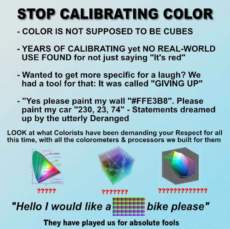
Now we zoom out to the perspective of a seasoned developer who’s been down this rabbit hole. The meme’s bold command “STOP CALIBRATING COLOR” sets a tone of exasperation. It’s the voice of a dev who has spent years dealing with design_vs_engineering headaches, now poking fun at the absurdity of it all. Why is it absurd? Because, in practice, humans don’t ask for colors by quotes of numeric values. We navigate the world of color with simple words and comparisons – “apple red,” “sky blue,” “kind of a peachy orange.” Meanwhile, developers and graphics engineers have been meticulously perfecting hex codes and 3D color spaces as if the universe depended on it. That contrast is the heart of the joke. It’s a classic UXDesign reality check: the end user’s mental model (“red is red”) versus the engineer’s elaborate system (millions of measurable color gradations).

Each bullet point in the meme drips with tongue-in-cheek frustration that any senior dev or graphics programmer can appreciate:

  • “COLOR IS NOT SUPPOSED TO BE CUBES” – This line lampoons the way we depict color in technical terms. We literally construct a cube (the RGB cube) or other geometric shapes to represent color spaces. A grizzled graphics programmer might chuckle here: Yes, we treat color like points in 3D space so our code can handle it, but no normal person thinks of a color as xyz-coordinates inside a cube. The meme shines a light on this almost comically geometric abstraction. It’s as if we took something as naturally flowing as color and locked it in a Rubik’s Cube, then demanded respect for solving it. Senior devs know these representations are essential for computations and GraphicsProgramming — from shading pixels to converting images between color profiles — yet they also recognize how alien it sounds outside the programmer bubble. It’s funny because it’s true: no painter sees a cube floating in the air when mixing pigments!

  • “YEARS OF CALIBRATING yet NO REAL-WORLD USE FOUND for not just saying ‘It’s red’” – Here the meme openly mocks the gulf between decades of engineering effort and everyday utility. Think of all the effort poured into calibrating monitors, printers, cameras – ensuring that a digital #FF0000 truly corresponds to a particular real-world red. Experienced devs have sat through meetings about slight color mismatches or slogged through bug reports like “icon color looks off on device X.” We have entire workflows for color profiles and spend countless hours fine-tuning gamma curves. And after all those years, how does a typical person communicate color? They just say, “That’s red.” Boom. End of story. The hyperbole in “NO REAL-WORLD USE” is part of the joke – of course calibrated color has real uses (printing a company logo in the exact brand color, for instance). But from the cynical viewpoint, it can feel like we solved a problem that hardly anyone else realized existed. It’s a shared smirk among senior developers: all that time spent on perfect color #RGB values and the user simply goes by what their eyes tell them, labels it with a basic word, and moves on. It highlights a recurring industry theme of design_vs_engineering: we chase precision that users may not even notice.

  • “Wanted to get more specific for a laugh? We had a tool for that: It was called ‘GIVING UP’.” – This line sarcastically suggests that if you ever tried to be ultra-precise in describing color verbally, you’d end up abandoning the effort. And truth be told, even professionals often “give up” on words and just use a sample or code. Senior devs recall times working with designers where discussions like “Could we make it a bit warmer red, maybe 5% more towards orange?” eventually end with “Here, use this exact hex code I picked.” In a sense, that is giving up on the ineffable task of describing a color in English. Why strain to articulate “a sort of greenish, slightly desaturated teal” when you can just hand over a swatch or a value? The meme sardonically frames this pragmatic solution as a comedic tool named “Giving Up.” It’s an exaggeration that lands because we’ve all been there – sometimes you stop arguing about adjectives and open the color picker instead. A seasoned engineer might also read this as an indictment of our proliferation of precision tools: we built entire systems to avoid the need for poetic color names. The joke lands: instead of inventing ever more elaborate color terminology, we resigned ourselves to hexadecimal hieroglyphics and called it progress.

  • “Yes please paint my wall ‘#FFE3B8’. Please paint my car ‘230, 23, 74’ – Statements dreamed up by the utterly Deranged.” – This is the meme’s punchiest example, and it’s pure comedic gold for anyone in on the joke. It conjures an image of a customer at a paint shop or car dealer speaking in what sounds like gibberish: a hex code (#FFE3B8) or an RGB triplet (230, 23, 74). Any normal salesperson would be baffled – those numbers mean nothing to someone outside the web/graphics context. The meme calls such hypothetical people “utterly deranged” because who else would specify a wall color as “hashtag FFE3B8”? It’s humor by absurdity: taking a very real thing we do in code and dropping it into a real-world request to show how crazy it sounds. Senior devs laugh because they recognize both the hex code (#FFE3B8 is a soft pastel peach color) and the RGB form (230,23,74 is a strong pinkish-red), and they know exactly how ridiculous it would be to say those out loud at the hardware store. This also pokes fun at how programmers sometimes forget that our convenient notations are cryptic to others. It’s a shared wink: “We spend all day thinking in these codes, but yeah, we’d look insane if we spoke them at Home Depot.”

“Yes please paint my wall ‘#FFE3B8’. Please paint my car ‘230, 23, 74’.”
– said no sane person ever

The meme is essentially saying, “Look at how over-the-top this has gotten!” Below those bullet points it even calls out, “LOOK at what Colorists have been demanding your Respect for all this time, with all the colorometers & processors we built for them.” That’s a spicy dose of sarcasm aimed at the professionals who champion color accuracy. The senior-perspective analysis here is that the author (in true Cynical Veteran style) feels engineers have bent over backwards to meet the demands of color experts – buying fancy calibrators, writing complex color management code, upgrading GPUs – and for what? So that someone can brag about a perfectly calibrated display while the audience just says “nice picture.” It’s a bit of an inside joke: colorists and graphics engineers do genuinely important work (and senior devs know that), but from an outsider’s view it can look like an obsession with microscopic details. The meme plays up that outsider viewpoint for humor. The three graphics shown (the Rec.2020 gamut triangle, an RGB cube, and a strange warped color space cube) each have rows of question marks under them, underscoring how incomprehensible these things appear to anyone who isn’t a color science geek. That’s the senior dev punchline: we might grasp those diagrams, but we admit that to most people, it’s just overkill nerd stuff. In essence, the meme has a senior developer throwing up their hands and laughing at themselves: “All this time, we thought these calibration charts and 3D cubes were so critical… and maybe we’ve been played for fools because the user just cares that it looks red enough!”

This mix of truth and exaggeration resonates with veteran developers because it mirrors experiences from other areas too. It’s reminiscent of spending months tuning some micro-optimized code that theoretically improves performance, only for the end user to say “Eh, it feels the same.” Here it’s color: you can almost hear an experienced web developer recalling a late-night bug fix where an icon was the wrong hex code and the product manager insisted it must be fixed (“It’s our brand teal, not just any teal!”). The fix probably involved tweaking a value by a few notches – a change no regular user would ever perceive – but hey, pixel-perfection was demanded. So when the meme concludes with “Hello I would like a ████ bike please” and “They have played us for absolute fools.”, the seasoned folks smirk. It’s the catharsis of realizing how absurd it can be to over-engineer something as intuitive as color. We’ve all been a bit “played” by chasing specs and calibrations that our non-tech friends and family frankly do not care about. The humor doesn’t deny that precise color management has a purpose; it just reminds us not to take it too seriously all the time. After all, at the end of the day, if the bike is red and looks good, who cares if its RGB value is perfectly calibrated?

Level 4: Chromaticity Conundrum

At the deepest technical level, color calibration plunges us into the arcane world of color science. Computers represent color as a point in a mathematical space – typically a three-dimensional RGB coordinate system. Imagine a cube where each axis (Red, Green, Blue) goes from 0 to 255. One corner is black (0,0,0), the opposite corner is white (255,255,255), and every other color lies somewhere inside that cube. It’s a convenient model for hardware and graphics algorithms, but nature isn’t so tidy. The meme’s cry that “COLOR IS NOT SUPPOSED TO BE CUBES” reflects a truth: the full range of human-visible color doesn’t form a perfect cube in any natural sense. In reality, the spectrum of colors we can see is irregular – often depicted as a horseshoe shape in a chromaticity diagram – and not every mix of red, green, blue is equally spaced in terms of human perception. This is why engineers and color scientists developed more complex color spaces like CIELAB that try to straighten out those irregularities. CIELAB (with its L*a*b* coordinates) is designed so that a one-unit step anywhere in its space means roughly the same perceptual change to the average human eye. If you map the simple RGB cube into CIELAB space, the shape becomes warped and squashed in places (hence the meme’s puzzling 3D color blobs with question marks). That distortion visualizes the chromaticity conundrum: equal steps in RGB do not produce equal perceptual_uniformity of color difference. In short, color theory knows that a naive cube doesn’t capture how we actually see colors – our eyes are more sensitive to some hues than others, and nonlinear response curves turn that neat cube into a very wonky shape.

All this theory is more than academic – it’s the backbone of color_management_systems used in graphics, photography, and display engineering. Over the years, standards like sRGB, DCI-P3, and Rec.2020 have defined specific “gamuts” (ranges of reproducible colors) as cubes or wedges within that messy color space. For example, the meme shows a Rec.2020 triangle on a chromaticity plot: Rec.2020’s triangle covers a huge area of the visible spectrum compared to the smaller sRGB triangle. To achieve that, device manufacturers had to push physics – using purer primaries (laser LEDs, quantum dots) to reach those extreme greens and reds. That “gamut triangle” with question marks highlights how abstract this all is to most folks. Each new standard (Rec.709 for HDTV, then Rec.2020 for 4K/UHD) expanded the cube, so to speak, encompassing more intense colors that previous displays simply couldn’t show.

Crucially, calibrating color means making sure those numeric codes produce a consistent visual result across different devices and media. We built dedicated hardware like colorimeters (those spider-like devices you stick on a screen) to measure emitted colors and adjust displays. High-end monitors and operating systems use 3D lookup tables and on-the-fly color profile conversions – heavy math under the hood – to maintain color fidelity. This is why the meme mockingly mentions “colorometers & processors we built for them”: entire CPU/GPU pipelines and gadgets exist just to reconcile the differences in phosphors, LEDs, inks, and human vision. Fundamentally, if I say a color is #FF0000 in sRGB, a calibrated system will ensure that looks like a specific red (with a defined chromaticity and brightness) on any compliant display. If I send that same value to a wide-gamut Rec.2020 projector, color management will translate it appropriately so it still appears as that same red to the viewer (not brighter neon red, unless it’s intended to). Achieving such consistency is a triumph of graphics engineering and colorimetry – grounded in research from CIE 1931 color matching experiments to modern ICC profiles. It’s a beautiful synergy of math and human physiology. But outside of labs and design studios, these precise distinctions blur into the background of everyday experience. The Spectral world of wavelengths and cone responses gets tamed into an RGB cube so that computers can do their magic. And yet, as this meme humorously points out, after all of that painstaking calibration of the “CIELAB cubes” and “Rec.2020 triangles,” the average person still just points at a bike and says, “Hey, nice red color!”

Description

A meme presented as a humorous, conspiratorial rant against the science of color calibration. The image has a light blue background with bold black text. The title is "STOP CALIBRATING COLOR". It lists several absurd arguments, such as "COLOR IS NOT SUPPOSED TO BE CUBES" and mocks the use of specific color codes like hex (#FFE3B8) and RGB (230, 23, 74), calling them "Statements dreamed up by the utterly Deranged." The meme displays three scientific diagrams used in colorimetry - a CIE chromaticity diagram (labeled Rec.2020), a wireframe color cube, and a 3D color gamut - each with red question marks underneath to feign confusion. The punchline is the sentence, "'Hello I would like a [image of a colorful checkerboard pattern] bike please'", satirizing the impracticality of applying complex digital color models to the real world. The meme concludes with, "They have played us for absolute fools." The joke targets anyone in tech or design who deals with the complexities of digital color, mocking the gap between precise mathematical models and subjective human perception
Comments

32
Anonymous ★ Top Pick This is what happens after a frontend dev spends a week trying to match a designer's Figma hex code to what the product manager sees on their iPhone with True Tone and Night Shift enabled
  1. Anonymous ★ Top Pick

    This is what happens after a frontend dev spends a week trying to match a designer's Figma hex code to what the product manager sees on their iPhone with True Tone and Night Shift enabled

  2. Anonymous

    Sure, PM - let’s spend two sprints converting the color cube to CIELAB just so you can tell marketing the button is ‘more red.’

  3. Anonymous

    After 20 years of implementing color management systems and arguing about sRGB vs Display P3, I've realized the real color space we're all working in is 'whatever looked right on the designer's uncalibrated MacBook at 2am with f.lux running'

  4. Anonymous

    After decades of building elaborate color management systems with ICC profiles, gamma correction, and perceptually uniform color spaces, we've finally achieved what we always wanted: the ability to tell a designer that their 'slightly warmer red' requires a 47-page specification document and three sprint planning meetings to implement. Meanwhile, the client just wanted 'the red one, you know, like a fire truck' - a requirement that somehow got translated into a 12-dimensional color space transformation pipeline that crashes on Tuesdays

  5. Anonymous

    Color gamuts in 3D cubes: because arguing over photon precision beats the real-world hell of 'it looks different on my phone' every sprint

  6. Anonymous

    We spent two sprints picking brand red in OKLCH and calibrating monitors; marketing shipped a Display‑P3 PNG - now Chrome, Safari, and Windows all render it differently, proving color management is the only spec where being compliant still looks wrong

  7. Anonymous

    We maintain ICC profiles, P3 fallbacks, and 3D LUTs so stakeholders can still say “make it red” on an uncalibrated monitor at 120% brightness

  8. @Johnny_bit 11mo

    After doing a bit of coding on darktable and seeing all that colorspace discussions, the color response curves... I feel this in my bones.

  9. @SamsonovAnton 11mo

    Calibration is simply "adjusting knobs": setting up the desired mode with hardware controls, if any, and then adjusting linearization (gamma coreection), if applicable. Color management is the real deal — that is, building the device profile (ideally, from a calibrated device, but that is not absolutely necessary in the narrow sense) and perform color-space matching from source to target: first, from input device — a scanner or a camera — to the working space (sRGB, Adobe RGB, etc.), then from the working space to display device, and ultimately to output device — a printer or a printing machine, possibly doing intermediate color-proofing on a display and/or on a desktop printer. 🤓

    1. @ZgGPuo8dZef58K6hxxGVj3Z2 11mo

      You said it before I could

  10. @SamsonovAnton 11mo

    Assessing color gamut on a 2D-diagram, even u'v' or a*b*, is stupid. It requires a visually uniform 3D-space, like L*a*b* (the third picture). Assessing color gamut on a xy diagram is the most stupid and lame thing to do. 🤓

  11. @moosschan 11mo

    A bunch of the "🤓☝️" in the comments

    1. @NaNmber 11mo

      🤓

  12. @azizhakberdiev 11mo

    Colors are relative, not absolute

    1. @SamsonovAnton 11mo

      Colors are merely a perception, they don't exist in reality.

      1. @Algoinde 11mo

        It's a perception of relative quantities of wavelengths tho, which do exist

        1. @SamsonovAnton 11mo

          What exists is the electromagnetic radiation. But there is no such thing as "blue color" or "red color". Also, color perception should better be associated with frequencies rather than wave lengths, as the latter depend on speed of light in the medium, while color perception does not (colors do not change underwater, for example) — it does depend on photon energy, which is proportional to its frequency. 🤓

          1. @Nabloid 11mo

            Good luck finding the electromagnetic wavelengths for magenta and all the colors in the "purples"

            1. @Nabloid 11mo

              N.W.: purples, not violets, as a specific range of violets are spectral

            2. @SamsonovAnton 11mo

              What makes you think that all colors must be strictly monochromatic (with maximum saturation)?

          2. @ashit_axar 11mo

            But frequency depends on how precise you can measure the time, you have to take your clock everywhere with you.

            1. @SamsonovAnton 11mo

              My guess is that colorimetry is the least important thing when time-space issues are to be considered, but color perception may still be unaffected.

              1. @ashit_axar 11mo

                Yes, but i think space(maybe a ruler to measure the distance) is still the same even on other planets, but measuring the time is a bit different. You know, even gravity and acceleration affects time. Let's stick to wavelength for now.

                1. @SamsonovAnton 11mo

                  Many decisions in colorimetry were made (prior to 1930) not because the scientists knew how to do things properly, but because they didn't have the knowledge we currently have, nor did they have today's instrumentation, nor computing power. That's why we still use wave lengths, CIE rgb primaries, XYZ color space, 2° standard observer, — based on studying color perception of just 17 people in a very specific conditions.

                  1. @azizhakberdiev 11mo

                    what more interesting is that subtractive colors were studied well prior to that and also still widely used as CMY color palette

            2. @azizhakberdiev 11mo

              not really, we can use diffraction grating to analyze the full spectrum of light

  13. dev_meme 11mo

    My #FFE3B8 is better than your #FFE3B8

    1. @deadgnom32 11mo

      better #FEMBOY

      1. @deadgnom32 11mo

        or #DEADBEEF

        1. @deadgnom32 11mo

          with opacity

          1. @SamsonovAnton 11mo

            "white overprint" 🤪

  14. @Nabloid 11mo

    > Using RGB to ask for specific paint shades Shiggydiggy

Use J and K for navigation