Skip to content
DevMeme
5886 of 7435
AI Coding Assistant Benchmark: A Horse Race of Models
AI ML Post #6445, on Dec 8, 2024 in TG

AI Coding Assistant Benchmark: A Horse Race of Models

Why is this AI ML meme funny?

Level 1: High Score Showdown

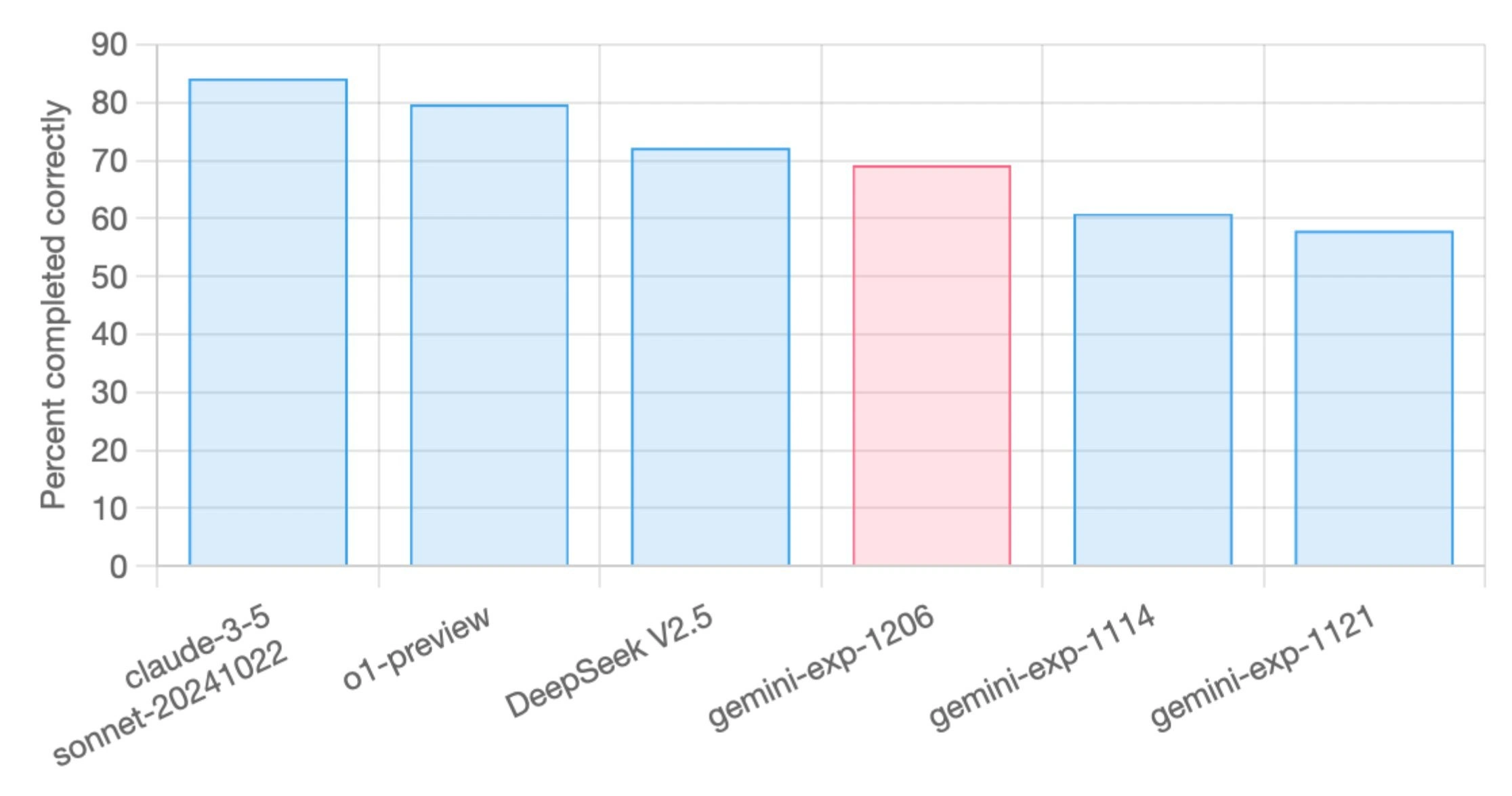
Imagine a classroom where six kids take the same big test, and the teacher makes a chart of their scores. The scores aren’t 100% – the top kid got about 83 out of hundred questions right, and the lowest got about 57 out of hundred. Now, these kids are super competitive. The one with 83% bragged, “I’m the best!” The one with 78% (just a bit behind at second place) says, “I was so close – next time I’ll beat you!” Another kid at 72% is in the mix, also trying to catch up.

In the corner, there’s a kid with a red shirt (that’s our red bar in the picture) who scored around 68%. Last month, that same kid only scored 57%, then 60% on a later test, and now 68%. So they’re improving really fast – everyone is looking at them like, “Whoa, they might become the top scorer soon if this keeps up!” That’s why the chart highlighted the red shirt kid’s bar: to say “Watch out, rising star here!”

The funny part is how seriously they treat these small differences. It’s like if one kid got 83 and another got 82, and the one with 83 runs around the school saying “I’m number one! I’m number one!” Meanwhile, the 82 kid is begging their parents for a fancy new tutor and spending all night studying just to gain that extra one point and claim the top spot next time. It’s a race for first place.

So this meme is basically showing an AI competition in simple terms – each bar is like a kid’s test score, and each kid is a different AI model. They’re all trying to have the highest score on a coding test. And just like kids (or gamers) brag about a high score even if it’s only a tiny bit higher, these AI creators brag about a slightly better percentage. It’s both a little silly and very relatable: nobody likes losing by a hair, and everybody loves being able to say “I’m the best” – even if it’s just by one point!

Level 2: Leaderboard Lingo

Let’s break down what’s going on in this meme for those newer to the AI/ML scene. We have a simple bar chart comparing the performance of six different large language models (LLMs) on some coding task benchmark. The y-axis is labeled "Percent completed correctly," which basically means accuracy – how often each model got the tasks right (likely by producing correct code or correct answers). The x-axis lists the models (the labels are tilted diagonally in the image, probably because the names are long). Each bar’s height shows that model’s score, and the taller the bar, the better the model did. We see the bars going from about 83% at best, down to about 57% at worst. So the top model solved ~83% of the tasks, while the bottom one solved ~57%. In other words, even the best model is far from perfect (not even 90%), and the worst one still gets more than half right.

Now, what are these model names? They look a bit cryptic:

  • claude-3-5 sonnet-20241022 – This appears to be a version of Claude 3.5, a model from Anthropic (Anthropic is an AI company like OpenAI). “Sonnet-20241022” likely indicates a specific model checkpoint or release (possibly from Oct 22, 2024). Claude is known to be a competitor to OpenAI’s models like GPT-4.
  • o1-preview – This one is less obvious by name, but the context tag openai_o1_preview is a clue. It likely refers to an OpenAI model (perhaps a preview of a new model version, maybe something like a GPT-4 successor or an experimental codename “O1”). OpenAI often uses codenames or version numbers internally, so think of this as possibly “OpenAI’s latest model preview.”
  • DeepSeek V2.5 – Not a household name, but it sounds like another AI model (perhaps from a smaller company or an open-source project). “V2.5” suggests it’s version 2.5 of the DeepSeek model. It could be fictional for this meme or a niche model focused on code tasks – at least, it’s being benchmarked alongside the big names, so imagine it as another contender in the AI coding arena.
  • gemini-exp-1206, gemini-exp-1114, gemini-exp-1121 – These three are clearly related. The word Gemini stands out – Gemini is actually the name of a real AI model initiative by Google, intended to be their next big thing in generative AI (and a response to models like GPT-4). The suffixes look like dates (12/06, 11/14, 11/21 – likely December 6, 2024 and November 14 & 21, 2024). And “exp” suggests these are experimental runs. So, it seems we have three Gemini experiment checkpoints, probably showing how Google’s model was progressing over time. gemini-exp-1121 got ~57%, then a week later gemini-exp-1121 (if that’s 11/21) got ~60%, and by early December gemini-exp-1206 hit ~68%. They colored the 1206 bar red to highlight it, perhaps because it’s a notable jump or a new result worth noticing.

So the chart essentially ranks: Claude 3.5 (around 83%) as the top performer, then OpenAI’s preview model (78%), then DeepSeek (72%), then Google’s Gemini experimental 1206 (68%), followed by older Gemini 1114 (60%) and Gemini 1121 (57%).

The phrase “Percent completed correctly” likely means if the benchmark had a bunch of coding tasks (for example, fixing bugs or writing functions), that percentage of them were solved correctly by the model. In coding, “correct” could be determined by running the model’s output code against test cases (if all tests pass, it’s correct). A special benchmarking tool (like the link to aider.chat’s leaderboard) handles this automatically and then calculates the success percentage. This is a form of model evaluation specifically for coding skills.

Now, why is this funny or notable? The meme and the title point out the “bragging-rights gap.” This means that companies brag about even small leads. If one model is a few points higher, its creators will tout it as “state-of-the-art” for coding. The humor is that these numbers are close enough that an outsider might shrug (“57% vs 60% vs 68%... they all fail a lot, don’t they?”), but insiders treat a 1-5% difference like a big deal. It’s like top scores in a video game – even a tiny bit higher score gets the crown. The description mentions that for seasoned architects, this chart echoes a chess match between vendors. That’s saying experienced tech folks have seen this pattern: Company A leads, then Company B releases a slightly better model, then Company A responds, and so on – a constant back-and-forth of one-upmanship on leaderboards.

Also, consider why only one bar is red and the rest blue. In data visualization, color can highlight something. Here, the red bar (gemini-exp-1206) might be emphasized because:

  • It’s a new entrant climbing up fast (Google’s latest experiment making a big jump).
  • Or maybe it’s the person who made the chart rooting for Gemini (like “Hey look, our experiment is catching up to the leaders!”). Either way, it draws attention, akin to saying “Keep an eye on this one.”

For a junior developer or someone new to Machine Learning, this meme is a glimpse into how competitive the AI industry is. These names and numbers aren’t just academic; they’re tied to real companies and big money. Every extra percent could mean bragging rights in press releases or attracting customers who need the best code assistant. It’s also showing how we use data visualization (a simple bar chart) to communicate something that’s actually a mix of tech and business: who’s winning the AI model race.

In summary, the meme uses a straightforward chart to tell a deeper tale: six AI models enter a coding contest; one wins (for now), and another is highlighted as an up-and-comer. To someone starting out, it’s a lesson that in AI, benchmarks are like high scores, and companies are always trying to beat each other – sometimes over just a few points!

Level 3: Million-Dollar Percent

Why do engineers chuckle at this bar chart? Because it perfectly captures the benchmark battleground of modern AI. Each bar is a gladiator in the coliseum of AIIndustryTrends, representing a major player’s latest large language model in a coding task showdown. The meme’s title nails it: “LLM leaderboard highlights the bragging-rights gap across recent model revisions.” In this world, even a 1% lead in accuracy isn’t just a number – it’s a power move. It’s the kind of edge that triggers frantic internal meetings and yes, a barrage of updated slide decks for next week’s conference pitch. A model that scores 83% versus a rival’s 82% on a key benchmark might as well plant a flag on the moon – marketing will spin it as a decisive victory. Seasoned architects have seen this before: it’s the perpetual chess match of foundation-model vendors. One month Anthropic’s Claude edges ahead; the next, OpenAI’s new preview (O1) or a Google Gemini experiment leaps forward. Each percentage point is hard-won, and everyone in the industry knows it often costs a fortune in compute or talent to get there – hence the joke about multi-million-dollar re-architectures for that sliver of improvement. It’s a hyper-competitive vendor face-off where bragging rights fuel a cycle of hype, investments, and late-night coding sprints.

Look at the bars: they descend from ~83% down to ~57%, and all but one are blue. The sole pastel red bar (gemini-exp-1206) draws our eye – clearly the meme-maker wants to highlight Google’s latest Gemini experiment. In a real sense, it’s like saying “Check out Gemini’s newest run – it’s catching up!” For those in the know, Gemini is Google’s heavily anticipated answer to GPT-style models, rumored to combine strengths in text and perhaps even multi-modal reasoning. Seeing it improve from earlier experiments (gemini-exp-1114 and gemini-exp-1121) suggests Google’s team made rapid progress (from 57% → 60% → 68%). A senior engineer reading this might smirk, recalling internal dash-boards where every deploy tries to inch that success metric upward. It’s both impressive and a little absurd – all that effort, and you’ve still got Claude’s bar looming taller at ~83%.

The humor also lies in the deadpan DataVisualization style: a plain bar chart with dry labels like “Percent completed correctly.” It’s so business-like and serious, yet it’s depicting what’s essentially an LLMHumor arms race. There’s an implicit satire: we’re treating these AI models like athletes at the Olympics, and a tiny lead is a world record. In practice, when a benchmarking tool (like the Aider code-editing benchmark mentioned) publishes these results, entire teams at the losing end might scramble. One can imagine a product manager at “DeepSeek” (who’s sitting around ~72% on that chart) furiously pinging the research group: “Why are we 5 points behind Claude? What’s our plan to close the gap?” Meanwhile, Anthropic’s folks celebrate – but only briefly, because they know OpenAI’s o1-preview (78%) is nipping at their heels, and rumor has it a new model checkpoint could drop any day. In essence, this meme distills the hype cycle: today’s leader can become tomorrow’s runner-up as models leapfrog each other on synthetic benchmarks.

For experienced devs, there’s also a wink at the real-world vs benchmark divide. We’ve all seen fancy bar charts where Model A outperforms Model B by a few points on paper. Yet, in practice, you might still prefer Model B for your use-case due to reliability, latency, or even pricing. One commenter notes this ranking aligns with their own experience using the models for coding – that adds a layer of validation: “Okay, maybe these scores aren’t just cherry-picked, they reflect actual coding capability.” But even so, the seasoned crowd knows to be skeptical of raw percentages. What was the evaluation metric? Did the benchmark fairly reflect diverse coding tasks, or was it narrow? Was percent_completed_correctly measured on trivial fixes or comprehensive feature implementations? Context like that can turn a 83% vs 78% difference from a huge deal into a minor footnote. This inside knowledge – that benchmarks can both illuminate and deceive – makes the dramatic presentation of the bragging-rights gap both funny and a tad anxiety-inducing. We laugh because it’s true: those bars will spark celebrations and post-mortems in equal measure, as if a synthetic benchmark were an Olympic scoreboard.

Ultimately, the senior perspective sees both the satire and the reality. We remember the days of ImageNet competitions or GLUE leaderboards, where every new entry claimed “state-of-the-art!” by a hair. It’s a cycle repeating now with coding LLMs: the tools change (from image classifiers to code-generating transformers) but the game remains the same. The meme is poking fun at how seriously we take these tiny differences – it’s the kind of seriousness that leads to engineers pulling all-nighters to tune hyperparameters for that extra 0.5%, or CEOs making bold claims on stage about having the “world’s best code AI” because a bar chart said 83% vs 82%. In short, this chart is the battlefield of bragging rights, and the joke is how something so nerdy and nuanced becomes the trigger for corporate chest-thumping and frantic refactoring back at the lab.

Level 4: Chasing the Asymptote

At the cutting edge of LLM development, every fraction of a percentage on a benchmark feels like chasing an asymptote. These large language models are giant transformer networks, often with hundreds of billions of parameters, and they live in a regime of diminishing returns. Improving a coding task success rate from, say, 78% to 83% might require an exponential increase in training data, model size, or innovative training techniques. Researchers invoke scaling laws (like those from the Chinchilla paper) that predict how performance grows with more compute and data – and they often find that each additional point on the leaderboard demands skyrocketing resources. It’s the last mile problem of AI: getting from “very good” to “almost perfect” can mean multi-million-dollar GPU budgets or radical architecture tweaks.

Under the hood, these models differ in subtle but significant ways. One might use improved fine-tuning on code-specific data (imagine feeding it millions of GitHub repos), another might incorporate advanced strategies like RLHF (Reinforcement Learning from Human Feedback) to better align with what developers consider a “correct” code edit. The percent completed correctly metric in this meme implies a rigorous evaluation – likely using an automated judge or test suite to verify code solutions. It’s reminiscent of academic benchmarks (think HumanEval for code) where a model’s output is run against unit tests to check correctness. Achieving a high percentage here means the model isn’t just spewing syntactically correct code; it’s semantically solving the problems as intended.

From a theoretical perspective, each model bar on this chart could be seen as a point on a Pareto frontier balancing model complexity against accuracy. The pastel red bar (gemini-exp-1206) hints at an experimental model attaining ~68% – an impressive jump over its predecessors (gemini-exp-1114 at ~60%, gemini-exp-1121 at ~57%). Such leaps suggest significant architecture revisions or training upgrades in just a few weeks. Perhaps Gemini’s team introduced a new optimizer, or increased context window to let the model “think” further ahead in code. Or maybe they integrated a retrieval mechanism so the model can pull in relevant documentation when editing code. These kinds of improvements often trace back to cutting-edge research: papers on context length extension, modular neural networks, or better prompting strategies that give an experimental model a sudden boost. In the relentless pursuit of state-of-the-art, the theoretical truth is that an LLM’s abilities approach an invisible ceiling – an asymptote – and pushing that ceiling even a tiny bit higher demands both scientific ingenuity and brute-force scale.

Description

A bar chart from the Aider code editing benchmark, displaying the performance of various large language models. The vertical axis is labeled 'Percent completed correctly' and ranges from 0 to 90. The horizontal axis lists several AI models. The results show 'claude-3-5 sonnet-20241022' as the top performer with approximately 84% accuracy. It is followed by 'o1-preview' at around 79%, 'DeepSeek V2.5' at about 72%, and 'gemini-exp-1206' highlighted in a distinct red bar at roughly 69%. Two other Gemini models, 'gemini-exp-1114' and 'gemini-exp-1121', score lower, around 61% and 58% respectively. The technical context, as provided by the original post's caption, is that this chart represents a significant benchmark for AI coding capabilities. It reflects the ongoing 'model wars' among major AI players like Anthropic (Claude), OpenAI (o1), and Google (Gemini). For experienced engineers, this isn't just a chart; it's a snapshot of a rapidly evolving tool-space where today's leader could be tomorrow's legacy system
Comments

12
Anonymous ★ Top Pick This benchmark shows which AI is best at editing code. The real-world benchmark is which AI is best at deciphering a three-year-old Jira ticket titled 'Fix the thing'
  1. Anonymous ★ Top Pick

    This benchmark shows which AI is best at editing code. The real-world benchmark is which AI is best at deciphering a three-year-old Jira ticket titled 'Fix the thing'

  2. Anonymous

    Nothing like a pastel bar chart to remind leadership that our entire Q3 roadmap depends on whichever model clears 70 % in a synthetic eval none of us volunteered to maintain

  3. Anonymous

    Gemini-exp-1206 in pink because it's embarrassed about being the only model update that made things worse - the classic 'we fixed the bug that was accidentally making it work' deployment

  4. Anonymous

    When your experimental model's version number goes up but the accuracy goes down - it's like deploying to production on a Friday, except the rollback takes three months and costs millions in GPU hours. The gemini-exp-1206 sitting there in pink is basically the architectural decision you defended in the design review that everyone's now too polite to mention in retros

  5. Anonymous

    Amazing how a 3% delta with no sample size or confidence intervals can trigger a platform-wide model swap, three ADRs, and a weekend of prompt‑router whack‑a‑mole

  6. Anonymous

    All these bars are probably inside the confidence interval we didn’t plot - yet procurement will mandate the pink one for ‘strategic alignment.’

  7. Anonymous

    Gemini-exp: Optimized for exponential hype, minimal completion

  8. @qtsmolcat 1y

    Claude's character limits kinda limit its coding usefulness tbh

  9. @SamsonovAnton 1y

    Aider Code editing benchmark Aides for everyone!

  10. @imfreetodowhatever 1y

    Why are devs the only ones so passionate with making themselves obsolete 🤔

    1. @qtsmolcat 1y

      That would require clients to a) know what they want and b) be able to clearly articulate that

  11. @SSS_Krut 1y

    Not agree, o1 made better results for me

Use J and K for navigation