Skip to content
DevMeme
5742 of 7435
The Uncanny Realization About AI-Generated Images
AI ML Post #6295, on Oct 4, 2024 in TG

The Uncanny Realization About AI-Generated Images

Why is this AI ML meme funny?

Level 1: The Button That Did Nothing

Imagine you’re watching your favorite shows, but lately it’s been showing a lot of cartoon clips and you’re a bit tired of them. You see a button that says “Show me fewer cartoons.” You happily click it, hoping to get more live-action shows instead. The TV screen even flashes a message saying, “Okay, you’ll see fewer cartoons now.” But then, to your surprise, the very next thing that plays is… *another cartoon! In fact, it’s almost the exact same cartoon as before, just in black-and-white instead of color. You’d probably laugh and think, “Huh? That didn’t change anything at all!”

That’s exactly the joke here. The meme shows a button that was supposed to reduce how many AI-made pictures a person sees. The person clicked “see less AI art,” which is like saying “I want to see less of those computer-made images.” The system said “Sure, you will see less,” but then kept showing another computer-made picture anyway. It’s as if you asked your friend to stop singing so loudly, and they said “okay” but started singing the same song at the same loudness, just wearing a different hat. It’s silly because the friend (or in the meme, the computer) acted like they listened to you, but they really didn’t change what they were doing.

So the funny part, in simple terms: the user pressed a special button to make something go away, and nothing actually went away. The computer just pretended to listen. It’s like a toy that has a fake switch which doesn’t do anything – you flip it, and it says “Switching off,” but it keeps on going just the same.

Level 2: The Filter That Doesn't Filter

Let’s break down what’s happening in simpler terms. Many apps and websites today use an algorithmic feed, which means the content you see (posts, images, videos, etc.) is chosen by an algorithm guessing what you might like, rather than just showing everything in time order. A recommendation engine (often powered by AI/ML techniques) is behind this, deciding “User X enjoyed posts about digital art, let’s show more of those!” Lately, a lot of that digital art is AI-generated content – images made by software (like those fancy art models that can create pictures of people or cartoons from text prompts). Not everyone wants to see a ton of AI-made images in their feed, so platforms introduce things like a content_filter_toggle specifically for AI content. That’s the “See less AI art” button in our scenario – it’s basically a user setting to say “hey algorithm, cool it with the AI stuff.”

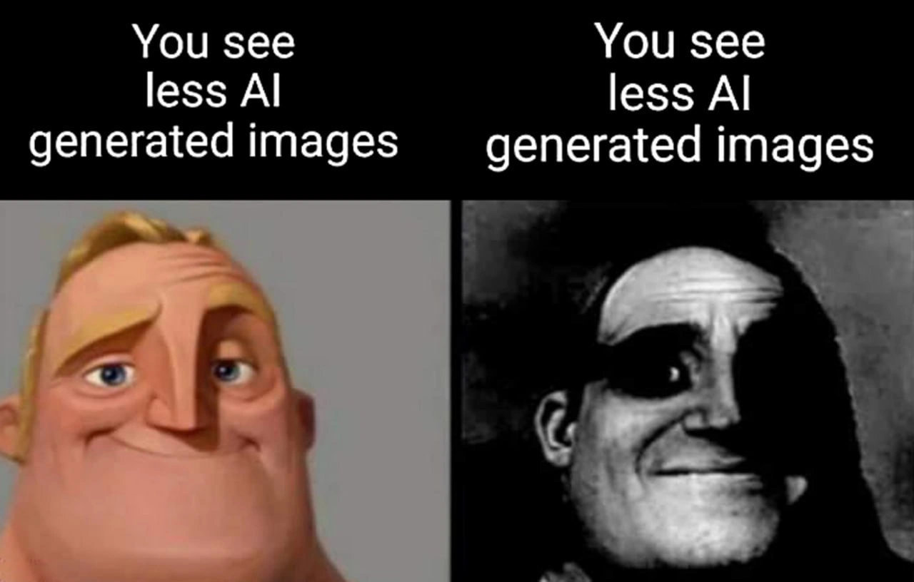
Now, when you click such a filter toggle, you expect the app to actually filter out or reduce that content going forward. The meme jokes that in this case, the app did nothing of the sort. Both panels of the meme display the text “You see less AI generated images,” yet both show an obviously computer-generated face (Mr. Incredible in two styles). It’s the exact same line on each side, implying the app just repeated itself. This hints at a bug or an incomplete feature: perhaps the developers added the text response “You will see less…” but forgot to implement the actual filtering logic. In programming, we’d call this a no-op (short for “no operation”) – the code runs, but it doesn’t actually change anything meaningful. It’s like adding a big red “OFF” switch on a machine that isn’t wired up inside – flipping it doesn’t power anything down.

There’s also a hint that the system simply re-ran the same prompt. In AI image generation, a prompt is the text description that tells the AI what image to make. If the recommender “just reruns the same prompt,” it means instead of showing a genuinely different type of content, it basically asked the AI to generate another image from the same description. That’s why we see the same character’s face twice, just in different art styles (left is a bright Pixar-style cartoon, right is a grainy black-and-white version). The user asked for less AI content, and the system’s idea of “less” was apparently to give another AI image with a different style. Essentially, nothing was filtered out – the system just presented a variant of the same thing.

For a junior developer, this illustrates a couple of important points (besides being funny). First, always ensure that your front-end controls match real back-end behavior. Here, the UX shows a reassuring message (“You see less…”) as if the preference was applied, but the backend didn’t actually change the feed. This could have been a simple oversight or a ux_copy_paste_bug – maybe the text label was hard-coded and copied for both states of the toggle. Or perhaps the team enabled the UI before the recommendation algorithm was ready to filter AI content. This is where feature flags come in: developers often use feature flags to turn features on and off gradually. A no-op feature flag means the flag is there, but flipping it currently doesn’t trigger any new behavior. It might be that the “see less AI” feature flag was turned on to show the button and message, but the engineering work to actually alter the feed wasn’t finished (or failed quietly). Oops! Users basically got a fake switch.

Second, it highlights a limitation in AI content filtering: how do you automatically detect what image is AI-generated? It’s not always easy. If the platform is trying to be smart, it might have an AI that scans images and guesses if they were made by another AI (looking for telltale signs like certain art styles or artifacts). But these detectors can be tricked or might consider something like a black-and-white photo style as “real” when it’s not. So if the filter isn’t robust, the feed won’t change much even with feedback. The meme exaggerates this to comic effect – clearly both images are the same guy’s face, clearly AI-made, so seeing the message twice just screams “the filter isn’t working!”

In summary, the meme is funny to developers because it’s a textbook scenario of a feature not delivering on its promise. You have a button meant to reduce a type of content, and yet you literally see the same message twice and the same kind of content twice. For a junior dev, it’s a gentle reminder: when building features, the front-end (what users see) and back-end (what the system does) have to be in sync. If they aren’t, users will notice – and they might just make memes about it! It also reflects the current AI hype vs reality: lots of buzz about AI features, but sometimes the implementation falls short or has funny bugs.

Level 3: The No-Op Toggle

For seasoned developers, this meme elicits a knowing groan: it’s poking fun at those “filter” features that do absolutely nothing. The two panels both saying “You see less AI generated images” highlight a classic UX copy-paste bug or a half-baked feature. We’ve all seen this in production: a new toggle in the app’s settings or feed that promises to customize content (“show me less of X”), yet flipping it yields no perceivable difference. The humor comes from that shared industry experience – the label changes, but the recommendations don’t. It’s like the system proudly declares your feed is adjusted, while continuing with business as usual. In other words, the toggle was a no-op (no operation): it didn’t hook into any real logic to filter out AI images.

This “no-op toggle” reflects how companies sometimes handle content moderation or user preferences. Under the hood, implementing “see less AI art” isn’t trivial. The dev team might need to plumb that preference through layers of microservices, retrain ranking models, or maintain an up-to-date classifier for AI-generated pictures. That’s a lot of work. In the rush of AI_hype, perhaps product management said, “We need a way for users to opt out of AI content, and we need it this quarter.” The developers, under the gun, shipped the UI part – a quick label change after a click – but the actual filtering pipeline wasn’t ready. The result? A faux feature that essentially just gives lip service to user choice. Users click “see less,” the interface dutifully echoes “You see less AI generated images”… and then proceeds to show the next AI image anyway. It’s corporate comedy in app form.

This also satirizes recommendation_engine_irony. Modern feeds learn from your behavior, but explicit feedback controls (like thumbs down or “not interested” buttons) often feel ineffective. Many senior devs suspect (half-jokingly) that those buttons are placebo. This meme takes that suspicion and makes it literal: the system literally re-ran the same prompt. In developer terms, it’s as if hitting the toggle called a function that returned the same result it started with. We can imagine the pseudo-code:

def on_click_see_less_ai():
    feed.show_message("You see less AI generated images")
    # TODO: Actually filter out AI images from feed in a future sprint
    return get_next_item(previous_prompt)  # Oops, returns content from the same prompt

The code above is tongue-in-cheek, but not far from reality. Perhaps the implementation just regenerated content with a slight variation, giving the impression something changed. This resonates with anyone who’s been on-call for a feature that wasn’t fully implemented: you get bug reports of “I clicked see less, but nothing happened.” Then you discover the flag reduce_ai_content was set true only in the UI state, never wired into the recommendation query. It’s an embarrassing post-mortem waiting to happen.

Historically, we’ve seen similar “toggle tragedies.” Remember when social networks introduced “Muted words” or “Not interested” options that barely worked? The industry tends to bolt on these controls after user backlash, often without fully reengineering the recommendation algorithm. It’s a classic trade-off: by the time the team adds proper support, users have already made memes about how useless it is. Here, developers are laughing (perhaps a bit bitterly) at that pattern. The meme’s side-by-side comparison (Pixar-esque Mr. Incredible vs. spooky vintage Mr. Incredible) exaggerates the “difference” the user sees – which is to say, almost none. It’s the same character, same context, just cosmetically altered. That’s exactly what a broken content filter would do: change the appearance slightly but not remove the content type.

In essence, the meme is a jab at the gap between AI industry trends promises and reality. The interface promises smarter personalization (“we’ll hide the stuff you don’t want!”), but the AI limitations and possibly some sloppy coding turn it into a farce. Seasoned devs have been there: a feature flag flipped to enable “less AI,” but nothing in the recommendation engine consuming that flag. It’s both funny and painful – funny because it’s absurd, painful because we know real users have hit these dead switches. The AIHumor here is also a bit of gallows humor about our current hype cycle: Everywhere you click, some AI is generating content, and even telling the system to tone it down might just result in more AI content (with a cheeky grin from Mr. Incredible to boot).

Level 4: Feedback to /dev/null

At the deepest technical level, this meme exposes how user feedback can vanish into a black hole of the recommender’s design. Modern algorithmic_feed systems (like those on social platforms) run on complex recommendation_engine logic, often driven by machine learning models optimizing for engagement. When the user clicks “see less AI art,” ideally it should act as a negative feedback signal into the model. In theory, the system would update its internal weighting to show fewer AI-generated content items. But here the irony is that the feedback was essentially ignored – as if piped to the proverbial /dev/null.

Why would that happen? One possibility is misaligned objectives in the AI system. The recommender’s model might be tuned to maximize time-on-site or ad clicks, and it has learned that bright, novel AI images grab attention. A single “see less” click is a weak signal compared to the model’s confidence that AI images = engagement. The result: the algorithm acknowledges the input cosmetically but doesn’t really alter its output distribution. This is a classic case of reward function misalignment – the system’s objective (keep user hooked with flashy images) conflicts with the user’s stated preference (fewer AI images). The top text “You see less AI generated images” appears twice, almost mocking the user, because the underlying algorithm indifferently served up the same kind of content anyway.

Another angle is the technical challenge of identifying “AI art” in the first place. Unless content is explicitly tagged, the platform might rely on an AI classifier to detect AI-generated images. Such classifiers are imperfect and can be bypassed. The meme’s two images (Pixar-like vs grainy vintage) might both be AI outputs, but the system could be fooled by style: perhaps it treated the second image’s grainy, photo-like style as “not AI” because it doesn’t look like obvious CGI. In effect, the content_filter_toggle may have just prompted the generator to produce the same prompt in a different style rather than actually sourcing a human-made image. Imagine an AI image generator receiving the exact same input prompt but with a style parameter tweak – you’d get a new image (maybe switching from colorful cartoon to monochrome “realistic” look) without changing the core content. The meme humorously implies the recommender did exactly that: it reran the same prompt through the AI, giving a superficially different image that still originates from AI. The label “You see less AI generated images” showing up unchanged is essentially a UI-level fib.

From a systems perspective, this highlights a no-op feature flag deployment. The front-end shows the “filter” state change, but the back-end logic for actually filtering or re-ranking the feed wasn’t there or was ineffective. Large-scale systems often roll out features gradually: first the UI, then the real behavior. In this case, it looks like the UI toggle was deployed without the algorithmic change – a feature flag paradox where turning the knob doesn’t adjust any circuitry behind it. Advanced developers recognize this as a probable result of rushed integration (perhaps product managers demanded a quick toggle to quell user complaints about AI content). The consequence is a placebo button: it provides the illusion of control without altering the recommendation model’s matrix factorization or content embedding space in any meaningful way. In sum, the meme captures a scenario where the AI/ML hype meets cold reality – an algorithmic irony where the user’s input is noted but effectively ignored by design, due to either technical limitations or misaligned priorities.

Description

A two-panel meme using the 'Mr. Incredible Becoming Uncanny' format. In the left panel, a colored, cheerful Mr. Incredible is shown with the text above reading, 'You see less AI generated images.' This represents a positive interpretation. In the right panel, the image is a dark, distorted, and unsettling black-and-white version of Mr. Incredible, but the text above remains identical. The humor is derived from the starkly different emotional reactions to the same statement. The first suggests relief that the flood of AI content is waning. The second, uncanny panel implies a horrifying realization: you see fewer AI images because they have become so realistic they are now indistinguishable from authentic ones. This meme speaks to the incredible pace of generative AI development and the emerging challenges of digital authenticity and potential for sophisticated misinformation
Comments

16
Anonymous ★ Top Pick Seeing less AI-generated content is like your observability platform suddenly going quiet. It either means the system is perfectly stable, or the platform has crashed and you're flying completely blind
  1. Anonymous ★ Top Pick

    Seeing less AI-generated content is like your observability platform suddenly going quiet. It either means the system is perfectly stable, or the platform has crashed and you're flying completely blind

  2. Anonymous

    Apparently the product team implemented ‘See Less’ by deduplicating the user table instead of the images - classic junior-level LEFT JOIN on the wrong column

  3. Anonymous

    The real uncanny valley isn't in robotics - it's in your LinkedIn feed where every headshot has that telltale Midjourney v5 sheen and everyone's hands have exactly 5.7 fingers

  4. Anonymous

    After training your production model on scraped internet data for six months, you realize the dataset was 40% AI-generated images from other models, 30% memes about AI-generated images, and 29% Stack Overflow screenshots. The remaining 1% was actual photography, but it was all from that one guy who posts lens flare tutorials. Your model now exclusively outputs images that look like they were rendered on a Pentium II running Blender 1.0, and somehow every face has that distinctive 'I've seen the training loop and it broke me' expression. The PM calls it 'artistic vision' in the retrospective

  5. Anonymous

    Our “see less AI images” toggle just bumps the synthetic-detector threshold from 0.50 to 0.51 - policy satisfied, CTR untouched, and growth still happy

  6. Anonymous

    GANs nailing photorealism like a junior dev's first prod deploy: close enough to trigger uncanny alerts

  7. Anonymous

    Amazing how a missing hyphen turns a content policy into a model‑ablation request

  8. @dst212 1y

    LMAO

  9. @callofvoid0 1y

    huh

  10. @callofvoid0 1y

    does the second one mean the AI is so good you can not recognize it? edit: reactions on fire

    1. @MixaKonan 1y

      yes

    2. @ZgGPuo8dZef58K6hxxGVj3Z2 1y

      No it means you go blind

  11. @grinya_a 1y

    It's good 🍷

  12. @SamsonovAnton 1y

    MOAR IMAGES!

  13. @karim_mahyari 1y

    Uncanny Van Gogh is 🔥

  14. Deleted Account 1y

    not that good the generated image texture still has footprints

Use J and K for navigation