290 Googlers debating which blue Gmail's Compose button should A/B test this month
Why is this Google meme funny?
Level 1: Big Team, Small Decision
Imagine you have a huge group of people all working together on one little thing – say, choosing a color for a button. It sounds silly, right? That’s basically the joke here. Think of it like this: you have 290 people (that’s a lot of people – more than most entire school grades!) and their job is to decide what shade of blue to paint a tiny door. Instead of building a new house or doing something big, they’re all just focused on that one little door’s paint color. They call meetings, they argue, they compare one shade of blue with another that looks almost the same. From the outside, you’d think these people are doing something really important or groundbreaking (because Google is a famous, world-changing company). But peeking inside, you find out they’re mostly fussing over a tiny detail – which exact blue looks best. It’s funny because it feels like an overreaction: do you really need that many smart folks spending that much time on something so small? It’s like using an elephant to carry a single straw. The humor comes from that contrast – big effort, tiny outcome. Even a kid can laugh at the idea of a whole classroom of adults intensely arguing whether the sky blue crayon or the azure blue crayon is better for coloring one button on a drawing. In simple terms, the meme is joking that sometimes big companies worry about very small things, and it’s poking fun at how goofy that seems.
Level 2: 290 Googlers, One Button
Let’s break down the joke in simpler terms. Googlers means Google employees – people who work at Google. The tweet is humorously saying that a team of 290 Google employees is responsible for just the “Compose” button in Gmail. That’s the big, usually blue button you click to start writing a new email. On Gmail’s interface it says “Compose” with a plus icon, and it’s pretty prominent. Now, having a whole team “own” that button means those folks take care of anything to do with starting new emails – the design, the code behind it, any new features or changes. It doesn’t literally mean they invented the button, just that it’s their area to maintain and improve. In a giant product like Gmail, work is divided into very specific parts, and apparently this meme imagines one part is just that button.
The tweet jokes that these Googlers sit in meetings all day debating which shade of blue they should A/B test this month. So, what’s an A/B test? A/B testing is a method tech companies use to make decisions based on data. Suppose Google isn’t sure whether a lighter blue or a darker blue would make more people click the Compose button. Instead of guessing, they do an experiment: they show version A (lighter blue) to some percentage of users, and version B (darker blue) to another percentage. Then they compare the results – like which group clicked the button more. If one color leads to even a slightly higher click rate, that color “wins” and Google might roll it out to everyone. It’s like asking a huge audience to vote with their actions on which color is nicer or more effective. Companies like Google run A/B tests constantly – it’s how they fine-tune designs and features. Even small changes can matter when you have billions of users. A 0.1% improvement in usage could mean millions of extra clicks or interactions. So Google is very data-driven: they let user data guide design choices whenever possible.
Now, why is that funny in this context? Because the tweet is painting a picture of an extremely meticulous process for something very small. Imagine spending hours in meetings just to decide “Should our button be slightly more sky-blue or slightly more cornflower-blue?” It sounds ridiculous, right? That’s the joke – it’s an exaggeration of real tendencies in big tech. Meetings in large companies can indeed pile up. There might be meetings to discuss the design (what shade of blue looks on-brand and accessible), meetings to approve running the test, meetings to analyze the A/B test results, and so on. The phrase MeetingOverload is real: sometimes there are so many meetings that employees feel like they hardly have time to actually do the work (like coding or designing). This meme takes that to the extreme by saying they sit in meetings all day. Of course, that’s part of the humor – it’s poking fun at the stereotype of corporate teams being bogged down in bureaucracy.
Speaking of bureaucracy, big tech companies like Google do have a lot of people and process involved in decisions. Big_tech_bureaucracy refers to the layers of management, approvals, and the sheer number of stakeholders. For any change in Gmail’s interface, you might have a product manager (deciding if the change aligns with goals), UX and UI designers (UX means User Experience, focusing on how it feels to use, and UI means User Interface, focusing on how it looks), researchers (maybe they interviewed users about the button), engineers (who will implement the color change in code), quality assurance testers (who make sure the new blue doesn’t oddly make the text hard to read, for example), and data analysts (who will look at the A/B test data). Each of these people might be part of that “290” team, and they all need to communicate. So yes, lots of discussions. It’s funny because 290 people for a button feels like complete overkill, but in a company with tens of thousands of employees, teams can get surprisingly large even for small features.
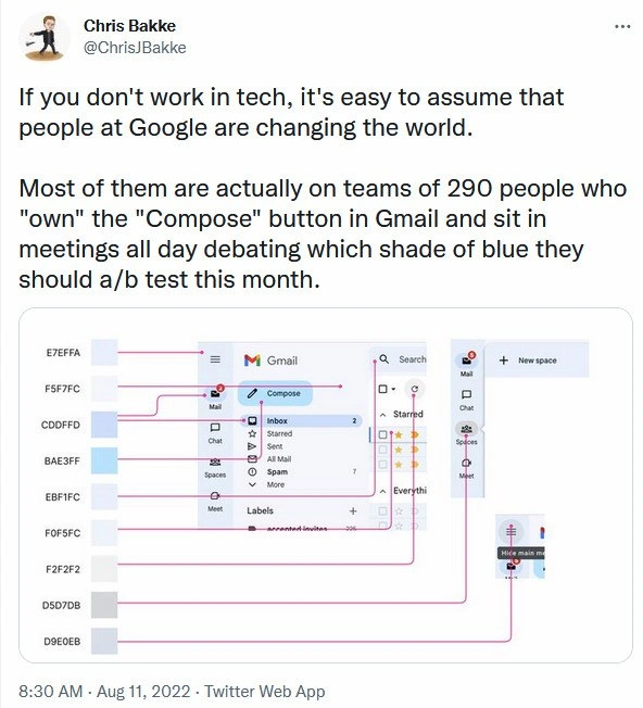
Now, the image in the meme shows Gmail’s interface annotated with a bunch of color codes: E7EFFA, F5F7FC, CDDFFD, BAE3FF, ... and so on. These codes are in hexadecimal (hex) format, basically a way to represent colors on computers. Each hex code corresponds to a specific color. They’ve drawn pink connector lines from each code to parts of the Gmail UI – like one code pointing to the Compose button, another to the “Inbox” label background, another to the little “Hide main menu” icon area, etc. What’s the point of this? It’s highlighting how many slightly different shades of blue or grey are used in one screen. For example, #E7EFFA and #EBF1FC are both very light bluish colors, almost indistinguishable at a glance. The meme maker is emphasizing the nitpicky detail: Gmail’s design uses a whole palette of blues. Possibly each of those was the result of a separate decision or design iteration. It’s basically saying, “Look, they’ve got all these nearly identical blues – this must be what those 290 people are fussing over!” It’s a visual gag about color_palette chaos. In good UX design principles, usually you’d want a consistent set of colors (like a primary blue, a secondary background blue, etc.), not a dozen variants. Seeing so many implies maybe every new meeting introduced a new tiny variation (“Could we try it a tad lighter?” “Sure, here’s #F0F5FC instead of #EBF1FC”). Over years, you accumulate a lot of redundant shades. Frontend developers know this pain: you open a stylesheet and find a rainbow of almost-the-same colors because different people at different times added new ones. Maintaining a clean style guide is hard when everyone’s running experiments on the fly.
We should also explain the term design bikeshedding that fits this scenario. Bikeshedding is a metaphor that comes from a story about a committee discussing plans for a nuclear power plant. The committee spent a disproportionate amount of time on the easiest, least important part – the bike shed in the plan – because everyone could weigh in on that (“I think it should be blue!”) whereas the hard stuff (like the reactor design) was too complex, so they glossed over it. In tech and design, we use “bikeshedding” to describe when teams waste time on trivial things anyone can have an opinion about. Debating the exact shade of a button is a textbook example of bikeshedding. It’s easy to have opinions on color (“blue is calming, but maybe a greener blue might be more inviting?”) so people get sucked into those debates. Meanwhile the bigger questions – say, “How do we make writing emails fundamentally better?” – might get less discussion because they’re hard and abstract. The meme is funny to developers because we’ve all seen this happen: a meeting that derails into arguing about icons or font size or some minor detail, consuming an hour that could’ve been spent on real progress.
Finally, consider the contrast between Google’s public image and this scenario. If you don’t work in tech, Google employees might seem like wizards changing the world with self-driving cars, cutting-edge AI, or solving big problems. Google certainly does those big things too (they have divisions for self-driving cars, called Waymo, etc.). But a lot of Googlers work on everyday products like Gmail, Search, Maps – and mostly they’re refining, maintaining, and incrementally improving these services. So the joke here is also saying: “People think Googlers are all doing genius moonshot projects, but actually many are just incrementally tweaking Gmail’s interface.” That’s not to say their work isn’t important – even small improvements can make users’ lives a bit better – but it shatters the myth that everyone at Google is working on the next revolutionary invention. For a junior developer or someone new to the field, this can be eye-opening. You might join a big company expecting to invent the next Gmail, only to find your job is to optimize the color of an existing button. It can be a mix of pride (“wow, a billion people will see my color change!”) and humor (“did I really go through four meetings to decide on blue?”).
In summary, the meme uses humor to shed light on a real phenomenon: big tech companies put a lot of resources and people into perfecting very small details, sometimes to a comedic extent. It’s poking fun at the MeetingHumor of being stuck in endless debates, the nitpicky nature of UX/UI design at scale, and the contrast between what non-tech folks imagine and what day-to-day tech work can actually be. If you’ve ever been in a team that spent an afternoon picking button colors or arguing about whether an icon should be a few pixels to the left, you’ll likely chuckle – this meme is painfully relatable!
Level 3: Bikeshedding at Scale
In every massive tech company like Google, even trivial details can become a big production. This meme lampoons the reality that a CorporateCulture of data-driven perfectionism often leads to huge teams obsessing over tiny things. Remember the legendary tale of Google testing 41 shades of blue for a link color? That wasn’t fiction – Google actually ran exhaustive A/B testing to find the most clickable blue. Here we have a tweet jesting that 290 Googlers “own” the Gmail Compose button and spend their days debating which shade of blue to try next. It’s a tongue-in-cheek exaggeration, but any seasoned developer knows it carries a kernel of truth. Large organizations can afford (and even demand) this level of meticulous optimization. When you serve billions of users, a 0.1% improvement in click-through on the Compose button could mean millions more emails sent – or so the thinking goes. So yes, teams really do run experiments on seemingly insignificant UI tweaks, from button colors to icon placements, chasing incremental upticks in user engagement. This hyper-analytical approach to UX/UI isn’t about whimsy; it’s about squeezing out every last drop of efficiency at scale.
Yet, it’s hard not to roll one’s eyes at the absurdity. The tweet perfectly captures design bikeshedding in action – a term from Parkinson’s Law of Triviality where groups spend disproportionate time on trivial details because they’re easier to grasp than the big stuff. Picking a hue of blue is the classic bikeshed: everyone from engineers to VPs feels qualified to chime in. Meanwhile, truly big challenges (say, overhauling an outdated email protocol or innovating a new feature) get less airtime because they’re complex or risky. The result? Endless debates over hex codes in meeting after meeting. A cynical veteran can practically feel the boredom of those color-review sessions: “Do we really need three separate meetings to figure out if #F0F5FC is better than #E7EFFA on the Compose button?” It’s funny because it’s true – well, truth stretched to meme proportions. The image underscores this by mapping a whole palette of nearly indistinguishable blues and greys onto Gmail’s interface. You see labels like E7EFFA, EBF1FC, F0F5FC pointing to the sidebar and button backgrounds. Gmail’s UI seemingly has a dozen shades that look almost the same. To an insider, this smells of design-by-committee: each subtle variation might be the remnant of a past experiment or the preference of some sub-team. No single designer would intentionally use nine slightly different blues in one app – that’s the fingerprint of iterative tweaks accumulated over time.
/* A snippet from an alternate universe Gmail stylesheet */
.compose-button { background-color: #E7EFFA; } /* Light blue variant A */
.sidebar-inbox { background-color: #EBF1FC; } /* Light blue variant B */
.nav-menu-item { background-color: #F0F5FC; } /* Light blue variant C */
/* So many shades of almost-the-same blue... */
The code above is a dramatization, but not far-fetched – large front-end codebases often end up with a mess of similar styles after years of micro-optimizations. It makes you wonder: did changing #E7EFFA to #EBF1FC really move the needle, or just give the UXDesign team something to present in last quarter’s report? The humor here is how big_tech_bureaucracy can turn something as innocuous as a button color into a mini-epic. A team of 290 is obviously hyperbole, but in a place like Google you might indeed have dozens of people (product managers, designers, UX researchers, analysts, and plenty of engineers) involved in the “Compose button team” if you count everyone from concept to launch. And with many people comes many Meetings. Design reviews, stand-ups, experiment result discussions, stakeholder check-ins – you can easily fill your calendar debating that one button. Veteran developers joke about MeetingOverload for exactly this reason: sometimes it feels like we spend more time talking about work than actually doing it.
It’s worth noting that this obsession with small details isn’t purely folly. At Google’s scale, even minor UX improvements can yield significant gains. There’s a famous internal metric-driven culture – “UXDesignPrinciples by numbers,” you might say. If data shows that a certain shade of blue makes users ever-so-slightly more likely to click, that’s the shade that wins. But that logic-driven optimization often clashes with creative instinct. Many designers have felt the frustration of having to defend every decision with data, down to the pixel. The meme plays on this tension: outsiders think Googlers are changing the world, while insiders know a lot of effort goes into incremental tweaks. It’s a form of DeveloperHumor that elicits a knowing groan – we laugh because we’ve been in those shoes, laboring on a tiny piece of a giant machine, half-proud and half-bewildered that this is what our workday has become.
To sum it up, the meme highlights a paradox of modern tech: world-changing companies often devote armies of talent to very narrow problems. It’s the gmail_compose_button today – tomorrow, it might be the YouTube thumbs-up icon or the Google Maps traffic line thickness. Sure, it’s important to polish the user experience, but the comedic exaggeration here asks, “How many brilliant minds does it take to repaint a button blue?” The answer, apparently: nearly three hundred, a pile of user data, and a whole lot of meeting invites.
| What outsiders imagine Google does | What many Googlers actually do |
|---|---|
| Invent world-changing tech and AI magic 🧪 | Tune the Gmail UI and color schemes 🎨 |
| Launch moonshot projects to “change the world” | Schedule meetings about pixel-level tweaks 📅 |
| Solve big problems (like self-driving cars) | Solve tiny problems (like which blue is best) |
Description
The image is a screenshot of a tweet by Chris Bakke (@ChrisJBakke) posted at 8:30 AM · Aug 11 2022 via Twitter Web App. Tweet text: “If you don't work in tech, it's easy to assume that people at Google are changing the world. Most of them are actually on teams of 290 people who "own" the "Compose" button in Gmail and sit in meetings all day debating which shade of blue they should a/b test this month.” Below the tweet is an annotated Gmail interface: the left column lists hexadecimal color codes “E7EFFA, F5F7FC, CDDFFD, BAE3FF, EBF1FC, F0F5FC, F2F7F2, D5D7DB, D9E0EB”. Pink connector lines map each code to slightly different blue-tinted UI elements - the “Compose” button, “Inbox”, “Mail”, “Chat”, “Spaces”, “Meet”, label chips, and the “Hide main menu” icon. Visible UI text includes “Gmail”, “Compose”, “Mail”, “Inbox”, “Chat”, “Spaces”, “Meet”, “Labels”, “Search”, “Starred”, “Everything”, and “New space”. The meme satirizes big-tech design bikeshedding, A/B testing culture, and how huge teams in corporate environments spend countless meeting hours on minuscule UX color decisions instead of groundbreaking innovation
Comments
6Comment deleted
Nine microservices, two SRE rotations, and a tiger team of PMs exist solely to ensure #E7EFFA beats #F5F7FC at p < 0.05 - proof that at Google scale, even color gradients get their own org chart
Meanwhile, the team maintaining Gmail's actual compose functionality is just one guy who hasn't been allowed to touch the code since 2011 because "it works fine and we don't want to break anything before the next reorg."
Ah yes, the classic enterprise architecture pattern: 290 engineers, 8 hex color variants, infinite meetings, and a single-point-of-failure Compose button. It's like microservices, but for organizational dysfunction - each team owns a microscopic piece of the user experience, complete with its own roadmap, OKRs, and quarterly planning cycle. The flowchart perfectly captures how every shade of blue (#E7EFFA through #D9E0EB) requires its own branch, code review, A/B test framework, metrics dashboard, and post-mortem when the button renders 2 pixels off-center. Meanwhile, the startup down the street ships their entire email client with three developers and a dream. But hey, at least Google's button has 99.999% uptime and a dedicated SRE rotation
Only at BigCo does changing Gmail’s Compose from material-blue‑500 to ‑501 need a design‑token RFC, the monorepo submit queue, three feature flags, and SRE on call - because the wrong shade once spiked click‑through and paged everyone
In big tech we needed a design‑token pipeline, SRE on‑call, and a change advisory board just to switch Compose from #E7EFFA to #F5F7FC - then discovered the “stat‑sig” CTR win was Friday p‑hacking
Google's true distributed system challenge: achieving consensus on which #4285F4 variant lifts compose clicks by 0.0001%