
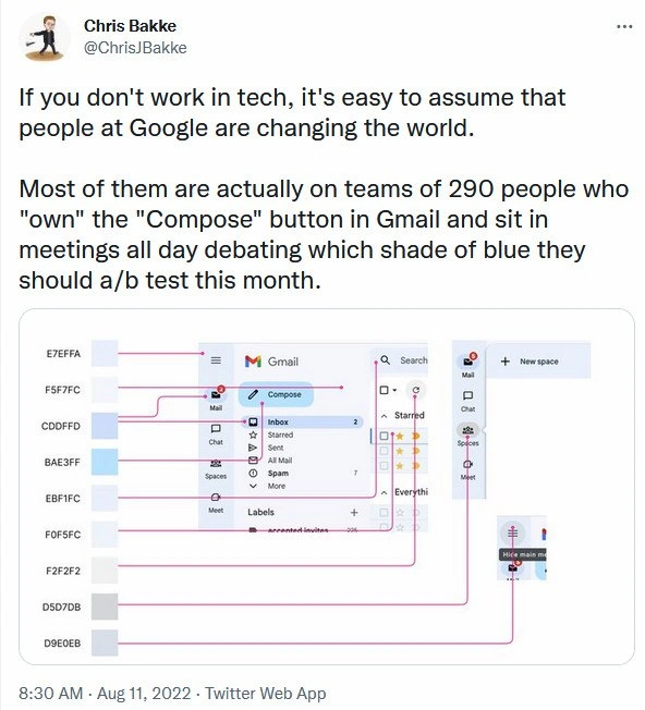
290 Googlers debating which blue Gmail's Compose button should A/B test this month
Description
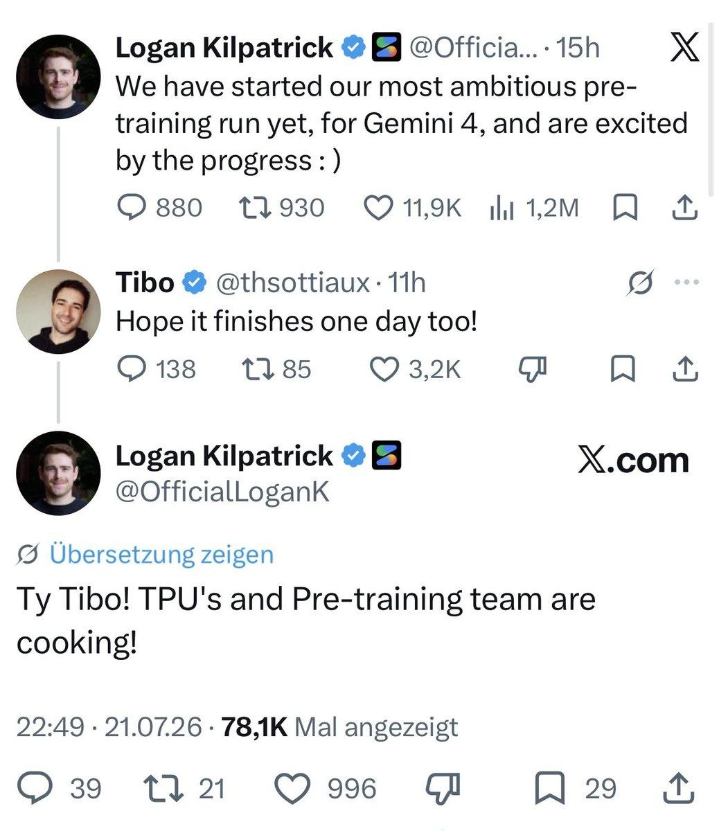
The image is a screenshot of a tweet by Chris Bakke (@ChrisJBakke) posted at 8:30 AM · Aug 11 2022 via Twitter Web App. Tweet text: “If you don't work in tech, it's easy to assume that people at Google are changing the world. Most of them are actually on teams of 290 people who "own" the "Compose" button in Gmail and sit in meetings all day debating which shade of blue they should a/b test this month.” Below the tweet is an annotated Gmail interface: the left column lists hexadecimal color codes “E7EFFA, F5F7FC, CDDFFD, BAE3FF, EBF1FC, F0F5FC, F2F7F2, D5D7DB, D9E0EB”. Pink connector lines map each code to slightly different blue-tinted UI elements - the “Compose” button, “Inbox”, “Mail”, “Chat”, “Spaces”, “Meet”, label chips, and the “Hide main menu” icon. Visible UI text includes “Gmail”, “Compose”, “Mail”, “Inbox”, “Chat”, “Spaces”, “Meet”, “Labels”, “Search”, “Starred”, “Everything”, and “New space”. The meme satirizes big-tech design bikeshedding, A/B testing culture, and how huge teams in corporate environments spend countless meeting hours on minuscule UX color decisions instead of groundbreaking innovation


Comments
6Comment deleted
Nine microservices, two SRE rotations, and a tiger team of PMs exist solely to ensure #E7EFFA beats #F5F7FC at p < 0.05 - proof that at Google scale, even color gradients get their own org chart
Meanwhile, the team maintaining Gmail's actual compose functionality is just one guy who hasn't been allowed to touch the code since 2011 because "it works fine and we don't want to break anything before the next reorg."
Ah yes, the classic enterprise architecture pattern: 290 engineers, 8 hex color variants, infinite meetings, and a single-point-of-failure Compose button. It's like microservices, but for organizational dysfunction - each team owns a microscopic piece of the user experience, complete with its own roadmap, OKRs, and quarterly planning cycle. The flowchart perfectly captures how every shade of blue (#E7EFFA through #D9E0EB) requires its own branch, code review, A/B test framework, metrics dashboard, and post-mortem when the button renders 2 pixels off-center. Meanwhile, the startup down the street ships their entire email client with three developers and a dream. But hey, at least Google's button has 99.999% uptime and a dedicated SRE rotation
Only at BigCo does changing Gmail’s Compose from material-blue‑500 to ‑501 need a design‑token RFC, the monorepo submit queue, three feature flags, and SRE on call - because the wrong shade once spiked click‑through and paged everyone
In big tech we needed a design‑token pipeline, SRE on‑call, and a change advisory board just to switch Compose from #E7EFFA to #F5F7FC - then discovered the “stat‑sig” CTR win was Friday p‑hacking
Google's true distributed system challenge: achieving consensus on which #4285F4 variant lifts compose clicks by 0.0001%