Skip to content
DevMeme
4634 of 7435
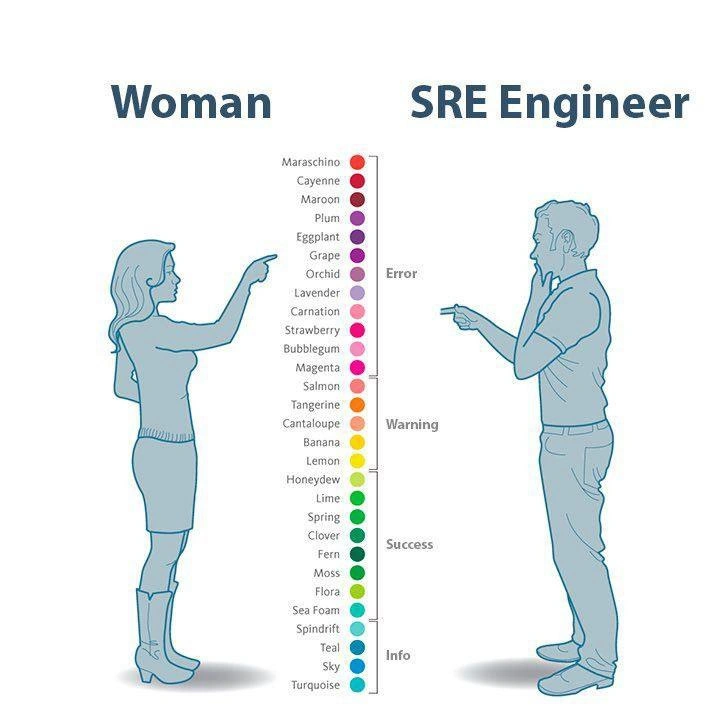
Color nuance versus dashboard severity: woman’s spectrum against the SRE status codes
DevOps SRE Post #5082, on Dec 14, 2022 in TG

Color nuance versus dashboard severity: woman’s spectrum against the SRE status codes

Why is this DevOps SRE meme funny?

Level 1: Traffic Light vs Crayon Box

Imagine you have a friend with a huge box of crayons – the kind with all the special colors. This friend can pull out a crayon and say, “This isn’t just red, it’s maroon,” or “This isn’t simply purple, it’s plum.” They have a name for every slight change in color, just like the left side of the picture where the woman points out specific fancy color names. Now think of a traffic light 🚦. A traffic light really only has a few colors it uses: Red, Yellow, Green (each one meaning something important: stop, slow/caution, go). The traffic light doesn’t use turquoise or magenta – it keeps things super basic so everyone immediately knows what to do.

In this meme, the SRE engineer is a bit like the traffic light. He groups all those pretty colors into a few simple signals: red means bad/problem, yellow-orange means be careful, green means good, and blue (in some tech contexts) means just info. He’s not interested in the exact shade name, he just wants to know if that color spells trouble or not. The woman, on the other hand, is like someone with the crayon box enjoying all the shades. She sees the differences between maraschino cherry red and strawberry red and thinks those details are important or fun.

The joke is that when it comes to computers and dashboards, people like this SRE engineer only care about colors the way we care about a traffic light’s colors. It’s very matter-of-fact: Is everything okay, or is something wrong? On a big computer monitoring screen, a tiny change from one kind of red to another doesn’t change the meaning – just like no matter what shade of red a stop sign is, it always means “STOP!”. Meanwhile, regular folks (or designers) might delight in all the unique shades they can see.

So basically, it’s funny because the two characters are speaking different “color languages.” One has 30 words for colors, the other has 4. It’s as if the woman says, “Look at this lovely color called Eggplant,” and the engineer replies, “All I see is Error Red – something’s wrong!” 😄. We laugh because we understand both sides: the joy of recognizing many colors, and the simplicity of using just a few colors as signals. The meme exaggerates that difference in a playful way, kind of like saying: Some people see a rainbow of choices, others see a simple stoplight. And when you’re an engineer on duty, you just want that stoplight clarity!

Level 2: Four Colors to Rule Them All

Let’s break this down in simpler terms. SRE stands for Site Reliability Engineer, a type of developer who focuses on keeping websites and services running smoothly (reliability is their mission). They use observability tools and monitoring dashboards to watch the health of systems. These dashboards often highlight issues using just a few standard colors. In this meme, we see a row of many colored circles with fancy names like Plum, Tangerine, Honeydew, and Turquoise. Those are specific color names — think of them like the names you find in a big box of crayons or on a paint swatch. Most people might just call something “purple” or “orange”, but here each shade has its own label (e.g. Eggplant is a dark purple, Cantaloupe is a soft orange, Sea Foam is a light green). The Woman on the left is confidently identifying one exact shade among these – showing off a very detailed color vocabulary.

Now, the SRE Engineer on the right isn’t interested in those detailed names at all. In his world, all those colors collapse into four basic severity levels used in tech: Error, Warning, Success, and Info. These correspond to how serious a situation is in a system:

  • Error (colored red or a similar alert color) means something is wrong or broken. For example, a server might be down or a code bug caused a crash. Red is used because it’s attention-grabbing (just like a stop sign or a red alert light).
  • Warning (often shown in orange or yellow) means “hmm, that’s not ideal, keep an eye on it.” It’s like a caution signal: perhaps memory usage is high or an unusual spike in traffic is occurring. It’s not a full-blown error yet, but it could become one. Yellow/orange fits because it reminds us of a warning traffic light meaning slow down or be careful.
  • Success (shown in green) means things are good or an action succeeded. Green is universally associated with OK/go/success (think of a green check mark or a “GO” light). For instance, if a daily backup job completed correctly or a test passed, a tool might mark it in green or label it as “Success”.
  • Info (commonly blue or sometimes gray) means neutral information – just a message or data point that doesn’t indicate a problem. Blue is often used as a calm, neutral color for logs that say things like “Server started at 3:00 AM” or “User login event.” It’s informational, meant to be recorded but not alarming.

So, while the left side lists thirty different color distinctions, the right side shows that the SRE groups them into just four buckets. This reflects real observability_monitoring systems. For example, if you’ve ever seen a web application’s status page or a continuous integration build system (like Jenkins, CircleCI, etc.), you might notice they use simple color signals: a green light or check mark for success, a red X or dot for failure, perhaps yellow for warnings, and maybe blue or gray for other info. The idea is that by keeping to a few distinct colors, it’s immediately clear how things are going. More colors would actually make it harder to tell at a glance if there’s a problem.

Think about the apps or games you use: have you noticed error messages often have red text or red icons? That’s by design. A success message (like “Profile saved successfully”) might have a green highlight or a little green check ✔️. Those conventions come from the same place as the SRE’s mindset. In a complex system with tons of data, you highlight the important stuff in a consistent way. An SRE’s dashboard might show hundreds of metrics, but the moments that demand attention will flash in bright red or orange. If everything is fine, they’ll see a reassuring sea of green. If it’s just routine info, maybe it stays blue or white and doesn’t draw the eye.

Now, the humor part: Traditionally, it’s joked that some folks (especially many engineers 😅) aren’t great at naming colors beyond the basics. There are famous internet jokes about how a woman might identify “dusty rose” vs “fuchsia”, while a man might say “uh, it’s pink.” This meme is playing on that idea. The woman here proudly points out a very specific shade by name, whereas the SRE engineer (a stereotypically male-dominated role) is scratching his chin, basically saying: “Uhh, I only know four categories for colors, and they’re tied to how panicked I should be.” It’s a lighthearted take on both DevOps humor and that classic men-vs-women color perception cliché.

From a newbie developer perspective, it’s also highlighting how UX design and DevOps prioritize color differently. A UX/UI designer might indeed use all those fancy color names when choosing a palette for an app — they care about the subtle difference between Orchid and Lavender to get a design just right. But a DevOps or SRE person creating a monitoring panel will deliberately use only a few colors, chosen for maximum clarity. There’s even a practical reason: if you woke up an on-call engineer at 2 AM with an alert, you want the screen to clearly scream “Error! Act now!” in red or “All good” in calm green. No one wants to play guessing games with shades in an emergency.

In short, the meme is funny to developers because it shows a communication gap in a silly way: One side is super precise about something (colors of the rainbow 🌈), and the other side says “Meh, I only speak in four colors, and they all map to how worried I should be about my servers.” It’s a clash between detailed color perception and pragmatic IT alerts. Even if you’re new to these concepts, you can appreciate that contrast. Once you start working with logging frameworks or monitoring systems, you’ll quickly notice this pattern too. For example, if you use Python’s logging library or check console output from a tool like Docker, error messages might appear in red text, warnings in yellow, etc. It’s all the same idea: we sacrifice color nuance in tech so we can instantly know what’s up. So the SRE engineer in the meme isn’t wrong – he’s doing what years of IT practice have taught him. It just ends up looking comical next to someone speaking in vivid color descriptors.

Level 3: Pantone vs PagerDuty

In the world of observability and monitoring, an engineer’s relationship with color is purely functional. This meme hilariously contrasts a finely tuned color vocabulary with the blunt instrument of an SRE (Site Reliability Engineer) dashboard. On the left, the woman confidently identifies a precise shade among 30 exotic color names (Maraschino, Eggplant, Teal, Turquoise, etc.). On the right, the SRE squints at that same vibrant spectrum but only sees four outcomes — the classic alert levels Error, Warning, Success, and Info. It’s a witty nod to how DevOps culture reduces a rainbow of hues into a few severity states on a monitoring dashboard.

In an SRE’s daily reality, subtle differences between Plum and Grape or Cantaloupe and Banana simply don’t matter. What does matter is whether the system is on fire or not. The entire red-to-purple range of fancy names? That’s just “Error red” – something’s broken or about to break. All the oranges and yellows? Lump them into “Warning amber” – caution, something’s off-kilter. The green family from neon Lime to deep Fern? That’s “Success green” – things are OK (for now). And the cool teals and blues? Those are “Info blue” – benign details for later. The meme perfectly mirrors how a typical status color mapping works in dashboards: it compresses dozens of possible color tones into a few meaningful categories. After all, in high-stakes DevOps_SRE scenarios, nobody has time to debate Orchid vs Lavender when an alert is blaring 😉.

This reduction of the color spectrum to key alert hues is grounded in practical design. Monitoring tools and incident dashboards (think PagerDuty, Nagios, or a Grafana alert panel) use a limited palette so that human eyes instantly recognize issues. It’s a UX principle wrapped in DevOps humor: by standardizing colors, you get immediate, visceral clues. Red grabs your attention as critical failure! (just like a red traffic light or alarm signal), yellow/orange flags caution, and green reassures all clear. The SRE persona in the meme embodies this mindset — he touches his chin, trying to decide which broad bracket a color falls into, rather than its exact name. It’s poking fun at how Observability_Monitoring pros often develop tunnel vision for severity. An experienced on-call engineer has effectively re-trained their brain to react to colors only as indicators of system status. You could flash any shade from maroon to magenta at 3 AM, and their response is the same: “Something’s wrong – fix it!”

There’s an underlying industry inside-joke here about gender_vs_engineer_perception. Culturally, it’s often quipped that many men (especially stereotypical engineers) have a limited color vocabulary — e.g. calling everything “purple” or “orange” — whereas women might use nuanced terms like plum or tangerine. The meme winks at this trope but gives it a tech twist: the SRE intentionally ignores nuance because, for him, colors exist only to convey system health. It’s not that he can’t tell mauve from magenta; it’s that, in his job, both mean “We’ve got errors in prod!”. This is ObservabilityAndMonitoring culture distilled: cut through the noise and focus on the signal. In effect, the SRE’s perspective quantizes the rainbow into four resolute states.

From a UX/UI design standpoint, this simplification is a feature, not a bug. Too many shades on a dashboard would be confusing — engineers need quick, at-a-glance awareness. By convention, dev teams map log levels or alert severities to fixed colors so consistently that it becomes second nature. Consider a continuous integration pipeline or server health console: a seasoned dev immediately knows that a red icon means a failed build or outage, without reading a single word. The meme’s humor lies in applying that laser focus to a casual scenario. On the left, the woman’s delighted in the beautiful granularity of Honeydew vs Lime. On the right, the SRE is basically thinking, “All those ‘different’ colors look like variations of my four alert levels… and anything in that top red zone is making my pager go off!”

In summary, the joke lands because it’s DevOpsHumor that’s painfully relatable: SREs live in a world of dashboards where every hue has a purpose (and usually, a corresponding PagerDuty sound at 2 AM!). While a normal person might admire the full Crayola box of colors, an SRE’s brain translates hues into system statuses. When you’re responsible for uptime, the difference between Maraschino and Cayenne is trivial — what matters is that they both spell “ERROR: immediate action required.” This contrast between everyday color appreciation and no-nonsense Monitoring pragmatism is what makes engineers smirk at this meme. It captures a little truth about tech life: sometimes, observability means sacrificing nuance for clarity.

Table: Alert Levels vs. Colors in Practice

SRE Severity Level Typical Color 🖥️ What It Means in Context
Error (Critical) Red / Dark Purple Major failure or outage. System is down or in serious trouble.
Warning (Alert) Orange / Yellow Concerning behavior. Not yet a outage, but watch out (high load, etc).
Success (OK) Green Everything is normal or an operation succeeded. 🎉
Info (Notice) Blue / Teal Routine information. No action needed – just for logging or FYI.

Above: How many DevOps tools categorize states — a few colors cover many shades of meaning. Notice how broad each bucket is: any red-toned alert, whether labeled “maroon” or “magenta”, signals a crisis (Error). Likewise, a green light covers the entire span from mint to forest if it means the system is healthy. This meme gets a knowing laugh from SREs because, in practice, we really do mentally replace a rich color spectrum with four big words and their associated hues. It’s a comedic reminder that in tech, context is everything: a color isn’t just a color, it’s an alert (or the lack of one). And if you’re an SRE, you don’t care if it’s called Bubblegum pink or Strawberry red — you care that it’s in the “Error” zone and you’ve got a job to do!

Description

The cartoon-style image is split into two blue monochrome silhouettes facing each other. A column of 30 colored circles runs between them, labeled (top to bottom): “Maraschino, Cayenne, Maroon, Plum, Eggplant, Grape, Orchid, Lavender, Carnation, Strawberry, Bubblegum, Magenta, Salmon, Tangerine, Cantaloupe, Banana, Lemon, Honeydew, Lime, Spring, Clover, Fern, Moss, Flora, Sea Foam, Spindrift, Teal, Sky, Turquoise.” Above the left figure is the caption “Woman”; she confidently points at a specific circle, suggesting fine-grained color vocabulary. Above the right figure is the caption “SRE Engineer”; the man touches his chin, then points, but along the column are only four grey bracket labels - “Error” (red-purple range), “Warning” (orange-yellow range), “Success” (green range), and “Info” (blue-cyan range) - mirroring typical monitoring dashboard severity colors. The humor contrasts everyday detailed color naming with site-reliability conventions where colors reduce to alert states, poking fun at DevOps observability culture
Comments

6
Anonymous ★ Top Pick Design can debate Maraschino vs. Cayenne all sprint long - by the time it hits the dashboard, every shade that wakes PagerDuty is just #FF0000 to me
  1. Anonymous ★ Top Pick

    Design can debate Maraschino vs. Cayenne all sprint long - by the time it hits the dashboard, every shade that wakes PagerDuty is just #FF0000 to me

  2. Anonymous

    The real art is convincing stakeholders that "Cantaloupe" in the design mockup maps to Warning severity, while explaining why your Grafana dashboard only needs four colors but somehow requires 47 different time series metrics

  3. Anonymous

    An SRE's relationship with color is purely transactional: red means you're getting paged at 3 AM, yellow means you're about to get paged at 3 AM, green means the last deployment somehow didn't break everything, and blue means someone's reading the documentation you wrote six months ago. Meanwhile, the rest of the world debates whether that alert notification is 'salmon' or 'coral' while your production database is on fire in a very specific shade of #FF0000

  4. Anonymous

    SREs don't chase Pantone trends - they ship with four log levels and call it a feature-complete palette

  5. Anonymous

    Pantone has thirty names for red; SRE has one: page - color is a lossy codec for SLIs

  6. Anonymous

    Design debates maraschino vs bubblegum; the SRE sees four colors: red = pager, yellow = burn-rate > 1, green = Prometheus crashed so Grafana says “healthy,” blue = someone silenced alerts

Use J and K for navigation