
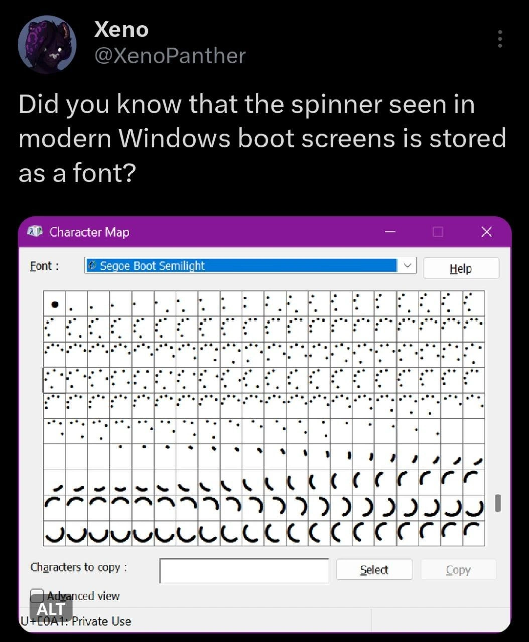
The Windows Boot Spinner Is a Font, Not an Animation
Description
This meme is a screenshot of a tweet from the user Xeno (@XenoPanther) that reveals a piece of technical trivia. The tweet reads, "Did you know that the spinner seen in modern Windows boot screens is stored as a font?" Below this text is a screenshot of the Windows Character Map utility. The application window shows the font "Segoe Boot Semilight" is selected. The character grid displays a series of glyphs that are actually the individual frames of the familiar dotted circle loading animation from the Windows boot screen. The bottom of the window indicates these are in a private use area of the font. The humor comes from the surprising and clever engineering hack of implementing a loading animation not as a video, GIF, or drawn graphic, but as a sequence of characters in a font. For senior developers, this is an amusing insight into the creative, low-level solutions required for processes like OS booting, where full graphics capabilities may not yet be available. It highlights how engineers use unconventional methods to solve problems under strict constraints
Comments
123Comment deleted
Implementing a loading spinner as a font is peak 'we need this to work before the graphics driver loads' energy
Of course the Windows boot spinner lives in Segoe Boot - when the graphics stack isn’t up yet, you do what any seasoned dev would: hijack the Private-Use Unicode range and let DrawText() handle your 60 FPS animation
This is peak 'it's not a bug, it's a feature' energy - Microsoft engineers storing boot animations in a font file because when you're rendering graphics before the graphics subsystem loads, you work with what you've got. Next they'll tell us BSOD error codes are actually just really aggressive emoji
Ah yes, the classic Microsoft engineering approach: 'We need a boot spinner.' 'Just make it a font.' 'But shouldn't we use SVG or - ' 'FONT. IT. NOW.' Turns out when you're Microsoft, every problem looks like a TrueType nail. Though I'll admit, storing animation frames as glyphs in a Private Use Area is actually brilliant - zero dependencies, hardware-accelerated rendering via the font engine, and it ships with the OS. It's the kind of elegant hack that makes you simultaneously respect and question the Windows team's architectural decisions. Next you'll tell me the BSOD is just a really aggressive CSS theme
Peak OS engineering: the Windows boot spinner is a font - use the one rendering path guaranteed pre-driver, animate Private Use Area glyphs, and ship “progress” as typography
Boot spinners as fonts: Because bootloader devs knew trig for arcs wastes cycles when font engines are preloaded and GPU-ready
Of course the Windows boot spinner is a font - vector glyphs render before the graphics stack is up, so the first thing your machine boots is a kerning demo
Spritemap Comment deleted
Too easy and much less resource-consuming. 🤓 Comment deleted
Don't sure need to measure. Font is vector, usually. Spritemap is rastr. So it can take more place. Comment deleted
1 bpp bitmap of fixed resolution vs multiple vectors with floating-point parameters? I doubt it. However, I was referring to CPU consumption when rendering curves vs painting bitmaps. Comment deleted
Bitmaps don’t scale Comment deleted
Who cares? Are Windows icons scalable, or still pre-rendered raster images? Comment deleted
It depends which ones. But the later ones are fonts too. Check MDL2 assets or fluent icons on google Comment deleted
I mean the icons what are used for application shortcuts and document type identification in Explorer. Aren't they still essentially the same ICO they used to be since 1990-s? And boot-screen animation is many times less critical for UI scalability than desktop images. Comment deleted
Yes those are but thats legacy component. Nowdays packages should have icons not plain exe files Comment deleted
And the boot screen is kinda important it does have a lot of places where it van show you progress of something. Like rollback or disk check or install status or automatic repair Comment deleted
1bpp bitmap looks worse than ttf, because bitmap not uses AA, also Windows usually shows other text on same screen like "Welcome" and uses ttf anyway. So there is no point to use bitmaps in this case I think. Comment deleted
In context of text legibility hard disagree there. Especially on lower resolution the difference is massive IME. (I had many angry rants on this topic in the context of early Android devices with 320x240 screens and such - and no way to select or even install bitmap font which would make the text at such resolution actually legible) However this is just pretty animation effect and I believe they do have scalable text on the screen already, so *shrug*. The font shaper will most likely prerender the glyphs to set resolution anyway. Comment deleted
in this case charset for loading icon will be prerendered too, because both outputs just textout ¯\_(ツ)_/¯ Comment deleted
Yup. it doesn't really matter here. Also I'm the kind of person that really wants to see the kernel/init/rc logs by default. Comment deleted
Fonts are efficient af Comment deleted
Nope its vector Comment deleted
At least on windows Comment deleted
Ms has a lot of patents on improving it Comment deleted
And rendering resolution independently Comment deleted
Since windows 8 scaling is pretty much a key point Comment deleted
And fonts have a lot of enginering to make them look good on weird scaling factors or fontsizes Comment deleted
As they contain optional metadata for grid snapping Comment deleted
This is a hint where to round the floats in case it doesn’t align with the pixel grid of your screen. Then fonts dont look like they used different strength for different lines in the charavter Comment deleted
1 char has at most just a few triangles and even old af PCs can do that Comment deleted
Window decorations in Win9X were also done by special font. Comment deleted
Yup very efficient Comment deleted
they render fonts in the kernel btw 💀💀💀💀 Comment deleted
You place the skulls like it is a bad thing Comment deleted
because it is? Comment deleted
It's not. It's for performance. Windows graphical performance was a lways a priority and it still is much better then for example X. Linux has been suffering from userspace graphics for decades. Comment deleted
hmm, maybe. i guess i'm just thinking as a server gal. lack of exploit vectors matters more than bits of performance for me Comment deleted
Ring 0 doesn't make code run magically faster. Comment deleted
Yes, thats what X was telling us for years and now they plan to move to the kernel at least partially, LOL. It's not the ring 0 it's the thing you do there, bare metal instead of another syscall Comment deleted
WTF are you talking about? Ring 0 is about as bare metal as you get (via documented means anyway). X11 always was primarily thin client network protocol in it's design. This has nothing to do with kernel mode and all with copying data around and interacting back and forth between processes. But there has been optional direct rendering in there (opengl/mesagl) literally since 90s. Comment deleted
So why then X was always considered sluggish? Are they always using all these network protocols for the local machine rendering? Comment deleted
Yes Comment deleted
Generally yes. Comment deleted
Well I can only ROFL to that😁😁😁😁😁 Comment deleted
I mean, no one even thought X would be used for local graphics back then Comment deleted
20 years passed, X or derivatives are still used. Write new clean solution, people! Comment deleted
Personally I'm fan of https://arcan-fe.com/about/ It supports both X11 and Wayland interfaces as well as it's own shared memory interface (unified for video, audio and input). And it has reasonable security model for a change. Comment deleted
Guess what it's called? Comment deleted
What? Comment deleted
Wayland Comment deleted
So, is every Linux using it? Does it make windows as agile and responsive as windows on Windows are?😁 Comment deleted
It's been a long time since I've used Windows as a main OS, but subjectively I'd say it's quite performant Comment deleted
Not every Linux distribution uses it, but it's getting increasingly popular, is a default almost everywhere, and mainstream software typically supports Wayland Comment deleted
Hahaha LOL. I switched to Mint after Ubuntu went unity🤮 and look here https://forums.linuxmint.com/viewtopic.php?t=389541 Comment deleted
Since 2011 I only have Linux as vmware guest on windows host so I don't know either Comment deleted
No but now you can have non-rectangular windows. Progress! (TBF I found any recent Windows install to be pretty bad UI latency wise. Which is less about drawing primitives and more of every application being a resource hog by default.) Comment deleted
LV426 visited?😁 Comment deleted
Not a fan myself. It's very Freedesktop who at start claimed to work on "simple compatible subset across desktop interfaces", but ended up being complexity for the sake of complexity and pushers of Gnome nonsense. In this case mostly doing bad design from start and instead of rearchitecturing they just pile workarounds and additions. Comment deleted
That was actually one of the major improvements the libre XFree86 project did early on https://en.m.wikipedia.org/wiki/MIT-SHM Comment deleted
TIL, thanks Comment deleted
For most applications it matters very little. Or matteted at the time. The rendering was CPU-bound and the resolution was small. Today most things are bound by RAM speed and resolutions are huge. Also ever since COMPOSE extension (somewhere in 2010s IIRC) it was fairly feasible to do direct rendering mostly everywhere. However from what I've talked with EFL folks (among the first ones to support various rendering backends in their GUI) the drivers for accelerated rendering were mostly so bad that it made things actually slower. Comment deleted
Even proprietary from video card makers are bad? Comment deleted
Oh yes, especially those. Hardware vendors don't make good software developers. :-] And it wasn't until ATI got bought by AMD that we've even seen any useful specs for those cards so libre drivers could be written. Everything before was pure reverse engineering. Comment deleted
Like, NVidia is single-handedly responsible for the "taint" flag in kernel. I.e. if you load those drivers kernel devs would refuse to look at any issue with that system, as it was notorious for random memory corruptions in unrelated parts of kernel. Really bad code there. Comment deleted
I remember I used nvidia propiertary drivers with Ubuntu 4/5/6 and the software was quote ok. Recompiled kernel module easily with one command after upgrading kerrnel and booting up in console. And somewhere around Ubuntu 6 or 7 it started to recompile itself automatically when needed on the fly. Compared to nv driver this looked very solid. We even played bzflag often and it ran fine Comment deleted
For long time the driver choice boiled down to: Libre drivers: stable & slow NVidia: go fast and break things ATI/AMD: be happy if it works at all I remember circa 2004/2005 (my first Gentoo system!) applications compiled against NVidia OpenGL drivers just crashed when you switched to implementation provided by Mesa. Or vice-versa, can't remember which. Those were the wild times. Ironically I've heard that major contribution to Linux on desktop was the introduction of Xbox. Because suddenly people were okay with having a games-only computer and didn't need fast 3D acceleration on their work machine. That's how the drivers were. (And since I haven't cared about AAA games for a loooong time I don't really how and if that changed) Comment deleted
Tbf windows has 2 renderings for gui. You probably know about this indirectly. For example the control panel is gdi+, so is the run box, and every single dialogbox in explorer. On the other hand you have the “new” like 13+ years old xaml which renders with true opacity and using triangles (without depth buffer) Comment deleted
it is bad, and silly Comment deleted
Answered to that above Comment deleted
hate to break it to you, but that wasnt me Comment deleted
I k ow but the answer would be the same😁 Comment deleted
Windows? No it depends Comment deleted
point of repeating frames? Comment deleted
IIRC, the spinner's speed oscillates, so perhaps that's the reason? Comment deleted
that spinner undergoes same phase twice, they just placed same frames a second time Comment deleted
No the same spinner is prerendered from the real spinners which is made in xaml. I have the source Comment deleted
There are tiny differences between the frames you highlighted Comment deleted
Use it for frozen screen/no progress Comment deleted
They are not they are different just moving way slower Comment deleted
Half life does this too Comment deleted
It is the same thing like emoji set, they can write something like :lambda: . Unlike loadscreen spinner, it makes sense Comment deleted
A while ago, I tried making a game and I stored a font as a tile set. They're doing the opposite - storing tileset as font Comment deleted
Btw, I assume, the font renderer can draw it in any size and colour with neat sub-pixel borders. Re-using an existing thing is a great engineering practice! Comment deleted
Using fonts for icons is quite a common practice nowadays Comment deleted
The thread is a year old but still... Comment deleted
Wtf, opensource world, wtf? Comment deleted
Ehh, it's not opensource world's fault, really. Windows provides just one UI, MacOS provides just one UI. Wayland's a protocol that's supposed to have lots of independent implementations. GNOME's ready, so you could argue it's no worse than what other OSes provide Comment deleted
I love internet😁 Comment deleted
probono is anti Wayland and anti systemd, his posts are hilarious Comment deleted
And yes, I do understand the amount of work needed, but still... Comment deleted
This seems...classic https://gist.github.com/probonopd/9feb7c20257af5dd915e3a9f2d1f2277 Comment deleted
@purplesyringa OK I ve read the above and now I have another question - are there any other "X replacement" projects? The ones that for example maintain full backwards compatibility but just eliminate all performance bottlenecks? Wayland seems to be another "systemd", did pottering wrote it also? Comment deleted
I don't think there's anything other than X and Wayland. Basically, Xorg's codebase is so damn ancient no one wants to touch it, so keeping backwards-compatibility *and* increasing performance is a ridiculously difficult project Comment deleted
Well isn't for a client desktop program X is just a collection of APIs? Why not just leave API as it is (well switching the way this API is called, direct via memory vs. Network is allowed) and rewrite the implementation? Comment deleted
I think one of the reasons is that X protocol is inherently slow due to some design flaws, but I don't remember any specifics sadly Comment deleted
I think you're both significantly overestimating the amount of effect the window/display system affects the latency of UI. Like - Gnome on Wayland renders most of it's desktop, including mouse pointer, as a single-threaded JavaScript application embedded into the display manager. So you can actually see the cursor jumping around and struggling to keep up. That's the kind of crap that's in there. X11 protocol does have it's downsides. But from what I remember, excluding stuff that has been addressed a decade ago it's: * no native support for multitouch touchscreens * compose stuff, i.e. rendering with the output of rendered windows — that kind of crap that Compiz did and has thankfully been largely forgotten about — is slower than on Wayland * few applications doing vsync, so you can spot tearing when moving stuff around * lack of access control anywhere, making keyloggers trivial (OTOH I don't believe in the Wayland approach either) And that's pretty much it to my knowledge. Comment deleted
Js for rendering desktop windows? Are they nuts.....chromium PC... Comment deleted
Gnome devs? Yes. Circa gtk3 there was big split of gnome vs. other gtk/glib users downstream. And they went "fuck y'all" and it's been progressively getting worse. From my sources inside RedHat they are regarded as an especially insane caste even amongst their own ranks. Comment deleted
Its nice to know that I left ubuntu/gnome world when unity was first introduced. Comment deleted
You have to remember: All Production Code Is Horrible https://www.stilldrinking.org/programming-suck FOSS has a rather small effect on that. What has more substantial effect is factoring things properly, eg. writing programs that do one thing and do it well. Guess what GUI developers do? The opposite of that. Comment deleted
Do one thing and do well - thats debatable. I always liked super advanced do-it-all software. If it was well written and well functioning. Comment deleted
That's indeed worth having debate about. Because it's way more about composability, interfaces and general good engineering practices than forcibly restricting programs. Alas I can't commit to that right now. Comment deleted
Everything has its limits. High performance graphical desktop enviroment suitable for any kino of task - is outside of "do one thing and do well" paradigm Comment deleted
I disagree there somewhat. Bad interfaces push desktop applications toward monolithic design. Comment deleted
BTW that MIT-SHM extension is for using SHared Memory to transfer large chunks of data and has been in use by default since 90s Comment deleted
Also, I don't think it's like systemd in any reasonable sense. I'd even argue it's less of a "systemd" than Xorg. Wayland is just a specification that has lots of server implementations (GNOME, KDE, etc.) and client implementations (basically, every single GUI framework). That's unlike systemd and Xorg, which are large code bases which don't conform to any specification than their own code Comment deleted
https://www.divergent-desktop.org/blog/2020/10/29/improving-x/ Comment deleted
Ubuntu tried building Mir but it never took off Comment deleted
X was the systemd, Wayland is its replacement that tries to gobble up less functionality Comment deleted
So when your computer is lagging and someone asks you what it's doing, you can legitimately say "My computer is reciting the alphabet from A to Z." Comment deleted
It’s still active as a Wayland compositor project afaik Comment deleted
Did he fixed sound subsystem zoo ?is it working fine now? Comment deleted
pipewire works for everything :shrug: Comment deleted
But is it working for all programms? Or some need alsa, some neet pulse and when you install it all - gnome volume mixer stops changing volume😁 Comment deleted
pretty sure the "gnome volume mixer" is pavucontrol, i.e. pulse audio volume control (don't ask about the u in pavu) Comment deleted
and yes that still works with pipewire Comment deleted
VolUme Comment deleted
unit Comment deleted
nope. the official name is "PulseAudio Volume Control" Comment deleted
why not "easyeffects"? Comment deleted
…why easyeffects Comment deleted
Nice Comment deleted