The Bug That Was a Better Feature
Why is this Bugs meme funny?
Level 1: A Cool Mistake
Imagine you see a friend’s window decorated with a shiny, clear sheet of glass that makes everything look futuristic, and you say, “Wow, that looks awesome! Great idea!” But then your friend laughs and says, “Oh, that wasn’t on purpose – one of the window panes accidentally fell out and it’s just open air! I’m fixing it soon.” You’d feel a bit surprised, right? You thought you were admiring a clever decoration, but it turns out it was just an oopsie. That’s exactly what happened in this meme: someone praised a neat-looking see-through computer message box, thinking it was a fancy new design, but the makers said, “Oops, that was a mistake in our program, and we’re fixing it.” It’s funny and a little sad because the person liked the “cool mistake,” but now it’s going away since it wasn’t meant to be there. It’s like complimenting an accidental art doodle that’s about to be erased because it was never meant to be part of the picture.
Level 2: Feature or Fluke
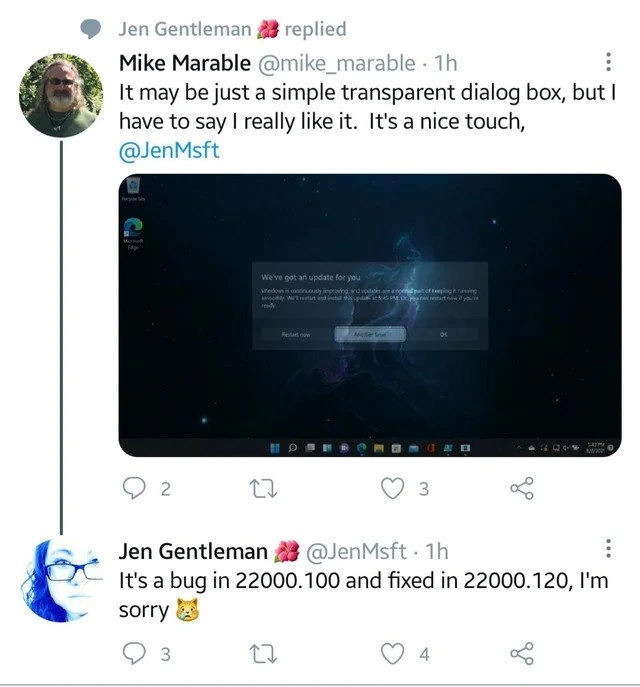
Let’s break down what’s happening here in simpler terms. A bug is an error or flaw in software that causes it to behave in unintended ways. A feature, on the other hand, is a planned aspect of the software – something the developers intended to put in for users. This meme shows a mix-up between the two: a user saw a Windows 11 dialog box that was see-through (transparent) and assumed it was a feature, a deliberate design choice. They even complimented Microsoft on this polished look. The funny twist is that a Microsoft engineer replied that this transparency was actually a bug in that test version of Windows (specifically in build 22000.100) and that it got fixed in build 22000.120. In other words, what the user thought was a cool design was really an unintended glitch, and Microsoft removed that behavior in the next update.
Why would someone think a bug was a nice feature? Well, Windows 11 has a new design style (part of what Microsoft calls the Fluent Design System) which does use translucent, frosty glass-like effects in places. For example, the Start Menu and other panels have a blurred transparency called Acrylic/Mica material, where you can vaguely see the wallpaper colors through them. So when this update dialog appeared completely transparent (so clear that the text and buttons were just floating over the wallpaper), the user thought it was an intentional subtle touch – maybe a new UX/UI design for update notifications. It’s like seeing a car with a shiny new paint job, but in reality the shine is because a layer of paint was accidentally left off!
The Microsoft engineer Jen (@JenMsft) responding with “It’s a bug… and fixed… I’m sorry 😺” shows a few things to a junior developer or tech enthusiast:
- Transparency in communication (pun intended): She openly admitted it wasn’t supposed to happen. Tech companies often use the phrase “it’s not a bug, it’s a feature” as a joke, but here it was clearly acknowledged as a mistake. The little cat emoji she added suggests a lighthearted “oops!”.
- Build numbers: She mentioned 22000.100 and 22000.120. These are version numbers of the Windows 11 Insider Preview builds. Microsoft releases many incremental builds to testers. Build 22000.100 had the transparent dialog issue, and by 22000.120 the developers had corrected it – meaning they probably gave the dialog the proper background again. For someone new to this, think of build numbers like app version numbers: higher number = a later version with changes/fixes.
- UX implications: From a user experience standpoint, a fully transparent dialog could look cool, but it might also make text hard to read depending on the background. In software design, usually an update prompt would have a distinct panel (even if semi-transparent) to ensure the message and buttons are legible. This bug likely made the dialog’s panel completely invisible, which wasn’t by design. The user’s wallpaper in the screenshot is dark and spacey, making white text visible, so the user thought it was a neat subtle style. But if someone had a busy or bright wallpaper, that text might have been impossible to read – a UX no-no. That’s likely one reason Microsoft fixed it quickly.
- Bug vs Feature humor: There is a long-running joke in development: when a user finds something odd in software, developers sometimes quip, “That’s not a bug, it’s an undocumented feature!” Here it happened in reverse. The user said “I really like this feature,” and the dev essentially had to say, “Sorry, that’s a bug, not a feature.” It highlights how sometimes the line between a bug and a feature is just whether it was intended. In this case, the unintended feature (transparent dialog) actually delighted someone!
For a newcomer, it’s a bit like if you’re trying out a beta version of a program and you see something unusual that you enjoy. You tell the creators “Wow, I love that you did this!” and they respond “Uh, that wasn’t on purpose, and we’ve removed it in the next update.” It can be both funny and a little disappointing. This happens in tech occasionally: users stumble on accidental behaviors that developers didn’t plan. Sometimes developers even decide to officially make it a feature if it’s popular, but other times (like here) it gets fixed because it was against the design guidelines or could cause other issues. This Twitter exchange became popular because it perfectly captures that misunderstanding in a single screenshot, and anyone who’s dealt with software can chuckle at the mix-up.
Level 3: Aero or Error?
At first glance, this looked like a sleek new UX design choice in Windows 11 – a floating update dialog with a transparent background elegantly showing the cosmic nebula wallpaper through it. Seasoned developers recognize the comedy: a user on Twitter excitedly praised this “nice touch” as if it were a polished feature, tagging a Microsoft engineer for kudos. In reality, it turned out to be an unintended UI glitch in an Insider Preview build. It’s the classic Bug vs Feature scenario stood on its head. Normally we joke “It’s not a bug, it’s a feature,” but here the user assumed a bug was a feature, and the dev had to politely say, “No, that’s actually a bug – and we already fixed it.” The humor cuts deep for developers because we’ve all been on one side or the other of this misunderstanding.
From a senior developer’s perspective, several layers make this meme hilariously relatable:
- Mistaking a bug for innovation: The user genuinely thought the transparent dialog was intentional Fluent Design. Windows 11’s design language (like Acrylic or Mica material effects) does use translucency and blur, so it wasn’t crazy to think this see-through dialog was on purpose. It’s like a UI mirage – a feature that wasn’t, fooling even observant testers.
- The dev’s candid response: Microsoft engineer Jen Gentleman (@JenMsft) responded with honest clarity (and a cat emoji for comfort): “It’s a bug in 22000.100 and fixed in 22000.120, I’m sorry 😺.” In dev-speak, that translates to “Oops, that transparent dialog behavior was a mistake in build 22000.100, and by build 22000.120 we corrected it.” The transparency wasn’t an easter egg or new visual flair, just an UI bug now gone. Her apologetic tone pokes fun at the situation – she’s essentially saying “Sorry you liked our mistake!” which is darkly amusing to anyone who’s shipped a bug that users come to adore.
- Feature by coincidence: This situation taps into the shared memory of developers where accidental behaviors sometimes outshine the intended features. Perhaps a rendering bug left the dialog background uninitialized (fully transparent) instead of the intended semi-opaque blur. The user found beauty in that accident. We’ve seen this pattern in our careers: one of those “ghost in the machine” moments where a fluke output looks so cool that people assume it’s on purpose. Experienced devs chuckle because we know under the hood it might be something like an alpha blending issue or a missing resource. The code might’ve set an opacity property wrong — e.g. using
transparentinstead of a intended translucent brush. It’s a Schrödinger’s feature: as long as nobody knows it’s a bug, it’s delivering joy like a feature!
In the Windows 11 Insider Preview builds (22000.100 was an early beta), the UI framework likely had a small rendering issue. Maybe the dialog’s background acrylic blur layer failed to load, so instead of a frosted glass effect it became fully clear. Here’s a conceptual snippet of what might have happened in the UI styling:
/* Intended style – semi-transparent dark backdrop for readability */
dialog.update-dialog {
background-color: rgba(20, 20, 20, 0.6); /* 60% opaque dark overlay */
}
/* Bugged outcome – background not set or set to transparent */
dialog.update-dialog {
background-color: transparent; /* Oops: fully transparent dialog */
}
In practice, the Windows composition engine likely dropped the backdrop material due to a bug, turning the dialog into a literal pane of glass. A senior dev laughs at the irony: we sweat over design details and usability, yet here a random glitch yielded a visually pleasing result. It’s as if the code said, “Failed to apply theme, default to invisible,” and users went “Wow, loving this minimalist vibe!” This reflects a broader truth in software development: sometimes users latch onto the quirks. Indeed, tech history is peppered with bugs that became beloved features – from the “rocket jump” in Quake (originally a physics quirk) to how PNG transparency was once mis-rendered in browsers and designers made entire styles out of it. The meme tickles developers because it showcases that thin line: one person’s bug is another person’s cool new feature. And of course, in true Microsoft fashion, the moment we admire the accidental transparency, the next update patches it out. The veteran in us smirks: “Figures, we can’t have nice things – back to the intended, less exciting UI.” It’s a humorous reminder that software bugs aren’t always crashes and garbled text; sometimes they’re pretty and your users wish you’d keep them!
Description
A screenshot of a Twitter interaction that highlights a humorous irony in software development. The top tweet, from a user named Mike Marable, shows a screenshot of a Windows update dialog. The dialog box has a stylish, transparent, blurred-glass effect against a dark, starry desktop background. The user praises this design, saying, 'It may be just a simple transparent dialog box, but I have to say I really like it. It's a nice touch,' and tags a Microsoft employee, Jen Gentleman. The reply below, from Jen Gentleman (@JenMsft), states, 'It's a bug in 22000.100 and fixed in 22000.120, I'm sorry 😿'. The humor lies in the user loving a feature that was actually an unintentional bug, which the development team had already 'fixed' by removing it. This scenario is a classic example of the disconnect between developer intent and user preference, where an accident is perceived as a superior design choice
Comments
22Comment deleted
Congratulations, you've discovered a 'Schrödinbug' - it's both a critical rendering error and a beloved feature until the moment a PM observes it
Congrats - we just reinvented “glassmorphism” by forgetting to initialize the alpha channel in build 22000.100; now product wants it in the style guide and I’m merging the bugfix behind a feature flag
The best features in enterprise software are often the bugs that accidentally improve UX - until someone files a JIRA ticket and ruins it for everyone by 'fixing' what users actually liked
The eternal software engineering paradox: spend months perfecting a feature that users ignore, then accidentally ship a bug that gets praised as 'a nice touch.' This is why we can't have nice things - because sometimes the nice things are literally bugs in build 22000.100. It's the visual equivalent of 'it's not a bug, it's a feature,' except in reverse: 'it's not a feature, it's a bug we already fixed.' Nothing says 'enterprise software development' quite like a Microsoft engineer apologizing for fixing something users actually liked
PM calls it "Mica," the graphics pipeline calls it "alpha-not-initialized," and 22000.120 calls it "fixed."
Windows Insider: where a single UI tweak demands its own build bump, because who needs semantic versioning when you have build hell?
Peak enterprise UX: a compositor z-order regression in 22000.100 gets applauded as 'Fluent design'; the 22000.120 fix ships with a Jira ticket to re-enable it behind a feature flag
remember that git keep all of your bugs forefer you cant escape them they are still there Comment deleted
git push --force Comment deleted
heretic! Comment deleted
git rebase -i --autosquash git push --force Comment deleted
git filter branch ) Comment deleted
Bugs are kinda like girls. Don't try to escape, just find a new one Comment deleted
just don't use git Comment deleted
and this is why we use semantic versioning Comment deleted
QA moment. Comment deleted
transparency was a bug or what? Comment deleted
Yes Comment deleted
probably an opacity style trigger set in the opposite way Comment deleted
Just don't shit to master and everything will be OK Comment deleted
Be like mojang. Turn your game's bugs into features! Comment deleted
Why did they fix, it is cool Comment deleted