When the Product is Bug-Free but the UX is a Disaster
Why is this UX UI meme funny?
Level 1: Not Everything That “Works” is Good to Use
Imagine you invented a new kind of broom for cleaning floors. You tested it in your room and it sweeps up dust just fine – no problems at all. You’re happy and give it to your friend to try. But your friend misunderstands and uses this broom as a hairbrush by mistake! (Maybe it looked like a giant hairbrush to them.) Of course, brushing hair with rough broom bristles would hurt a lot. Your friend ends up in pain, yelling “This is terrible! I’m just going to use my normal hairbrush.” You’re shocked because in your tests the broom was perfect – it cleaned floors well – but you never thought someone would try to use it on their head.
This is exactly what’s happening in the meme, in a funny way. The developer and tester thought the software was perfect because it passed all their checks (like our broom that sweeps dust). But the user did something unexpected with it (like using the broom on hair) and got hurt or frustrated. The core idea is: just because something works correctly in one way doesn’t mean it’s easy or safe for everyone in real life. It’s a silly example that makes us laugh, and it also teaches us to think about how real people might use what we create, not just whether it technically works.
Level 2: Bug-Free ≠ User-Friendly
Let’s break down the scenario in simpler terms. QA (Quality Assurance) is the part of software development where testers check the product for bugs (errors or defects). They run test cases – planned experiments on the software – to make sure everything works as intended. Here, the QA person says “no known bugs,” meaning none of the tests failed. That implies the software met the specifications given to the team. Developer Humor often riffs on this phrase because “no known bugs” doesn’t guarantee no bugs at all – it just means we didn’t find them yet! It’s like saying “we checked all the usual spots and didn’t see any problems.”
However, a product can be technically flawless in tests and still be awful for the user. UX/UI stands for User Experience/User Interface design. This focuses on how real people interact with the software – is it clear, intuitive, and pleasant? A UX failure means that even if there’s no crash or error message (no technical bug), the design or concept is confusing or painful to use. In the meme, the toilet brush scenario is a funny example of a user experience design fail (or arguably a user mistake). The toilet brush and holder presumably work fine for cleaning a toilet (their intended function). QA would say “it works!” if they were testing it as a brush. But the End User (Christine) either misunderstood how to use it or tried to use it in a way it wasn’t meant for – and she got hurt. This is analogous to a user misunderstanding a feature in an app because the interface was unclear, and getting a bad outcome despite no “error” happening in the code.
Key terms and ideas here:
- QA Testing vs. Real-World Use: QA testing usually follows a script or checklist (for example, “Does clicking this button do X as specified?”). It often tests the happy path, meaning the correct, expected way to use the product. Real users, especially new ones, might not follow that happy path. They might click the wrong thing, use features in the wrong order, or interpret the UI differently. If the design doesn’t guide them, they can end up in weird states that testers never tried. In our analogy, QA tested the “happy path” of the toilet brush (scrub a toilet bowl), but the user took an unhappy path (using it as toilet paper 😬).
- User Error or Design Error? Sometimes developers label these situations as user error – basically saying “It’s the user’s fault for using it wrong.” Christine’s review could be seen as a user error: she used the brush incorrectly. But modern thinking in user experience design says if a lot of people misuse something, the design might be at fault for not communicating its proper use. A well-designed product usually tries to prevent “user errors” or at least warn against them. For instance, a software app might gray out a dangerous option or add a confirmation popup (“Are you sure you want to delete all your contacts?”) to prevent misuse. In the toilet brush’s case, maybe clearer instructions or a different design could have signaled “this is not a personal hygiene product!”
- TestingHumor and Relatable Experience: New developers might run into this scenario early in their careers. For example, you build your first website feature and test it yourself: no bugs, great! Then you ask a friend or a colleague to try it, and they immediately get confused: they click the wrong button or don’t understand the icon you used, and something unintended happens. You realize that just because you (or the QA team) knew how it was supposed to be used, that doesn’t mean the user will get it. That feeling is both humbling and oddly funny in hindsight, which is why this meme is tagged RelatableDeveloperExperience. It’s a reminder to include user testing or UX evaluation as part of quality, not just functionality testing.
In short, “bug-free” doesn’t automatically mean “pain-free” for the user. A good product needs both solid testing (to remove technical bugs) and good design/UX (to ensure people can use it comfortably and correctly). This meme uses an exaggerated example – a person using a toilet brush wrong – to make us laugh and remember that lesson.
Level 3: Beyond the Happy Path
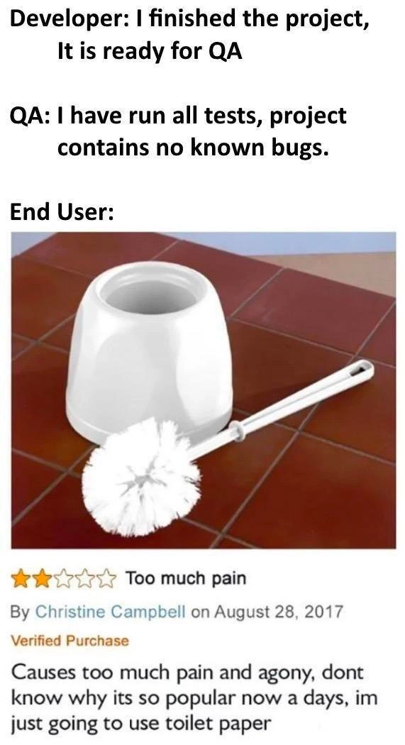
The meme highlights a classic disconnect in software development: a feature-complete, bug-free application sailing through QA testing, only to flop painfully in the real world. In the setup, the developer proudly proclaims the project “ready for QA,” and QA responds with "I have run all tests, project contains no known bugs." On paper, everything is green-lit. But then comes the sucker-punch: the End User experience is depicted by a toilet brush and holder being disastrously misused, accompanied by a scathing 2-star review complaining it “Causes too much pain and agony.” This is hilariously relatable to senior developers and testers, because we’ve all seen projects that technically meet specifications (no failing test cases, all acceptance criteria checked off) yet still leave users miserable.
Why is this so funny and painfully true? The humor thrives on the gap between functional correctness and usable design. In the meme’s analogy, the toilet brush isn’t broken per se – it’s a legitimate cleaning tool – just like software that passes QA isn’t necessarily malfunctioning. But Christine’s review reveals she attempted to use this brush in place of toilet paper (ouch!), highlighting an absurd misuse case that no one imagined. Similarly, in software, a QA team might rigorously verify all test cases on the happy path (the intended way to use the product) without considering the odd, quirky, or downright incorrect ways real users might interact with it. Seasoned developers recognize this pattern:
- “Works on my machine” Syndrome: An application might pass all internal tests (
allTestsPassed == trueand QA signs off), but once deployed, actual users find new and creative ways to break it or get hurt by it. The product team is left scratching their heads because “it should have worked!” - Edge Cases & Unknown Unknowns: No test suite can cover every possible user action — the space of possible interactions is enormous. Users inevitably do things the developers never anticipated (like using a cleaning brush for personal hygiene). What’s obvious to the creator (“Of course that’s a toilet brush holder, not a cup!”) might not be obvious to a customer encountering the design with fresh eyes.
- Difference Between Bugs and UX Failures: A bug usually means the software is not working as intended (e.g., a crash, wrong calculation). A UX failure means the software works as coded but the user experience is frustrating, confusing, or even painful. QA said "no known bugs" because the product technically did what the requirements said it should. Yet, from the user’s perspective, it’s a failure because it doesn’t meet their actual needs or expectations. In the meme, the product’s intended use vs. the user’s understanding of its use were totally misaligned – the result is agony without a single code error.
This scenario is a bit of dark humor among developers and testers. It satirizes the tendency to celebrate too early: “QA approved it, ship it!” — only to discover that real users are filing angry tickets or 1-star reviews. The Verified Purchase review from Christine is the software equivalent of a critical production bug filed by a customer. It’s a reality check: quality assurance in the lab isn’t the same as quality in the wild.
From a senior perspective, the meme also hints at process shortcomings. Maybe there was no User Acceptance Testing (UAT) or UX review. Perhaps the team was too narrowly focused on requirements (“clean a toilet”) and forgot to ensure users know how to use the solution properly, or whether the solution fits human preferences (maybe a less abrasive approach was needed – in software terms, a more user-friendly interface). It reflects an agile anti-pattern: Definition of Done was met (code complete, tests passed), but Definition of Delight was not (users cry out in pain).
In real projects, this kind of issue leads to late-game scrambles: developers hurriedly adding tooltips or redesigning interfaces once user feedback starts rolling in, or support teams writing FAQs like “Please, do not use the toilet brush like that!” The meme resonates because everyone in development has felt that sinking feeling reading a user’s review or support ticket that makes you go, “How on earth did they manage to do that?!” It’s a humbling reminder that QA Process and Testing can certify something as “working as designed”, yet the true measure of success is if it works as expected and desired by the user. In summary, the humor comes from that internal facepalm: the code had zero bugs, but the user experience was a total fail. The product team’s triumph turns into embarrassment, much like a proudly launched toilet brush now infamous for causing agony.
Description
This meme illustrates a classic software development disconnect in three parts. The first part, labeled 'Developer:', says 'I finished the project, It is ready for QA'. The second, 'QA:', states 'I have run all tests, project contains no known bugs.'. The final section, 'End User:', displays an image of a white toilet brush and a one-star product review. The review, titled 'Too much pain', reads: 'Causes too much pain and agony, dont know why its so popular now a days, im just going to use toilet paper'. The humor is a metaphor for a catastrophic failure in User Experience (UX) design. While the developer and QA team have technically built a 'correct' product that passes all tests (the toilet brush works as a brush), it's completely misunderstood and misused by the end user, leading to a painful and absurd outcome. For senior engineers, this is a sharp commentary on how teams can focus so heavily on technical specifications and bug-free code that they completely miss the most critical part: how a real person will actually use the product. It's a perfect example of a product that is technically sound but a complete usability failure

Comments
7Comment deleted
The JIRA ticket response would be: 'Closed - Cannot Reproduce. Works on my toilet.'
We hit 98 % code coverage - turns out the missing 2 % was the scenario where the user grabs the API by the bristles and files a P1 because “it hurts.”
We spent three sprints perfecting the toilet brush's bristle-to-handle ratio and achieved 100% code coverage, but forgot to ask if anyone actually wanted to scrub toilets with their bare hands
This perfectly captures the eternal triangle: developers ship features that pass all unit tests with 100% coverage, QA validates against acceptance criteria in pristine staging environments, and then production users somehow manage to use your REST API as a toilet brush. No amount of integration testing prepares you for the creative ways users will violate every assumption you baked into your domain model - turns out your carefully crafted user journey map didn't account for someone trying to authenticate with a cleaning implement
QA: all green; prod: the untested interface was the human - who promptly fuzzed our spec by using the toilet brush on themselves
QA proved the absence of known defects; UAT proved the presence of poor design
QA boasts 'no known bugs' after green CI suite - until users hit the untestable edge case: actual human frustration in prod