When ambiguous copy turns your friendly site into accidental cannibalism
Why is this UX UI meme funny?
Level 1: Let’s Eat Grandma!
Imagine you walk into a store and see a big sign that’s supposed to say something nice, but it comes out all wrong. For example, a cake shop wants to tell Grandma it’s time to eat, so they meant to write, “Let’s eat, Grandma!” on a banner (inviting Grandma to dine with us). But instead, they left out the comma and it says “Let’s eat Grandma!” 😲 Now it sounds like the shop is suggesting we cook and eat poor Grandma! Of course, nobody actually thinks that’s what the shop intended – it’s just a silly mistake.
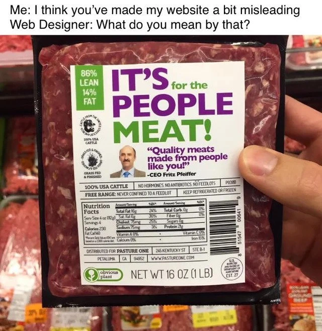
This meme is the same kind of joke. The words on the label got jumbled so it sounds like they’re selling meat made out of people instead of meat for people to eat. That’s totally crazy and not what they meant! It’s funny because it’s a huge oops: a friendly message turned into a horror movie advertisement just by the way it was written. The feelings it creates are a mix of shock (“Ew, did they really say people meat?!”) and laughter (“Obviously they goofed up, nobody would really sell that!”). It’s like when you mishear something in a conversation and it sounds outrageous until you realize what the person actually meant. Here, the poor designer didn’t realize how the words sounded when placed together. The humor comes from that innocent mistake. We laugh because we know it’s just a mix-up – the site or label should have said “This meat is for people” but instead it looks like “This meat is made of people!”
In simple terms: one little error made the whole thing sound completely wrong (and kind of creepy), and that surprise is what makes it so funny!
Level 2: For People, Not People
At its core, this meme is highlighting a simple web design mistake: unclear wording that changes the meaning of a message. Let’s break down the key ideas for a junior developer or someone new to UX/UI:
Copywriting: In a design context, copy means the text or words used on the site/app. Ambiguous copywriting is when those words can be understood in more than one way. In our case, the phrase on the label can mean two very different things. Good copywriting aims for clarity so users don’t get confused or shocked by what they read.
UX Design and clarity: UX stands for User Experience. It’s not just about how things look, but also about how easy and clear they are for users. A major part of UX is making sure labels, buttons, and messages say what they mean. When we talk about UX failures here, we mean the design did not communicate the right message to the user. A friendly website accidentally implying something outrageous (like cannibalism!) is definitely a UX failure. It’s a bit like a road sign pointing the wrong way – users get the wrong idea about where to go (or what you’re selling).
The scenario (designer vs client): The caption “Me: ... Web Designer: ...” sets up a conversation between a client (or developer) and a web designer. The client thinks the website is misleading. The designer is confused by that feedback (“What do you mean by that?”). This hints at a communication gap – the designer didn’t realize the way they presented the text was confusing. Miscommunication can happen when the client’s stakeholder expectations (what the site owner wants to convey) aren’t clearly translated into the design. The client expected a friendly, welcoming message for a website selling meat to people; the designer delivered something that reads like it’s selling people as meat. They obviously weren’t on the same page!
Why the label is misleading: The big label text was supposed to mean “It’s meat for the people” (a positive, inclusive slogan). But because of how it’s written and arranged, it looks like “It’s... people meat.” The lack of clarity in phrasing is the whole joke. It’s similar to writing a sentence without a comma and totally changing the meaning. For example, the famous grammar joke: “Let’s eat Grandpa” vs “Let’s eat, Grandpa.” One tiny comma changes it from an invitation to Grandpa, into a suggestion that we eat Grandpa! 😅 In our meme, a missing word or a bad line break changed for people into people as the ingredient. The quote “made from people like you” should have been something like “made for people like you” – one word makes a huge difference. This is a content strategy gone wrong moment: whoever planned the content didn’t double-check how these words might be misread.
Design layout and text hierarchy: Typography hierarchy refers to using different font sizes or colors to show which words are most important. For instance, titles are big, subtitles are smaller, fine print is tiny. Here, the designer made “PEOPLE” and “MEAT!” big and bold, so those words stand out the most. Meanwhile, “It’s for the” is small. The way our brains read images, we tend to grab the big bold words first (especially when they’re in eye-catching colors like green and purple). So a user might see PEOPLE and MEAT and mentally skip over the smaller “for the”. The result is an inconsistent UI message – the design’s visual cues (big text) and the actual intended meaning didn’t line up. Essentially, the interface was shouting “PEOPLE MEAT!” even if that’s not what they meant to say. In web design, if a heading and subheading aren’t clearly separated or phrased carefully, you can end up with these kinds of mix-ups, especially on a responsive site where line breaks can change on a small screen. Good information architecture (organizing and structuring content) would ensure that related words stay together and the message is read in the right order.
Learning from this: For a junior developer, the big takeaway is that communication and clarity are key in both code and design. Just like ambiguous code logic can cause bugs, ambiguous text can confuse or upset users. Always pay attention to the words in your UI. If you’re given text that doesn’t sound right, speak up! Sometimes developers copy-paste whatever the client or content writer provided, but a little critical thinking can save everyone from embarrassment. In this meme’s scenario, if someone had said “Hey, this line could be read the wrong way,” they could have avoided printing a label that makes it sound like the company is selling human meat. It’s a funny example, but it teaches an important lesson in communication: make sure what you put on a website (or any product) can’t be wildly misinterpreted. And if you’re the designer, double-check with the stakeholder that the wording conveys their intent correctly. A five-minute chat between the designer and client could have caught this before it went live.
In summary, the meme is a lighthearted look at a serious UX principle: always clarify your message. It uses an extreme (and comical) case of misunderstanding to show how a simple mix-up in words or design can completely change what users think. Junior devs and designers can learn that good UX isn’t just about code or visuals – it’s also about using the right words and making sure there’s no room for the wrong idea to slip in.
Level 3: A UX That Consumes Its Users
Me: "I think you’ve made my website a bit misleading."
Web Designer: "What do you mean by that?"
This meme sets up a classic communication gap in a web project: the client (or developer) sees something horribly wrong with the copy on their site, but the designer is oblivious. The image of a meat package labeled “IT’S for the PEOPLE MEAT!” with the tagline “Quality meats made from people like you!” is a darkly hilarious example of ambiguous UX copy gone off the rails. Essentially, a combination of poor UX copywriting and misguided typography hierarchy turned a presumably friendly message into an accidental cannibalism ad. Let’s unpack why seasoned developers and designers are cringing and laughing in equal measure:
Ambiguous wording: The phrase “It’s for the PEOPLE MEAT!” is meant to be two separate ideas – “It’s for the people” (i.e., this product is meant for people) and “MEAT!” (the product itself). But the way it’s laid out causes the reader’s brain to fuse it into “People Meat.” 😱 In user-interface terms, the content has an unintended double meaning. A single misplaced word or line break can completely change the semantics. Here, the innocent slogan became misleading to the point of implying the product is literally made of people. It’s a textbook UXFailure in copy: one poorly structured sentence turned a wholesome selling point into a Soylent Green scenario (that infamous sci-fi film where the food product tagline ends up being “It’s people!”).
Visual hierarchy fail: In design, bigger or bolder text grabs attention first. The label puts “PEOPLE” and “MEAT!” in large, bold font (green and purple), while “It’s for the” is smaller. The eye is drawn to PEOPLE and MEAT together, effectively skipping the small words in between. This is a typography hierarchy fail – the design’s visual emphasis leads users to read the message in the wrong order. It’s similar on a webpage when a heading and subheading are arranged without considering how they’ll be read together. The designer likely wanted to highlight the product (MEAT) and the target audience (PEOPLE), but ended up highlighting a phrase that sounds like “people meat.” The information architecture – basically how content is organized and prioritized – was not thought through, so the intended meaning (“meat for people”) got lost in layout.
Copy and content strategy gone wrong: The smaller tagline under the big text is just as cringe-worthy: “Quality meats made from people like you!” The intention was probably to say “made for people like you” or perhaps “made by people like you” (to suggest relatable folks behind the product). But using “made from people like you” is a disastrous choice of preposition. It implies the meat is literally made from people, turning a friendly assurance into a horror story. This is where a content strategist or copy editor would scream and immediately rewrite it. It highlights how crucial stakeholder expectations need to be clearly communicated: maybe the CEO (like our fictitious CEO Fritz Pfeiffer on the label) had a vision for a folksy, inclusive slogan, but somewhere between brainstorming and publishing, the phrasing went unchecked. In any case, the miscommunication at the content level is glaring. A single word (“from” instead of “for”) is the difference between a normal marketing line and, well, cannibalism.
Why experienced devs and designers relate: This meme strikes a chord because many of us have lived through similar “oops” moments (though usually less gory!). Perhaps a developer concatenated strings or adjusted a UI layout without realizing the new juxtaposition creates a bad meaning. Or a designer focused on aesthetics, not noticing a misleading label emerging from the wording. It’s a reminder that UI text matters. In code terms, think of it like a bug caused by an unexpected interaction of two modules: the headline module and the subheader module together produce a nasty output no one anticipated. For example, imagine a simple site generation code:
const tagline = "It's for the People";
const productName = "Meat";
console.log(`${tagline} ${productName}!`);
// Output: "It's for the People Meat!"
Here, concatenating a innocent tagline and product name without careful review yields the problematic phrase. In real projects, if developers and content writers don’t collaborate, you can literally end up shipping “People Meat!” as your hero text. Seasoned pros have learned (often the hard way) that every piece of text on a UI should be scrutinized. A stakeholder’s expectations might have been a welcoming slogan, but without clear guidance, the team delivered an absurd outcome.
- Shared industry joke: The humor also comes from a bit of schadenfreude – relief that it’s not our project, and a recognition of how easy it is to mess up. The meme exaggerates the scenario (most teams would catch something as extreme as cannibalistic messaging before it went live... we hope!), but it underscores real issues. Communication gaps between non-technical stakeholders and the development/design team can lead to inconsistent UIs and off-brand messaging. Everyone in the approval chain might have been too close to the project or too siloed in their role: the designer focusing on visual style, the developer focusing on functionality, the CEO focusing on vision – and nobody actually reading the whole thing from a user’s perspective. The result? A site (or package) that unintentionally says “We serve people… literally.”
In short, this meme is a senior-level cautionary tale masked as a joke. Miscommunication in requirements, ambiguous copywriting, and a flawed review process combined to create a hilariously horrifying user experience. It elicits nervous laughter because every experienced techie knows that a few wrong words or a minor layout issue can completely derail the message to users. It’s both funny and a bit scary to think about how close our own projects might have come to a “people meat” moment without proper UX oversight!
Description
Meme format with a white text banner on top that reads, “Me: I think you’ve made my website a bit misleading Web Designer: What do you mean by that?”. Below, a hand holds a supermarket-style ground-beef package. The large green-and-purple label says: “86% LEAN 14% FAT IT’S for the PEOPLE MEAT!” Under that, a quote in purple reads, “Quality meats made from people like you!” - CEO Fritz Pfeiffer (face on photo is blurred). Small print includes: “100% USA CATTLE • NO HORMONES, NO ANTIBIOTICS, NO FEED LOTS”, “FREE RANGE: NEVER CONFINED TO A FEEDLOT”, a full Nutrition Facts panel, the “obvious plant” logo, and “NET WT 16 OZ (1 LB)”. Visually, the typography hierarchy makes “PEOPLE MEAT” the focal phrase, creating a darkly humorous implication that the product is made *of* people rather than *for* people. Technically, the meme satirizes poor UX copywriting, misleading information architecture, and the communication gap between stakeholders and web designers, highlighting how unclear wording or layout can completely change user perception

Comments
9Comment deleted
One misplaced font weight and your “Meet the People” page becomes a “People Meat” endpoint - legal’s opening a GDPR ticket while SRE pages Hannibal on-call
This is what happens when you deploy straight to production without a design review - suddenly your A/B test for customer engagement becomes an FBI investigation
This is the visual equivalent of a SQL injection attack on user expectations - technically valid markup, catastrophically wrong semantic interpretation. The designer clearly optimized for character count over parse tree clarity, resulting in a O(horrifying) user experience. It's a perfect reminder that in both code and design, ambiguity isn't just a bug - it's a feature that makes your product literally indigestible. Every senior engineer knows: whitespace isn't wasted space, it's the difference between 'helping your Uncle Jack off a horse' and... well, you get the idea. This is why we have design systems, code reviews, and the fundamental principle that context-free grammars should never be applied to human communication
Marketing shipped "It's for the people meat" and the parser chose the wrong parse tree - operator precedence matters outside the compiler too
Classic UX dark pattern: typography so poor it passes WCAG scans but fails the Hannibal Lecter litmus test
Proof that typography is a production dependency: a greedy H1 line break turned 'for the people' into 'people meat' - Legal just filed a Sev-1
😳 Comment deleted
Is that...real? Comment deleted
It's people for the meat Comment deleted