Developer Assumptions vs. User Reality in UI Design
Why is this UX UI meme funny?
Level 1: Not So Obvious
Imagine you gave your friend a new jar of peanut butter, but you never told them or showed them how to open it. You just think, “It’s easy, they’ll figure it out.” Your friend has never seen a jar like this before. So what do they do? Instead of twisting the lid off (the normal way), they take a spoon and poke a big hole right through the lid to get to the peanut butter! Peanut butter gets everywhere and the lid is ruined. It’s a silly sight and kind of funny, right?
Now, why is this funny in a bigger sense? It’s like when someone gives you a new toy or gadget with no instructions because they assume you know how to use it. The person who made it thinks it’s super simple — “Anyone can use it!” But if you’ve never seen it before, you might use it the wrong way. The humor comes from that mismatch: one person thought it was obvious, and the other person was so confused they did something crazy.
In simple terms: when we don’t explain things because we think they are obvious, people can get really confused. The meme is a playful reminder that what seems easy to one person might not be easy for everyone. So it’s always good to help out with a little explanation — before someone ends up jamming a spoon where it doesn’t belong!
Level 2: No Manual Provided
Let’s break this down in simpler terms. This meme jokes about developers not writing documentation because they think their UI (User Interface) is super easy to understand. Documentation usually means guides or instructions (like a user manual or a README file) that explain how to use something. But here the developer says, “No need to document it,” believing users will just know what to do.
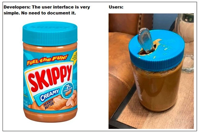
In the images, the product is a jar of peanut butter. The jar’s interface is its lid — that’s how you “use” or open the jar to get the peanut butter out. The developer’s panel shows a brand-new Skippy peanut butter jar with its blue lid intact. To the developer, the lid’s function is obvious: you’re supposed to twist it off. They think this design is so straightforward that even without any instructions (no sticker saying “Turn to open”), everyone will get it.
Now, the funny part: the user’s panel shows what happens when a user has no clue how to open this “simple” jar. Instead of twisting the lid, the user took a spoon and literally stabbed a hole through the plastic lid to reach the peanut butter! 😮 It’s a ridiculous sight: a spoon sticking out of a peanut butter jar’s lid, peanut butter smeared around. This happened because the user either didn’t realize the lid screws off or found it too hard to open, so they improvised. They thought, “Well, I need to get inside somehow… poke!”.
This is a classic DocumentationGap scenario: there’s a gap between what the creator thinks is obvious and what the user actually knows. It highlights a few important concepts in tech and design:
- User Experience (UX): This is all about making products easy and pleasant for people to use. Good UX design tries to ensure that the way you interact with something (like turning a jar lid, or clicking a button in an app) is clear. Here the UX failed for that user — maybe the jar’s lid design or the lack of clues led them to a wrong action.
- User Expectations: Users come with their own expectations or past experiences. Perhaps this user had only seen pop-off lids or was never taught about screw lids, so their expectation wasn’t met and they did something unexpected. In software, if users expect a button to do one thing but it does another, they’ll be confused too.
- Documentation: This refers to any text or material that explains how to use a product. It can be as simple as a note that says “Twist lid to open” or a full user guide. The developer skipped this entirely. Often in software, developers might launch an app or library without even a basic guide, thinking it’s straightforward. New users then feel lost or do “wrong” things as a result.
For a junior developer or someone new to building products, the lesson is: don’t assume the user knows what you know. What’s second-nature to you might be brand new to your user. For instance, you as a developer might know that pressing Ctrl+S saves a file in an application (because that’s common in many programs). But if you made a new app where saving isn’t automatic, and you didn’t tell users to press Ctrl+S (and there’s no Save button), some users might lose data simply because they weren’t aware of that “obvious” shortcut. They might even do something wild like trying to copy-paste content into a text editor to save it, similar in spirit to stabbing the jar lid.
This meme also touches on the importance of usability testing: that’s when you watch real people try to use your product before you release it widely. If the developer had given this peanut butter jar to a few test users, they might have discovered that at least one person doesn’t know to twist the lid. In the software world, letting some beta users try out your app can reveal where they get confused. Maybe they’ll ask, “How do I do X?” and you’ll realize you never explained X because you assumed it was obvious.
DeveloperExperience (DX) is also a tag here, which usually refers to making things easy for other developers (like good docs for an API). But in this context, it reminds us that developers sometimes write code or tools for others and assume other devs will “just get it.” A humorous but real scenario: a developer publishes a library with zero documentation except maybe a one-liner, “Just call the main function, everything’s handled.” Then other developers are like, “Uh, what’s the main function? What parameters does it take? How do we handle errors?” Without docs, even skilled users are left guessing.
The peanut butter jar with a spoon-hole is an extreme example of what can go wrong without instructions. It’s funny to look at, but it carries a serious reminder: always consider the user’s perspective. If there’s something you can do to guide the user — through intuitive design, labels, placeholders, or written instructions — do it. Otherwise, people might use your software (or jar) in ways you never intended, often with messy results! The meme gets a laugh from developers because we’ve all seen users do things that make us facepalm, only to realize we, as creators, could have prevented the confusion with a bit more clarity.
Level 3: The Myth of Intuitive UI
User Experience (UX) professionals often caution that "intuitive" is not a universal quality—what’s obvious to a developer might baffle an end-user. This meme hilariously illustrates the developer_vs_user_gap: the developer assumes a peanut_butter_jar_interface is self-explanatory, while the user’s literal spoon-through-lid approach is a UX horror story. It’s a classic case of DocumentationHumor where skipping instructions backfires spectacularly.
In the left panel, the developer proudly presents a pristine jar with a screw-on lid, basically saying:
Developer: "The user interface is very simple. No need to document it."
In software terms, this is like a dev releasing a new app with zero documentation and assuming every feature’s use is obvious. The right panel — a jar whose lid has been stabbed by a spoon — is the user’s response:
User: "I had no clue how to open it, so I improvised."
This absurd scenario satirizes a common DocumentationGap in tech. Developers, deep in their own creations, suffer the curse of knowledge: they know their system inside out, so basic operations feel innate. They honestly believe the UI needs no explanation (“our design is so good, who needs a manual?” 🙄). But real users approach the product with fresh eyes. What devs consider a straightforward UIDesign can confuse or mislead if users have different mental models.
Consider how the jar’s bright-blue lid looks obvious to open by twisting — at least to someone who’s opened jars before. The developer assumes this affordance (visual clue) is clear. But a user without that background might not get the twist-off hint. Perhaps the user thought the lid was a pop-top or sealed some other way. Lacking guidance, they did the digital equivalent of a brute-force hack: jamming a spoon through. This is UserExpectations meeting reality: users will use whatever knowledge and tools they have, often in unexpected ways, when confronted with an unfamiliar interface.
In real projects, such misassumptions cause serious usability fails. For example:
- A developer designs a form where the submit button is just a tiny icon with no label because “it’s obvious that’s a send button.” Users might stare, click the wrong thing, or give up — the spoon-in-lid analog in software is the user randomly clicking or force-quitting out of frustration.
- An API is released without examples because “the functions are self-explanatory.” New engineers end up reading the source code or using it incorrectly (the code equivalent of puncturing the jar) because there’s no documentation to guide them.
This meme’s comedy resonates with developers because we’ve all seen or heard of “user errors” exactly like this. It highlights the arrogance-fueled optimism some devs have: believing their DeveloperExperience (DX) was so well-crafted that no one could possibly misuse it. But as any battle-scarred senior dev knows, users are creative and UserError is often DesignerError in disguise. The phrase “No need to document it” is practically inviting Murphy’s Law: if something can be misunderstood, it will be.
From an organizational perspective, skipping documentation and UX research is a symptom of deeper issues. Tight deadlines, lack of customer feedback, or a culture that undervalues technical writing can lead to products with great features but terrible onboarding. Teams might assume somebody else (like support or QA) will handle user education, or they rely on “intuitive design” as an excuse to cut corners. This meme playfully warns us: intuitive_ui_misassumptions can result in spoon_through_lid_fail levels of disaster.
The fix isn’t as easy as it sounds. Writing clear documentation and designing truly intuitive interfaces require time, empathy, and iteration. Developers need to step out of their own heads and perform UsabilityTesting: watch real people use the product. If our “simple UI” confuses a user, that’s feedback to improve design or add guidance. It’s humbling but crucial. After all, the cost of a quick README or a one-line hint is tiny compared to the cost of frustrated users mutilating our software (or peanut butter jars 😂).
In summary, the humor here is bothlighthearted and biting: it’s funny because it’s true. DeveloperHumor often points out real problems. The pristine jar vs. punctured jar is a perfect metaphor for developer assumptions vs. user reality. It reminds experienced developers that no interface is too simple for misunderstanding. As the saying goes in tech, “If you think nothing can go wrong, users will prove you wrong.” Document your “jar lids,” folks, or someone’s gonna bring a spoon.
| What Dev Expects | What Users Do |
|---|---|
| Lid is obviously twist-off; no help needed. | Unsure how to proceed, they improvise (spoon straight through the lid!). |
| Software feature is self-evident. | Clicks every button randomly or uses the tool wrong out of confusion. |
| Minimal instructions because UI is intuitive. | Mistakes the purpose of buttons; maybe even breaks something by trying a wild approach. |
Bottom line: Never assume your UI is so simple that anyone can use it flawlessly without guidance. Even a peanut butter jar can become a usability nightmare in the absence of clear cues or instructions!
Description
A two-panel meme comparing developer expectations with user behavior. The left panel is labeled 'Developers: The user interface is very simple. No need to document it.' and shows a pristine, sealed jar of Skippy creamy peanut butter. This represents the developer's view of their creation: perfect, intuitive, and with a clear, intended method of use (unscrewing the lid). The right panel, labeled 'Users:', shows a similar jar of peanut butter, but the user has completely bypassed the intended mechanism. Instead of unscrewing the blue lid, they have violently stabbed a spoon through the top of it to access the peanut butter inside. This provides a stark and hilarious visual metaphor for how users can interact with software in completely unexpected and destructive ways, underscoring the developer's curse of knowledge and the critical importance of documentation, intuitive design, and user testing
Comments
7Comment deleted
The developer saw the lid as a singleton factory for accessing the peanut butter. The user saw a lid and decided to apply a dependency injection... of a spoon, directly through the interface
Ship Skippy.jar without the Javadoc and watch a user invoke main(String spoon) straight through the lid
After 20 years in tech, I've learned that the only truly intuitive interface is the nipple, and even that has a learning curve. Everything else needs documentation, especially when your 'obvious' twist-off lid becomes a penetration testing exercise
This perfectly captures the classic 'it's intuitive' defense that crumbles the moment you watch actual users interact with your system. We architects spend months designing elegant APIs with 'self-evident' patterns, then wonder why users are essentially jamming spoons through the lid instead of using the twist-off mechanism we assumed was obvious. The real kicker? That spoon represents every Stack Overflow question asking 'how do I...' for something you considered too trivial to document. Remember: if your interface requires tribal knowledge to operate correctly, you haven't built a simple system - you've built a hazing ritual
Like a REST API with no OpenAPI spec: dead simple for the dev, a pry-bar puzzle for users
UX is the API for humans; if the happy path requires tribal knowledge, users will invent PUT-through-lid semantics and file a Sev-2
We said the jar UI was self-documenting - then a user shipped a zero-dependency integration by calling SpoonThroughLid(). Undefined behavior: the most popular extension point