Data 'Siens' in Action
Why is this DataScience meme funny?
Level 1: Big Talk, Simple Task
Imagine you have a friend who puts two LEGO bricks together and then proudly claims, “I built a huge skyscraper!” That’s pretty silly, right? They did something very basic, but they’re acting like it’s something super fancy. That’s exactly what’s happening in this picture: the person is just adding 1 + 2 on the computer (a really easy thing), but they’re pretending they’re doing big, important science work. It’s funny because they’re bragging about something as simple as adding two numbers, just like bragging about stacking two blocks and calling it a skyscraper.
Level 2: Excel Reality Check
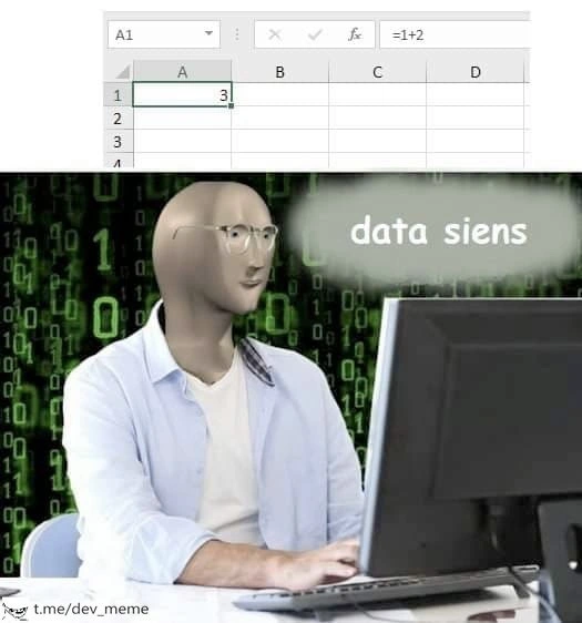
Let’s break down what’s happening in this meme in simple terms. The top half shows Microsoft Excel, which is a spreadsheet program almost everyone has used at some point. In Excel, you have cells (little boxes) organized in columns (labeled A, B, C, ...) and rows (1, 2, 3, ...). You can click a cell and type either a number or a formula. Here, cell A1 contains the value 3. If you look closely, the formula bar at the top (labeled with fx) shows =1+2. That means the person typed a formula telling Excel to add the number 1 and the number 2. Excel did that calculation and is displaying the result, 3, in the cell. So, the spreadsheet is doing a very simple addition – something you could do on paper or a basic calculator in a second. There are no other values or formulas in that screenshot; columns B, C, D are empty. It’s as minimal as it gets.
Now, the bottom half shows a person sitting at a computer, but it’s depicted in a very dramatic way. The background is the famous green rain of numbers from The Matrix, which in movies usually signals “mega advanced hacking” or crazy complex code running. The person’s face is actually a meme character (a blank, kinda plastic-looking face often used to represent a generic or clueless person). He’s wearing office-casual clothes (a light blue shirt) and typing intensely. Next to his head is a speech bubble that says “data siens”. That’s a misspelling of “data science” – likely done on purpose to make it look goofy or to hint that this person might not be as knowledgeable as they appear. So, visually we have someone who thinks they’re doing hardcore data science, like they’re in some hacker montage scene, but the reality (from the top panel) is they’re literally just adding 1 + 2 in Excel.
Now, what exactly is data science supposed to be? In real life, data science is a field where people work with lots of data to find patterns, make decisions or predictions, and solve complex problems. A typical data science workflow can be pretty involved:
- Usually you start by collecting data (maybe from a database or an experiment or the web).
- Then you clean and prepare the data (real-world data can be messy – think missing values, errors, or different formats that need standardizing).
- After that, you might do some analysis: calculate statistics, make charts, or apply algorithms to see trends. Often this is where machine learning comes in – for example, training a model to recognize images or to predict stock prices.
- Finally, you present the results – maybe as a report, a visual dashboard, or by integrating a prediction into an app.
When people say “data science”, they often imagine using programming languages like Python or R with libraries (like pandas for data manipulation or TensorFlow for building neural networks), working with databases or big data tools, and generally doing pretty advanced math or stats. It’s considered a step beyond just making an Excel chart – it’s the kind of thing that might require understanding of algorithms, probability, and coding.
Excel spreadsheets, on the other hand, are one of the most basic tools for working with numbers. Excel is incredibly useful and powerful in its own way – you can do a lot with it, from simple budgets to fairly complex financial models. But it’s all happening in those grid cells and usually on a single computer. Excel is generally for relatively smaller datasets (think thousands of rows, not millions) and straightforward operations. In fact, a lot of people’s first exposure to “data analysis” is in Excel – for example, summing up a column of sales, making a simple bar graph, or using a formula to calculate an average. Excel can even do some advanced stuff with the right knowledge (it has statistical functions, pivot tables for summarizing data, and you can write macros to automate tasks), but it’s not typically what comes to mind when you hear the buzzwords “Big Data” or “AI algorithm”.
That’s why the meme is funny: the person in the picture is acting like they’re doing something as sophisticated as decoding the Matrix, but all they’ve done is a first-grade math operation in Excel. The phrase “data siens” in the bubble is written wrong, almost like how a meme might illustrate someone who doesn’t really get what they’re talking about but wants to sound smart. It’s a deliberate silly touch – anyone who truly works in data science would spell it correctly, so the typo makes the “expert” look a little hapless and adds to the humor.
This joke is part of a bigger category of tech humor where we compare hype vs. reality. You might have heard of the term “AI hype” – it refers to how companies and people sometimes exaggerate what artificial intelligence or data science is doing, to sound cutting-edge. For example, a business might say “We use AI to revolutionize personal finance!” when in reality maybe they just have a spreadsheet that flags transactions over a certain amount. In this meme, AIHypeVsReality is exactly the theme: The hype is the guy thinking he's some data science hotshot (with the Matrix-y vibe, implying “I’m doing super complex computations”). The reality is him using the most straightforward tool (Excel) to do the simplest thing (adding two numbers).
For a junior developer or someone just learning this stuff, it’s a good lesson in not believing everything with a fancy label. The term “data scientist” became very trendy in the past decade. It was even called "the sexiest job of the 21st century" in an influential article. Suddenly, every company wanted one, and a lot of people started branding themselves that way. But not everyone had the sophisticated skills or problems to match the title. A lot of so-called data science in the wild turned out to be glorified Excel sheets or basic SQL queries. There’s nothing wrong with using simple tools – in fact, Excel is often the right tool for a quick calculation – but it is a bit humorous when someone acts like this basic task is rocket science.
The meme’s tags like DataScienceHumor and DeveloperHumor tell us that this is a lighthearted joke meant for folks in the tech community. You don’t need to be a senior engineer to get it – if you’ve ever worked on a school project or a job report where someone dressed up a simple result with big words, you’ll relate. And if you’ve started learning programming or data science, you might have experienced the difference between what you think a cool project is (maybe imagining fancy algorithms) and what it sometimes actually ends up being (maybe just a few Excel formulas or a script that does a sum). The tag spreadsheet_based_analytics even winks at the idea that there are analyses essentially done entirely in spreadsheets. It’s common in many companies because Excel is readily available and everyone knows a bit of it – but calling that data science is like calling a paper airplane an aerospace engineering project.
So in plain terms: the meme jokes that someone is overhyping their work. They label a super simple Excel addition as a full-blown “data science workflow.” It’s making fun of that exaggeration. We find it funny because we’ve all seen a bit of truth in it – times when the branding or title doesn’t match the actual effort. This humor also gently reminds newcomers that fancy software or titles aren’t always needed to do things – sometimes, all you’re doing is basic addition, and that’s okay. Just maybe don’t insist it’s AI. 😉
Level 3: The Sum of All Hype
The meme brilliantly skewers the data science buzzword obsession by contrasting hype with reality. In the top panel, a plain Excel spreadsheet shows a single cell with the result 3 and a formula bar revealing =1+2. That's the entire "algorithm" – literally just adding two numbers. Yet the bottom panel portrays a self-proclaimed data guru: a faceless figure with glasses typing away, surrounded by a Matrix-style cascade of green binary code. A speech bubble proudly (and misspellishly) announces “data siens”. The humor lies in this absurd mismatch: a trivial Excel formula being glorified as if it were some cutting-edge AI-driven breakthrough. It's poking fun at IndustryTrends_Hype – the way every simple report or sum gets rebranded as “advanced analytics” or “Big Data” nowadays.
Seasoned developers immediately recognize this satire. We’ve all seen the scenario where someone’s entire "data science workflow" is just a shaky spreadsheet, yet it's touted as a machine learning project in meetings. It's the classic AIHypeVsReality situation: the talk is all “neural networks and big data pipelines,” but the walk is just Addition 101. The meme’s data siens typo even adds a sly jab – suggesting the person is so far from a real data scientist they can’t even spell it. The faceless, blurred-out character (a variant of the infamous Wojak/NPC meme) sitting in front of that streaming code background is a caricature of those who think they're living in a tech thriller, when in fact they’re just an office worker futzing with ExcelSpreadsheets. The green binary wallpaper screams “I’m a 1337 hacker,” which makes the painfully simple Excel formula on the other half even funnier. It’s a perfect visualization of AI hype vs. reality: dramatic Matrix aesthetics vs. mundane arithmetic.
This kind of humor lands so well in developer circles because it’s a shared experience. Many engineers have had to maintain or refactor a so-called “analytics solution” only to discover it’s a spreadsheet_based_analytics monstrosity with a bunch of SUM() formulas and maybe a pivot table (if you’re lucky). We chuckle (or cringe) because we remember those projects where a director insisted they had a “predictive model,” but the “model” turned out to be Bob from accounting dragging cells in Excel. The tag excel_data_scientist exists precisely because of this phenomenon: folks who mainly work in spreadsheets now adopting the grandiose title Data Scientist since it’s the hot title of the decade. And truth be told, Excel is an incredibly powerful tool (one might even call it the original low-code data platform), but let’s be real – typing =1+2 is light years away from training a real machine learning model or running a distributed Spark job across a cluster.
To highlight the contrast, consider how buzzwords translate into reality in scenarios like this:
| What they call it | What’s really happening |
|---|---|
| “Advanced Data Science Workflow” | Opening a spreadsheet and typing 1+2. |
| “AI-driven predictive analytics” | Using an =SUM() formula to get a total of 3. |
| “Big Data processing pipeline” | A single Excel file with a few cells of data. |
| “Expert Data Scientist at work” | An office worker adding two numbers in A1. |
Every senior developer reading this meme can practically hear the hype machine in action. One can imagine a meeting where someone drones on about “leveraging data science for actionable insights,” while in reality their dataset is 3 rows in Excel and their analysis is “hey look, the total is 3.” It’s both hilarious and painfully true. DataScienceHumor often riffs on this exact theme: the inflation of job titles and project descriptions. Ten years ago, you might be a Business Analyst making a report in Excel. Today, maybe you’re called a Data Scientist because that report involves a spreadsheet and some basic formulas. The meme uses exaggeration (Excel as “data science” with a cyberpunk hacker vibe) to highlight how ridiculous it can get.
From a veteran’s perspective, the joke also touches on a deeper industry pattern: the gap between best practices and what actually happens. We have all these amazing tools for real data science – Python with Pandas for data wrangling, TensorFlow for building neural nets, cloud GPUs for crunching huge datasets – yet in many orgs, the most-used data tool is still the good old Excel sheet emailed around version after version. Why? Because Excel is accessible and familiar, even if it’s not scalable or robust. So you end up with situations where decision-makers are calling something AI that barely qualifies as automation. This resonates with engineers who value truth and precision, because we cringe seeing a two-cell math operation dressed up as “insight extraction using advanced algorithms.” It’s like watching someone put a lab coat on to sum two integers. No wonder the meme’s tone comes off as sarcastic – it’s channeling our inner CynicalVeteran disbelief.
There’s also an underlying commentary about hype culture in tech. Data science, dubbed “the sexiest job of the 21st century,” saw everyone rushing to rebrand themselves. Recruiters started looking for that title, companies started claiming they do “AI for everything.” As a result, many relatively simple data tasks got swept up in that rebranding. The meme captures this absurdity: calling something fancy doesn’t actually make it complex. The numeric result 3 in the sheet is so concrete and small, it shamelessly exposes the truth: no machine learning magic here – just arithmetic. And yet, we’ve got our faux-data-scientist with the Matrix code screensaver believing (or at least pretending) they’re doing high-tech “data siens”. The misspelling itself feels deliberate, almost as if the meme is whispering: “we’re not dealing with a real expert here.”
In summary, this meme tickles developers because it’s a scenario we know too well: tech hype vs. reality distilled into a single, absurd image. It’s a gentle roast of superficial analytics practices. We laugh, a bit ruefully, because we’ve either encountered this or maybe even (early in our careers) been that person who thought a neat Excel trick made us data gurus. After all, everyone starts somewhere – but wrapping a first-grade math operation in buzzwords? That’s some next-level corporate comedy. Or as the meme might put it, “data siens intensifies.” 🚀🤖
Description
A two-panel meme that contrasts a simple task with a hyped-up job title. The top panel shows a screenshot of a Microsoft Excel spreadsheet. Cell A1 is highlighted, displaying the number 3, and the formula bar above shows the calculation '=1+2'. The bottom panel features the 'Meme Man' character - a surreal, bald, 3D-rendered head with glasses - sitting at a computer. The background is a green 'digital rain' effect reminiscent of 'The Matrix'. A thought bubble next to Meme Man contains the deliberately misspelled phrase 'data siens'. The meme satirizes the trend of individuals or companies glorifying basic spreadsheet arithmetic as sophisticated 'data science,' poking fun at the dilution of technical terms and the inflation of skills on resumes or in corporate jargon

Comments
7Comment deleted
A data scientist's biggest fear is model drift in production. A 'data siens' expert's biggest fear is a circular reference error in Excel
Our “AI-powered analytics platform” turned out to be Bob smashing F9 on an Excel cell that says =1+2 - guess we’ve finally shipped serverless, VLOOKUP-based machine learning
After 15 years in the industry, I've learned that 90% of 'AI-powered analytics platforms' are just Excel with better marketing and a Python script that calls pandas.read_csv() somewhere in the backend
When your data science team discovers that Excel can do =SUM() instead of importing pandas, numpy, scipy, and writing a custom aggregation function with unit tests, CI/CD pipeline, and comprehensive documentation. Sometimes the real big data insight is realizing that 90% of stakeholder requests could have been a pivot table all along
Enterprise “data science”: formula bar as the model, F9 as the orchestrator, and Final_FINAL_v7.xlsx as the model registry
Data science's true scaler: one pivot table away from 'production-ready deep learning'
At this shop our feature store is column B, the model is =FORECAST, and MLOps is hitting F9 before emailing weekly.xlsx