Skip to content
DevMeme
5794 of 7435
The Real Reason He's Awake: Executive Dashboard Anxiety
DataVisualization Post #6350, on Oct 30, 2024 in TG

The Real Reason He's Awake: Executive Dashboard Anxiety

Why is this DataVisualization meme funny?

Level 1: Counting Charts, Not Sheep

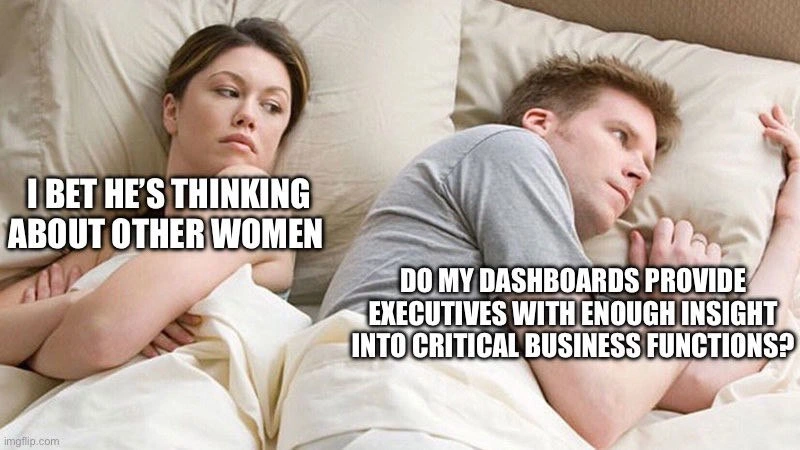
Imagine a couple lying in bed. The woman thinks her boyfriend’s mind is on another girl, but actually he’s just really worried about his job. He made some important charts and graphs at work to show his bosses how the company is doing. Now he’s staring at the ceiling, wondering, “Did I do it right? Will my bosses understand the numbers I put together?” She expects he’s troubled by romance, but he’s actually stressing about work. It’s funny because his head is filled with work stuff (numbers and charts) instead of anything romantic. In other words, the “other woman” he’s thinking about isn’t a person at all – it’s his big work project that’s keeping him up!

Level 2: Late-Night KPI Worries

Let’s break down what’s happening in simpler terms. In this bedroom scene, the girlfriend looks annoyed because she assumes her boyfriend is thinking about another woman. In reality, the boyfriend is wide awake thinking something like: “Are the KPI dashboards I built at work giving my bosses enough information about how our business is doing?” The joke is that she expects a romantic issue, but he’s actually preoccupied with a work problem.

Now, what are KPIs and dashboards, and why would someone lose sleep over them? KPI stands for Key Performance Indicator. It’s basically an important measurement that shows how well something is working. For example, a KPI for a website might be the number of new user sign-ups per day, and a KPI for a store might be monthly sales revenue. Companies pick KPIs so they can track their success in specific areas. An executive dashboard is a type of display or report that puts a bunch of these KPIs together on one screen, often using charts and graphs. It’s called a “dashboard” because, like a car’s dashboard shows your speed and fuel level, a business dashboard shows the vital signs of a company (like sales, costs, customer satisfaction, etc.) at a glance. It’s a common DataVisualization tool to help leaders see how things are going without wading through raw data.

In our meme, the man likely created such a dashboard at work – perhaps using some reporting tools or coding a web page to display all the key numbers. His stakeholders (in this case, the executives or managers who rely on the data) are expecting this dashboard to give them insight into critical business functions. “Critical business functions” just means the most important things a company does: for example, making and selling products, serving customers, keeping the website running – all the big, important stuff that keeps the business alive. The man is worrying that maybe his dashboard isn’t as insightful as it should be. He’s basically asking himself, “Did I pick the right metrics to show? Will my charts make sense to a non-technical boss? Am I missing something important that my managers need to see?” These are the kinds of questions that can nag anyone who builds reports for others.

This situation is funny to people in tech because it’s relatable: even outside office hours, we might still stress over whether our work meets expectations. As a new developer or analyst, you eventually learn that it’s not enough to just collect data – you have to present it in a way that your stakeholders find useful and clear. If your boss or client has ever said, “I don’t understand this report” or “This chart isn’t telling me what I need,” you’ll know why that kind of feedback can keep you up at night. Basically, this is part of what’s called Business Intelligence (BI) – taking lots of raw data and turning it into meaningful information (like summaries and visuals) to help with decisions. Our worried boyfriend is doing BI in his head at midnight because he wants to meet his bosses’ expectations so badly. The meme exaggerates it in a humorous way: instead of thinking about love or personal matters, his brain is consumed by work — specifically, by whether he did a good job on those charts and graphs for the higher-ups. It’s a lighthearted take on how passionate (or anxious) tech folks can get about their projects, even to the point of losing sleep over a Dashboard design.

Level 3: Pillow Talk & Pie Charts

This meme flips the classic “I bet he’s thinking about other women” scenario into a scene every experienced developer or data analyst finds darkly relatable. The man in bed isn’t contemplating an affair at all – he’s wide awake agonizing over his dashboard design and whether it delivers what his company’s leaders need. In other words, he’s mentally reviewing those carefully chosen KPIs on his ExecutiveDashboard, asking himself if they truly give the Stakeholders (the executives) clear insight into critical business metrics. It’s a perfect depiction of modern DataVisualization anxiety: instead of counting sheep, he’s counting conversion rates and uptime percentages by the glow of an imaginary laptop.

Why is this so painfully funny to industry veterans? Because we’ve all been that person, staring at the ceiling at 3 AM, mentally iterating on a BusinessIntelligence report or replaying a tough meeting with a VP. Building a great executive dashboard involves more than just pretty graphs or slapping metrics on a screen. It demands knowing what StakeholderExpectations are, anticipating follow-up questions, and striking a balance between vanity metrics (numbers that look impressive but don’t drive decisions) and actionable metrics (KPIs that genuinely signal health or problems in the business). If you’ve ever had a project where the CEO keeps asking for “one more chart” or “deeper insight”, you recognize the nightmare. No matter how many ReportingTools or interactive charts you use, there’s that nagging worry that some vital signal is still buried in the noise.

This man’s late-night panic captures that exact flavor of professional paranoia. Perhaps earlier that week he demoed his new dashboard and an executive asked a pointed question like, “Why didn’t we see last quarter’s drop in customer satisfaction coming?” Now he’s second-guessing every graph: Did I include a customer retention KPI? Is the data fresh and accurate? Will they understand the trend line on slide 5? In essence, he’s debugging his data presentation in his head. Seasoned developers know that overthinking is practically an occupational hazard – especially when your work will be scrutinized by non-technical leaders who just want quick, reliable insight. The humor here is tinged with truth: in tech, the “other woman” keeping us up at night is often a looming presentation or an unresolved production issue. In this case it’s a suite of KPIs, not an illicit romance, that has stolen his peace of mind.

There’s also an implicit nod to how work stress sneaks into our personal lives. His partner misreads his distant expression and assumes relationship trouble, while in reality he’s wrestling with data trouble. The gulf between their thoughts is hilariously wide, and that’s what makes us smirk. For those of us in software and data roles, it’s a familiar comic tragedy: your body is in bed but your brain is still at the office, refactoring code or redesigning a dashboard. The meme playfully jabs at this dashboard_anxiety. It’s saying: even during “pillow talk,” a true data geek might be obsessing over pie charts instead of romance. And as any grizzled tech veteran can attest with a wry smile, if you’ve ever found yourself up late wondering “Does my system provide enough insight into our critical functions?”, you’re officially in deep enough to find this meme both hilarious and a little too real.

Description

This meme uses the popular 'I Bet He's Thinking About Other Women' format, which depicts a couple in bed. The woman is on the left, looking suspiciously at her partner with an annoyed expression, and text above her reads, 'I BET HE'S THINKING ABOUT OTHER WOMEN'. On the right, the man lies awake, staring blankly at the ceiling with a preoccupied look. His internal monologue, in the same white text with a black outline, is 'DO MY DASHBOARDS PROVIDE EXECUTIVES WITH ENOUGH INSIGHT INTO CRITICAL BUSINESS FUNCTIONS?'. The image captures the humor in the vast disconnect between personal relationship insecurities and the niche, high-stakes anxieties of a tech professional. For an experienced developer, SRE, or data scientist, the fear that the dashboards they've built for leadership are inadequate, misleading, or simply not being used is a very real and often stressful part of the job. It highlights the pressure to translate complex system data into actionable business intelligence for non-technical stakeholders, a task that can easily keep one up at night
Comments

11
Anonymous ★ Top Pick He's not worried about another woman. He's worried the 'critical business function' dashboard is just a time-series graph of the office coffee pot level and the CEO hasn't noticed in six months
  1. Anonymous ★ Top Pick

    He's not worried about another woman. He's worried the 'critical business function' dashboard is just a time-series graph of the office coffee pot level and the CEO hasn't noticed in six months

  2. Anonymous

    I’m not distant, I’m just mentally tracing the ETL path that turns thirty microservices, four naming conventions and one silently failing cron into the “simple” KPI the CEO expects by 8 a.m

  3. Anonymous

    After 15 years of building dashboards, you realize the real KPI is how many executives actually look at them versus how many just ask for 'one more metric' in the next sprint planning meeting

  4. Anonymous

    The real question isn't whether your dashboards provide insight - it's whether executives will actually look at them instead of asking you to export everything to Excel and manually email it every Monday morning at 8 AM with three different pivot table variations and a PowerPoint summary

  5. Anonymous

    He’s debating whether the exec dashboard is insight or KPI theater when “Revenue” lives in three tables, the freshness SLA sleeps past stand‑up, and Goodhart’s Law is the de facto PM

  6. Anonymous

    She's eyeing side quests; he's graphing if SLOs hold up under executive scrutiny

  7. Anonymous

    He’s not distant - he’s debating whether “active_user” means post‑login or any event, fully aware the CFO’s Excel will outvote the semantic layer at QBR

  8. @EmberFox 1y

    cursed

  9. @qwnick 1y

    Hookerbot

  10. @TERASKULL 1y

    it will never be enough, because the rival companies are "using ai" and "streamlining dashboard insights"

  11. @duchemeister 1y

    This is me

Use J and K for navigation