Web.dev Fails Its Own Audit
Why is this WebDev meme funny?
Level 1: Teacher Gets Graded
This is like a teacher giving everyone a test about being neat and organized, then the teacher's own desk gets inspected and turns out to be messy. The funny part is not that the desk is the worst ever; it is that the person telling everyone else how to improve is visibly failing one of the important parts too.
Level 2: Lighthouse With Receipts
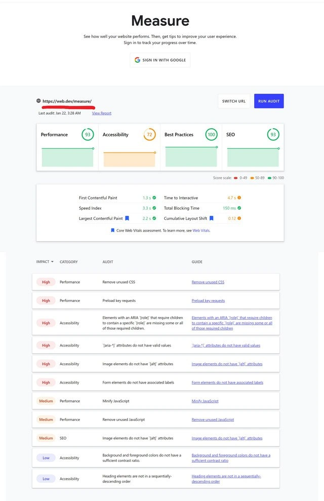
Web performance metrics measure how quickly and smoothly a page loads. In the screenshot, numbers like First Contentful Paint, Largest Contentful Paint, Time to Interactive, Total Blocking Time, and Cumulative Layout Shift describe whether users see content quickly, can interact soon, and avoid the page jumping around while it loads.
Accessibility means making a site usable for people with different abilities, including people using screen readers, keyboards, zoom tools, or high-contrast settings. The table calls out concrete accessibility issues:
- ARIA attributes help describe interface behavior to assistive technologies, but broken ARIA can be worse than none.
- Missing
alttext means images may not have meaningful descriptions for screen reader users. - Form elements without labels make inputs harder to understand and navigate.
- Low color contrast can make text difficult or impossible to read.
- Bad heading order makes the page structure confusing, like a book with chapters nested in the wrong order.
For a junior developer, the humor is close to a first encounter with CI checks. You run a tool expecting a neat green report, then discover the tool has opinions about things you did not realize mattered. The screenshot shows that even a major tech company can end up with the same kind of list: remove unused CSS, preload key requests, minify JavaScript, fix labels, fix headings. The prestige of the logo does not exempt anyone from the checklist.
Level 3: Audit Thyself
The screenshot is funny because the page is not merely being judged by some random plugin; it is Google's own web quality experience being measured inside a tool branded around improving web quality. The page headline says:
Measure
and promises:
See how well your website performs. Then, get tips to improve your user experience.
Then the score cards immediately undercut that promise. Performance sits at 93, Best Practices at 100, and SEO at 93, but Accessibility is visibly stuck at 72, colored in the warning range. That is the entire joke compressed into one dashboard: the machine for grading homework brought its own homework and got comments in red pen.
The audit table makes it sting because the failures are not exotic edge cases. The visible rows include ARIA role child problems, invalid aria-* attributes, images without alt attributes, form elements without labels, insufficient color contrast, and non-sequential headings. Those are the unglamorous accessibility basics every frontend team knows they should handle before shipping. Nothing here says "quantum browser rendering bug"; it says "someone shipped a UI where assistive technology and document structure were not treated as first-class requirements."
That is why this lands with experienced web developers. Lighthouse-style tooling gives teams a clean numeric interface, but the numbers can create an awkward corporate theater. A team may celebrate 100 in Best Practices while ignoring a warning-yellow Accessibility score because the release deadline is louder than the screen reader. The visible post message, "How the tables have turned," nails that reversal: the auditor becomes the audited, and the dashboard is suddenly much less abstract.
There is also a subtler tooling lesson here. Automated audits are valuable, but they are not moral authority. A tool can detect missing labels, contrast issues, and common ARIA mistakes, yet still live inside an ecosystem where design systems, deadlines, component reuse, and ownership boundaries create the very defects it reports. The page is both the teacher and the cautionary example. Somewhere, a ticket probably said "improve accessibility score" and then patiently aged into archaeology.
Description
The screenshot shows Google's web.dev "Measure" page with the text "See how well your website performs. Then, get tips to improve your user experience. Sign in to track your progress over time," plus a "SIGN IN WITH GOOGLE" button. The measured URL is "https://web.dev/measure/" with "Last audit: Jan 22, 2:38 AM," "View Report," "SWITCH URL," and "RUN AUDIT" visible; the score cards show Performance 93, Accessibility 72, Best Practices 100, and SEO 93, with the score scale labeled 0-49, 50-89, and 90-100. The metrics list First Contentful Paint 1.3 s, Speed Index 3.3 s, Largest Contentful Paint 2.2 s, Time to Interactive 4.7 s, Total Blocking Time 150 ms, and Cumulative Layout Shift 0.12, followed by "Core Web Vitals assessment. To learn more, see Web Vitals." The audit table columns read "IMPACT," "CATEGORY," "AUDIT," and "GUIDE," with rows including "Remove unused CSS," "Preload key requests," ARIA role child issues, invalid aria attributes, missing image alt attributes, form elements without associated labels, "Minify JavaScript," "Remove unused JavaScript," insufficient color contrast, and non-sequential heading order. The humor is that the tool for judging web quality is shown giving Google's own web.dev page a notably weak accessibility score.

Comments
3Comment deleted
Running Lighthouse on web.dev is the web platform equivalent of making the compiler compile itself and then filing accessibility bugs.
how the turntables... Comment deleted
hmmm Comment deleted