Meta's Logo: Did It Copy Visual Studio's Homework?
Why is this IndustryTrends Hype meme funny?
Level 1: Twin Logos, Different Colors
Imagine you and your friend have to do a big art project for school. Your friend draws a really cool, unique purple infinity-shaped doodle. You love it, but you didn’t finish your own drawing in time. So, right before class, you quickly copy your friend’s drawing – only you color yours blue instead of purple, hoping the teacher won’t notice it’s basically the same picture.
This meme is laughing at a very similar situation, but with companies. Visual Studio had a purple loopy logo (kind of like a sideways figure-eight) for a long time. Then one day Facebook (a big social media company) decided to rename itself Meta and showed a new blue loopy logo that looks a lot like Visual Studio’s drawing. It’s like Meta peeked at Visual Studio’s homework and tried to change the color so no one would call them out. But of course, everyone who knows Visual Studio could spot it instantly, just like a teacher would notice if two kids handed in nearly identical art. The joke is simply that Meta’s logo doesn’t look very original – it looks like it “copied” the Visual Studio logo’s idea. And seeing two huge companies with almost twin logos is funny in the same way seeing two classmates turn in the same homework with tiny tweaks would be. It makes people smile and think, "Caught you! You just changed the color, but it’s basically the same thing."
Level 2: Copy-Paste Branding 101
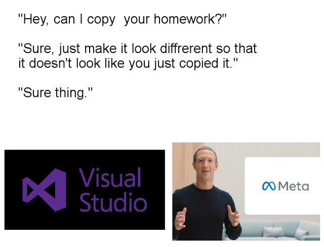
Let’s break down the meme in simpler terms. The image is using a well-known joke format among students and internet folks: one person asks to copy another’s homework but is told to "change it a little" to avoid being too obvious. In the meme, Meta’s new logo (the one Facebook introduced when it renamed itself to "Meta") is basically the homework copy, and Visual Studio’s logo is the original homework.
Visual Studio, for context, is a popular Integrated Development Environment (IDE) made by Microsoft. An IDE like Visual Studio is a software application that programmers use to write and test code. Visual Studio’s icon is a distinctive purple symbol that kind of looks like an infinity loop or a sideways "8". Developers have seen that icon on their desktop and taskbar for years; it’s practically burned into our brains from opening the IDE a million times.
Now, in October 2021 Facebook’s parent company decided to rebrand itself as Meta (this was a huge move in the tech industry, meant to emphasize their focus on the "metaverse" — a sort of virtual reality future internet). With the new name came a new logo: a blue curved shape that also looks like an infinity symbol, or maybe a twisted letter "M". The infinity symbol (∞) generally means "forever" or "endless". Meta likely chose it to signify endless possibilities in virtual worlds. BrandingInTech often uses such abstract symbols to feel visionary and sleek.
Here’s the funny part: side by side, the Visual Studio icon and the Meta logo look remarkably alike. They’re both looping shapes. Visual Studio’s is purple and sort of 3D-ish, Meta’s is blue and flat, but essentially they’re both doing the infinity-loop thing. For anyone in the developer community, this resemblance was instantly obvious. It’s like seeing two people wearing almost the same outfit in different colors.
The meme spells out the humor with a mock conversation (the text on the top of the image):
“Hey, can I copy your homework?”
“Sure, just make it look different so that it doesn't look like you just copied it.”
“Sure thing.”
In this dialog, Meta is the one asking to copy, and Visual Studio (or Microsoft) is the one reluctantly agreeing. "Sure thing," followed by Meta unveiling basically the same infinity loop, implies Meta didn’t really put much effort into making it different. They just copied the idea and maybe changed the color from purple to blue. This is a common meme format when two things look too similar: you joke that one must have copied the other’s homework but only superficially altered it.
To a junior developer or someone newer to tech, it helps to know:
- Visual Studio – an IDE from Microsoft, icon is a purple infinity-like loop. It’s used for writing software (especially C#, C++, etc.).
- Meta – the new name for Facebook’s overarching company. New logo as of 2021 is a blue infinity-shaped symbol (meant to look like an "M" for Meta, but definitely an infinity loop vibe).
- Rebranding – when a company changes its name/logo/identity. Here Facebook rebranded to Meta, changing its corporate name and logo.
- Infinity symbol (∞) – a math symbol for "infinite" or "never-ending". Both logos use a version of this shape.
- "Copy your homework" meme – a joke implying one person duplicated another’s work with minimal changes. In developer humor, we often use this to tease lookalike products or features (“X app copied Y app’s feature”).
Because developers are very familiar with Visual Studio’s logo, they immediately caught the similarity. It’s a bit of an inside joke: a person outside of tech might not connect Meta’s logo to Visual Studio at all. But in the programmer world, the Visual Studio icon is iconic (pun intended). So when Meta’s logo came out, a lot of devs went on Twitter and Reddit joking, "Facebook copied VisualStudioIDE’s logo!" This meme basically captures that sentiment in a single image. It’s poking fun at BrandingInTech by suggesting even huge companies sometimes end up with logos that look like they copy-pasted someone else’s design. And the fact that it’s Microsoft’s Visual Studio (an old, established developer tool) makes it extra funny to developers – it’s like the new kid (Meta) showed up wearing the veteran’s trademark hat, pretending it’s brand new fashion.
In essence, the meme is straightforward: Meta’s blue infinity logo looks like Visual Studio’s purple infinity logo. The humor comes from how blatant the resemblance is, framed in that familiar "copying homework" joke format. It’s a bit of good-natured ribbing at both big corporate design decisions and the notion that in tech, even creative work like logo design sometimes isn’t as original as companies think. After all, in a community that thrives on TechHumor, calling out this kind of thing is a way to bond and say, "Hey, we see what you did there, Meta."
Level 3: Infinite Identity Crisis
On a deeper look, this meme highlights a brand déjà vu that only tech insiders might catch. In late October 2021, when Facebook unveiled its rebrand to Meta with a shiny new infinity-loop logo, developers did a collective double-take. The logo on that keynote slide looked uncannily similar to the Visual Studio icon—a purple, twisting infinity symbol that developers have clicked on for years. The humor kicks in because we expect a giant company like Meta to debut something unique, yet here it appears as if they "forked" the Visual Studio logo repository, changed the color from purple to blue, and shipped it as new. It's the classic "Hey, can I copy your homework?" scenario playing out in real corporate branding.
From a senior developer’s perspective, this is TechIndustrySatire at its finest. We’ve all seen ideas in tech get "borrowed" before (just think of how every chat app suddenly added Stories after Snapchat popularized them). But copying an entire logo design is a bold move. The meme’s dialogue format nails this absurdity:
"Hey, can I copy your homework?"
"Sure, just make it look different so that it doesn't look like you just copied it."
"Sure thing."
Here, "homework" is Meta’s $FULL_REBRANDING effort and Visual Studio’s icon is the answers key. The punchline: Meta didn't make it look all that different. For seasoned devs (especially those in the Microsoft ecosystem), the resemblance was immediate and hilarious. It’s as if the bigtech design team truly did ask Microsoft’s IDE for the answers and only bothered to swap purple for blue, hoping no one would notice. Spoiler: everyone noticed.
This joke lands so well because it taps into shared developer experiences and CorporateCulture oddities. We’ve been in those code reviews where someone copy-pasted logic from Stack Overflow with tiny tweaks, thinking it’d slip by. (We see you changing variable names and indentation, nice try.) The Meta-vs-VS logo situation feels the same, but on a massive scale: a multi-billion dollar company inadvertently (or maybe inevitably) creating a logo_design_similarity with an existing product. It’s a mix of flattery and comedy—flattery for Visual Studio, whose iconic design apparently screams "infinite future" as much as Meta’s vision, and comedy in the idea that Meta’s logo designers might have unknowingly done the equivalent of a developer copying code from their favorite editor.
There’s also a bit of tech history and irony here. Visual Studio’s infinity symbol logo has been around for quite a while (a part of the product's identity through many versions), representing perhaps infinite loops of coding and continuous innovation. Meanwhile, Meta chose an infinity-like loop to convey an infinite horizon of the metaverse. Different contexts, same ancient symbol ∞. It’s not the first time two companies converged on similar branding—minimalist design trends have made a lot of logos look like siblings. But rarely does it happen in such a way that one could joke about bigtech_copying_design like a lazy student. The developer community’s collective memory is sharp: we recognize our beloved VisualStudioIDE icon instantly, so seeing it echoed on the world stage during Zuckerberg’s presentation was both surreal and giggle-inducing.
And let’s admit, there’s schadenfreude in seeing a tech giant stumble into a brand_identity_overlap. Engineers often endure non-technical management decisions that seem absurd ("rewrite everything in a month," anyone?). Here, a major corporate decision (Facebook’s costly rebrand) collided with a bit of geek culture (the Visual Studio icon) in an oops moment. The meme serves as a playful reminder that even with all their resources, big companies can end up doing things that look just like copying homework. In code terms, one might pseudocode Meta’s design process like:
# Meta's logo design pseudocode
visual_studio_logo = "∞" # original inspiration
meta_logo = visual_studio_logo
meta_logo_color = "blue" # tweak the color so it's not obvious 😉
Whether by pure coincidence or a subconscious nod, Meta turned in homework that felt like a re-skin of Microsoft’s assignment. For veteran devs, the humor also hints at how ideas recirculate in tech. Today it’s logos; tomorrow it might be features or product names (remember all the “Azure vs. AWS vs. Google” service name similarities?). It’s an infinite loop of branding where companies sometimes independently arrive at the same symbol. The meme’s brilliance is making this complex convergence accessible and funny—because who would’ve thought a CorporateHumor joke about logo design could also double as a programmer inside-joke about copying code with a find-and-replace?
Description
A two-part meme comparing the logos of Microsoft Visual Studio and Meta. The top half contains a three-line text exchange on a white background: 'Hey, can I copy your homework?', followed by 'Sure, just make it look different so that it doesn't look like you just copied it.', and finally 'Sure thing.'. The bottom half consists of two images side-by-side. On the left, against a black background, is the purple logo for Microsoft Visual Studio, which resembles a stylized infinity symbol. On the right is a screenshot of Mark Zuckerberg during a presentation, with the new blue Meta logo displayed prominently next to him. The Meta logo also resembles a stylized, slightly warped infinity symbol. The meme humorously alleges that Meta's logo is a thinly veiled copy of the Visual Studio logo, using the popular 'copying homework' meme format to make the point. It's a cynical take on corporate branding, resonating with developers familiar with the long-standing Visual Studio icon

Comments
15Comment deleted
The Meta logo is just the Visual Studio logo after a few billion dollars in funding and a pivot to a virtual world where bugs are features and the 'endless loop' is the business model
Meta’s “new” logo feels like someone ran `git clone visual-studio-logo && sed -e 's/#68217A/#0064FF/' && git push --force branding` - hope they remembered to update the license header
The real metaverse was the Visual Studio instances we compiled along the way - at least Microsoft's infinity loop crashes with proper stack traces instead of just harvesting your biometric data
When your rebrand's diff shows you basically just changed the color palette and variable names from 'microsoft_purple' to 'meta_blue' - but hey, at least you ran the linter and updated the copyright year
DRY applied to branding: Meta forked the Visual Studio logo, tweaked a design token, renamed the namespace, and shipped
Meta 1.0 shipped with a logo that collides with VisualStudio.Icon via perceptual-hash Hamming distance < 5 - branding needs namespacing and a pre-commit hook too
Meta's secret to IDE innovation: git clone microsoft/vs, sed 's/VS/Meta/g' logo.png, commit -m "disruptive architecture"
Metasoft Comment deleted
2012 one fits better Comment deleted
👍 Comment deleted
this one is actually 2010 one https://logos.fandom.com/wiki/Microsoft_Visual_Studio Comment deleted
That makes complete sense now Comment deleted
it is more than 1:1 👍😂 Comment deleted
https://t.me/devs_chat/40254 Comment deleted
Anybody knows the visual basic 2008 icon? Comment deleted