
Skip to content
DevMeme
4829 of 7435
When manual icon-clustering outperforms your fancy k-means production pipeline
UX UI Post #5289, on Jul 2, 2023 in TG

When manual icon-clustering outperforms your fancy k-means production pipeline

Why is this UX UI meme funny?

Level 1: Organized by Looks

Imagine you have a big box of different toys, and you decide to sort them not by what they are or what they do, but by how they look. For example, you find a bunch of toys that are all round and have a hole in the middle or a round shape – like a toy target, a gear from a toy machine, a flower with a circle center, maybe a round sticker. You put all those into one group just because they look kind of the same shape. Then, feeling silly, you give that group a goofy name that makes you giggle – something a bit rude that you’d never find on a real label, like calling them “Buttholes” because, well, they’re round with a hole. It’s like a kid’s private joke in how they organized their stuff.

Normally, people organize things by what they’re used for – say, all your drawing tools in one box, all your action figures in another. But here, the person is organizing like a child who noticed a funny shape: “Hehe, these all look like butts, so I’ll keep them together!” It’s unexpected and that’s what makes it funny. It’s showing that sometimes our eyes and our sense of humor guide us more than any serious rule. We group things because they “just look alike” in a silly way.

So the meme is basically doing that with app icons on a phone. The person put all the icons that have a similar round design into one folder and named it something naughty to amuse themselves. It’s funny because it’s a very human thing to do – seeing a random resemblance and making a joke out of it – something a machine or a formal organizer would never do. It reminds us that organizing can be personal and playful. Anyone looking at it will first be confused – “Why on earth is this folder called that?” – then see the icons and realize the innocent visual rhyme that led to the joke. It’s a little peek into how someone’s brain made a playful connection, turning a boring phone screen into something that can make you laugh.

Level 2: Sorting by Shape

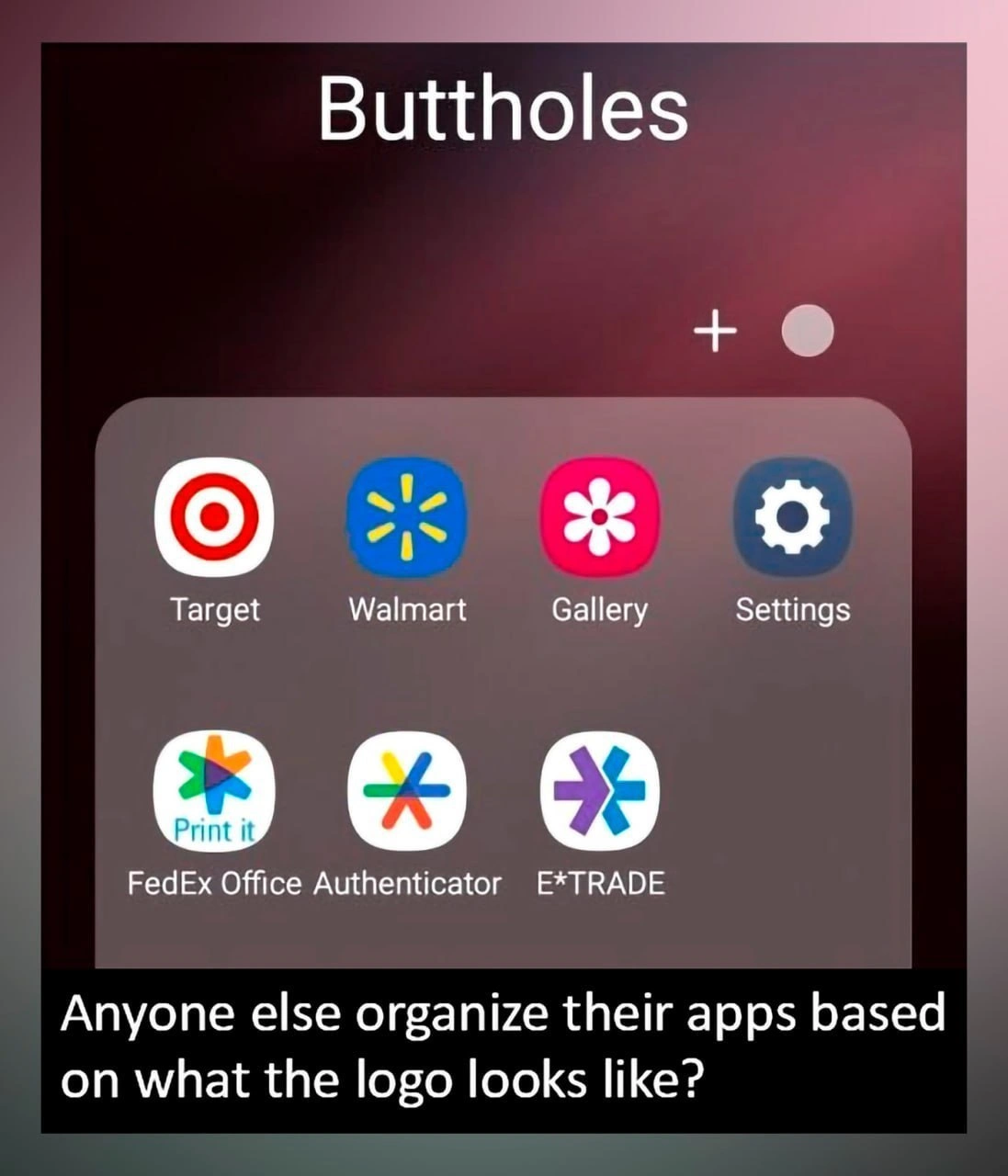
Let’s break down what’s going on in simpler terms. We have a screenshot of an Android phone’s home screen, where the user has created a folder and titled it "Buttholes". On Android (and iPhones too), you can group apps into a folder – basically a little container on your screen that shows multiple app icons inside it – and you can give that folder any name you want. Typically, people name folders for what the apps do, like “Games” for game apps or “Shopping” for retail store apps. In this meme, the user did something different: they organized their apps based on what the app icons look like, not what the apps actually are. All the app icons in the "Buttholes" folder share a similar look: they have a round, hole-like design in the middle.

For example:

  • The Target app has the company’s logo as its icon: a red and white target symbol which is basically a red circle with a dot (or another circle) in the middle – it looks like a bullseye.
  • The Walmart app’s icon is a stylized yellow spark or flower shape on a blue background. It’s essentially six yellow petal-like shapes arranged in a circle, with a little empty space in the middle – again kind of a radial, circular design.
  • The Gallery app (common on Android phones for viewing your photos) often uses a pink or magenta flower icon (a simplified flower with petals) which has a circular center. Indeed, in the screenshot it’s a pink flower with a white center – another circular element.
  • The Settings app icon is almost universally a gear or cogwheel (a gray/blue gear shape). A gear icon has a hollow center (the axle hole) and teeth around – visually, it’s a circle with stuff around it.
  • Then on the bottom row, there are two FedEx Office apps (one for printing, one an authenticator) – their icons are multi-colored asterisk or star-like shapes (FedEx’s logo for their Office services is like a splash of colors or asterisk). These also have a radial symmetry – many points arranged around a center, so at a quick glance they look like round shapes too.
  • Finally, E*TRADE, a finance/brokerage app, uses a purple and green asterisk-like icon (it looks like two arrows crossing to form a star). Again, it’s a shape with a center and repeating arms around – similar vibe.

So visually, all seven apps have icons that are circular or have a centered design with radial symmetry. If you’re a bit immature or have a cheeky sense of humor, you might look at those circles and star shapes and think they resemble cartoon drawings of buttholes (a butthole being, well, the anus – kids might snicker about it, and it’s often represented comically as a simple star or circle). It’s crude, but clearly this user made that connection. They saw these icons and said, “Ha! These all kind of look like little buttholes!” Then they dragged those apps into a folder and named the folder "Buttholes" for the joke.

Now, the title of the meme says: “When manual icon-clustering outperforms your fancy k-means production pipeline.” Let’s unpack that. Clustering means grouping similar things together. A production pipeline implies some programmed, automated process that’s running in a real-world application (production means it’s live for users, not just an experiment). K-means is a specific algorithm used in machine learning to automatically cluster data into groups (the “k” is the number of groups you want). It’s used in unsupervised learning when you don’t pre-label things, you just want the algorithm to find patterns and bunch similar items together.

So a “k-means production pipeline” suggests an automated system that, for instance, could analyze all your app icons and try to cluster similar ones together – maybe to auto-sort your apps or make suggestions on organizing them. Fancy, in this context, implies it’s high-tech or complex. The meme joke is saying: a human doing manual icon clustering (meaning the person manually picked and grouped icons by eye) outperforms (does better than) that fancy automated pipeline. Basically, the person beat the algorithm. How? By using their own pattern recognition (in this case, noticing a funny visual similarity).

Why is that funny or significant? Because usually we think of computers and algorithms as very powerful – they can process tons of data and find patterns. But here, a human’s simple approach (organize by looks and humor) achieved a result that an algorithm likely wouldn’t even consider. It’s a tongue-in-cheek way to say sometimes human intuition or a quick eyeball test can beat artificial intelligence, especially for quirky tasks. The “fancy k-means algorithm” might cluster apps in a boring way (like grouping by color or some other property that doesn’t feel meaningful to the user). Meanwhile, the user’s approach feels satisfying (and hilarious) to them. They got a coherent group – all icons truly do share that round, center-hole look – and they gave it a memorable label.

This resonates with developers because it highlights a concept in UX/UI: users will often find their own ways to use software that designers and developers never expected. It also touches on the idea that naming things in tech can be arbitrary or funny at times. The user could have named the folder “Circle Icons” or “Random”, but calling it "Buttholes" is them being playful. In the developer world, we often name servers, folders, or code projects with inside jokes or funny references (especially on personal projects or in development, where professionalism isn’t a big concern). It’s a relatable developer experience to use humor as a way to organize or remember things.

Additionally, for a junior developer or someone new to machine learning: k-means might be a new term. It’s one of the simplest clustering algorithms – you give it a bunch of data points and a number k, and it will try to group the points into k clusters based on their features (like grouping similar ones closer together). But k-means doesn’t understand context or meaning; it just crunches numbers. So it might not “see” what a human sees in an image, unless those visual patterns are translated into the numbers well. For images, you’d have to feed some features like shapes or edges or use the raw pixels (which often isn’t effective without more advanced processing like neural networks). So an automatic pipeline might not group Target with Walmart and Settings, because their pixel colors differ a lot. The human, however, used their own vision and even a bit of cultural knowledge (“gear icon means Settings, bullseye means Target, but visually hole-like”) to form a group. It’s a fun demonstration of the difference between artificial pattern recognition and human pattern recognition.

So, in simpler terms: the meme shows a phone folder where the user organized apps by a funny visual pattern (all icons look like buttholes). It jokes that this silly manual grouping is “better” than a smart computer program grouping things, highlighting how humans can sometimes come up with creative groupings that computers wouldn’t. For someone newer to tech, it’s a reminder that not everything that’s technologically advanced is actually better for every task – and that developers have a quirky sense of humor when using technology!

Level 3: K-Means vs Keen Eye

Why do developers find this hilarious? Because it’s relatable on multiple levels. First, it’s poking fun at our industry’s tendency to over-engineer solutions. We’ve all seen scenarios where a complex machine learning pipeline or a sophisticated algorithm is deployed to categorize or personalize something – a recommendation engine, an automatic photo organizer, you name it – and yet a human can sometimes achieve a surprisingly good result with a quick, intuitive hack. Here, the meme caption jokes that “manual icon-clustering outperforms” the high-tech solution. It’s the classic tale of a keen human eye and a sense of humor trumping a ton of code and math. Any senior engineer who’s watched a simple script outperform a bloated system (or an intern’s quick regex beat a fancy NLP model for a niche problem) will crack a smile at this. It’s a gentle jab at the hype of AI in production – sometimes, the straightforward approach wins, especially for quirky tasks that formal algorithms don’t even know they should solve.

Second, the humor comes from an absurd but spot-on grouping. Traditionally, we organize apps semantically: a “Shopping” folder for retail apps, “Photography” for camera and gallery, “Utilities” for settings and tools, etc. That’s UXDesign 101 – group by function or user intention. But here, a rogue developer mind treats the home screen like a clustering problem based purely on visual similarity taxonomy. The folder naming convention is thrown out the window in favor of a personal, irreverent category: “Buttholes.” 🤭 This is a prime example of pattern_matching_humor: seeing a cheeky pattern where no sane UX designer would intentionally see one. It’s the same energy as noticing two coworkers wearing shirts that together resemble a famous cartoon duo and dubbing them accordingly – a mix of clever observation and juvenile glee. Developers often have to create naming conventions for projects or data schemas, and under pressure (or boredom) we sometime resort to silly or informal names. (Ever see microservices named after Star Wars characters or Pokémon? Or a legacy code module still called newShinyExperiment_final_FINAL.cpp because the developer had a laugh? Same vibe.) Naming a folder “Buttholes” because all the icons look that way is that same dev humor: irreverent, a bit geeky, and very much not what the UX guidelines say.

There’s also an undercurrent of designer_developer_disconnect here. UI designers pour effort into making each app icon unique and on-brand. The Target icon should evoke Target’s red bullseye logo; the Settings icon universally uses a gear to imply “tools/configuration”; the Gallery icon (a flower) suggests photos and memories blooming, etc. Each is meant to stand on its own meaning. But to a developer casually glancing at their phone late at night, these corporate symbols converge into one unintended category – circular thingies with a center. It highlights a practical truth: put a bunch of UIDesign elements together and unintended patterns emerge. (Designers probably never intended the Walmart spark icon to end up next to E*TRADE’s asterisk in a folder named after anatomical slang, but hey, users have minds of their own!) This is a bit of UXIrony: the user experience is that the phone owner is reinterpreting the UI in a way no designer would predict or probably approve. And developers, who often are power-users of tech, love to repurpose or subvert interfaces in creative ways – like using an app in a way it wasn’t intended or creating easter eggs. Organizing apps by “what the logo looks like” is exactly that kind of subversive play with a UI.

From a senior dev perspective, there’s a whiff of truth in “manual beats machine” here that goes beyond just icons. We’ve experienced situations where algorithms struggle with visual similarity tasks that humans find obvious. For example, image classifiers can confuse odd things (remember the classic internet meme of “AI can’t tell a chihuahua from a muffin” because they have similar colors and shapes?). Here, a presumably sophisticated pipeline might cluster icons in a dull or irrelevant way, whereas the human immediately spots a funny visual correlation. It’s a reminder that human intuition and domain knowledge (or in this case, cultural knowledge – knowing what a butthole looks like in cartoon form and finding it funny) can produce outcomes that an algorithm wouldn’t even know to aim for.

Finally, let’s talk about the “production pipeline” angle. This phrase conjures an image of some big enterprise system crunching data to group app icons into folders automatically – perhaps an AI that arranges your home screen for you. The meme exaggerates: it implies someone deployed k-means clustering at scale to organize apps, and yet here comes a user with a manual method that outshines it. It’s funny because in real life, if a product boasted an AI-driven organizer, it might completely miss this kind of category. In fact, if it ever did cluster these seven apps together, it would probably label them something benign like “Various” or “Other”. Only a cheeky human would label the cluster so frankly and humorously. In the dev world, we often joke about AI and automation failing to grasp context – like an automatic code formatter that hilariously misaligns an ASCII art, or an auto-generated report that picks unfortunate acronyms. We appreciate that contrast: the ultra-modern pipeline versus the down-to-earth, somewhat crude human solution.

In summary, the senior-perspective humor here comes from the intersection of MobileDevelopment and human creativity. It shows a developer (or at least tech-savvy user) bending their device’s organization system to their will, in a witty way. It satirizes how we sometimes invest a ton of effort in smart systems, while a user might just do something dumb and simple that works (often yielding a laugh and a facepalm). It’s a celebration of that shared developer experience: finding patterns, naming things (the two hardest problems in computer science, as the joke goes: cache invalidation and naming things… 😅), and sometimes using our powers of observation for pure comedic effect. We’ve all been there, chuckling at 2 AM, arranging something on our screen or in our code just because we noticed a pattern and had to run with it. This meme perfectly captures that vibe.

Level 4: Unsupervised vs Unfiltered

At the highest level, this meme highlights a collision between algorithmic clustering and cognitive pattern recognition. In data science terms, a "fancy k-means production pipeline" refers to an automated system using the k-means algorithm to group similar items (here, app icons) based on numerical features. K-means treats each icon as a data point in a high-dimensional feature space – for example, an icon’s color histogram, shape descriptors, or pixel embeddings. It then partitions icons into k clusters such that each icon belongs to the cluster with the nearest centroid (mean feature vector). The result is clusters of icons that are numerically similar. But here’s the rub: what computers consider similar (say, pixel color distribution or geometric symmetry) might not align with what humans notice.

Humans have extraordinarily advanced visual pattern-matching capabilities and a penchant for pareidolia – seeing meaningful patterns or images in random stimuli. In this case, a human user noticed that several app icons share a certain… radial design motif. Each icon has a central shape with a ring or petals around it (Target’s bullseye 🎯, Walmart’s spark ❇️, a flower 🌸 for Gallery, a gear ⚙️ for Settings, FedEx Office’s star ✳️, E*TRADE’s asterisk ✨, etc.). To the human eye – especially one with a mischievous sense of humor – these dissimilar apps all visually rhyme with each other. The user’s brain performed an impromptu clustering: not by app category or function, but by visual similarity of shape. Essentially, the person defined a custom feature: “butthole resemblance.” It’s an attribute so abstract and irreverent that no typical machine learning model would ever include it!

From an AI standpoint, capturing this “looks like a cartoon sphincter” feature is incredibly tricky. A k-means algorithm would need a numeric representation of “butthole-ness” – perhaps some combination of roundness, a hole in the center, symmetry, and maybe a juvenile giggle-factor metric 😜. Needless to say, no standard image embedding or convolutional network is trained for that particular semantic. Instead, an out-of-the-box pipeline might cluster these icons differently – perhaps grouping by dominant color or brand style. An unsupervised algorithm lacks contextual understanding and certainly lacks a sense of humor. It doesn’t know that a Target bullseye and a Settings gear share a crude visual metaphor; it just sees different colors and shapes. The human classifier, on the other hand, operates with rich context and zero filter: it gleefully groups the icons by a visual gag that only makes sense to minds that know what a “butthole” is and find it funny to spot one in a corporate logo.

In essence, the meme showcases how human perception can outperform machine algorithms in niche, high-level pattern matching – especially when the pattern is a tongue-in-cheek visual pun. The fancy pipeline likely produces dry clusters (“Cluster 1: mostly red icons, Cluster 2: blueish icons…”), while the manual clustering produces a cluster that is both visually coherent and hilariously labeled. It’s a reminder that human brains excel at finding creative similarities that are not easily quantifiable. Sometimes our organic, irreverent taxonomy can beat a computational approach in delivering meaningful (or at least entertaining) groupings. The irony is that the unsupervised learning method is upstaged by an unfiltered learning method – a developer’s brain doing a cheeky visual sort. This speaks to a deeper truth in AI/UX: no matter how advanced our algorithms, humans will spot patterns (and jokes) that machines won’t, because we infuse perception with cultural and emotional context that code can’t capture (yet!).

Description

The meme is a smartphone screenshot showing an Android home-screen folder titled "Buttholes." Inside the rounded-corner folder are seven apps whose circular or radial icons all resemble, well, cartoon sphincters: top row (left-to-right) Target, Walmart, Gallery, and Settings, bottom row FedEx Office Print It, FedEx Office Authenticator, and E*TRADE. A subtle grey '+' symbol and empty circle indicate room for more icons. Below the screenshot, a black banner reads, "Anyone else organize their apps based on what the logo looks like?" The joke riffs on human pattern-matching versus algorithmic classification - rather than semantic categories, the user has applied their own irreverent visual taxonomy, highlighting both the arbitrariness of iconography and the cognitive shortcuts developers often take when naming folders, micro-services, or code modules under deadline pressure
Comments

19
Anonymous ★ Top Pick Proof that a senior dev with thirty seconds and low empathy can outclass your entire CV-based image classifier - welcome to the Butt-hole cluster, now serving prod
  1. Anonymous ★ Top Pick

    Proof that a senior dev with thirty seconds and low empathy can outclass your entire CV-based image classifier - welcome to the Butt-hole cluster, now serving prod

  2. Anonymous

    After 20 years of arguing about semantic naming conventions and domain-driven design, we've finally discovered the ultimate organizational pattern: anatomical similarity clustering. Wait until the design system team hears their carefully crafted brand guidelines resulted in the 'sphincter folder' taxonomy

  3. Anonymous

    When your app folder taxonomy is driven by visual hashing collisions rather than semantic clustering - a perfect example of why humans still can't be replaced by deterministic algorithms. Even our neural networks would struggle to explain why a retail app, an MFA token generator, and a brokerage platform belong in the same namespace, but here we are, organizing by logo shape like it's a valid indexing strategy

  4. Anonymous

    Shape-driven development: grouping apps by what the logo resembles - great for cognitive cache hits, catastrophic when marketing rebrands and your taxonomy suffers cache invalidation

  5. Anonymous

    When your information architecture is so weak the user invents k‑means on glyphs - unsupervised clustering of spokes and bullseyes - the mobile equivalent of naming microservices svc‑a through svc‑z

  6. Anonymous

    Logo-based folders: easier than partitioning Kafka topics by key hash

  7. @realVitShadyTV 3y

    I have only two folds: trash and not trash.

    1. @RiedleroD 3y

      I have zero folders because I know where my apps are goddamnit /j

      1. dev_meme 3y

        No idea where my apps, whatever is app I looking for - I use search 👀

    2. @Bitals 3y

      Why would you keep trash on your device?

      1. @realVitShadyTV 3y

        I need somethimes Google Auth, or my mobile provider app or gas station app, but I marking it as trash apps.

        1. @Bitals 3y

          Understandable. Well, at leasts GAuth has multiple drop-in FOSS replacements.

          1. @RiedleroD 3y

            yeah, e.g. I use Aegis

    3. @biskwiq 3y

      i have 3: -Offline apps -Online apps -Most used

      1. Deleted Account 3y

        Move over

      2. @realVitShadyTV 3y

        Is most user app called „Your mom”? 😁 (relax it’s just a joke)

  8. @DenDrobiazko 3y

    Target 🌚

  9. @callofvoid0 3y

    My folders are so genral that all of my different 150 games fit into a single folder

  10. @Linxter 3y

    I only have 2 folders, 1 for tools and the other for tools that I actually use

Use J and K for navigation
