The Inevitable 'Stories' Feature Comes to Twitter
Why is this IndustryTrends Hype meme funny?
Level 1: Follow the Leader
Imagine you and your friends are all playing with different toys, and one day one friend shows up with a super cool new toy that everyone loves. The next day, you notice all the other kids (who originally had their own favorite toys) have begged their parents to get them that exact same toy. Now suddenly, during playtime, everyone is waving around identical shiny gadgets. It’s a little funny because just yesterday each friend had something unique, and now they all look the same trying to be the coolest. Basically, one kid started a trend, and all the others copied it so they wouldn’t feel left out. That’s exactly what happened here: Twitter saw Instagram had a popular new “toy” (the Stories feature), and Twitter didn’t want to be left behind, so it grabbed the same toy for itself. The end result is a bit like a class where every single kid is following the leader – it might be exciting for a moment, but it also makes you smile because everyone ended up doing the exact same thing.
Level 2: Stories Everywhere
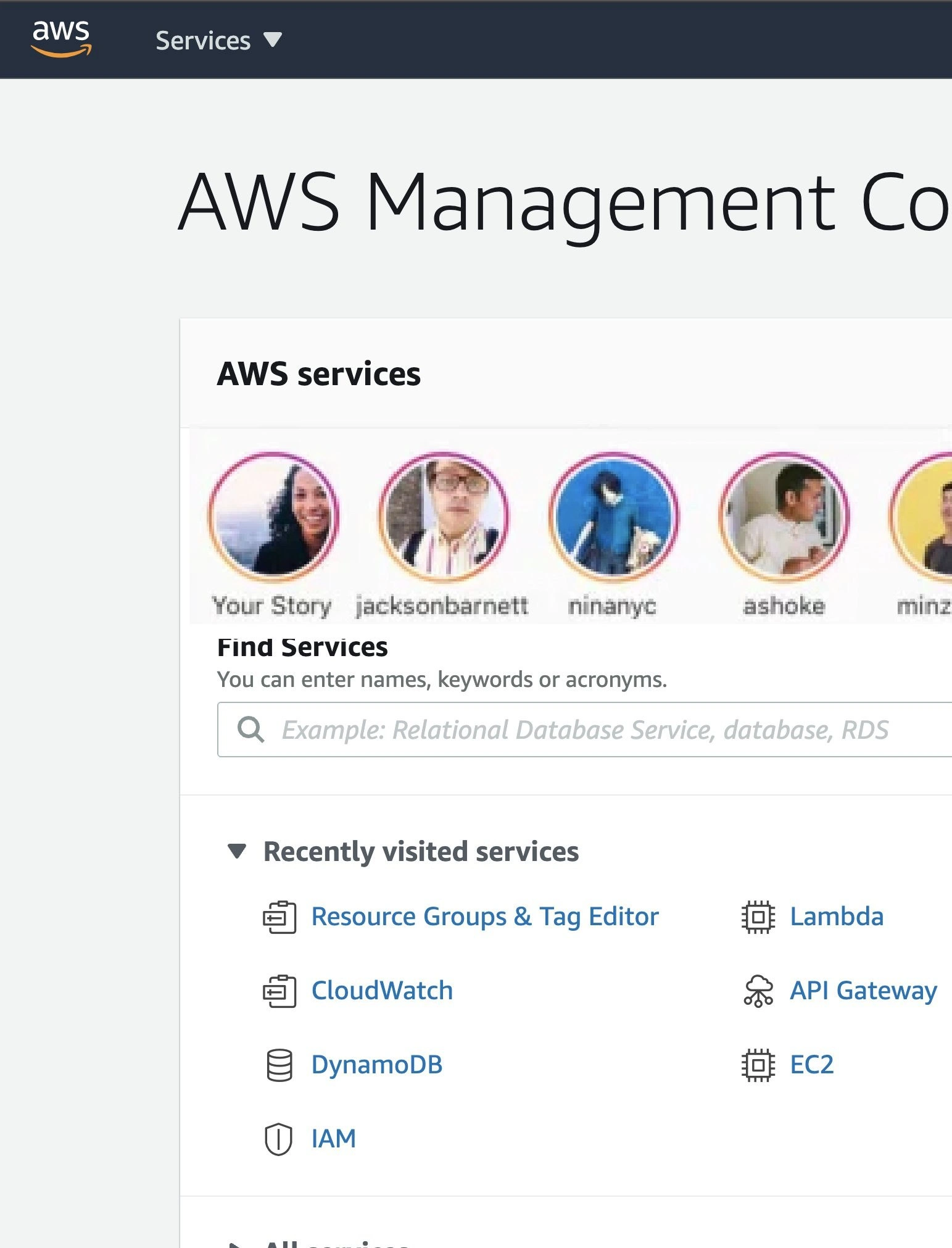
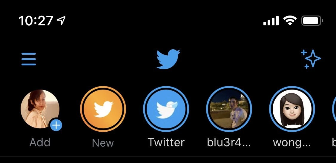
What we see in this meme is Twitter imitating Instagram’s famous Stories feature. In the image, the top of the Twitter app (the header area) has a row of circular profile pictures, just like you’d see on Instagram or Snapchat. Each of those circles represents a user's short-lived post (a “story”) that you can tap on. Twitter named their version of this feature Fleets, implying “fleeting thoughts,” because these posts disappear after 24 hours. The joke here is that Twitter’s app suddenly looks almost identical to Instagram due to these story circles multiplying across the top of the screen. For anyone who knows both apps, it’s a striking example of feature cloning – basically copying a competitor’s popular idea.
Let’s break down the elements visible in the screenshot:
- Hamburger icon (≡) on the top left: This is a common UI symbol indicating a menu. In Twitter’s app, tapping that would open the side navigation or settings.
- Twitter bird logo in the center: That’s the classic Twitter home icon, usually at the top of the feed.
- Sparkle-plus icon on the right: Twitter normally uses a sparkle (✨) icon to let users switch between latest tweets and top tweets. Here it has an extra plus (+), possibly indicating a new function (maybe related to adding or managing these story posts). It’s a bit mysterious, but it’s clearly another button in the header.
- Story circles (avatars with rings) below the header: This is the new addition. The first circle shows “Add” with a plus – that’s likely the user’s own profile, where you tap to add your own Fleet (just like “Your Story” on Instagram with a “+” to add). Next to it, there’s an orange circle labeled "New" with a white Twitter bird – perhaps highlighting a new Fleet feature or an official Twitter Fleet example. Then you see circles labeled "Twitter", "blu3r4…" and "wong…" – these are other users’ profiles (truncated names because there isn’t enough space to show full usernames). The blue rings around them indicate those users have unseen Fleets (new story content you haven’t viewed yet), a design taken straight from Instagram (where a colored ring means a new story is available).
In plain terms, Twitter has added a Stories feature to its app, and the interface for it looks almost exactly like Instagram’s implementation. This is funny to developers and designers because it’s such an obvious case of feature creep and “me-too” design. Feature creep means continuously adding extra features to a product, often to the point that the product becomes complicated or cluttered. Here, Twitter’s original simple timeline of tweets is being crowded with another layer of content (ephemeral stories) because management felt the need to chase a trend.
Why would Twitter do this? Largely due to stakeholder pressure and industry trends. A stakeholder in this context usually means someone like a product manager or an executive at Twitter who is responsible for the app’s success. If they see a rival (Instagram) keeping users engaged with a popular feature (Stories), they feel pressure to not fall behind. This is often driven by business goals: they want to boost user engagement, attract more eyes, and keep people on the app longer. In late 2020, Stories were the hype in social media – almost every platform was adding them. So, Twitter’s stakeholders likely decided, “We should have this too.” It’s a mix of wanting to follow UX design trends and fearing missing out on what competitors have.
For mobile engineers (the developers who build the iOS and Android apps) and UX/UI designers (the folks who craft the look and experience), this can be a pain point. A pain point is something that causes problems or frustration. In this case, the engineers had to quickly integrate a whole new content type into the app. That means writing new code for recording and displaying these photo/video stories, creating a new UI element (the carousel of circles), and ensuring it all works smoothly with existing features. It’s a lot of work and it can introduce bugs or performance issues. Imagine you had the app working fine, and now you’re told to add this complex feature that was never originally planned – it can feel a bit overwhelming.
For UX designers, the pain is seeing the interface become more crowded and potentially confusing. UXDesignPrinciples often emphasize simplicity and a clear hierarchy of information. Twitter’s design used to be straightforward: you open the app and see tweets. Now there are these extra bubbles at the top vying for attention. Designers worry that this kind of mobile_ui_crowding makes the app harder to navigate or diminishes the core experience (reading tweets). It can also be jarring for users who didn’t ask for this feature – one day you open your favorite app and everything looks a bit more complicated.
The meme’s description calls it a “near-clone of a rival UI,” highlighting how unapologetically similar Twitter’s approach is to Instagram’s. This gets a nod (and a chuckle) from industry folks because feature cloning is a well-known phenomenon. We’ve seen platforms do this repeatedly: one company comes up with an idea, it gains traction, and then others rapidly implement their own version. A recent example around that time was how Facebook and Instagram themselves copied Snapchat’s stories. Even professional networks like LinkedIn and business tools like Slack toyed with story-like features. It was a fad – a hype – and companies didn’t want to be left out.
In summary, “Twitter turns Instagram” is both the title of the meme and literally what happened in the UI. Twitter implemented the fleets_feature which mimics Instagram’s stories to ride the IndustryTrends_Hype wave. It underscores a bit of industry comedy: instead of innovating uniquely, big companies sometimes just copy each other’s homework. For a junior developer or someone new to tech, the takeaway here is that this kind of feature cloning and stakeholder-driven design is common. It’s funny because it’s true – all our apps slowly start looking the same when everyone chases the same popular ideas. But it also serves as a lesson in the push and pull between ProductManagement goals and UX/UI ideals. Twitter adding stories might keep it competitive on paper, but as the meme hints, it also makes us shake our heads and say, “Here we go, another app with Stories everywhere.”
Level 3: Monkey See, Monkey Deploy
Twitter’s mobile app UI is now sporting Instagram-style story circles at the top, proving that even big platforms aren’t immune to feature FOMO. In the screenshot, you see Twitter’s iconic blue bird surrounded by a new horizontal carousel of circular avatars – nearly identical to Instagram Stories UI. This isn’t a coincidence or a sudden shared design epiphany. It’s classic feature creep fueled by Product Management chasing the latest IndustryTrends_Hype. The meme gets a laugh from veteran developers and designers because we’ve seen this movie before: one app introduces a hit feature, and suddenly every other app scrambles to bolt on their own copy. Twitter calls their version Fleets (fleeting tweets – get it?), but aside from the name, it’s a carbon copy of Instagram’s story feature. Innovation? No, this is more like feature cloning with a dash of corporate anxiety.
From a senior developer’s perspective, this is equal parts amusing and exasperating. You can almost hear the meeting:
Stakeholder: “Instagram’s engagement is through the roof with Stories. We need our own version ASAP!”
Developer (sighing): “Alright… guess I’ll carve out space in our nicely streamlined header for a bunch of circles.”
Suddenly, the once-clean Twitter app header is crowded with new UI elements: a hamburger menu on the left, the Twitter logo crammed in the middle, and now an array of rainbow-rimmed profile pics elbowing for space. That little blue sparkle-plus icon on the right used to control the timeline view; now it likely doubles as an entry point for these new stories or some other flashy functionality. The design looks familiar because it’s essentially borrowed wholesale. Those blue-outlined profile rings (with labels like "New" and truncated usernames) are a direct lift from Instagram’s playbook – a rival UI pasted into Twitter. Seasoned UX/UI designers shake their heads at this mobile_ui_crowding. It violates the UXDesignPrinciples of consistency and focus, all for the sake of chasing a trend. The meme highlights this absurdity: Twitter has effectively turned into Instagram in the header, sacrificing uniqueness for me-too features.
On the engineering side, implementing “Stories” in an app originally built for text tweets is a notorious pain. Imagine being a mobile developer on the iOS team when this mandate came down. The codebase was tuned for a vertical scroll of tweets, and now you have to cram in a horizontal scrolling UICollectionView of story bubbles at the top. Hope you enjoy debugging layout constraints at 3 AM! The MobileDevelopment reality is that such retrofits often introduce new bugs and performance issues – perhaps images not loading, stories not updating, or the app shell feeling more sluggish due to all the added overhead. It’s a textbook case of stakeholderPressure versus developer sanity. The PMs and execs want shiny new engagement metrics, while devs are left wrestling with a rushed feature that wasn’t in the original design scope. In pseudo-code, the strategy looks something like:
// Pseudo-code for hype-driven feature addition
if competitor.hasFeature("Stories") && !ourApp.hasFeature("Stories") {
productRoadmap.insert("StoriesClone", at: nextRelease)
app.ui.header.add(StoriesCarousel()) // add a new horizontal scroller in header
engageMetrics.boost() // ...hopefully
// Developer's to-do: handle new complexity and potential bugs
}
This is humorous in a dark way: the code comment // Developer's to-do: handle new complexity and potential bugs is basically the unspoken truth whenever stakeholders hastily cram in a feature to keep up with rivals. Every experienced engineer knows that adding more stuff – especially copying another app’s complex feature – often means technical debt down the line. Sure, Twitter’s product team probably promised that Fleets would increase “time on app” or whatever metric they’re chasing. But the folks maintaining the app now have to deal with a more complex UI state (stories that expire after 24 hours, new notification types, extra content moderation for fleeting posts, etc.). It’s extra layers of logic everywhere: new APIs on the backend, new UI components on iOS and Android, and edge cases galore (What happens if a Fleet fails to post? Do we show an error in the circle? How to indicate when there are no new Fleets?).
The IndustryTrends_Hype aspect is strong here. This meme came out around late 2020, right when Twitter launched Fleets globally. Why? Because Snapchat started the ephemeral Stories craze years prior, Instagram perfected it for a broader audience, and by 2020 every social app (from Facebook to LinkedIn, believe it or not) felt the pressure to have “stories” or risk looking outdated. It’s a hallmark of the tech industry: a kind of convergent evolution where all distinct platforms end up offering the same set of features. Senior folks chuckle at this because it’s borderline cliché – “Oh, Snapchat has disappearing posts? Let’s all do disappearing posts. Next, TikTok has short-form videos? Brace yourselves, we’re getting those too.” In fact, we cynically anticipate these moves. The meme resonates because it confirms our jaded predictions: of course Twitter slapped Stories on their app; it was just a matter of time.
There’s also an underlying commentary on UXDesign integrity. Good UX is about serving user needs in a coherent way. But here it feels like the design is driven by corporate fear rather than user demand. Twitter’s core proposition was always real-time short messages (tweets) – quick to consume, publicly visible, with a focus on text and retweets. Ephemeral slideshows of content (“fleets”) are arguably orthogonal to that core mission. A UX practitioner seeing this might groan because it appears the company is diluting their product’s identity. The meme’s image even shows labels like "Twitter" and "New" on those story circles – it’s almost too on-the-nose, as if the app itself is screaming “Look, we have a new thing! Please use it!” It’s a bit desperate, and that’s funny in a tragicomic way.
In summary, the humor at this level comes from recognizing a pattern of feature cloning and the déjà vu of it all. The phrase "Twitter turns Instagram" says it all – the once-distinct Twitter interface is morphing into a clone of its competitor. To a battle-scarred dev or designer, it’s a mix of I told you so and here we go again. We laugh because we cope – better to chuckle at the absurdity than cry over the late-night sprints spent implementing the boss’s latest stakeholderDriven fad. This meme captures that collective eye-roll among tech veterans: New feature from a rival? Sure, just copy-paste it into our app, who needs originality? It’s borderline satire of tech leadership. At the end of the day, Twitter Fleets is a real example of the “Monkey see, monkey do” mentality – or as we put it in dev terms, Monkey see, monkey deploy.
Description
A screenshot of the Twitter mobile app interface from November 2020, showcasing the newly launched 'Fleets' feature. The image displays the top portion of the app with a dark mode theme. Visible elements include the time '10:27', a hamburger menu icon, the central Twitter bird logo, and a 'sparkle' icon for switching timelines. Below this is the Fleets bar, a horizontal row of circular icons mimicking the 'Stories' feature from Instagram and other platforms. The icons include a user's profile with an 'Add' button, a 'New' fleet with an orange background, the official 'Twitter' account's fleet (notably, the bird logo is wearing a light blue surgical mask, a nod to the COVID-19 pandemic), and other user profiles. The meme captures the tech industry trend where every major social platform felt compelled to copy the ephemeral 'Stories' format, leading to feature homogenization. For developers, it's a commentary on product decisions driven by competitive pressure rather than genuine user need or platform originality
Comments
7Comment deleted
Twitter Fleets were the perfect agile story: poorly defined requirements, a rushed two-week sprint to copy a competitor, and then quietly archived when engagement metrics proved it was a massive waste of resources
Quarterly OKR: “Ship a Stories carousel like Instagram.” Result: 1,300 lines of hurried React tacked onto the Swift monolith via WebView - proving eventual consistency: all social apps (and their tech debt) converge to the same circles
The account switcher is just microservices architecture for your personality disorders - each one maintaining its own state, occasionally achieving consensus on what framework is overrated this week
Every senior engineer's Twitter account switcher tells a story: one for professional hot takes that won't get you fired, one for shitposting about JavaScript frameworks, one for lurking in tech Twitter drama, and at least two abandoned test accounts from that OAuth integration you built in 2019. The 'New' button sits there like a reminder that you're always one controversial opinion away from needing another identity
Fleets: 24-hour TTL for posts, indefinite TTL for Kafka topics, Redis caches, and PagerDuty rotations
Twitter's recsys embeddings clustered the brand into users - classic cold start meets identity crisis
When your feature‑flag reads are eventually consistent, the client renders both control and treatment - Schrödinger’s rollout sitting right there as “New” next to “Twitter.”