Skip to content
DevMeme
3849 of 7435
Most project time spent perfecting button color instead of writing code
UX UI Post #4192, on Feb 10, 2022 in TG

Most project time spent perfecting button color instead of writing code

Why is this UX UI meme funny?

Level 1: Coloring vs Homework

Imagine you have a big homework project due, but instead of writing the report or doing the important research, you spend almost the whole day deciding what color paper to use for the cover. You try blue, then a slightly different blue, then maybe a purple, just to make the cover look perfect. You only leave a tiny bit of time to actually do the homework itself. In the end, your project has a super pretty cover page, but the report inside isn’t finished! This meme is funny because it’s showing that same idea: we often focus on a small, easy thing (like picking a color or making something look just right) and forget to spend time on the big, important work. It’s a silly reminder that doing the fancy decorating is fun, but you’ve got to do your homework (or write your code) too!

Level 2: Pixel Perfection Pitfall

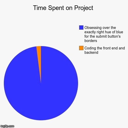
Let’s break down the meme in simpler terms. It shows a pie chart titled “Time Spent on Project,” with two slices. The giant blue slice (about 95% of the pie) is labeled “Obsessing over the exactly right hue of blue for the submit button’s borders.” The tiny orange sliver (around 5%) is labeled “Coding the front end and backend.” In other words, almost all of the project time is spent choosing a button color, and only a little bit on actual coding. This is a humorous exaggeration of a real frontend pain point: spending too much time on minor UI design details instead of the core functionality.

So why a blue button border specifically? Blue is a common color for buttons (think of all those blue “Submit” or “OK” buttons in apps and websites). In web development, choosing the exact blue means fiddling with color codes in CSS (Cascading Style Sheets). CSS is the language that controls how a webpage looks – including layouts, fonts, and colors. In CSS, colors can be specified with hex codes like #0000FF (which is pure blue) or #4287f5 (a particular shade of blue). It’s easy for a developer to change a color value slightly and keep checking if it looks better. For example, they might try a bunch of close shades:

/* Trying different blues for the button border */
.submit-button { border: 2px solid #1E90FF; }  /* a bright blue */
.submit-button { border: 2px solid #1C86EE; }  /* a bit darker */
.submit-button { border: 2px solid #1874CD; }  /* even more navy */

They could go on and on tweaking those hex codes. This process can turn into a time sink. The meme jokingly suggests that nearly the whole project timeline might slip away doing this (“obsessing over the exactly right hue of blue”), which of course leaves almost no time to code the front end or backend – i.e., to build the actual features and logic of the project.

Let’s clarify some terms. The front end of a project is the part that users see and interact with – the buttons, text, images, and overall layout in the browser. Front-end work includes HTML structure, CSS styling, and often JavaScript for interactivity. The back end is what’s behind the scenes – the server, database, and application logic that make the app function (like handling a form submission or fetching data). In a balanced approach, a developer would spend time on both front-end design and back-end code. But the pie chart joke implies the developer (or team) spent almost all their time picking a border color for a button (a small front-end styling detail) and hardly any time building the actual application logic or interface.

Why is this funny to developers? Because it satirizes a common mistake: getting stuck on a minor detail. There’s even a nickname for it – “pixel-perfect obsession” or as mentioned, bikeshedding. Bikeshedding means spending way too much time on something unimportant that everyone feels qualified to talk about. The origin of the term is an old story: a committee spent so long choosing a paint color for a simple bike shed that they ran out of time to plan a complex nuclear power plant – the trivial job overshadowed the crucial one! In software, picking the perfect button color (or debating a logo size, or some tiny CSS detail) is the bike shed, whereas designing the system architecture or writing the core features is the power plant. It’s easier and less intimidating to tweak a color or a small UI detail than to tackle a big coding challenge, so people subconsciously gravitate to the small stuff. Plus, design choices like colors are visible to everyone, so they often attract a lot of opinions. UX/UI design is important for sure – a nice look and feel can improve user experience – but it needs to be balanced with actually making the software work.

The meme falls under developer humor because almost every programmer has been in this scenario or seen it happen. Maybe you were building a website and got caught up in “should the button be sky blue or slightly more teal?” for hours, while the form behind the button wasn’t fully functional yet. It’s funny in hindsight because it’s a little ridiculous – the time spent is hugely disproportionate to the impact of that decision. It also pokes at developer productivity: if you spend 95% of your time on such a tiny detail, you might miss deadlines or end up with very polished buttons on an otherwise incomplete project. The pie chart format is a perfect choice for this joke because it visually emphasizes the huge chunk of time eaten by something as small as a color tweak.

In summary, this meme emphasizes a design vs. implementation imbalance. It gently reminds junior developers (and, honestly, all of us) that while polishing the interface is fun and visually satisfying, you have to actually build the thing. Don’t let the hue of blue trap you: it’s better to get a working frontend and backend first, then refine the exact shade of the submit button later. Save some of that pie (chart) for writing code!

🔵 Obsessing over the exactly right hue of blue for the submit button’s borders
🟠 Coding the front end and backend

Level 3: Bikeshedding Blues

At the highest level, this meme is poking fun at a classic software folly known as bikeshedding. The term (coined from Parkinson’s Law of Triviality) describes how teams sometimes give disproportionate attention to trivial details while neglecting the important stuff. Here, the trivial detail is the “exactly right hue of blue for the submit button’s borders.” Seasoned developers recognize this scenario all too well: hours poured into tweaking a CSS color code by a few hex values, while actual front-end and back-end features languish. It’s an exaggerated (yet uncomfortably familiar) slice of developer life where developer productivity gets derailed by an obsession with minor UI perfection. Why is it so relatable? Because obsessing over a button’s border color is tangible and easy to debate – everyone from developers to managers can chime in on whether the blue is too purple or too green. Meanwhile, the complex backend logic or performance optimization (the real heavy lifting of the project) gets only a tiny sliver of time and attention. This phenomenon is funny in a knowing way: it highlights the absurdity of polish-over-progress where teams burn time on cosmetic tweaks.

In real projects, this often happens when UX/UI design enthusiasm goes overboard or when decision fatigue leads people to procrastinate on hard problems by fussing with small ones. A cynical veteran coder might chuckle (or groan) because they’ve seen critical deadlines blown while the team argued about pixel nuances or the perfect shade of corporate blue. The pie chart’s ~95% blue slice vs ~5% orange slice is obviously hyperbolic, but it rings true – it reflects that feels-like reality when a simple stylistic decision drags on for days. There’s even industry lore to back this up: famously, Google once tested 41 shades of blue for a link color, painstakingly optimizing a minor detail. Sure, that was driven by data and had a payoff, but most teams aren’t Google – more often, endless color tweaking is just diminishing returns. It’s a common senior-engineer lament: we spent more time perfecting the button style than building the feature. No surprise that this pie chart meme gets knowing nods and laughs; it’s pointing out the priorities gone askew. And the humor has a hint of pain: everyone remembers a sprint where “make it pop” design feedback led to iterative CSS rabbit holes.

The phrase “hue of blue” itself is a bit poetic — it implies an almost artistic quest for the ideal aesthetic. That grand effort contrasts with the mundane reality that users probably wouldn’t notice a slight color change. In practice, a shade like #4287f5 versus #4287f7 on a button border is virtually indistinguishable to most eyes. Yet, developers or designers might insist one is markedly better. It’s both comedic and cautionary: focusing on these tiny differences is how projects lose momentum. At the end of the day, no user has ever said, “This app is great because the submit button border color is perfect!” They care that the button works and the site is functional. This meme speaks to that truth with a wink — reminding us how easy it is to get the blues (quite literally) by micro-optimizing visuals instead of delivering working code.

Description

Image is a minimalist meme styled as a pie chart on a white background. Center-top text reads "Time Spent on Project" in bold black letters. The pie dominates the lower half: about 95 % of the circle is bright blue, while a razor-thin 5 % slice is orange. A legend on the right shows a blue square labeled "Obsessing over the exactly right hue of blue for the submit button's borders" and an orange square labeled "Coding the front end and backend." The visual joke conveys that developers disproportionately spend time bikeshedding CSS color values and minor UI polish instead of actually building application logic, a familiar productivity pitfall for frontend and full-stack teams

Comments

22
Anonymous ★ Top Pick We spent two sprints debating #1E90FF vs #2196F3 for the submit button; the 5-minute backend update was just lowering the Postgres isolation level so the app would finally stop deadlocking
  1. Anonymous ★ Top Pick

    We spent two sprints debating #1E90FF vs #2196F3 for the submit button; the 5-minute backend update was just lowering the Postgres isolation level so the app would finally stop deadlocking

  2. Anonymous

    After 15 years in the industry, I've learned that the difference between #0066CC and #0066CD is exactly 3 hours of stakeholder meetings, 2 A/B tests, and one existential crisis about whether we should be using CSS-in-JS instead

  3. Anonymous

    Google A/B tested 41 shades of blue for links; you're just doing the same rigor, minus the users, the data, and the product

  4. Anonymous

    This pie chart perfectly captures the senior engineer's dilemma: you know the submit button color doesn't matter to the business logic, you know the backend architecture is more critical, you understand the technical debt implications of delaying core features - yet here you are, 3 hours deep into a Stack Overflow thread about color theory, testing seventeen shades of #0066FF because 'the user experience deserves precision.' It's the engineering equivalent of spending a week building the perfect deployment pipeline for a side project that never ships. We've all been there, meticulously crafting the perfect border-radius while the authentication system remains a TODO comment

  5. Anonymous

    Built the feature in a week; spent a quarter choosing a submit-border blue that’s WCAG AA in sRGB, matches P3 on iOS, maps to the brand token, and doesn’t invalidate 800 snapshot tests in the monorepo

  6. Anonymous

    We burned two sprints debating blue-500 vs blue-600 for a 1px border - meanwhile prod still 500s

  7. Anonymous

    Backend: O(1) lookup. Button borders: O(∞) hue iterations until WCAG sighs in relief

  8. @sylfn 4y

    why not using default button

    1. @TERASKULL 4y

      should have spent more time picking a better blue for this eye-killing chart

    2. @dsmagikswsa 4y

      Have a heart of designer instead of a programmer

  9. dev_meme 4y

    As a junior front end dev i confirm this is 100% true

    1. @TERASKULL 4y

      that's why you're still a junior

      1. dev_meme 4y

        that s not funny

      2. @karumsenjoyer 4y

        Lol

      3. @ulanov_show 4y

        🤣

  10. @sylfn 4y

    am i the only one to see hue = хуй (fuck)?

    1. @freeapp2014 4y

      Lol

    2. @ulanov_show 4y

      Yes. Thats because u are not used to english

    3. dev_meme 4y

      хуй=dick not fuck

    4. @feskow 4y

      хуй (cock)

  11. @qtsmolcat 4y

    *green

  12. @SamsonovAnton 4y

    The joke is not that shallow as it may seem, because the "violet-blue" hue range is the most difficult for color management (if only that was used anywhere in general-purpose GUI).

Use J and K for navigation