Skip to content
DevMeme
3339 of 7435
Mona Lisa takes a tour through the modern SDLC circus
SDLC Post #3666, on Sep 9, 2021 in TG

Mona Lisa takes a tour through the modern SDLC circus

Why is this SDLC meme funny?

Level 1: The Telephone Game

Imagine you start a game where you whisper a secret message to one friend, they whisper it to the next person, and so on down a line of people. By the time it reaches the last person, the message is completely different and usually pretty silly compared to the original. This meme is funny for the same reason. The original idea (like the first whispered message) was to paint a perfect Mona Lisa. But each person or team along the way changed it a little or misunderstood something, just like in the telephone game. By the end, the final message – or in this case, the final product – is totally jumbled: instead of a beautiful painting, we got a weird half-Mona Lisa with googly eyes. It makes us laugh because it’s a playful reminder that when people don’t stay on the same page, the result can be very far from what was first planned (and kind of ridiculous!). Even a kid who’s played the telephone game can understand why that mix-up is humorous: everyone tried their best, but the more the message got passed along, the funnier and more wrong it became.

Level 2: MVP vs Reality

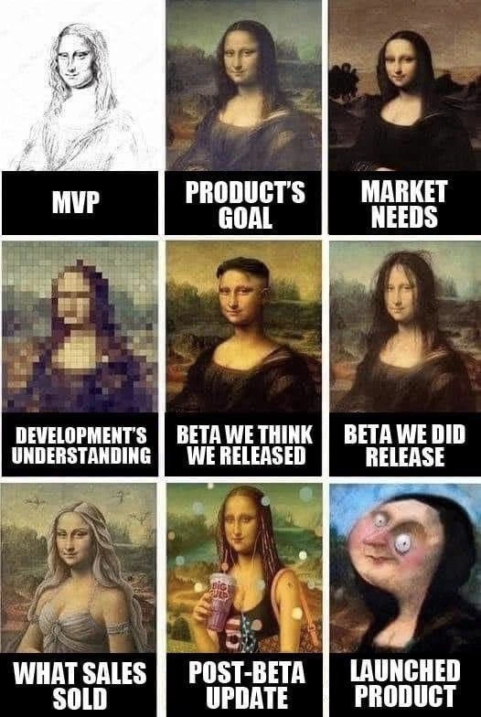
At an introductory level, let's break down each stage of this Mona Lisa software saga and what it represents in a real project:

  • MVP (Minimum Viable Product) – This is the simplest version of a product that can still work, created with minimal features just to prove the concept. In the meme, it’s depicted as a rough pencil sketch of Mona Lisa. That rough sketch means the MVP is bare-bones, lacking detail but conveying the basic idea. In real projects, an MVP might be a quick prototype or an early app version that just barely meets the core need. It's not pretty or fully featured, but it's enough to start testing the waters and see if the idea has merit.

  • Product’s Goal – This panel shows a fully detailed, classic Mona Lisa painting. It represents the ideal final product that the product team or client initially envisioned. Think of this as the official goal or the original requirements document describing how the product should ultimately look and function. In reality, this would be a comprehensive design or vision laid out by product managers: everything working perfectly, meeting all the key requirements and quality standards. In short, a true masterpiece outcome that everyone would be proud of.

  • Market Needs – Here we see another polished Mona Lisa, but slightly different from the "Product’s Goal" version. This indicates adjustments made for real-world demands. Market needs are what customers or the market actually require, which sometimes differs from the original idea. Companies often realize they must change or add features to address competitor products or user feedback. This panel suggests a small pivot or refocus: the product goal has been tweaked (maybe Mona Lisa's expression or style is a bit different) to better appeal to actual users. It’s still high quality because these market-driven changes are usually carefully considered improvements, not compromises.

  • Development’s Understanding – This one is a heavily pixelated, blocky Mona Lisa. It symbolizes how the engineering team interpreted the requirements. When requirements are unclear (requirements ambiguity) or communication is poor, developers might build something that only vaguely resembles the intended design. The pixelation means a loss of detail: subtle points from the "Product’s Goal" got lost in translation. For a junior developer, this scenario is familiar: you think you understand the feature request, but without clarity, you implement a simplistic or slightly off-target version. It’s like the difference between a sharp painting and an 8-bit video game sprite — the essence is there, but many details are missing or wrong because of misunderstandings or oversimplification.

  • Beta We Think We Released – This panel is a lower-resolution but still recognizable Mona Lisa. Beta refers to a testing phase where a product version (called a beta version) is released to a limited audience to find bugs and get feedback (this practice is known as BetaTesting). "We think we released" implies that the development team and product team believe the beta they put out is of a certain quality (maybe not perfect, but close to what they intended). It’s like saying, “We’re pretty sure the version we gave to testers looks like a decent Mona Lisa (maybe not high-def, but okay).” In real life, teams often have an internal picture of the beta build and are optimistic that it’s on track.

  • Beta We Did Release – The next panel is a darker, blurrier Mona Lisa. This reveals that the beta which actually went out was worse than expected. Perhaps something went wrong in the release process or a last-minute change made it buggier. In simple terms, it’s the unexpected reality versus what was intended. For instance, a configuration error might have caused a lower-quality build to deploy, or a critical bug slipped through, making the beta experience poor. For a junior developer, it’s like when you run your program on your computer and it works fine (what you think you're giving users), but when you actually deliver it, it behaves differently or crashes (what you actually gave them). This is a nod to real deployment issues – sometimes the version in production isn't the one you tested due to pipeline mix-ups. The beta users ended up seeing a darker, messed-up version, which is a nightmare scenario for developers who thought everything was okay. It’s the classic “it worked on my machine” moment, now in pictorial form.

  • What Sales Sold – Now we have a completely different, glamorized version of Mona Lisa (blonde hair, beachy vibes). This represents what the sales team promised to customers. Salespeople, eager to close deals, might describe the product in the best possible light or even promise features that don’t exist yet. The meme humorously shows a fantasy Mona Lisa because what Sales "sold" is often an idealized or altered vision of the product. From a developer’s perspective, this can be shocking: you might learn that a salesperson promised a client something like “Yes, our app will make you look as radiant as this Mona Lisa in sunglasses!” (metaphorically). In reality, the actual product might be far from that promise. This creates a huge misalignment of expectations between what customers expect and what the product can currently do. It’s a major reason projects suddenly expand mid-stream — because now the dev team is asked to build those promise features ASAP.

  • Post-Beta Update – Here Mona Lisa looks like a neon party girl sipping a giant soda. This panel stands for the changes made after the beta phase, in response to feedback or new directives. A "post-beta update" is the version of the product after improvements and alterations are applied following beta testing. Often, teams will get feedback like “users found the app dull” or “competitor X has feature Y,” and then rush to make changes before the final launch. In the meme, the result is a Mona Lisa that’s drastically changed in style (bright colors, a soda cup) – meaning the product has veered significantly from the original classiness to something trendier (and possibly tacky). For a junior dev, this shows how late-stage changes can be drastic: new features, changed UI themes, or experimental additions thrown in under tight deadlines. It’s a bit chaotic – the product now has a bunch of flashy tweaks that weren’t in the original plan, reflecting a common crunch-time scenario where the team is trying to address every piece of feedback or idea in one go. The core idea is still there, but it’s now covered in neon and glitter, so to speak.

  • Launched Product – The final panel is an awkwardly cropped, exaggerated half of Mona Lisa’s face. This is the product that actually gets released to all users on launch day. Unfortunately, as depicted, it's kind of a mess. Only the bottom half of Mona Lisa’s face is visible, suggesting the product is incomplete – maybe only half of the promised features made it in, or the implementation only covers part of what was intended. The crazy bulging eyes and distorted look imply there are quality issues (big bugs or design flaws) that make the product appear broken or silly. In real life, this is the outcome when a project suffers from all the issues above: the final software is far from the initial vision and might be full of odd problems due to rushing and constant changes. A new developer can understand this by imagining a school assignment where your initial idea was great, but after rushing last-minute changes and getting confusing input from friends, you turn in something that only kind of resembles what you wanted and has glaring mistakes. The launched product here basically makes people say, "Huh? This is what we ended up with?" It's the literal expectation vs. reality punchline. Internally, everyone knows it's not ideal, but it’s what got delivered given the chaos.

In summary, each panel of this meme corresponds to a stage in the product’s journey and shows how the outcome can stray at each step. It highlights common developer frustrations: unclear requirements, shifting goals, deployment slip-ups, over-promising to clients, and last-minute feature chaos. If you're new to software development, this meme is like a cautionary comic strip about the importance of clear communication and managing expectations. Otherwise, you might end up with a "Mona Lisa" that went through an art blender by the time you ship it! It’s funny DeveloperHumor now, but it underscores why good project management and teamwork are so crucial.

Level 3: Masterpiece to Monsterpiece

This nine-panel progression is painfully familiar to any senior engineer. It’s essentially a tour of a project going off the rails in slow motion. We start with the MVP — that quick and dirty pencil sketch meant to prove basic viability. Of course, in theory the MVP is supposed to be thrown away or at least refined, but in reality it's often temporarily permanently used as the foundation for the final product. The Product’s Goal is depicted as the proper Mona Lisa, the flawless ideal the business hoped for. Then Market Needs come in: the market demands tweaks and new features (maybe a different smile or added background?), so now the target shifts slightly. A different but still polished Mona Lisa appears, hinting at a pivot to satisfy real user demands. This is how initial requirements get adjusted once real stakeholders or market research weigh in.

Next, we hit the translation to engineering: Development’s Understanding shows a blurry, pixelated Mona Lisa, implying engineering either didn’t get clear requirements or oversimplified the design. At this point, all the RequirementsAmbiguity in the specs manifests as missing details — the devs built something, but it’s at like 8-bit resolution compared to the high-def vision. Every senior dev has lived this. The spec said “portrait of a woman,” so the team delivered exactly that, missing all the nuance. It’s classic requirements vs. reality: the essence is there, but the quality and specifics are way off. This panel basically screams miscommunication: the beautiful idea got lost in translation on the way to the codebase.

Then comes the Beta release misadventures. The meme splits into “Beta we think we released” versus “Beta we did release.” This is a nod to those chaotic ReleaseCycles where the build you demo internally isn’t quite the same as the one that actually went out to users. Perhaps QA or DevOps accidentally shipped an older build, or last-minute hotfixes made the deployed version uglier (darker, buggier) than expected. I've seen that happen at 4 PM on a Friday: the team cheers that Beta v2 is live (looking as expected on staging), only for real users to report that Beta v2.1 (with some weird patch) actually hit production. Cue facepalm. It's an old joke in ReleaseManagement: “We test in prod, so you don't have to.” Here, the poor beta that users got is a degraded cousin of what we intended. The dev team’s mental image of the beta was rosier than reality — a common developer pain point where you think your deployment went well, only to discover something got lost in the pipeline.

Now enter the wild card: What Sales Sold versus reality. The bottom-left panel has a blonde, bombshell Mona Lisa – a totally different vibe – because Sales has a talent for painting their own picture to clients. This is the classic sales/marketing disconnect. Sales likely promised the product would be a miraculous, sexy solution that slices, dices, and makes julienne fries — nothing like the modest MVP engineering actually built. Every engineer cringes at this scenario: you demo a simple feature, then find out Sales went and sold the upcoming “Pro” version with twice the features and some magic AI that nobody has started yet. The engineering team’s reaction: "We haven't built any of that... yet we're somehow obligated to deliver it now?" This is a pure stakeholder expectations nightmare, and a breeding ground for scope creep as the team scrambles to fulfill promises that were never realistically scoped. It highlights misalignment not just inside the dev team, but between departments with different incentives. Sales gets commission for selling big; engineering gets late-night calls to somehow make it happen. No surprise, the product roadmap gets distorted yet again.

The Post-Beta Update panel (Mona Lisa with neon colors and a giant soda cup) represents the product after product management and marketing get their hands on the beta feedback. Perhaps in response to lukewarm user testing, they demand flashy changes to grab attention. Maybe someone in leadership said, "Hey, our app needs to be more fun and on-trend to win market share – give Mona Lisa a Big Gulp and some neon lights!" It's absurd, but so is the reality of many post-beta change requests that steer a product far off its original course. At this stage, the product has been morphed to appease every loud stakeholder: a bit of gaudy UI here, a rushed feature there. The result is often a bizarre, half-modernized, half-broken experience. Seasoned devs know this phase well: the last-minute scramble to address a grab bag of feedback and executive whims. Each "quick update" or new feature is like another clashing brushstroke on the canvas, until the product feels like a collage of disconnected ideas. In project retrospectives, this is where everyone admits, “We lost the plot.”

Finally, the Launched Product – the coup de grâce of this tragicomedy. We're left with an awkwardly cropped, crazy-eyed Mona Lisa. It’s only the lower half of her face, blown up and distorted. This is where the project ends up after all those miscommunications and eleventh-hour changes: a far cry from the elegant original vision. It’s basically a Frankenstein’s monster of a product – recognizable in parts, but overall pretty horrifying. The customers are baffled, the dev team is dismayed, and management is in spin-control mode. The final software might have only half the intended features working (hence showing just half her face) and a bunch of unintended quirks (those wild eyes!) that give it a creepy vibe. This panel hits home for anyone who’s shipped something under a tough deadline, only to think, “How did it end up like this?” It’s the perfect visual punchline to a long chain of MisalignedExpectations.

The humor here is equal parts laughter and pain. Each stage of this SDLC turned into a circus of missteps, miscommunication, and misalignment. It’s AgileHumor with a dark twist: Agile methods are supposed to keep everyone aligned through constant feedback, but when the process breaks down, you get iterative chaos instead of iterative improvement. This meme resonates because it exaggerates a truth many of us know: a beautiful idea can devolve into a production nightmare thanks to organizational dysfunction. It satirizes how each department (product management, engineering, QA, sales, marketing) contributes their own distortion. In the end, you have a launched product that's a meme of itself – an outcome so absurd you have to laugh. Seasoned engineers share this with a knowing sigh because we've survived those “MVP-turned-forever” projects, and it's both comforting and cringe-inducing to see the whole saga laid out in one picture.

Level 4: Entropy in the Pipeline

On an abstract level, this meme illustrates a kind of information entropy in the software process. Each hand-off in the SDLC (Software Development Life Cycle) acts like a noisy communication channel where details get irreversibly lost or mutated. Just as compressing an image over and over results in a pixelated mess, transferring a product vision from one team to another introduces lossy compression of information. The pristine idea (the Mona Lisa masterpiece) degrades stage by stage: requirements get summarized, misinterpreted, or oversimplified – reminiscent of how saving a JPEG repeatedly introduces artifacts. There’s an academic parallel in communication theory: without strong error-correction (like rigorous documentation or continuous feedback), the original message’s fidelity decays. Conway's Law famously states that system design mirrors the organization's communication structure; here each siloed team’s output reflects their limited understanding. It’s almost like observing a cascade failure: the initial high-quality signal (clear requirements) succumbs to accumulated “noise” as it traverses product management, development, QA, and marketing. The final deployed software is akin to the chaotic end-state of maximum entropy – essentially random relative to the intended order. In theory, methodologies like Agile try to inject frequent feedback loops (error-correcting signals) to combat this entropy, ensuring that stakeholder expectations align with implementation at every iteration. But when those feedback mechanisms break down or when ScopeCreep accelerates beyond control, the outcome follows a sort of second law of thermodynamics for projects: the RequirementsVsReality gap inevitably widens with time. The humor (and horror) is in recognizing this as a near law-of-nature in big organizations: without deliberate alignment, a project drifts towards disorder and absurdity, exactly as depicted by our progressively distorted Mona Lisa.

Description

A 3×3 meme grid uses progressively distorted versions of Leonardo da Vinci’s Mona Lisa to lampoon the software-delivery pipeline. Row 1 shows: (1) a rough pencil sketch captioned “MVP”, (2) a faithfully painted portrait captioned “PRODUCT’S GOAL”, and (3) a slightly different but still polished painting captioned “MARKET NEEDS”. Row 2 escalates the chaos: (4) a heavy, block-pixelated Mona Lisa labeled “DEVELOPMENT’S UNDERSTANDING”, (5) a low-resolution but recognizable version labeled “BETA WE THINK WE RELEASED”, and (6) a darker, blurrier version labeled “BETA WE DID RELEASE”. Row 3 finishes the tragedy-comedy: (7) a beach-blonde fantasy version captioned “WHAT SALES SOLD”, (8) a neon, party-girl illustration sipping a giant soda captioned “POST-BETA UPDATE”, and finally (9) an awkwardly cropped close-up of only the lower half of Mona Lisa’s face captioned “LAUNCHED PRODUCT”. The meme satirizes the misalignments between vision, requirements, implementation, marketing, and the messy hand-offs throughout an enterprise SDLC, resonating with senior engineers who have survived countless ‘MVP-turned-forever’ projects
Comments

9
Anonymous ★ Top Pick If you squint at the launch column hard enough, you can almost see the original requirements document - just like production users do
  1. Anonymous ★ Top Pick

    If you squint at the launch column hard enough, you can almost see the original requirements document - just like production users do

  2. Anonymous

    After 20 years in tech, I've learned that the only thing more abstract than our microservices architecture is the game of telephone we play between product vision and what actually ships. At least with eventual consistency, we have mathematical proofs - with product development, we just have eventual disappointment

  3. Anonymous

    This perfectly captures the architectural decay pattern we all know too well: start with a clean MVP sketch, aim for the Louvre-quality masterpiece, but somewhere between the pixelated 'development understanding' and what sales promised the enterprise client, you end up shipping that final panel - a product so distorted by competing requirements, technical debt, and last-minute 'critical' features that even the original architect wouldn't recognize it. The real tragedy? That post-beta update somehow made it worse, and now you're the one on-call when it breaks at 3 AM

  4. Anonymous

    Second law of thermodynamics: product entropy surges from MVP sketch to launched derangement

  5. Anonymous

    Turns out our SDLC is a distributed lossy codec: requirements go in as PNG, bounce through PM/Dev/Sales like telephone, and by GA we ship a 32×32 JPEG that marketing upscaled to 4K

  6. Anonymous

    Our org treats the PRD, Jira board, sales deck, and release notes like a distributed system - without consensus; the launched product is just last-write-wins

  7. @flamboyantFlamingoes 4y

    post beta update do be fine NGL

  8. @alhimik45 4y

    Sales sold Daenerys Targaryen?

  9. @Magilarp 4y

    I kinda like the "beta we think we released"

Use J and K for navigation