Skip to content
DevMeme
Saying the UI is simple versus watching users stretch to actually use it
UX UI Post #67, on Feb 7, 2019 in TG

Saying the UI is simple versus watching users stretch to actually use it

Why is this UX UI meme funny?

Level 1: The Mailbox You Can Almost Reach

Imagine building a lemonade stand and putting the cup-holder slightly too far from where people stand — so every customer has to lean way over, on tiptoes, arm fully stretched, just to grab their drink. You proudly say, "It's so easy to use!" while a nice old man is practically lying flat in mid-air trying to reach it. That's this picture: the machine works, the man is paying, and yet everything about the moment screams that somebody who designed it never watched a real person try. The funny part is the gap between how easy we think we made something and the acrobatics people actually perform to use it.

Level 2: Vocabulary for the Dangling User

  • UI (User Interface) — everything a person sees and touches to operate a system: buttons, screens, slots, layouts. Here, the toll terminal.
  • UX (User Experience) — how the whole interaction feels end-to-end. The UI in the photo may be fine; the UX is a man planking over a motorway.
  • Edge case — a situation outside the typical, expected use. Designers plan the average case (car stops close); reality supplies the rest. Good engineering means asking "what if they stop a meter short?" before shipping.
  • Usability testing — watching real users attempt tasks without coaching. Five minutes of observation routinely demolishes months of confident assumptions, which is exactly what the meme's two-line caption dramatizes.

The classic junior-developer encounter with this: you build a beautiful form, demo it flawlessly, and then the first real user types their phone number into the name field, uploads a 300MB photo, and somehow triggers a state you didn't know existed. Your first instinct is "users are using it wrong." The career-defining realization is that there is no wrong — there is only the design that didn't account for them.

Level 3: The Happy Path Stops Two Meters Short

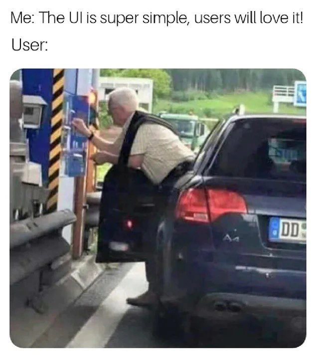
Me: The UI is super simple, users will love it! User:

— and the photo answers with an elderly driver who has stopped his Audi wagon just far enough from the toll machine that he must climb halfway out of the open door, torso horizontal over the asphalt, legs anchored inside the car, fingers straining toward the blue terminal. Every element of the scene is a design lesson wearing a high-visibility stripe.

The toll machine is simple. Buttons, slot, screen — a textbook minimal interface. What its designers modeled was a car positioned within arm's reach; what reality delivered was a user whose stopping accuracy didn't match the spec. This is the canonical gap between the happy path — the idealized flow where users behave exactly as the wireframe assumed — and field conditions. Seniors recognize the pattern instantly because it has a thousand software incarnations: the form that assumes nobody pastes formatted text, the wizard that assumes nobody presses Back, the date picker that assumes nobody was born before 1940. Note also what the user does not do: he doesn't reposition the car. Reversing and re-approaching is the "correct" recovery, but humans overwhelmingly prefer a heroic workaround over restarting the flow — the physical-world equivalent of users force-refreshing five times rather than reading the error message.

The deeper organizational satire is in the "Me:" line. The confidence isn't malicious; it's structural. The designer tested the interface on themselves — a person who knows where everything is, parks perfectly, and has full context. That's why usability testing with real, unbriefed users exists, and why the discipline's bitter wisdom holds that you are not your user. Watching five strangers use your product teaches more than fifty sprint demos, mostly by inflicting scenes exactly like this one. The system works, technically. Payment will be made. But "task completed while dangling out of a vehicle" is the UX equivalent of a 200 response with a four-second latency and a pulled hamstring.

Description

Meme with two parts: a white caption on top reads, "Me: The UI is super simple, users will love it!" then a line break followed by "User:". Below the caption is a photo of an older man in a beige shirt who has stopped his dark-blue Audi at a toll or parking gate. Because the car is parked too far from the blue kiosk, he has opened the driver door, stepped one leg onto the ground, and is awkwardly leaning his entire torso out to press buttons on the machine. The scene is outdoors with green countryside in the background and striped yellow-black safety markings on the kiosk. The visual gag highlights a mismatch between designer optimism and real-world usability, echoing common software UI issues where developers assume ‘simple’ but users struggle. Technically it satirizes poor user-experience research, inadequate usability testing, and the gap between perceived and actual accessibility of interfaces


Comments

7
Anonymous ★ Top Pick “PM: ‘Onboarding is one effortless click.’ 
Reality: that click lives 600 px off-screen, behind two SSO redirects, an MFA prompt, and an iframe - turns out we shipped Fitts’s Law as a full-body workout.”
  1. Anonymous ★ Top Pick

    “PM: ‘Onboarding is one effortless click.’ 
Reality: that click lives 600 px off-screen, behind two SSO redirects, an MFA prompt, and an iframe - turns out we shipped Fitts’s Law as a full-body workout.”

  2. Anonymous

    After 20 years of building "intuitive" interfaces, I've learned that the only thing truly intuitive is the nipple - and even that comes with a learning curve and a support hotline

  3. Anonymous

    Usability testing in one photo: your interface isn't 'intuitive' until you've watched a user operate it while hanging out of a moving constraint you never modeled

  4. Anonymous

    This is the physical manifestation of every 'mobile-first' designer who never tested their kiosk UI with actual humans in actual cars. Sure, it passed all your Figma reviews and looked great on the 27-inch monitor, but did anyone consider the interaction radius? This is why we have user acceptance testing - and why 'works on my machine' extends to 'works from my ergonomic standing desk' but fails spectacularly at a 45-degree angle from a car seat. The gap between your beautifully crafted design system and a user doing automotive yoga to pay for parking is exactly why senior engineers insist on field testing before launch. Remember: your users aren't sitting in optimal conditions with perfect posture - they're contorting themselves at toll booths while you're patting yourself on the back for that clean, minimal interface

  5. Anonymous

    Tollbooths: Proof bad UX shipped before React, still haunting us in prod

  6. Anonymous

    Product: “It’s one click.” Reality: Fitts’s Law puts that click one car-width out of reach - simplicity without reachability is just a happy-path demo

  7. Anonymous

    Our 'intuitive' flow apparently had a hidden dependency on arm length and lane alignment - Fitts's Law meets happy-path engineering

Use J and K for navigation