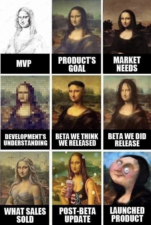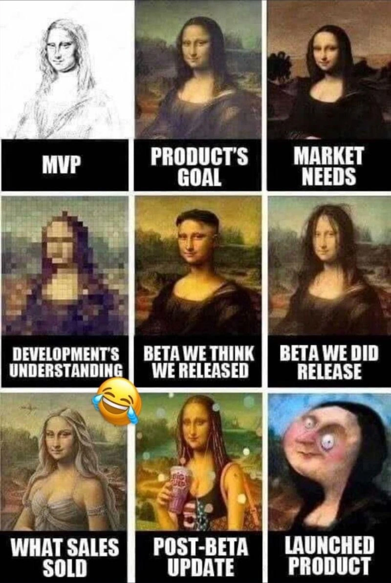
Every chaotic product development stage reenacted by Mona Lisa variants
Why is this SDLC meme funny?
Level 1: Expectation vs Reality
Imagine you and your friends are all trying to paint the Mona Lisa together, but you each take turns without a clear plan. You start with a quick, rough sketch of the idea – that’s like the very first simple version. Then your friend comes in and paints what they think the final beautiful portrait should look like. Another friend says, “Hmm, people actually want the background to be darker,” and repaints the background a different color. Someone else only saw a tiny, blurry picture of the Mona Lisa, so when it's their turn to paint, they add very blocky, rough details because they weren’t sure what it should look like. Later, you think the painting is nearly done and it looks good to you, but when you show it to others, it turns out the colors are smudged and it’s not as clear as you thought. Meanwhile, another friend has been telling everyone that this painting is going to be the most amazing and perfect masterpiece ever (way beyond what you’ve actually done). So just before finishing, someone else tries to make the painting trendy by adding fun new details – like putting sunglasses on Mona Lisa or making her hold a fancy drink – hoping to impress people. Finally, when you all step back and look at the finished painting, it’s... well, pretty weird and nothing like the original Mona Lisa idea.
Everyone bursts out laughing because the result is such a mix-up. It’s a big difference between what you expected to make and what you actually made. This is exactly why the meme is funny: it shows how a simple plan can turn into a silly mess when everyone has different ideas and keeps changing things. In other words, the picture in your head versus the thing that got created are totally different – a classic expectation vs. reality moment that anyone can understand (and laugh at).
Level 2: Minimum Viable Painting
Let's break down each panel of this meme and what it represents in the software development process:
MVP (Minimum Viable Product): This is the first, rough version of the product. In the meme it's a simple pencil sketch of Mona Lisa. An MVP includes just enough features to be usable so that early feedback can be gathered. It's like a prototype of the product. The sketch shows it's not polished or complete – only the basic idea is there.
Product’s Goal: This panel shows the classic, full Mona Lisa painting, representing the ideal final product. This is what the company or product manager ultimately wants to achieve – a high-quality, complete product. Think of it as the goal or vision everyone is aiming for.
Market Needs: This is depicted as a darker-toned Mona Lisa. Market needs are what customers or the target market actually want or require. Sometimes, after a project starts, you discover that users have different needs, so the product has to change. The darker Mona Lisa could hint that users wanted a "dark mode" or a different style. It shows the product being adjusted from the original plan to satisfy real-world demands.
Development’s Understanding: This panel is a very pixelated Mona Lisa, meaning the development team’s understanding of the requirements is low-resolution or unclear. Maybe the specifications they got weren’t detailed enough, or there was confusion. The dev team might think they know what to build, but if the picture is fuzzy, they're essentially guessing some parts. This often happens when requirements aren't communicated clearly or get lost in translation.
Beta We Think We Released: Here Mona Lisa looks almost right, with just a small odd twist. Beta refers to a test version of the product released to a limited audience to find issues. "Beta we think we released" implies the development team believes this beta version is pretty close to the target. In the image, the painting looks okay to the team – they assume everything is fine. This is like when developers say, "We tested it and it looked good to us!"
Beta We Did Release: In this panel, Mona Lisa is blurred. This shows that what actually went out to the beta users was not as clear or correct as the team thought. Perhaps when real users tried the beta, they encountered many bugs or the quality was worse than expected. It's a surprise to the team, like "Uh-oh, why does it look so bad out there?" This can happen due to deployment mistakes or unforeseen issues that only appear when more people start using the product.
What Sales Sold: Now we see a completely different, exaggerated version of Mona Lisa (almost like a fantasy pin-up version of her). This represents what the sales team promised to clients or customers. Sales people sometimes over-promise to make a sale – they might describe features that don't exist yet or make the product sound far more amazing than it really is. The meme shows this with a laughable contrast: the sales version is so flashy and unrealistic compared to the real product. It’s like telling someone a normal car can transform into a spaceship just to get them to buy it.
Post-Beta Update: Here Mona Lisa is shown in a modern style (holding a big drink, looking like she's taking a selfie). This stands for changes made after the beta test. Maybe users gave feedback or a new trend became popular, so the team quickly added some new features or updates to appear up-to-date. For example, after beta, developers might add a popular feature or a fresh coat of paint to the design to please users or bosses. In the meme, giving Mona Lisa a hip makeover shows how the product was tweaked to be more "cool" or "marketable" post-beta.
Launched Product: The final panel shows the product that actually launches to everyone – and it’s a messed-up, distorted Mona Lisa face. This is the end result after all the changes, misunderstandings, and rushed work. The launched product might technically work, but it looks nothing like that original goal. It’s like a distorted version of what was promised. This often happens when there have been too many last-minute changes or when each team (development, sales, etc.) pulled the product in different directions. The final software is full of compromises and quick fixes, which can make it feel awkward or unstable (just like that distorted face).
In simpler terms, this meme highlights how a project can start with a clear vision but end up completely off-track after going through multiple stages and different hands. Each caption corresponds to a stage that’s familiar in software projects:
- You begin with an MVP to get the basic idea out.
- You have a Product Goal that’s the perfect version you hope to build eventually.
- You adjust for Market Needs to make sure customers actually want what you’re building.
- The Development Team’s Understanding of the plan might be imperfect if communication isn’t clear.
- You release a Beta version, thinking it’s fine, but the actual Beta might reveal unexpected problems.
- Meanwhile, the Sales team might be promising something far fancier to clients (uh-oh!).
- You rush in a Post-Beta Update to fix things or add trendy features.
- And finally, the Launched Product is what comes out at the end, which may be very different (and more broken) than anyone first intended.
It’s a humorous way to show the classic case of misaligned expectations among all the people involved in a project (the stakeholders). Stakeholders include everyone with an interest in the project’s success: the developers, the product managers, the sales team, the clients, etc. If these stakeholders aren’t on the same page, the project can turn into a game of telephone – the message (or in this case, the product) gets jumbled along the way.
For a junior developer or someone new to product development, the key lesson here is that communication and managing expectations are as important as writing code. Even if you build something correctly, it might not be the right thing if you misunderstood the assignment or if others promised something else. This meme uses Mona Lisa’s wild transformation to remind us in a funny way that when everyone has a different idea of what’s going on, you can end up with a final result that makes people say, “Wait... this is what we set out to make?” It’s both funny and a little cautionary about how projects can go awry.
Level 3: Renaissance Reality Check
This nine-panel meme uses the iconic Mona Lisa to parody a chaotic software project, and every engineer who's endured a messy product launch will feel this one. Each Mona Lisa variant represents a phase or perspective in the Software Development Life Cycle (SDLC), highlighting the massive misaligned expectations between what was intended and what actually got delivered. It's essentially a visual requirements vs. reality checklist for a project spiraling out of control (with an art-history twist for good measure).
MVP – The top-left panel labeled “MVP” is a rough pencil sketch of Mona Lisa. In startup lingo, MVP stands for Minimum Viable Product. It's supposed to be the simplest possible version of the product that still delivers core value. And indeed, the sketch is just enough to recognize Mona Lisa (kind of). This is our scrappy first draft of the product: quick, rough, and nowhere near the polished vision. Often teams crank out an MVP under tight deadlines to test the waters, and it usually ain't pretty – it's held together by duct tape and hope. The humor here is that calling it "Mona Lisa" at this stage is almost ironic, much like how calling a buggy prototype a "product" is a stretch.
Product’s Goal – The middle of the top row shows the real Mona Lisa painting labeled “PRODUCT’S GOAL.” This is the dream scenario, the product management vision of perfection. It's what the product was supposed to look like after all the planned features and polish. Every team starts with this picture in mind – their own masterpiece. In reality, it's as if the team said, "One day our app will be as renowned and flawless as the Mona Lisa." This panel sets the gold standard that everything else will hilariously fall short of.
Market Needs – The top-right panel is a slightly darkened Mona Lisa labeled “MARKET NEEDS.” Notice how the background and tone are different – like someone applied a dark filter. This suggests that the market (i.e. customers or users) demanded something different from the original plan. Maybe users wanted a Dark Mode (hence the darker palette) or some other change that wasn't initially envisioned. In product terms, it’s a pivot or an adjustment: the team realizing, "Hmm, users are asking for something else, so let's tweak the product to meet actual needs." Accommodating these market-driven changes is critical, but it already starts altering that perfect vision.
Now, the second row gets into the implementation comedy:
Development’s Understanding – Far left of the second row, we have a heavily pixelated Mona Lisa captioned “DEVELOPMENT’S UNDERSTANDING.” This one gets a knowing laugh from engineers. It implies that by the time requirements reach the development team, the details have become fuzzy and unclear – much like a pixelated image. Think of the game Telephone but with product requirements: the original message (build a Mona Lisa) turns into something like "Moanah Lisa-something" by the time it gets to engineering. The devs are working with a low-resolution spec, so they fill in the blanks as best they can. In the real world, this is when the technical team has an incomplete or confusing requirements document or user story. Maybe the PRD (Product Requirements Document) was vague, or too many people added changes to it. The result? The engineers build what they think is being asked for, but there's a lot of guesswork. It's basically the requirements gap made visible: you get a blurry understanding, you deliver a blurry solution.
Beta We Think We Released – The middle of the second row shows a slightly “off” replica of Mona Lisa captioned “BETA WE THINK WE RELEASED.” This represents the version of the product that the development team believes they have delivered for beta testing. In their eyes, it’s pretty close to the goal – maybe not museum-perfect, but close enough that only an expert would notice the differences. This is classic developer optimism at work: “It’s not perfect, but hey, it's basically there, right?” The image looks like Mona Lisa, but if you inspect it, her face or smile is a bit different – a subtle sign that something’s off. In practice, this could be the build that passes all internal tests and gets demoed in the sprint review. The dev team is confident they’ve hit the mark for the beta phase.
Beta We Did Release – The right panel in the second row is a blurred Mona Lisa labeled “BETA WE DID RELEASE.” Ah, reality strikes. This is what actually got shipped out to beta users, and it’s not nearly as crisp as the devs thought. Possibly, something went wrong between the dev environment and production – maybe a misconfigured build, missing assets, or one of those "it worked on my machine" moments. Every developer has had that sinking feeling when the thing that looked fine in QA ends up broken or degraded in production. The meme captures this with a literally blurry painting. It's a nod to how the team’s perception vs. the end-user’s experience can be wildly different. The Beta that went out might have had serious performance issues or obvious bugs that somehow slipped through. This panel is basically the project manager telling the team, "Users are saying the image looks all blurry," and the devs going, "Wait, what? It looked fine to us!" It's Agile humor in a nutshell: iterative development is great until you realize your iteration went sideways.
Now the bottom row is where the outside world and post-release chaos come in:
What Sales Sold – Bottom-left, we have the Mona Lisa reimagined as an over-the-top, fantasy-style painting with exaggerated features, captioned “WHAT SALES SOLD.” And to hammer the joke home, the meme even plastered a 😂 (tears-of-laughter) emoji on it, highlighting how ridiculous this version is. This is a savage jab at the sales team. Essentially, while the developers were struggling to deliver the blurry beta above, the sales folks were out there promising customers the moon. They've pitched the product as something far grander (and shinier) than reality. It's common: Sales wants to close a deal, so they promise features that don't exist yet or describe the product as if it's flawless. The meme exaggerates this by turning Mona Lisa into a completely different genre of painting – not even the same style anymore. It's like selling a plain sedan but promising it’s a Formula 1 race car with wings. The humor (and horror for developers) comes from knowing someone now has to deliver on those wild promises. If you're an engineer, that laughing emoji is basically LOL, we're so doomed.
Post-Beta Update – The center of the bottom row, labeled “POST-BETA UPDATE,” shows Mona Lisa as a trendy modern girl sipping a big drink (looking like a selfie with a frappuccino). This represents the stage after beta where the team scrambles to improve the product with updates. Maybe users gave feedback or a new trend emerged, so the developers quickly bolted on some flashy features to seem up-to-date. Essentially, they're turning the classic Mona Lisa into a hip version to attract attention. New hairstyle, shiny accessories, maybe a neon background – whatever it takes to address the latest market needs or executive whims discovered during beta testing. It’s a playful dig at how products often chase the latest trends: dark mode, social integration, a new UI theme, you name it. Here, giving Mona Lisa a 21st-century makeover is how the meme shows feature creep in action. The product is drifting further from the original core vision (our museum-worthy Mona Lisa) and becoming something else entirely. It's like when a simple to-do app suddenly adds a chat, a crypto wallet, and a TikTok feed because one big client asked for them during beta. The product gets more features but also more inconsistent.
Launched Product – Finally, the bottom-right panel titled “LAUNCHED PRODUCT” shows an absolute abomination of Mona Lisa – her face is comically distorted and almost unrecognizable (imagine Mona Lisa in a funhouse mirror). This is the endgame: the product that actually went live to all customers after all the tweaks, misunderstandings, and over-promises. It’s the sum total of all the above craziness. The once-elegant vision has morphed into a bit of a Frankenstein monster. Sure, it technically has all the parts it’s supposed to (there’s a face with two eyes, a nose, and a mouth... just like the product technically has all its features), but nothing is where it should be, and the elegance is gone. This is where veteran developers either laugh or cry (or both). It's funny because it's true: by launch time, many products carry the scars of rushed patches, hacks to meet last-minute promises, and half-implemented features. The launched Mona Lisa looks insane because, to the team, the final software often feels insane – a far cry from that initial goal of a masterpiece. It's the ultimate payoff to the requirements vs reality joke: this is what we ended up shipping.
Overall, the meme perfectly encapsulates a dysfunctional project lifecycle in an Agile era (or maybe fragile Agile). It’s showing how an initially promising project can derail when there's poor communication, constant change, and conflicting stakeholder agendas:
- The product manager had one goal (the masterpiece),
- The market/users pulled in another direction,
- The developers only half-understood the plan,
- The beta was shakier than expected,
- The sales team described an entirely different product to clients,
- The team then tried to patch things up post-beta with trendy features,
- And the final release ended up, well, goofy.
Anyone who’s worked on a software team recognizes these stages. It's a comedic exaggeration, sure, but not by much – which is why it resonates (in a painfully familiar way). There's a classic project management cartoon from decades ago that similarly shows a tire swing project: each frame depicts what the customer wanted, what the analyst designed, what engineering built, what marketing advertised, etc. This Mona Lisa meme is that concept updated for modern tech and Agile startup culture, using a famous painting as the common reference point. We laugh because we've either been on a project exactly like this, or we live in fear of ending up on one. It’s a tongue-in-cheek reminder that without clear communication and realistic expectations, even the most beautiful project goals can turn into a distorted caricature. And when that happens, everybody – developers, managers, salespeople, and customers – is left staring at the result thinking, "How the heck did we end up here?"
If you translate this journey into a developer's language (say, a version control timeline), it might look like this:
# Git commit history of the Mona Lisa project (newest first):
* 9f8cde9 fix: finalize launch with last-minute bugfixes (result: distorted Mona Lisa)
* 4e21b07 feat: post-beta trendy makeover (added cool accessories to Mona Lisa)
* a3d88c1 feat: implement features sales promised (Mona Lisa but make it fantasy)
* 8b14f71 fix: address blurry image bug from beta (attempt to sharpen Mona Lisa)
* c4f5d9e feat: deploy beta release to users (we think it's a masterpiece)
* d1c669a fix: clarify requirements (realized devs misinterpreted some details)
* f7e1abc feat: adjust to market feedback (gave Mona Lisa a darker background)
* 7c2d5ef feat: refine details for product goal (improve Mona Lisa’s smile, etc.)
* 3b9ae76 feat: initial commit – MVP sketch of Mona Lisa
You can practically reconstruct the chaos from those commit messages: a flurry of features and fixes steering the project away from its original path. It's the software equivalent of repainting the Mona Lisa over and over in response to every new whim. In a well-run project, you'd expect more alignment and fewer last-minute swerves, but in this meme's scenario, every commit is reacting to a new surprise. No wonder the final Mona Lisa looks shell-shocked. Been there, shipped that.
Description
Nine-panel meme laid out in a 3×3 grid, each cell showing a different altered version of the Mona Lisa painting with bold white captions on black bars underneath. First row: a rough pencil sketch labeled “MVP”, a pristine classical painting labeled “PRODUCT’S GOAL”, and a darkened version labeled “MARKET NEEDS”. Second row: a heavily pixelated image captioned “DEVELOPMENT’S UNDERSTANDING”, a slightly off replica captioned “BETA WE THINK WE RELEASED”, and a blurred image captioned “BETA WE DID RELEASE”. Third row: an over-sexualized fantasy figure captioned “WHAT SALES SOLD” (overlaid by a tears-of-laughter emoji), a trendy selfie-style Mona Lisa sipping from a cup captioned “POST-BETA UPDATE”, and a distorted, almost unrecognizable face captioned “LAUNCHED PRODUCT”. The progression humorously contrasts ideal vision, team perception, sales promises, and final shipped software, satirizing the software development lifecycle, MVP culture, stakeholder misalignment, and the gap between beta and production quality that seasoned engineers encounter
Comments
6Comment deleted
Proof that Shannon wasn’t kidding about information loss: we sketch an MVP, marketing paints a da Vinci, sales sells the Louvre, each sprint adds another layer of JPEG compression, and ops deploy a 32-byte favicon at 03:00 UTC
The real masterpiece was the technical debt we accumulated along the way
This perfectly captures the entropy of software delivery: you start with a sketch that somehow becomes the Louvre's finest work in the roadmap deck, gets implemented as a 16-color bitmap by devs who've never seen the original requirements, and ships as something that would make Picasso question his career choices - all while Sales has already promised the Sistine Chapel to enterprise clients
Product lifecycle: MVP sketch → PM’s Mona Lisa → dev’s 12th‑hand Slack jpeg → sales sells the Louvre → growth adds glitter → we launch whatever fits the billing SKU - and the OKRs are somehow green
Definition of Done: when the beta thumbnail ships as GA and the error budget becomes the marketing budget
MVP sketch: O(1) elegance. Launched product: the Big O of accumulated misinterpretations across stakeholder handoffs