Skip to content
DevMeme
7212 of 7435
Patrick Collison Hypes MSL's Muse Spark Speed-to-Intelligence Chart
AI ML Post #7910, on Apr 9, 2026 in TG

Patrick Collison Hypes MSL's Muse Spark Speed-to-Intelligence Chart

Why is this AI ML meme funny?

Level 1: The New Kid's Race Time

Imagine a race where one runner started five years ago and had to invent the shoes, draw the map, and pave the road as they ran. Then a new kid shows up, laces up the finished shoes, sprints down the paved road, and posts a chart titled "fastest racer ever (counting from when each person started)." Technically true! But the new kid ran a road the first runner spent years building. The funny part is everyone clapping at the chart, while one voice in the back says what the rest are thinking: that's a cursed chart — drawn specifically so the newest runner's line looks like a rocket.

Level 2: How to Read (and Distrust) This Chart

  • Benchmark index: a composite score averaging many evaluation suites into one number. Convenient for comparisons; dangerous because it hides what was tested and how.
  • "Days Since Formation": a relative x-axis. Each lab's line starts at its own founding, so the chart compares speed, not state. Two labs at the same x-position exist in completely different technological eras — day 300 for OpenAI was 2016; day 300 for MSL is the post-ChatGPT world.
  • Step lines: each vertical jump is a model release improving the lab's best score. Long flat stretches are research happening quietly (or models that didn't beat the previous best and thus vanish from the narrative).
  • Prior art: the accumulated public knowledge — papers, architectures, training recipes — every new lab inherits free. It's the invisible head start no formation-date axis can show.
  • Quote-tweet endorsement: in tech, distribution is part of the product launch. A high-credibility amplifier turns a marketing chart into "data."

The junior takeaway: when a chart's axis is unusual, ask who benefits from that choice. Normal axes get used when they tell the desired story; creative axes appear when they don't.

Level 3: Chartsmanship Relative to Narrative Formation Date

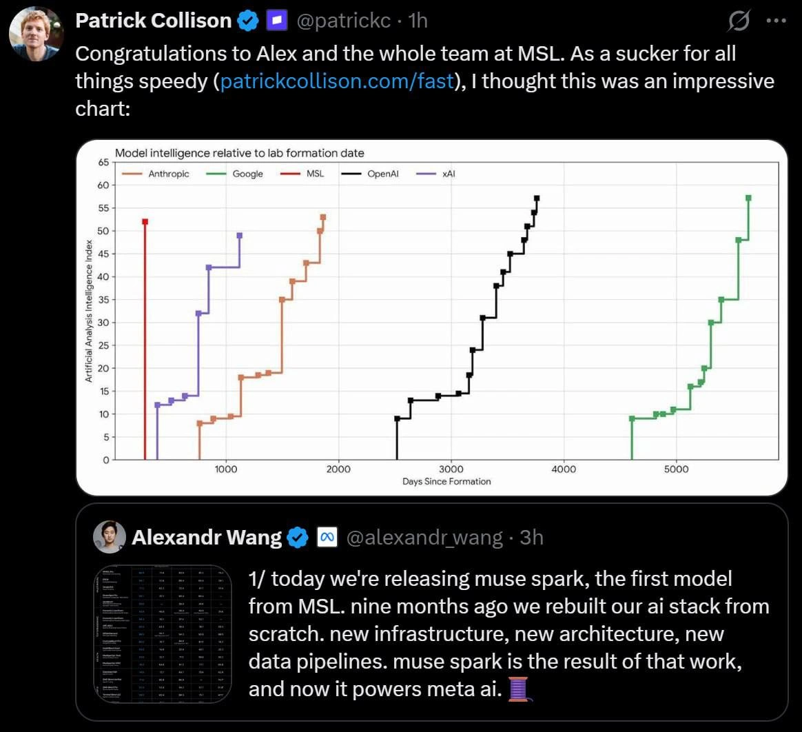
The artifact here is a masterclass in benchmark chartsmanship, lovingly preserved with its hype apparatus intact. Alexandr Wang announces "today we're releasing muse spark, the first model from MSL" — Meta Superintelligence Labs — noting that "nine months ago we rebuilt our ai stack from scratch. new infrastructure, new architecture, new data pipelines... and now it powers meta ai." Patrick Collison quote-tweets with "As a sucker for all things speedy... I thought this was an impressive chart," and the chart in question plots the Artificial Analysis Intelligence Index against "Days Since Formation" — producing a near-vertical red MSL line hitting ~52 within a few hundred days, while OpenAI's black staircase grinds 2500–3800 days to reach ~57 and Google's green one stretches past 5000.

The channel caption — "Back to the topic of cursed charts" — is the correct peer review. The x-axis is the trick. Anchoring on lab formation date resets every lab's clock to zero while silently importing everything that doesn't reset: published transformer research, scaling-law papers, open benchmark suites, distillation from existing frontier models' outputs floating around the web, a mature GPU supply chain, and — in MSL's specific case — being a reorganized division of a company that had already trained multiple Llama generations. OpenAI's 2500-day crawl to an Index of 13 happened when "LLM" wasn't a word; MSL's day-zero starts with the answer key on the table. It's survivorship-adjusted speedrunning: of course the newest runner posts the fastest split — they started at the checkpoint everyone else built. Engineers recognize the shape instantly because it's the greenfield rewrite fallacy in chart form: the team that rebuilds "from scratch" in nine months demos faster than the decade-old monolith, mostly because the monolith's decade answered all the questions the rewrite gets to skip.

The supporting cast makes it richer. The y-axis is a single composite index — the kind of scalar that compresses "intelligence" into one number precisely because one number fits in a tweet. The step-line format implies inevitable upward marches, with no failed runs, deprecated models, or retracted claims plotted. And the social layer is the real distribution mechanism: a beloved tech founder amplifying a lab's launch chart with "impressive" does more benchmark work than the benchmark. Nobody in the chain is lying, exactly — the chart is presumably accurate point by point. It's just that axis selection is the editorial, and "intelligence relative to formation date" is the metric you choose when "intelligence" alone wouldn't put your line on top.

Description

A dark-mode X (Twitter) post by verified Patrick Collison (@patrickc, 1h) reading: 'Congratulations to Alex and the whole team at MSL. As a sucker for all things speedy (patrickcollison.com/fast), I thought this was an impressive chart:'. The embedded chart is titled 'Model intelligence relative to lab formation date', plotting Artificial Analysis Intelligence Index (y-axis, 0-65) against Days Since Formation (x-axis, 0-5000+) as step lines for five labs: Anthropic (orange), Google (green), MSL (red), OpenAI (black), and xAI (purple). MSL's red line is a near-vertical spike reaching ~52 within a few hundred days of formation, while OpenAI and Google take 3000-5000+ days to reach similar scores; xAI and Anthropic sit in between. Below is a quoted post from Alexandr Wang (@alexandr_wang, 3h) with a benchmark table thumbnail: '1/ today we're releasing muse spark, the first model from MSL. nine months ago we rebuilt our ai stack from scratch. new infrastructure, new architecture, new data pipelines. muse spark is the result of that work, and now it powers meta ai.' followed by a thread emoji. The chart implicitly flatters Meta Superintelligence Labs by anchoring on lab formation date rather than absolute capability or the field's accumulated prior art

Comments

7
Anonymous ★ Top Pick Measuring intelligence per days-since-formation is the lab equivalent of a greenfield rewrite demoing faster than the legacy monolith - easy when someone else spent a decade building the roadmap you're stepping on
  1. Anonymous ★ Top Pick

    Measuring intelligence per days-since-formation is the lab equivalent of a greenfield rewrite demoing faster than the legacy monolith - easy when someone else spent a decade building the roadmap you're stepping on

  2. @Sun_Serega 3mo

    > this message replies to huh?

  3. @Sun_Serega 3mo

    I don't think channel post can reply to anything, and in the backing channel chat (getting to which is a bit of black magic), where this post is just a message - also doesn't show it being a reply

    1. @sylfn 3mo

      it can, and it is a long-time feature the reply post in question is https://t.me/dev_meme/7012

    2. @b7sum 3mo

      just because of how comments under posts work you can't view them in the chat

  4. @Sun_Serega 3mo

    (ok, nvm, I was looking in comments view, but it does actually show old post if I go back to channel)

  5. @azizhakberdiev 3mo

    charts used to make data more comprehensible, not the other way

Use J and K for navigation