Code Confidence: Monday Morning vs. Friday Afternoon
Why is this Production meme funny?
Level 1: Big Talk for a Small Win
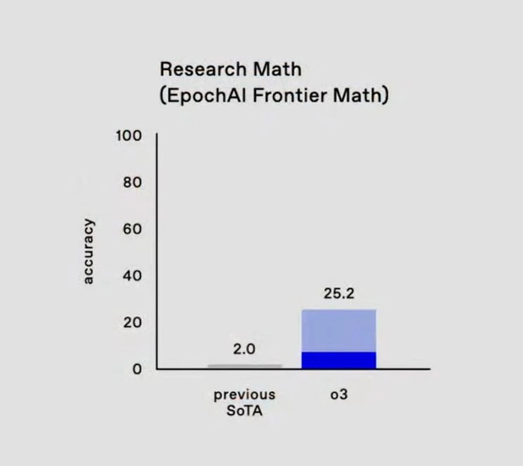
Imagine you took a really hard test and last time you only got 2 questions right out of 100. This time, you worked hard and got 25 questions right out of 100. That’s a lot better than before – you improved a bunch! 🎉 But… you still failed 75 out of 100 questions. You’re far from an A+ score. Now picture you start telling everyone this is a huge breakthrough and call it a “frontier achievement.” It would sound pretty silly, right? You’re basically throwing a victory party for still mostly getting things wrong. That’s what this meme is joking about. It’s showing a bar graph where the new blue bar (25 out of 100) is way taller than the tiny grey bar (2 out of 100). The joke is that even though the blue bar is much bigger than the grey one, it’s still nowhere near the top of the chart. Bragging about 25% success as if it’s a world-changing milestone is like celebrating that you ran a bit farther in a race even though you’re still nowhere near the finish line. It’s funny because the people making the chart are using fancy words and big graphics to make a small win look like a big deal.
Level 2: From SoTA to Spin
Let’s break down what’s going on in simpler terms. In machine learning research, State of the Art (often written SoTA) means the best result achieved so far on a specific problem. Here the “previous SoTA” accuracy was only 2.0 (think of that as 2.0%, if the scale is 0 to 100%). That’s extremely low – basically the old best model could only get about 2 out of 100 questions right. Now along comes a new model, nicknamed “o3”, and it scores 25.2 (about 25%). On the surface, that’s a huge leap in performance: from practically getting nothing correct to getting around one-quarter of them correct. No wonder the chart’s second bar is so much taller! They even colored it with a dark-blue base and a light-blue top, a stacked bar style that makes the new result pop visually. Data visualization tricks like this help catch your eye, emphasizing the gap between the tiny grey bar (old result) and the big blue bar (new result). Now, why is this funny or eye-roll inducing? Because accuracy is the proportion of correct answers – and 25% accuracy is still very poor for most tasks. Imagine a medical AI that correctly diagnoses only 1 in 4 patients, or a self-driving car that only handles 25% of road situations properly. You wouldn’t call those milestones, you’d call them not ready. But the title says “EpochAI Frontier Math” and calls it a “frontier AI” milestone. The meme is poking fun at the hype in the AI industry: sometimes companies or research labs spin modest achievements as big breakthroughs. By using a fancy term like “frontier AI” (implying cutting-edge, next-level stuff) for a result that’s still largely failing, it’s turning marketing spin up to 11. The humor is that engineers and data scientists have seen this pattern in real life. A press release or conference talk might boast “1200% improvement!” – which sounds incredible until you realize it went from virtually 0 to something still very low. It’s like improving from a D- grade to a D+ and throwing a party. We also have tags like AIHumor and AIHypeVsReality, which signal that this is a joke about the difference between how AI results are presented vs. how they actually are. If you’re newer to these concepts: know that MachineLearning models are often evaluated on benchmark tests (like specialized math problems here). Getting 25% of them right might indeed be progress if before almost no AI could solve any. But calling it a “milestone” is tongue-in-cheek exaggeration. It hints that someone is trying to make the result sound cooler than it is – perhaps to secure funding or media attention. Overfitting is also worth mentioning: that’s when a model memorizes the test answers rather than truly learning the skill, which can produce a jump in test accuracy without real understanding. Seasoned folks have a healthy skepticism: they’ll ask “Did the model genuinely improve, or did it just get good at this specific test?” The meme channels that skepticism. In short, this image shows a bar chart joke about an AI result – 2% to 25% – highlighting how easy it is to celebrate a relative improvement while glossing over the fact that 25% accuracy is still pretty bad in absolute terms. It’s a lighthearted reminder to always check what those impressive-seeming numbers actually mean.
Level 3: Relative Gains, Absolute Pains
In the AI/ML world, nothing raises an eyebrow among seasoned engineers faster than a flashy bar chart touting a “frontier AI breakthrough” that still flunks basic benchmarks. Here we have an alleged research milestone by “EpochAI Frontier Math,” where the previous SoTA (State-of-the-Art) accuracy was a measly 2.0 – effectively near-zero success. The new model, coyly labeled “o3”, boasts 25.2 accuracy, shooting up over 12x the last result. On paper it’s a jaw-dropping 1,160% improvement (marketing loves that giant percent jump), but on an absolute scale it means the model still gets almost 75% of answers wrong. Senior devs have seen this movie before: a team snags a tiny victory on an esoteric benchmark and the press release spins it as if Skynet has arrived. IndustryTrends_Hype in AI often involves cherry-picked metrics like this – you highlight a relative gain while quietly hoping nobody asks, “Hey, isn’t 25% accuracy still terrible?” The DataVisualization itself plays a supporting role: a stacked bar chart with a dramatic dark-blue + light-blue column for “o3” towering over a sad grey sliver for previous SoTA. It visually screams “breakthrough!”, even as the y-axis (properly labeled 0–100 accuracy) whispers the truth that we’re only one-quarter up the scale. This contrast is the core of the humor. Seasoned engineers recall countless slide decks where AIHumor meets reality – the gulf between PowerPoint performance and production-ready results. We know that a groundbreaking model with 25% accuracy is about as useful as a self-driving car that only stays on the road one out of four trips. The meme brilliantly satirizes how AIIndustryTrends often rebrand mediocre progress as “frontier” science. It’s a nod to every over-eager research lab and startup that’s ever declared victory after moving the needle from practically nothing to slightly above nothing. The dark humor here? We’ve all been in that meeting where a VP, dazzled by a chart like this, asks why the MachineLearning model isn’t in production yet – forcing engineers to explain that AIHypeVsReality gap without wiping that smug 25.2% off the graph. In essence, the meme’s stacked blue bar is a monument to marketing math: technically true improvements that still leave you miles from the finish line. Senior folks chuckle (or groan) because they’ve survived the fallout of such over-sold “milestones” – they know that ModelEvaluation means looking past the pretty picture to the brutal facts beneath. OverfittingModels might even lurk here: it wouldn’t be the first time a model over-optimized for a benchmark to jump from 2% to 25%, only to face-plant on real-world data. Bottom line: claiming frontier AI status for a quarter-baked result is a classic hype maneuver, and this meme calls it out with that stark 2.0 vs 25.2 visual – a reminder that AIHypeVsReality is often a bar chart with a very inconvenient y-axis.
Description
A two-panel meme using the 'Buff Doge vs. Cheems' (or 'Swole Doge vs. Cheems') format, which contrasts strength with weakness. On the left, a powerful, muscular, and confident Shiba Inu, known as Buff Doge, is depicted with the label 'My code'. This represents the developer's code as robust, well-designed, and resilient. On the right, a small, sad, and anxious Shiba Inu, known as Cheems, is shown with the label 'My code on Friday'. This humorously portrays the exact same code as suddenly seeming fragile, weak, and prone to failure as the weekend approaches. The meme perfectly captures the psychological phenomenon among developers known as 'Friday deployment fear.' It’s not that the code has actually changed, but the perceived risk of pushing an update and causing a production issue right before the weekend dramatically lowers a developer's confidence. It's a commentary on risk aversion and the desire to protect personal time from on-call emergencies
Comments
7Comment deleted
On Monday, my code has 99.999% uptime. On Friday, it looks like it's held together by a race condition and a prayer
Sure, it’s a 12× improvement - just don’t zoom out far enough to notice it’s still failing three out of four test cases, aka ‘shipping in Q4’ in Gartner-speak
Going from 2% to 25% accuracy on frontier math is impressive until you realize it's the same improvement trajectory as our sprint velocity estimates after switching from waterfall to agile - technically better, still fundamentally wrong most of the time
When your 'breakthrough' AI model achieves 25% on the math benchmark and marketing calls it revolutionary progress - technically true since 12x improvement sounds better than 'still fails 3 out of 4 problems.' At this rate of exponential growth, we'll hit 100% accuracy by... *checks calculator* ...never, because that's not how asymptotic curves work. But hey, at least o3 can now confidently get the wrong answer to research-level math problems 75% of the time instead of 98%
Only in AI can 25.2% accuracy earn a victory slide - try telling your SREs the service returns the right answer one out of four times and call it ‘frontier math’
“12× improvement” sounds great until your error budget says “still wrong 75% of the time” - we’ll put it behind a circuit breaker and call it a math‑ish microservice
Previous SOTA teams built numerical libraries for decades; o3 just scales parameters and laps them