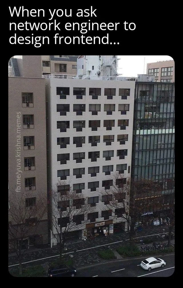
When a network engineer applies subnet logic to frontend window layout
Why is this Frontend meme funny?
Level 1: Wrong Person for the Job
Imagine you asked a traffic engineer (someone who designs highways and roads) to design a children’s playground. Instead of swings and slides, they might create a miniature grid of roads with perfectly spaced lanes and traffic lights. Every inch of the ground would be neatly divided into squares of pavement because that’s what they know how to do. Children showing up to that playground would find it super organized but not much fun at all — there’d be no colorful jungle gym, just a lot of evenly spaced little roads! This scenario would seem pretty silly, right? That’s exactly what’s going on in the meme. A company needed a nice looking front-end (think of it like designing a fun playground for users of a website), but they asked a network engineer to do it. A network engineer is like the traffic engineer of the computer world: they usually design the “roads and highways” that data travels on. So, when tasked with making something look nice, the network engineer did what they’re good at — they made it super organized. The building in the picture is used as a funny example: it has windows arranged in a perfect grid, every window the same size and shape, like a huge checkerboard on the side of the building. It’s very tidy, but it looks odd for a building (just like the road-grid playground would be odd for kids). We laugh at the picture because it clearly looks like it was designed by the wrong person for the job. The network engineer treated the building design (or by analogy, a webpage’s design) like one of their network projects, and the result, while orderly, is kind of dull and absurd. In simple terms: they made everything the same when it shouldn’t be, and that mix-up is what makes the joke funny and easy for anyone to get — you weren’t supposed to ask the “road guy” to decorate the playground!
Level 2: Packets vs Pixels
Let’s break down the joke in simpler terms. We have two worlds colliding here: network engineering and frontend UI design. A network engineer is someone who designs and manages computer networks – think about the people who set up your routers, handle IP addresses, and make sure data travels smoothly between computers. They deal with things like IP addresses, subnets, and routing. One of their tools is something called a subnet. A subnet is like a chunk of addresses on the network that’s been cleanly cut out from a bigger pool. Imagine numbering houses on a street where only certain ranges are allowed – a subnet might be, say, all addresses from 1 to 100 on a street, and then the next subnet is 101 to 200, and so on, with no overlap. In technical terms, subnets are defined by masks (like subnet masks or CIDR notations) that ensure each subnet has an equal number of addresses, often a power of two (8, 16, 32, 64, 128, etc.). This makes the network engineer’s world very structured and uniform by necessity. They often visualize networks as grids or tables of addresses, where everything lines up neatly. For example, a common subnet mask 255.255.255.0 (pronounced “two-five-five dot two-five-five dot two-five-five dot zero”) corresponds to 256 IP addresses neatly grouped – no more, no less. It’s all very precise.
On the other side, we have a frontend (front-end) developer/designer, who is responsible for how a website or application looks and feels to the user. They work on layouts, buttons, text, images – basically the entire user interface (UI) and user experience (UX). Their world is about visuals, aesthetics, and usability. Frontend folks use concepts like layouts and grids too, but in a more flexible way. For instance, a web page might use a grid system to ensure things align, but not every “cell” in that grid has to be the same. Some might be bigger, some smaller, some merged together – it depends on what content or emphasis is needed. The key is that front-end design is user-centric: it’s about making things clear, easy to use, and visually appealing for people.
Now, the meme caption says: “When you ask a network engineer to design frontend…” and then shows a building facade with an almost absurd level of symmetry: a perfect grid of square windows, all identical in size and spaced evenly. The building looks a bit like a giant checkerboard of windows, almost like pixel art or a low-resolution pixel grid. Why is that funny? Because it’s exactly what you might get if someone with a network engineering mindset designed a visual layout. The network engineer might think, “Okay, let’s make sure the windows (or on a website it would be content boxes) are all evenly spaced and identical, because that’s nice and organized – just like how I allocate IP addresses in even blocks.” They’ve basically applied “subnet logic” to a window layout. Subnet logic would say, for example, “We need X number of windows, let’s arrange them in a neat matrix with no irregular gaps, maybe in powers of two for good measure.” The outcome is super tidy… and that’s the problem! It’s too tidy and uniform to make sense in a normal front-end design context.
Think of it this way: a typical website or app interface isn’t just a uniform grid of identical elements. Instead, it might have a banner across the top, a sidebar, different sections for content – variety that helps a user navigate and highlights what’s important. A building’s design (or a user interface) usually has some variation too – maybe a larger window here for a lobby, or balconies, or something to break the monotony. But here, every window is the same, giving no indication of where the entrance is or which rooms might be important or different. It’s as if the network engineer said, “Who needs a special front door or lobby? I’ve given you 256 windows all equally spaced – that’s efficient and meets the requirements!” It fulfills a logical brief (“design the layout with windows”), but completely misses the human aspect (“make it look good and make sense to people”).
This meme falls under both NetworkHumor and FrontendHumor. People who work in networks find it funny because it exaggerates their love of structure in a context where it doesn’t belong. People in front-end find it funny (and maybe a little horrifying!) because it’s the opposite of good UI design. It’s a classic developer humor scenario where one kind of engineer is doing the job of another kind and applying their own rules blindly. It’s also tagged as a cross_discipline_meme and wrong_role_assignment, meaning it jokes about what happens when someone from one specialization is thrown into another. In tech, we sometimes encounter this when, say, a database administrator is asked to tweak a website’s look (“just change the HTML/CSS, how hard can it be?”) or a front-end designer is asked to configure a server. The results can be… well, let’s say unexpected. This building with its symmetric window layout is the “unexpected result” of a network engineer tackling front-end design.
The image description even notes the facade has a “subnet mask vibe.” A subnet mask in binary form is a series of 1s and 0s that is usually contiguous (like 11111111.11111111.11111111.00000000 for the example /24 mask). That pattern of a bunch of 1s (ones) and then 0s (zeros) creates a kind of blocky binary art. The building’s windows are so uniformly placed that it indeed gives off a vibe of a binary pattern or some kind of grid addressing scheme. It’s as if the building’s front is a big grid of bits, or perhaps an old-school video game graphic where each window could be a pixel that’s either “on” or “off.” The network engineer essentially treated the building like a giant circuit board or a data diagram, with each window as an identical unit in the system.
Let’s clarify a few terms mentioned:
- Network Engineer: A professional who works on the infrastructure that allows computers to communicate. They set up routers, switches, and networks, defining how data packets travel. Their decisions involve IP addresses, which are numbers assigned to each device, and how to group those addresses into networks and sub-networks (subnets). They rely on mathematical neatness (like powers of two, binary math) because computers communicate in binary and networks operate on those principles.
- Subnet: Short for sub-network, it’s like taking a big network and chopping it into smaller equal pieces. Think of having a big LEGO base, and you draw lines to divide it into smaller rectangles all the same size — those are subnets in an analogy. Each subnet can host a certain number of devices (like the number of LEGO blocks that fit in one rectangle), and the rules say subnets usually come in sizes that are powers of two (because of how binary math works). This is why network folks love numbers like 8, 16, 32, 64… these often correspond to how many IP addresses can be in a given subnet.
- Frontend Design (or Frontend Development): This is the craft of making the part of software that users actually see and interact with. It involves creating layouts with HTML/CSS, making it interactive with JavaScript, and ensuring the design is both functional and aesthetically pleasing. Frontend developers often talk about things like responsive design (making sure the layout works on different screen sizes), UI/UX (user interface & user experience), and accessibility. They may use design patterns or frameworks that include grid layouts, but these grids are tools to create balanced designs, not rigid rules that everything must be identical.
Now, in the context of the meme, the network engineer is treating the front end like a network: every element (window) is the same, lined up in a grid as if each were a node in a network diagram or an entry in a routing table. It’s orderly to the extreme. The caption implies that someone literally asked a network engineer to handle a frontend task — likely as a joke scenario — and this picture is the punchline. Of course, in reality, a professional network engineer wouldn’t be asked to design a building or a website layout (we hope!), but exaggeration is what makes it funny. It highlights a truth in a humorous way: different jobs require different ways of thinking, and using the wrong mindset can lead to absurd outcomes. The network engineer’s obsession with symmetry and uniformity, which is great for network topology, becomes comically out-of-place in the visual design of a building (or website).
Even the watermark on the image (“fb.me/yuvakrishnamemes”) suggests this came from a tech meme page, meaning it’s intended for an audience that finds this mix-up humorous. This isn’t mocking network engineers as people; it’s poking fun at the idea of applying the wrong set of rules. In tech, there are lots of similar jokes, for example: “When a backend developer tries to do CSS” often accompanied by a picture of something misaligned or overly plain; or jokes about a programmer designing UI with default gray buttons everywhere because they don’t prioritize style. Here it’s specifically NetworkEngineering humor meeting FrontendHumor. The building with identical windows is like the physical-world version of a webpage made entirely of identical data tables — super functional-looking and not user-friendly.
To someone new to these concepts, the key takeaway is: this meme is funny because it shows a very organized but very impractical design, caused by someone using the wrong expertise. The network engineer did what they know best (make everything consistent and logically partitioned) in a scenario where you’d normally want creativity and user comfort. It’s a bit like organizing a party by lining up all the chairs in a perfect grid and giving every guest an identical name tag with a number — sure, it’s organized, but it’s not exactly fun or thoughtful! In development terms, the meme reminds us that just because two fields involve computers doesn’t mean the experts are interchangeable. You wouldn’t want a UX designer setting IP ranges any more than you’d want a network guru picking your color scheme. The end product would likely work on a basic level but feel completely wrong to the intended audience, exactly like this window-covered building that is technically “designed” but in a very odd way.
Level 3: Subnet Mask Aesthetics
In this meme mash-up of Frontend vs Networking mindsets, a network engineer has inadvertently treated a user interface like an IP address scheme. The result? A building facade of perfectly identical windows arranged in a rigid grid — as if the poor guy tried to apply a subnet mask to architecture! It’s the ultimate cross-discipline joke: take someone who lives and breathes neat binary subdivisions and ask them to create something meant to be visually engaging. The humor shines through in how network engineering principles clash with frontend development aesthetics.
Network engineers are used to thinking in binary grids and evenly partitioned blocks. In IP networking, “subnet logic” means dividing an address space into equal-sized chunks (often powers of two). Everything is calculated to be uniform and aligned on binary boundaries. For example, a typical subnet like 192.168.0.0/24 gives exactly 256 addresses (from .0 to .255), forming a satisfyingly complete block where every slot is the same size. Visually, if you represented that /24 subnet in a grid of bits, it’d be a solid block of 1’s — a very symmetrical pattern. No surprise that our network engineer’s design sensibilities lean toward uniform spacing and predictable, repeating units. The building’s façade in the image looks like a giant router’s patch panel or an IPv4 spreadsheet: each window is a neatly allocated “address” on the grid, aligned with machine-like precision. It’s as if each window could have its own IP label like 10.0.0.1, 10.0.0.2, ... right down the line! The caption “When you ask network engineer to design frontend…” nails it: the engineer applied routing logic to a realm that expects whimsy and variety, not a rigid CIDR block layout.
From a seasoned developer’s perspective, the joke lands because we’ve all seen what happens when experts step outside their specialty. A Frontend designer would normally use visual hierarchy, variety in component size, and creative layouts to make a user interface intuitive and appealing. In contrast, a network specialist cares about consistency, efficiency, and structure above all. This building with its repetitive windows is a perfect metaphor: it has the pixel-perfect precision a network engineer might obsess over (every window exactly like the next, spaced like evenly addressed packets), but absolutely none of the flair or user-centric thought a front-end designer would add (no focal point, no differentiating features — just a flat grid). It’s form follows function to an absurd degree, like a webpage made entirely of identical text boxes because “hey, that covers all the addresses, job done!” The rigidity screams “designed by someone who indexes things for a living,” akin to a subnet where each host IP must fit in its preassigned slot. This is classic TechHumor on the theme of wrong role assignment: the network engineer delivered a UI that’s logically organized yet comically lacking in typical UI/UX sensibilities.
To seasoned devs, there’s an extra layer of chuckling here. We know that modern frontends do use grid systems (think CSS Grid or frameworks like Bootstrap) to organize content — but those grids are a means to an end, not the end itself. A front-end developer might start with a 12-column layout for structure, then intentionally break symmetry to highlight important elements (a hero banner spanning multiple columns, an off-center call-to-action, etc.). However, a network engineer approaching that might say, “Why 12 columns? Let’s do 16 or 32, that’s nice and power-of-two!” 😄 They might treat the UI grid like an IP allocation chart, ensuring every pixel “belongs” to a perfect slot. The meme’s building looks like it could be a /28 subnet with every window as an addressable unit! It’s so satisfyingly organized that it becomes absurd in a visual medium where some asymmetry is actually desirable.
Let’s compare how a networking pro’s instincts differ from a front-end designer’s approach in practice:
| Networking Approach 🛰️ | Frontend Design Approach 🎨 |
|---|---|
| Divides space into equal subnets (e.g. every segment must be the same size, often a power-of-two count). | Uses grid layouts flexibly – some sections might span multiple columns or rows for emphasis (not every box is identical). |
| Values strict uniformity for predictability and order. (All IP addresses in a subnet follow a sequential, evenly spaced pattern.) | Values visual hierarchy – variation in size and placement guides the user’s attention (some elements should stand out). |
| Physical hardware and network diagrams are symmetric and repeating (think of a switch with 24 identical ports in a row). | Web UIs often have intentional asymmetry (a big banner here, a sidebar there) to create a pleasing and intuitive layout. |
| Primary concern: structure and efficiency – data flows through well-defined lanes. Appearance doesn’t matter to the data packets. | Primary concern: user experience – design should be friendly and engaging. Aesthetic appeal and clarity matter a lot to people. |
| Uses binary logic: on/off, 1/0 decisions (like windows either present or absent in a perfect pattern, reminiscent of a binary mask). | Uses creative logic: considers color, typography, whitespace – things that can’t be captured in a simple binary scheme. |
In short, the network engineer’s brain is wired for order and protocol, whereas front-end design thrives on creativity and usability. The meme humorously exaggerates this by showing an extremely symmetric window layout (the building’s façade) that feels more like a sterile spreadsheet or an IP allocation table than a welcoming interface. Those of us in development immediately recognize the satire: it’s poking fun at what happens when you put the wrong specialist in a role – you get something that technically “works” (every window is aligned, nothing is out of place – it’s logically consistent) but misses the point of the task (a front-end/UI is supposed to be visually communicative, not just symmetrical for symmetry’s sake).
The phrase “applies subnet logic to frontend window layout” in the title perfectly captures this incongruity. A subnet in networking is all about carving up networks into tidy, non-overlapping ranges. Applying that to a window layout, the engineer basically carved the building’s front into a tidy grid of non-overlapping identical windows. It’s the same mentality of a routing table applied to UI design. For network folks, evenly distributed windows might feel comforting (no misalignment! no half-open intervals! 😅). For UI folks, it’s a nightmare – there’s no focal point, no responsive design, and it probably looks like some early 1980s video game graphic. The building almost has a pixel-art vibe, as the description notes, because everything is so uniformly chunked that it resembles a low-res pixel grid. Ironically, that pixel-art style is literally the result of treating each “pixel” (window) with equal weight, akin to how each IP in a subnet is just a number in sequence.
At an industry level, this meme resonates because it underscores the importance of specialization. Frontend developers and network engineers each have deep knowledge, but in very different areas. A network engineer’s attempt at UI can come out looking hilariously off-target — and vice versa, imagine a UI designer trying to subnet a network, perhaps they’d make a beautiful but totally dysfunctional network topology diagram. It’s a playful reminder that software/hardware engineering isn’t one blob of general knowledge; there are distinct domains with their own best practices. The developer humor here comes from recognizing just how wrong things can go when those domains get mixed up. We laugh because we’ve seen hints of this in real life: maybe a backend developer was tasked with making a page pretty and ended up choosing awful neon colors and Times New Roman font everywhere, or a network admin once made an intranet site that was literally just a list of links in plain HTML (functional, but ugly!). This meme scales that joke up with a visual gag — a building so monotonously arranged that it screams “engineered, not designed.”
And yet, part of us also admires the bizarre result. The router-port symmetry of that building is oddly satisfying if you’re the kind of person who likes things in neat rows and columns. 😅 It’s humor born from contrast: the FrontendDevelopment world expects creativity, while the NetworkEngineering world expects structure, and when you swap those expectations you get this pixelated-looking apartment block. It’s the tech equivalent of mixing up roles: like having an accountant decorate a kids’ birthday party with spreadsheet tables as art. The outcome is both impressively orderly and comically inappropriate. This dichotomy is why the meme strikes a chord among engineers — we love our order and logic, but we also know when those go too far at the expense of common sense. In summary, the meme uses a concrete image (the building of identical windows) to lampoon a common tech scenario: a talented person in one field producing a laughably misaligned result in another field, all due to applying the wrong set of rules. It’s a lighthearted poke at our own narrow mindsets and a celebration of why diverse expertise exists in technology. After all, you wouldn’t want your UX designer configuring your BGP routes either! 😉
Description
The meme is framed in black with white sans-serif text at the top reading, "When you ask network engineer to design frontend...". Below the caption is a photograph of a mid-rise building whose façade is a perfectly uniform grid of square windows; every window is spaced like evenly addressed packets, giving the front an almost pixel-art or subnet mask vibe. The rigid, router-port symmetry humorously contrasts with typical UI/UX expectations, implying that a specialist in IP routing might render a web page as nothing but identically sized boxes. A faint watermark on the left edge reads "fb.me/yuvakrishnamemes". The joke plays on cross-disciplinary misunderstanding between networking (routing tables, CIDR blocks) and frontend design (layouts, responsiveness)
Comments
11Comment deleted
Asked our CCIE to build the dashboard - came back as a CSS grid of /28-sized divs, perfectly routable but users can’t find the login without running traceroute
At least the building has perfect cross-ventilation and zero packet loss, though residents complain about the lack of hot-swappable windows and no support for Power over Ethernet in the bathrooms
This is what happens when you optimize for O(1) lookup time on your CSS selectors but forget that humans also need to parse the interface. The network engineer clearly applied their 'every port configured identically' philosophy to window placement - perfect for automated deployment scripts, terrible for anyone who has to actually look at it. At least the building probably has excellent uptime and redundancy, even if the user experience is about as engaging as reading RFC documentation
Asked for Flexbox; he delivered Spanning Tree - a /24 façade where whitespace is blocked by ACL
Network engineer’s frontend: default‑deny ACL on every window, only ports 80/443 exposed, and a CIDR‑aligned grid he swears is “responsive.”
Firewall rule denying all aesthetic packets: accept only perfect grid topology, drop flair on sight
Typical USSR architecture Comment deleted
lol I just googled "ussr architecture" and misread the first result as "the unbearable gayness of buildings" Comment deleted
https://osnovypublishing.com/en/soviet-brutalist-heritage/ Comment deleted
Looks nice enough Comment deleted
It looks cool 45port Comment deleted