Skip to content
DevMeme
5938 of 7435
Microsoft Teams vs. Microsoft Teams: The Illusion of Choice
Microsoft Post #6502, on Jan 10, 2025 in TG

Microsoft Teams vs. Microsoft Teams: The Illusion of Choice

Why is this Microsoft meme funny?

Level 1: Two Identical Doors

Imagine you’re standing in front of two doors that both lead to the same room. The doors look exactly alike, and behind either door is your classroom where your friends are waiting. Now picture someone stopping you and asking, “Which door do you want to use to go in?” It’s a pretty silly question, right? If the doors are the same and go to the same place, it shouldn’t matter – you just want to get inside! You’d probably shrug and say, “Uh, either one… they’re literally the same.”

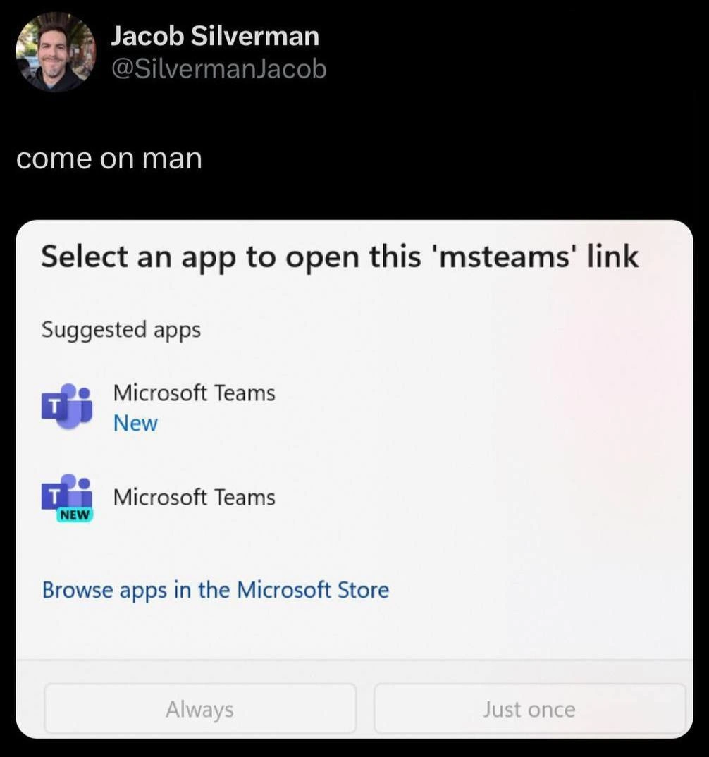
In this meme, the computer is basically doing that to a person. The person just clicked a link to join an online meeting on Microsoft Teams (which is like a virtual classroom or meeting room). Normally, you’d expect the meeting to just open up. But instead, the computer pops up a box that’s like those two identical doors. It’s asking, “Hey, do you want to use Teams or… Teams to open this?” The two choices it gives are both called “Microsoft Teams” and even have the same little picture. It’s as if your device is confused and is making you choose between twins with the same name.

The reason this is funny is because it’s so obviously unnecessary. The person in the screenshot wrote “come on man,” which is exactly what you’d say if someone asked you a question that makes no sense. It’s a friendly way of saying, “Seriously? Why are you even asking me this!” Everyone can relate to that feeling. Maybe you’ve had a time when an adult asked you a very obvious question and you just gave them a puzzled look. That’s what’s happening here. The poor user just wants to join their meeting, and their computer is asking a goofy question that feels like a small prank.

So, the humor is in the absurdity: the computer should know it’s the same thing, but it’s acting like there’s a big decision to be made. It’s like if you were holding one cookie in your left hand and the same kind of cookie in your right hand, and then someone asked, “Which cookie would you like to eat?” You’d probably laugh because it doesn’t matter – a cookie is a cookie! In the same way, the person who made the meme is laughing (and facepalming a little) at how technology can sometimes over-complicate something very simple. It’s a gentle reminder that even our smart computers can do dumb things, and all we can say is “Oh, come on!” while we grin.

Level 2: Double Teams Trouble

Microsoft Teams is a popular workplace chat and video meeting application (think of it like Microsoft’s version of Slack or Zoom). In recent times, Microsoft decided to build a new, improved version of Teams to address some performance issues. They released this “New Teams” alongside the old Teams app. That means some people (especially those in large companies or who opted into the preview) ended up with two versions of the Teams desktop app installed on Windows: the classic one and the shiny new one.

Now, Windows has a feature where if you click a special kind of link – in this case, a Teams meeting link that starts with msteams:// – it will try to open the appropriate app. This is handled by something called a protocol handler (basically, a rule that says “for links of this type, use this app”). If more than one app can handle that link, Windows isn’t sure which to use, so it asks the user to choose. That’s what’s happening in the meme image: a Windows dialog box pops up saying “Select an app to open this 'msteams' link.” This is the OS asking, “Which program should I use to open this Teams meeting link?”

Under “Suggested apps”, we see two entries, both named Microsoft Teams. They even have the same purple Teams logo. One of them has the word “New” written just below its name, and the other has a tiny teal banner that says “NEW” on its icon. Essentially, the computer is offering you what looks like the same choice twice. It’s as if you opened a menu and the menu had: “Microsoft Teams (New)” and “Microsoft Teams (also New?)”. For a user, especially a busy developer rushing to join a meeting, this is pretty confusing! You’re thinking, “Huh? Aren’t they the same thing? Which one am I supposed to pick?” This dialog is a UX/UI misstep because it fails to clearly distinguish between the two options. It turned a simple action (join the call) into an unnecessary question.

The reason this is funny to developers is that it highlights a kind of silly UX failure that we encounter all the time. It’s an example of inconsistent UI design: the system is making us choose between options that weren’t labeled in a helpful way. Ideally, if two versions of an app are installed, each should have a distinct name or icon. For example, it could say “Microsoft Teams (Old)” and “Microsoft Teams (New Preview)” or something along those lines. But here, both options basically say “Microsoft Teams” with a subtle hint of “new” that doesn’t really explain anything. It’s a small design oversight, but it creates real confusion. This confusion is exactly what the meme is poking fun at.

For newer developers or end-users, it’s worth understanding the context: duplicate app versions can occur during software transitions. Microsoft didn’t want to completely replace the old Teams immediately (in case the new one had issues), so for a while both existed together. The unfortunate side effect is exactly what you see – Windows doesn’t know your preference by default, so it asks. This is expected behavior from Windows (it’s actually trying to be safe by not assuming), but the way it’s presented here is awkward. It’s a bit of a developer experience fail because it momentarily interrupts your workflow. Imagine you’re about to join a daily stand-up meeting – you click the invite link expecting to hop in, and suddenly you have to stop and think, “Okay, which Teams app do I click?” It’s not a huge delay, but it’s an annoyance.

This also touches on the idea of tooling overload. Developers already deal with lots of tools and software every day – multiple programming languages, editors, versions of frameworks, you name it. We strive for our environment to be as streamlined as possible so we can focus on coding and problem-solving. When something basic (like joining a meeting) throws a curveball like this, it’s both frustrating and ironically relatable. Many of us have dealt with having multiple versions of things installed (like Python 2 vs Python 3, or two Java SDKs) and the system getting a bit confused because of it. In this case, it’s just visually apparent and kind of ridiculous: two Teams icons staring you in the face.

The tags like MicrosoftProducts, UXFailures, and InconsistentUIs attached to this meme are there because it’s a prime example of a Microsoft product showing a less-than-ideal user experience. The humor here comes from the obvious “Microsoft, why?” sentiment shared by many developers. It’s that feeling of “Even the operating system isn’t sure what to do with this software bloat!” Indeed, it’s a minor case of software entropy — where instead of getting simpler, the software setup temporarily got more complicated.

In summary, for a junior developer seeing this: don’t worry, it’s not that you missed some trick – the situation really is as silly as it looks. Even big, professional software can have odd moments where things aren’t streamlined. The meme is funny because it’s a gentle roast of those moments. It’s basically saying, “Look how goofy this is: two of the same app, and even the computer is confused!” And every dev who’s had their share of quirky computer moments can chuckle in agreement, remembering times when they muttered “come on, man” at their screen for similar reasons.

Level 3: New Teams, Old Problem

For seasoned developers, this meme triggers a knowing groan. Windows is essentially asking, “Hey, which version of Microsoft Teams do you want to use to open this Teams link?” — and the punchline is that both choices look the same. This absurd little dialog is peak UX failure and oh-so-Microsoft. It perfectly satirizes how a big software vendor can roll out a “new and improved” app, yet for a while we end up running duplicate app versions side by side. The humor comes from that immediate déjà vu: we've all seen similar nonsense before.

Think about it: the dialog shows Microsoft Teams twice. The first entry says “Microsoft Teams New” with a purple Teams icon; the second shows the same icon (with a tiny teal “NEW” ribbon) and the text “Microsoft Teams”. They’re nearly indistinguishable. It’s as if someone tried to label the new version, but ended up slapping "New" on both options in different ways. Talk about not helping! This is supposed to be a Select an app prompt, but it feels more like a trick question. The tweet above it saying “come on man” captures that exasperation. As developers (and users), we’re laughing because we’ve been there. This is developer humor born from real developer frustration.

The real-world scenario behind this is easy to imagine. Microsoft releases New Teams – a faster, sleeker rebuild of the Teams app – but doesn’t automatically remove the old Teams. Perhaps you (or your IT department) enabled the preview of the new version. Now your system has two Teams clients installed. You click a meeting invite link (which is a special msteams: URL meant to launch Teams), and Windows isn’t sure which Teams you prefer. So up comes the Windows "choose app" modal: “Select an app to open this ‘msteams’ link.” Under Suggested apps, it lists both versions: basically Teams vs. Teams. This is a prime example of teams desktop app confusion. Instead of seamlessly joining your meeting, you’re stuck playing multiple choice with what looks like the same answer twice.

In the industry, this isn’t an isolated fluke – it’s a pattern. Microsoft in particular has a history of awkward transitions and overlapping products. Remember when there were two Skype apps (Skype and Skype for Business aka Lync)? Or the era of two OneNote applications (the desktop Win32 version and the UWP app) coexisting, confusing users about which one to use? How about Windows 10’s two settings menus (the modern Settings app vs. the old Control Panel)? Each time, users and developers shared a collective facepalm. These are classic UX/UI missteps where old and new collide. The new vs old Teams saga is following the same script: a “modern” version is introduced, but the legacy version sticks around, and the poor user gets caught in the middle.

What makes this especially comical (or painful) for developers is that it violates a basic principle of good user experience: don’t make me think unnecessarily. Opening a link in the correct app should be a no-brainer automation. Instead, here the OS punts the decision back to us in the worst way possible. It’s an inconsistent UI experience — inconsistent with our expectations and with good design. One minute you’re just trying to join a daily stand-up call, and the next minute you’re staring at two MicrosoftProducts icons wondering what the difference is. It’s a tiny example of tooling overload: we already juggle countless tools and contexts, and now even a single tool (Teams) duplicates itself like a glitch in the Matrix. The result is a mix of annoyance and dark comedy.

Why does this happen? Largely because of how software is developed and deployed in big companies. The Teams team likely needed to re-engineer the app (to fix performance issues, reduce memory usage, etc.), but they couldn’t just yank the old one immediately – enterprise customers hate sudden breakages. So for a transition period, duplicate app versions are alive in the wild. The new Teams might even be packaged differently (one from the Microsoft Store, while the old one is a classic installer), so Windows sees them as two separate apps. Without careful coordination, you get situations like both registering for the same protocol handler. The folks at Microsoft probably assumed most users would stick to one or the other, but clearly in cases where both are present, the responsibility to pick falls on the user. It’s an oversight – an amusingly glaring one.

From a DeveloperExperience_DX standpoint, these little friction points add up. It’s not a catastrophic bug – nobody’s database got deleted – but it’s the kind of papercut that makes developers sigh and tweet out their irritation. It disrupts your flow for no good reason. You know it’s a temporary glitch of the transition, but it still feels sloppy. When you have a morning full of stand-ups and meetings, even a few seconds of “Which button do I press?” can make you late or at least cranky. And if you’re the resident “IT guru” on your team, you might even get coworkers pinging you: “Which Teams am I supposed to choose here?” – leading to more collective eye-rolling.

In the end, this meme resonates with devs because it encapsulates a truth: even the biggest tech companies create UX failures that seem absurd in hindsight. It’s a reminder that tech isn’t perfect – far from it. We laugh because it’s better than screaming. The next time you’re stuck in a pointless dialog like this, you can at least take comfort that the entire developer community is laughing and groaning along with you. Software entropy spared no one, not even mighty Microsoft, and we’ve all just gotta navigate through the clutter with a sense of humor intact.

Level 4: The Entropy of Choice

At the deepest level, this scenario exposes a law of software entropy in action: over time, complex systems tend toward a state of clutter and confusion. Here we have Windows presenting two indistinguishable options to open a Teams link – a UX scenario approaching maximum entropy. In information theory terms, both choices have equal probability and zero distinguishing information, yielding high uncertainty for the user. It's essentially a UI overchoice paradox: offering more options actually reduces clarity. Cognitive science has long noted that too many similar choices can paralyze decision-making (the classic paradox of choice), and in this dialog the user is staring at a perfect example – two options that appear identical. A PhD in UX might shake their head at this design, but us battle-scarred devs just roll our eyes and mutter "you gotta be kidding me."

Under the hood, what likely happened is a classic Microsoft quirk of backward compatibility. The new Teams client registered itself as a handler for the msteams protocol without overwriting the old registration. The Windows OS dutifully checks its registry and finds multiple protocol handlers for the msteams:// link. Following its design, it surfaces both in a modal dialog, assuming each entry has a distinct name or icon. But instead, both registered apps are named "Microsoft Teams" and even share the same purple icon. The only hint of difference is the word "New" – ironically slapped onto both entries in some form. From the system's naive perspective, it’s offering a valid choice; from an information perspective, it’s offering 0 bits of useful information.

This is a textbook case of entropy in user experience: the Microsoft Teams ecosystem has split into two parallel states (old vs new) on one machine, and the OS is basically asking the user to collapse the wavefunction. One might playfully call it Schrödinger’s Teams – you won’t know if you’re launching the old Electron-based memory hog or the shiny new optimized client until you click. In a perfectly ordered world, only one Teams would exist and no choice would be needed. But real software systems are messy; new versions often layer on top of old ones, increasing disorder unless carefully managed. Microsoft’s penchant for supporting legacy alongside innovation often results in these little pockets of chaos. In physics, the second law of thermodynamics says entropy never decreases; in tech, we have a parallel: without deliberate cleanup, SoftwareEntropy increases – leading to moments like a silly dialog where the user must untangle duplicated options. It’s both absurd and inevitabile: complexity begets confusion. And as every veteran knows, when complexity hits critical mass in an interface, the user experience can approach heat death – or at least a facepalm.

Description

The image captures a tweet by user Jacob Silverman that simply says 'come on man', expressing exasperation. Below this text is a screenshot of a Windows operating system dialog box. The dialog is titled 'Select an app to open this 'msteams' link'. Under 'Suggested apps', it confusingly presents two visually almost identical options: 'Microsoft Teams' with a blue 'New' text label, and a second 'Microsoft Teams' with a 'NEW' badge overlaid on its icon. This screenshot satirizes a common user experience frustration with Microsoft's software ecosystem, where versioning and updates lead to redundant or confusing choices for the end-user. The humor lies in the absurdity of being asked to choose between two things that are ostensibly the same, highlighting issues of software bloat and poor product lifecycle management in a large enterprise environment
Comments

37
Anonymous ★ Top Pick This isn't a bug, it's a feature. Microsoft is exposing its microservices architecture directly to the user. Choose your endpoint: `teams-v1-deprecated` or `teams-v2-preview`. Both resolve to the same legacy codebase anyway
  1. Anonymous ★ Top Pick

    This isn't a bug, it's a feature. Microsoft is exposing its microservices architecture directly to the user. Choose your endpoint: `teams-v1-deprecated` or `teams-v2-preview`. Both resolve to the same legacy codebase anyway

  2. Anonymous

    Windows asking if I want ‘Microsoft Teams New’ or ‘New Microsoft Teams’ is just the GUI version of Docker offering teams:latest versus teams:latest-latest - either tag spins up the same 600 MB Electron container

  3. Anonymous

    After 20 years in tech, you realize the hardest distributed systems problem isn't consensus or CAP theorem - it's getting Microsoft to agree with itself on which Teams app should open a Teams link

  4. Anonymous

    When your URL protocol handler registration is so robust that it achieves high availability through active-active redundancy. Microsoft Teams implementing the 'two is one, one is none' principle at the OS integration layer - because nothing says enterprise-grade reliability like offering users the Schrödinger's choice of selecting the same application twice. At least they're consistent: if Teams can duplicate itself in your taskbar notifications, why not in the protocol handler registry?

  5. Anonymous

    Classic Teams and New Teams both register the msteams URI, so Windows implements manual leader election: you

  6. Anonymous

    Nothing says “seamless migration” like two msteams:// handlers both called “Teams (New)” - blue/green where the user is the load balancer

  7. Anonymous

    Windows app associations: because one Teams registry entry wasn't polymorphic enough for the enterprise multiverse

  8. @GioMetal 1y

    can we erase this bot from this gentlemen channel? ^

  9. @TheWhiteStripes 1y

    sad

  10. @purplesyringa 1y

    surely my votes will be counted twice 🙂

  11. @RiedleroD 1y

    I'm considering just making the bot delete votekick commands from untrusted users

    1. @RiedleroD 1y

      how fucking difficult is it for people not to click on the blue thing that's obviously some sort of command, hm?

      1. @RiedleroD 1y

        but then again, I still think this is a very obvious design flaw in telegram. they should at the very least have a "are you sure" dialog

        1. @Saeid025 1y

          why tho? it's not discord when sending a @everyone could ping thousands of users... its a simple command... what I would like more is the ability to select what users could use a command, just like setting bot scoop but with addition of forcing the command to only be usable with users that have the command set for them.... this would be neat (telegram won't do it tho, lol...)

      2. @affirvega 1y

        Hahahahaha But actually this is good addition to delete messages

      3. @affirvega 1y

        We're short attention-spanned monkeys

        1. @RiedleroD 1y

          1. people have always had short attention spans, and older people have always been complaining about it 2. I don't think that's anything to do with attention span and more with curiosity, just wanting to see what it does. that's nothing bad in itself, but it is really annoying in this case.

      4. Deleted Account 1y

        You understimate human stupidity

        1. @RiedleroD 1y

          I've been a telegram mod for *looks at watch* uh, 4 years I think? trust me when I say I know exactly how stupid people can be

          1. Deleted Account 1y

            Touche

      5. @ZgGPuo8dZef58K6hxxGVj3Z2 1y

        I dond now whad kind of blue link you are taking about sir.

        1. @echedelle 1y

          I wonder how telegeam and forks are with accessibility

          1. @ZgGPuo8dZef58K6hxxGVj3Z2 1y

            This is iOS with old theme

    2. @azizhakberdiev 1y

      then how would you trust someone who was trying to votekick?

      1. @RiedleroD 1y

        extra condition: only when replying to the channel

        1. @purplesyringa 1y

          oh, that's neat

          1. @purplesyringa 1y

            although maybe just deleting a /votekick in reply to a channel message would work better?

            1. @RiedleroD 1y

              nah, I want people to discover it so I can /trust new people

    3. @Saeid025 1y

      deleting immediately isn't that good instead create a timer which remove both bot response and user command after N seconds

  12. @sylfn 1y

    like this fucking difficult

  13. @serangor 1y

    Sorry I thought it would open profile

    1. @azizhakberdiev 1y

      you have some really dangerous thoughts

  14. 1y

    😂😂😂

  15. @socket_socket 1y

    Are you guys seriously developer?

    1. @RiedleroD 1y

      who?

      1. @socket_socket 1y

        Just a joke for the people who can't help clicking commands

        1. @RiedleroD 1y

          ah

Use J and K for navigation