When the Only Metric is 'Chart Go Up'
Why is this Management PMs meme funny?
Level 1: Chore Chart Confusion
Imagine you have a big pile of chores or homework to do, and you make a little chart to show how many tasks are left each day. On Monday, you have 10 tasks left. By Tuesday, you finish some, and there are 7 left – the line on your chart goes down, which means you’re making progress (yay!). Now let’s say on Wednesday, somehow you end up with 12 tasks left – maybe you discovered extra chores or your teacher gave you more homework – so the line on the chart goes up. That’s actually not good, right? It means you have more work to finish than you did before. Now picture your parent looking at this chart, seeing the line shoot up, and saying, “Wow, great job! The chart went up, you must be doing so well!” 🙃 You’d probably scratch your head and reply, “Um, that line going up means I have more chores left, not less… that’s actually worse.” It’s funny (and a bit silly) because the parent completely misunderstood what the chart was showing. They thought “up means good” without realizing this was a countdown chart. In simple terms, the joke is like someone clapping for you because your to-do list got longer instead of shorter – a mix-up anyone can see is pretty ridiculous once you explain it. That confusion and the polite correction (“Sir, this is a burndown chart”) is exactly why the meme makes us smile.
Level 2: Burndown Breakdown
In simpler terms, this meme spotlights a mix-up in understanding an Agile Scrum report. Let’s break down the basics: Agile is a way of managing projects where teams work in small cycles (often called sprints, usually 1-2 weeks long). In Scrum – which is a popular Agile method – the team plans a set of tasks or user stories to complete in the sprint. They often use a burndown chart to track progress during that sprint. A burndown chart is basically a line graph that shows how much work is left to do each day. The vertical Y-axis might be the number of remaining tasks or story points (a unit developers use to estimate effort), and the horizontal X-axis is time (each day of the sprint). At the start of the sprint, the amount of work is at its highest. As the team finishes tasks, the line should go down toward zero by the sprint’s end. If all goes perfectly, you’d see a nice downward slope – burning down the work. There’s often even a grey “ideal” line as a guide, showing how the burn down should progress if everything goes smoothly.
Now, in the meme’s first panel, the manager sees a red line on this chart going up instead of down. In reality, an upward jump on a burndown means the team has more work remaining than before (maybe new tasks were added mid-sprint or estimates changed). This is usually a bad sign because it indicates the team is moving away from finishing, not closer. But the manager in the comic doesn’t realize this. He just sees a line shooting up and thinks, “Wow, the graph is rising – that must mean the team is super productive!” He’s treating the burndown chart like it’s a sales or profit chart where up is good. It’s a bit like if someone unfamiliar with speedometers thought that a higher needle means the car is in better shape – a total misunderstanding of the dial.
The developer in the second panel, wearing a red fast-food-style uniform, responds with a blank stare and says, “Sir, this is a burndown chart.” This one sentence is a polite correction. He’s essentially explaining, “This chart isn’t meant to go up, sir. It shows remaining work – so going down is what we want.” The phrasing of “Sir, this is…” is a direct nod to the meme world’s “sir, this is a Wendy’s” joke. In those jokes, an employee at (for example) a Wendy’s burger restaurant has to tell a customer who’s acting out of place something like, “Sir, this is a Wendy’s,” implying the customer is treating the place like it’s something it’s not. Here, the developer is saying in meme-speak, “Sir, you’re treating this chart like something it isn’t.”
This highlights a common communication gap between technical teams and management. The team might produce Agile artifacts (like burndown charts or velocity charts) expecting everyone to understand them, but someone without that background might misread the signals. A junior developer or someone new to Scrum might even find this humorous because it’s a mistake one could easily make if Agile charts are unfamiliar. In fact, Agile pain points often include educating stakeholders on what the metrics really mean. Manager expectations can be out of sync if the manager isn’t trained in Agile. They might expect every chart to resemble a classic business KPI where “up = good.” This meme is a lighthearted way of saying, “Nope, not this chart!” It teaches an important point: context matters with metrics. An upward trend is not universally positive – you have to know what’s being measured. And in a Scrum team’s burndown chart, less remaining work (downward line) is the real sign of progress.
In real-world Agile teams, you’d often see this chart during daily stand-up meetings or posted on a project board. If the line was going up or not going down at all, the Scrum Master or developers might raise concern: maybe the team is taking on unexpected extra tasks or underestimating work. A well-informed manager would normally ask, “Why is our remaining work increasing?” rather than cheerleading it. The meme exaggerates the scenario for comedic effect – the manager here is so clueless about Agile metrics that he literally applauds a problem as if it were an achievement! For someone learning about Scrum, the takeaway is: burndown charts = track remaining work (down is good, up is bad). And also, maybe double-check that your boss actually knows which way the chart is supposed to go 😅. It’s definitely a piece of developer humor aimed at those awkward moments when non-technical higher-ups misinterpret the data. This contrast between what the manager sees and what the developer knows is exactly why the meme is funny.
Level 3: Up Means Down
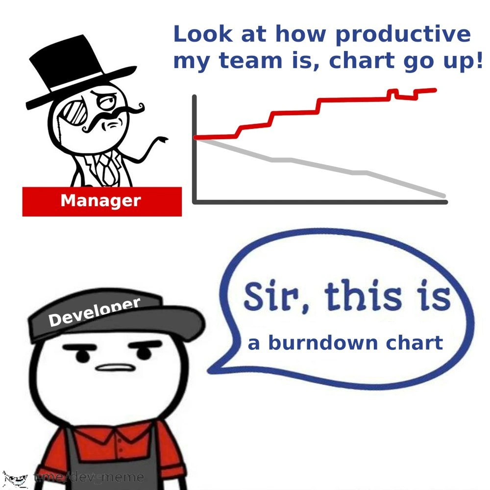
Manager: "Look at how productive my team is, chart go up!"
Developer: "Sir, this is a burndown chart."
In this exchange, the Manager proudly points to a climbing red line on a graph, equating "line go up" with team productivity. This reveals a burndown chart misinterpretation that is painfully familiar in the software world. A burndown chart in Scrum (an Agile framework) is supposed to track the remaining work in a sprint over time – it’s literally meant to burn down to zero by the end. On a typical burndown, the vertical axis is the amount of work left (often measured in story points or hours) and the horizontal axis is time (the sprint duration). The grey line here likely represents the ideal trend (a steady decline of remaining work), while the red line shows the actual remaining work each day.
Now, humorously, the red line in the meme is climbing upward instead of trending down. That means tasks aren’t being completed as planned – perhaps new work was added or the team is falling behind. In Agile terms, an upward burndown line is a warning sign of scope creep or a sprint in trouble. But the monocle-wearing manager (depicted with the classic "Like a Sir" meme face for added satire) is applauding because he sees a graph going up and assumes that’s great news. It’s like watching someone celebrate a temperature chart going up without realizing it means the patient has a worse fever. The manager crows, “chart go up!” in that delightfully ignorant way, focusing on the shape of the graph rather than what it represents. This is the core of the joke: a total agile metrics confusion where the manager treats a burndown chart as if it were a productivity scoreboard. In reality, up on this chart means “more work left undone” (bad), while down means “work is getting completed” (good). The mismatch is a perfect illustration of management vs engineering perspectives and how easily productivity vs progress can be misconstrued.
The developer’s deadpan response, “Sir, this is a burndown chart,” is a direct riff on the internet meme format “sir, this is a Wendy’s.” In those jokes, an employee politely points out that someone’s request or praise is completely out of place (like a customer trying to do something absurd at a Wendy’s restaurant). Here, the developer – drawn wearing a fast-food style uniform and cap labeled "Developer" – plays the role of the bemused employee. He’s essentially saying, “Excuse me, but you’re completely misunderstanding this situation.” The formality of “Sir” underscores the absurdity, as if he’s correcting a customer who wandered into the wrong establishment. This communication gap is real in tech teams: the people building the product and the people managing it might as well be speaking different languages. The meme nails a common Agile pain point: management demands metrics and charts from teams adopting Scrum, but oftentimes stakeholder expectations don’t line up with what those metrics actually mean. A seasoned developer (perhaps a bit cynical after too many status meetings) will smirk at this scenario because it’s too real. They’ve likely sat in a sprint review where an executive, much like our top-hatted manager, claps at the “high numbers” on a chart without realizing he’s cheering for remaining work 😬. It’s a classic case of misguided metrics – celebrating the exact opposite of what you should. In fact, this darkly funny scenario has unfolded enough in real life that it’s practically Scrum humor canon.
Beyond the punchline, there’s an insight about process: Agile tools like burndown charts are meant to foster transparency and quick reaction to problems (like scope getting out of control). But if a higher-up only sees “red line go north” and thinks “team go brrr” (more output), it defeats the purpose. The meme is calling out that superficial understanding. It suggests that some managers might take a two-day Agile certification and emerge knowing how to say “We use Scrum now,” but still assume any chart that isn’t skyrocketing upwards must spell failure. In reality, sometimes the best sprint burndown is a boring downward slope – because that means the team is steadily closing tasks. The humor lands because everyone on the dev team knows what the manager should be looking for, and the manager in the meme clearly doesn’t. It’s an AgileHumor moment that captures the absurdity of misaligned perspectives: the boss gets giddy over a graph going in the wrong direction, and the dev is left doing a polite facepalm and explanation. In short, the meme brilliantly highlights how a lack of understanding in Agile metrics can turn a simple chart into a comedy of errors (or tragedies, if you’re the team under that manager!).
Description
A two-part meme contrasting a clueless manager with a deadpan developer. In the top half, a cartoon figure in a top hat and monocle, labeled 'Manager', gestures proudly towards a line graph. The manager exclaims, 'Look at how productive my team is, chart go up!'. The chart itself displays a grey line trending downwards and a red line trending sharply upwards. In the bottom half, a cartoon developer in a baseball cap and overalls, labeled 'Developer', looks unimpressed and says in a speech bubble, 'Sir, this is a burndown chart'. The humor is rooted in the manager's complete misinterpretation of a fundamental agile metric. A burndown chart tracks remaining work, so an upward-trending line signifies a project in deep trouble, likely due to scope creep or stalled progress. The manager's celebration of this negative trend highlights a common frustration among developers: leadership that is metric-obsessed but data-illiterate
Comments
9Comment deleted
A manager seeing a rising burndown chart and calling it 'productivity' is the corporate equivalent of seeing a memory leak and calling it 'dynamic cache allocation'
Our burndown chart is basically Kafka - append-only, eventually consistent, and management keeps reading it like a success log
After 20 years in tech, you realize the only thing that reliably goes up and to the right is the burndown chart when product keeps adding 'just one more small feature' mid-sprint while the CEO promises investors you're 'ahead of schedule'
When your manager celebrates the burndown chart going up, you know you're not burning down work - you're burning out developers. It's the Agile equivalent of celebrating negative velocity: technically a number on a chart, but definitely not the direction you want your sprint heading. At this rate, the only thing 'going up' is the team's collective blood pressure and the Jira ticket count
Manager rotates burndown 180° and declares infinite velocity - classic enterprise Agile alchemy
Goodhart’s Law in agile: optimize for “chart go up,” and your burndown converts to a burn-up with velocity measured in scope-creep per sprint
Manager cheers the burndown trending up - peak Goodhart: convert scope creep into a KPI and call it velocity
layoffs chart Comment deleted
CHART MUST GO UP! TIS A BURNUP Comment deleted