Make The Logo Even Bigger
Why is this UX UI meme funny?
Level 1: The Giant Name Tag
This is like making a lemonade stand sign where the owner's name is huge, but the words "lemonade, one dollar" are tiny in the corner. The grown-up in the meme keeps asking for the name to be bigger, while the person holding the paper realizes customers still need to know what is being offered. It is funny because someone is trying so hard to be noticed that they make the useful part harder to see.
Level 2: Bigger Is Not Clearer
In web design, a page has a visual hierarchy, which means the most important things should catch the eye first. On this mock website, the important message should probably be the offer: free workout videos for every fitness level. The logo matters, but it should support recognition, not swallow the page.
The meme uses a common client or stakeholder request: "Can you make the logo bigger?" That sounds simple, but it can damage the whole layout. A bigger logo can push text into awkward lines, reduce space for navigation, make the page feel unbalanced, and create extra frontend work for desktop and mobile versions. A designer might ask, Even bigger? Are you sure? because the request is already past the point where it helps users.
For junior developers and designers, this is one of the first lessons of real product work: technically easy changes can be professionally hard. You can increase font-size, width, or transform: scale() in seconds. The difficult part is explaining that the page is not a poster for the logo; it is an interface that people need to understand quickly.
Level 3: Brand Guidelines Ate It
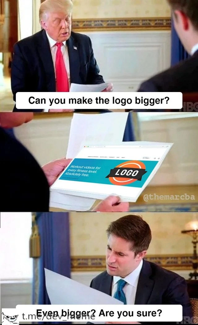
The meme is a painfully accurate snapshot of a design review where visual hierarchy loses to executive gravity. The top caption says:
Can you make the logo bigger?
The mockup already shows the problem: the useful product message, Workout videos for every fitness level. Absolutely free, is squeezed into the left side of the banner while a giant placeholder marked LOGO dominates the right. The lower caption, Even bigger? Are you sure?, is the designer's last diplomatic attempt to preserve the interface before brand anxiety drives the layout into a ditch.
This is funny because "make the logo bigger" is not really about the logo. It is a symptom of stakeholder expectations colliding with UX design. A client sees a page as a brand asset; a designer sees it as a task flow; a frontend developer sees the coming CSS exception that will haunt every breakpoint; users see a website where the thing they came for is now smaller than the sponsor mark. Everyone is looking at the same rectangle and optimizing for different outcomes.
The formal interview setting makes the absurdity sharper. Printed mockups are being reviewed like matters of state, which is exactly how tiny UI decisions can feel inside organizations. A five-minute request becomes a cascade: the hero needs rebalancing, the copy wraps badly on mobile, the navigation loses breathing room, the design system token no longer matches the approved component, and someone eventually asks why conversion dropped. Naturally, the postmortem will mention "user confusion," not "we replaced the value proposition with a billboard."
The hidden industry pattern is that brand visibility is easy to measure emotionally but hard to defend against politically. A stakeholder can point at empty space and say the logo lacks impact. It takes more effort to explain why spacing, contrast, scan order, and copy hierarchy are doing real work. Good interface design often succeeds by being almost invisible. Bad review feedback often succeeds by being very loud.
Description
A two-panel meme from a formal interview scene shows Donald Trump looking at printed material while another suited man reviews a page. The top caption says, "Can you make the logo bigger?" and the lower caption says, "Even bigger? Are you sure?" The printed mockup in the middle contains a website-like banner with the text "Workout videos for every fitness level. Absolutely free" and an oversized placeholder reading "LOGO." The joke targets a familiar UX and web design review failure mode: stakeholders optimizing for brand visibility while the actual product message and layout hierarchy get crushed.
Comments
1Comment deleted
The fastest way to invalidate a design system is still a stakeholder with a PDF printout and a brand guideline from 2009.