Skip to content
DevMeme
6272 of 7435
Smooth bowl vs spiky nightmare: an ego contest of loss landscapes
AI ML Post #6875, on Jun 11, 2025 in TG

Smooth bowl vs spiky nightmare: an ego contest of loss landscapes

Why is this AI ML meme funny?

Level 1: Smooth Ride vs. Bumpy Ride

Imagine you and a friend are each rolling a toy car down a hill to see whose car goes further. Your hill is like a smooth slide – it’s gently sloped and even, so your toy car zooms straight down and reaches the bottom easily. You’re grinning because that was easy and fun! Now, your friend’s hill is completely different – it’s like a rocky road full of bumps, pits, and little hills. When your friend lets go of the toy car, it bumps around, gets stuck in little holes, and maybe doesn’t even make it to the bottom. That’s super frustrating for your friend. You turn to them and say with a smirk, “My hill is so nice and smooth 😉! But your hill is all bumpy and messed up!” This makes both of you laugh, because obviously your friend didn’t want a bumpy hill – it’s just a silly comparison.

In the meme, the smooth red surface is like that perfect slide: easy path to success, so the person with that is happy (no sadness at all). The jagged grey surface is like the rocky hill: a difficult, messy path that makes the person with it upset (very sad because things aren’t working out). It’s funny in the same way as bragging about something silly, like “my toy is better than your toy.” Even a kid can get the emotion: one side is “Yay, everything is going great!” 😊 and the other side is “Oh no, everything is troublesome!” 😣. The joke is basically saying “Wouldn’t it be nice if everything was easy like my side? Too bad your side is hard!” – which is a goofy, teasing thing to say. So, it’s comparing an easy, happy situation to a hard, frustrating one, using two hills (one smooth, one spiky) to show the difference. That contrast makes it silly and humorous, because who wouldn’t prefer the smooth ride, right?

Level 2: Convergence vs. Chaos

Let’s break down the joke in simple technical terms. In machine learning, a loss function (also called a cost function) is basically a measure of error – it tells us “how wrong” the model’s predictions are on given data. The goal in training is to make this loss as low as possible (which means our model is doing a good job). Now imagine a landscape or surface where every point on that surface represents the loss for a particular setting of the model’s parameters (weights). This is what we mean by a loss landscape or loss surface. High peaks on this landscape correspond to high error (the model is doing poorly there), and low valleys correspond to low error (the model is doing well there). When we train a model, we are essentially trying to move through this landscape, going downhill (reducing the loss), to reach the lowest valley – that would be the best possible model (the one with minimum error).

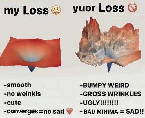
The meme shows two very different loss landscapes side by side. “My Loss” on the left is drawn as a smooth red bowl shape. This is the ideal situation: a nice, simple landscape that curves gently downward towards a single bottom point. In the world of math, this kind of shape is often a convex function – a fancy way of saying it’s shaped like a U or a bowl, with one single lowest point (often called the global minimum). Why do we love that? Because if there’s just one valley, you can’t get lost. Any path you take downhill will eventually lead you to that one bottom point. In practice, we use algorithms like gradient descent to find the bottom of the loss surface. Gradient descent is like feeling the slope of the terrain and stepping downhill in the direction where the loss decreases. On a smooth bowl, this process is straightforward – you keep going down and you’ll reach the center of the bowl, which is the lowest loss. The meme’s left bullet points say “converges = no sad ❤️” which in plain terms means: “my model’s training process actually reached a solution, so I’m happy.” When training converges, it means the model’s loss stopped getting lower and stabilized, indicating it found a minimum (hopefully the global one) and things are working well. The little heart emoji is just exaggerating how pleased one would be. The other bullet points “smooth, no weinkls, cute” are jokingly personifying the loss function – basically saying “aww, look at that nice gentle loss curve, isn’t it lovely?” From a technical standpoint, a smooth loss means there are no abrupt changes or jagged parts in the error surface – everything changes gradually, which is easier for algorithms to handle. No wrinkles implies no weird little bumps or irregularities (imagine a perfectly ironed sheet with no creases). And indeed, if a loss surface has no wrinkles, it likely doesn’t have false minima to trap you. So training on such a surface is almost guaranteed to succeed (making the developer “not sad”).

Now, “your Loss” on the right is the chaotic scenario. The surface drawn is jagged with lots of peaks and valleys, almost like a rugged mountain range or crumpled paper. This represents a non-convex loss landscape – which means, unlike the single nice bowl, here we have many little valleys (many local low points) scattered among high regions. In training terms, that means there could be many possible “solutions” the algorithm might find, and not all of them are good. The bullet points on the right say “BUMPY WEIRD, GROSS WRINKLES” – that’s describing this surface as irregular and messy. Those “wrinkles” are essentially the smaller dips and pits in the loss surface. The worst part about wrinkles is that they can create local minima. A local minimum is a small valley that is lower than its immediate surroundings, but not necessarily the lowest point in the entire landscape. Think of standing in a dip on a mountainside: you’re in a low spot relative to around you, but if you looked across the region, you might see a much deeper valley elsewhere. If our training process (which is like rolling a ball downhill) ends up in a local minimum, it will stop there, thinking “I’m at the bottom,” even though there might be a deeper valley (lower loss) somewhere else. In plain words, the model gets stuck with an okay solution, but not the best one. That’s what the meme calls “BAD MINIMA” – a bad (suboptimal) local minimum – and why it says “= SAD!!”. Because if your model stops at a suboptimal point, you as the developer are going to be disappointed (sad) that it didn’t reach the best performance possible.

To make it clearer, imagine gradient descent working on that right-side landscape. It starts somewhere and follows the steepest downward slope. Given how bumpy things are, pretty soon it might find itself in, say, a little pit. Once in that pit, all directions might seem uphill (just around that small area), so gradient descent thinks, “Okay, I’ve done it, there’s no way down from here.” But unbeknownst to it, maybe a short distance away, there’s a much deeper pit. The algorithm won’t get there because it’s not smart enough to climb out of the current pit and go find a deeper one – it only knows to go downwards, not up-and-over. This is a classic gradient_descent_struggles scenario. The poor algorithm can’t see the whole landscape; it only knows the slope under its feet. So in a rough loss surface full of “gross wrinkles,” it’s very easy to end up in a not-so-great place.

For someone new to these concepts, you can think of it like trying to find the lowest point in a hilly area by walking downhill blindfolded. If the area is just one big smooth valley, no problem – downhill will always eventually lead to the single lowest point. But if it’s a mountainous region with lots of little dips, you might walk into a small ditch and think it’s the lowest point because everything immediately around you is higher, not realizing there’s a deep canyon further away. That is why smooth vs. bumpy matters in optimization: smooth (ideally convex) means easy to find the best solution, bumpy (non-convex) means you might get fooled by a subpar solution.

The meme’s language is exaggerated for comedic effect – using words like ugly and gross to describe a mathematical function’s graph is just silly and fun. Ugly here means “hard to work with” in a sense. When training a deep learning model, an “ugly” loss curve might be one that goes up and down erratically (for example, your loss decreases for a while, then suddenly spikes up, then down again). This could happen with tricky models or if your training setup isn’t ideal (maybe the learning rate is too high, causing the algorithm to jump all over). It’s visually and emotionally jarring – hence people actually do call such training curves ugly or messy. By contrast, a “pretty” loss curve is one that smoothly declines and perhaps gently plateaus when it converges. That’s so satisfying to watch during training – it means things are on track. So when someone jokes that their loss is cute and yours is ugly, they mean their model trained in a very clean, sweet way, while yours was a wild ride.

To put it simply: the left side is an optimization dream scenario, the right side is an optimization nightmare. If you have a smooth single-basin loss surface, you can almost do no wrong – just run gradient descent and you’re golden. But if you have a rugged multi-basin surface, you’re in for a struggle; you might need extra tricks or just luck to get a good result. There’s also a bit of a lesson here: often, simpler models or well-constructed problems yield nicer (smoother) loss landscapes. For example, a plain logistic regression on linearly separable data will have a convex loss (no headaches!). But a deep neural network on a complex task (like recognizing objects in images) naturally has a complicated error surface – it comes with the territory of being a more powerful model. This is an optimization tradeoff in ML: more powerful model = more complex landscape = potentially harder training. Researchers try to make those landscapes easier (through algorithmic tweaks or network design), but they can’t eliminate the fundamental complexity if the problem itself is complex.

All in all, the meme is riffing on this idea by personifying the loss landscapes. “My loss is smooth and nice, yours is bumpy and terrible.” It’s something machine learning folks joke about because it’s oddly relatable. Even if you’re new to this field, you can appreciate the concept: one friend’s project goes smoothly, another friend’s project is full of problems. Here those projects are represented by how their error graphs look. And the takeaway? Everybody wants the project that converges without drama (we all want “no sad”), but sometimes we end up with the one that has issues (sad face indeed).

Level 3: Bowl Envy

my Loss 😁
– smooth
– no weinkls
– cute
– converges = no sad ❤️

yuor Loss 🚫
– BUMPY WEIRD
– GROSS WRINKLES
– UGLY!!!!!!!!
– BAD MINIMA = SAD!!

In this meme, two machine learning practitioners are basically comparing whose model has the “prettier” training curve. It’s an AI humor take on the classic playground taunt "my stuff is better than your stuff," but applied to loss functions. On the left, "my Loss 😁" is bragging about being easy and well-behaved: it’s smooth, with no wrinkles (intentionally misspelled as "weinkls" for a goofy touch), and it’s even called cute. The subtext is that this loss function probably belongs to a nice, friendly problem – maybe something convex or just an ML model that trains without any hiccups. "Converges = no sad ❤️" is the final boast, combining tech and emotion: if your loss converges (meaning your training ends in success), you have no reason to be sad – you can put a heart there instead. The author of those bullet points is clearly gloating: their training process was smooth sailing, and they’re so proud of it. The use of an emoji 😁 and cutesy language reinforces that this side is feeling happy and perhaps smug.

Now, on the right, we have "yuor Loss 🚫" (yes, even the word your is deliberately misspelled as "yuor", as if the person is so agitated they can’t even spell – a common meme trope for emphasis). This side is a disaster: “BUMPY WEIRD”, “GROSS WRINKLES”, “UGLY!!!!!!!!”. Notice the all-caps and excessive exclamation points – the person describing this loss is basically screaming in frustration. The phrase "BAD MINIMA = SAD!!" gets to the heart of it: this model’s training process keeps getting stuck in bad local minima, and that leads to a sad outcome (both in terms of model performance and the researcher’s mood). This right-hand loss surface is depicted as a jagged, treacherous landscape – it looks like a craggy mountain range or a crumpled piece of paper. Just seeing it, anyone who has trained a complex DeepLearning model can relate: it calls to mind those chaotic training plots where the loss goes down, then up, then oscillates, and generally misbehaves. It’s the kind of training that gives you gray hair (or makes you want to pull it out).

The humor here really lands for folks experienced in MachineLearning because we’ve all been on both sides of this comparison. Maybe you remember a simple project, like training a straightforward classifier on nicely prepared data – the loss curve was smooth as butter, it went down and down and converged without a fuss. That’s the left side: you feel like an ML rockstar, gradient descent feels like a trusty sled gliding down a gentle hill, and life is good. But then there are the other times – oh boy. Times where you’ve tried to train some complicated model (say a GAN for generating images, or a deep network on a very noisy dataset) and the loss curve looked like a seismograph during an earthquake. Peaks, valleys, random jumps – you name it. That’s the right side: you double-check your code thinking “Is something broken, or is my loss function just cursed?” It’s gradient_descent_struggles incarnate: the algorithm is flailing around those “wrinkles” and bad local minima, unable to make steady progress. Your optimism goes out the window as each epoch’s loss is unpredictably weird. The meme nails this feeling by labeling the right plot “UGLY!!!!!!!!” – it’s ugly in the aesthetic sense and in the sense of outcome.

What’s funny is also the ego contest vibe: the left side implicitly mocks the right side. It’s like one data scientist teasing another – "Haha, my loss is so smooth and nice (so my model must be doing great), but your loss is all messed up." In reality, having a smooth loss surface isn’t purely a matter of ego or skill; often it’s a luxury of the problem domain or model choice. For instance, if one person is training a convex model like linear regression (which naturally has a single minima, i.e., a nice bowl-shaped error surface), and another person is training a super deep neural net for, say, DeepLearningModels in computer vision, the former is going to have a much easier optimization task. The meme exaggerates this as if those two people are in direct competition: “My approach is so good that even the loss landscape is polite and easy, whereas yours looks like a tornado hit it.” It’s a light-hearted exaggeration, because in truth, nobody wants their loss to be bumpy – it just happens with complex models. But in the meme’s world, the left side takes personal credit for their beautiful loss curve, and the right side is being shamed for their ugly one.

From a seasoned developer’s perspective, there’s a lot of shared pain being laughed at here. Bad local minima and training instability are notorious problems in deep learning. We swap war stories about “that one model that just wouldn’t train right.” Perhaps you’ve experienced training a network and watching the loss stop improving at some mediocre value – you suspect it’s trapped in a local minimum. You try all the tricks: different initializations, lowering the learning rate, using momentum, perhaps even a completely different optimizer or adding regularization – basically anything to smooth out that landscape a bit or give the optimizer a push. Sometimes you succeed (the model finds a slightly lower valley on the next run), and sometimes it’s just stuck no matter what, echoing "SAD!!". Conversely, sometimes you luck out: you throw together a quick model and for some reason the training goes perfectly (the gods of gradient descent smile upon you). When that happens, you almost feel guilty or superstitious – why was this one so easy? – and if you’re in a team, you might jokingly brag about it. This meme captures that absurd bravado: acting as if you personally tamed the loss into a smooth bowl, versus blaming someone else’s loss for being inherently “gross.”

The loss_landscape “aesthetics” have even become a mini-genre of humor and research. You’ll find folks posting 3D visuals of their loss surfaces in research papers or blogs, sometimes discovering bizarre structures. A smooth landscape (like the left image) usually means your model or problem is well-behaved – often thanks to good design choices or just an inherently simpler task. A wild landscape (right image) might occur when training something like a Generative Adversarial Network, which is famously fickle (the two networks can get into weird dynamics causing super spiky loss plots), or a very deep network without proper normalization. There’s even a known optimization tradeoff: often, to get top performance you accept a more complex, bumpier optimization process. For example, big deep nets on complex tasks eventually outperform simple models, but you pay the price in training difficulty (many researchers recall how training deep nets was really tricky before innovations like ReLU activations and better initializations came around to smooth things out a bit).

The bullet points themselves (with that over-the-top tone) are part of the joke format. The left side uses playful language and even a heart emoji – it’s basically baby-talking its loss function, calling it cute and implying an almost loving relationship because it “converges = no sad ❤️”. The right side, by contrast, is shouting in all caps with utter disgust: “UGLY!!!!!!!!” – as if just looking at that plot is making the person angry. This contrast is exactly how it feels internally: when your model converges nicely, you’re as delighted as if your pet just won a prize – “good model, thank you for behaving!”. But when the training is going badly, you might feel like screaming at the computer, "Why are you like this?!" This meme personifies that emotional rollercoaster, and because it’s such a universally shared experience in the AI/ML crowd, it’s hilarious.

In essence, my_loss_vs_your_loss here isn’t about who’s a better programmer; it’s a tongue-in-cheek way to commiserate and poke fun at the fickle nature of training algorithms. The next time you see someone post a perfectly smooth training loss curve, you might jokingly reply with “so smooth, no weinkls, much cute” – acknowledging this meme and implying “lucky you, my last project’s loss curve looked like a spiky nightmare!”. It’s a form of camaraderie through humor: we laugh, because otherwise we’d cry whenever our models dive into the optimization abyss of gross wrinkles and bad minima.

Level 4: The Curse of Non-Convexity

At the most theoretical level, this meme highlights a core concept in optimization theory: convex vs. non-convex loss landscapes. A convex loss function is the stuff of legend in machine learning – it's shaped like a single gentle bowl. Formally, a convex function has the property that any line drawn between two points on the curve lies above the curve itself (no dips in between). In practical terms, this means it has one global minimum and no deceptive local pockets. Gradient-based algorithms love this: gradient descent on a convex surface is guaranteed to converge to the absolute lowest loss (assuming a reasonable learning rate). It’s like rolling a ball on a smooth bowl: no matter where you start, it’ll eventually settle at the bottom. This is why convex problems are considered "easy" (at least computationally) – we have strong guarantees about finding the best solution, and plenty of elegant math (from CS fundamentals and calculus) backs it up. For example, optimizing a simple linear regression or an SVM (with convex loss) is a predictable journey; you'll hit the optimum with no nasty surprises.

On the flip side, the jagged orange-grey surface labeled "yuor Loss 🚫" represents a highly non-convex loss function. Non-convexity is essentially the curse haunting most complex Deep LearningModels: the loss surface is riddled with peaks, valleys, and flat regions. Mathematically, such a function can have many local minima (and other weird critical points like saddle points). Unlike the friendly bowl, a non-convex landscape offers no guarantee that following the gradient downhill will lead to the global best. In fact, finding the absolute lowest point in a general non-convex landscape is often NP-hard – roughly speaking, as hard as the most difficult problems where brute force might be the only sure method. There’s a well-known theoretical result that even training a modest 3-layer neural network is NP-complete in the worst case. This complexity theory perspective explains why the right side is a "spiky nightmare": it's poking fun at how training a complex model can feel like an impossible quest to find the true global minimum hidden among countless tempting decoys. Each "wrinkle" or bump in that surface is a potential bad local minimum – a place where the training process could get stuck with a mediocre solution, thinking it's good enough because every small step around it goes uphill. The meme screams “BAD MINIMA = SAD!!” because getting trapped in one of these means your model is performing worse than it could, and standard algorithms won’t know how to escape to find a better spot.

Let’s talk about why those wrinkles are so dreaded. In high-dimensional loss landscapes (as we have in modern deep networks with millions of parameters), you not only have hills and valleys but also saddle points – points that are minima in one direction but maxima in another. Imagine a mountain pass: go one way and you go up, go another way and you go down. A saddle point can stall gradient descent just as a local minimum can, because the slope (gradient) might be nearly zero, tricking the optimizer into thinking it's reached a flat basin when it's really perched precariously. Research in deep learning has noted that in very high dimensions, truly bad local minima (that give much higher loss than the global minimum) might be relatively rare; instead, a lot of those "weird" critical points are saddle points or flat regions. However, the optimizer doesn’t care – a saddle with near-zero gradient can slow convergence to a crawl, effectively acting like a trap. The right-hand image’s chaotic topology illustrates this chaos: the optimizer could slide into a narrow crevice or plateau and just stop improving. It’s a visual exaggeration of what practitioners fear during training: that their carefully designed neural network might get stuck and never reach the accuracy they hoped for.

The Hessian (the matrix of second derivatives) is the formal way to describe “wrinkles” vs. smoothness. For a convex function, the Hessian is positive semi-definite everywhere – all its eigenvalues are non-negative, which basically means no direction in the space will curve upward (no local hills hiding in your valley). For the bumpy function, the Hessian in different regions will have both positive and negative eigenvalues, indicating directions of upward curvature (peaks) and downward curvature (valleys). This is a fancy way of saying the loss surface has mixed curvature: it's not one nice bowl but a turbulent terrain. Optimization trade-offs come into play here: models that are more expressive (like deep neural nets) inevitably create these complex error surfaces, whereas simpler or heavily regularized models simplify the landscape at the cost of flexibility.

Because non-convex loss landscapes are so treacherous, a lot of innovation in MachineLearning has been about finding ways to cope with them. Techniques like stochastic gradient descent (SGD) introduce a bit of randomness (nudging that ball around so it might jump out of a shallow pit) – in fact, the noise from SGD’s mini-batch sampling can kick the optimizer out of local minima or saddle points on occasion. Other algorithms add momentum, which helps plow through small bumps by carrying velocity from prior gradients, hopefully bypassing narrow local dips. We also have fancy optimizers like Adam, RMSprop, etc., which adjust the step size based on curvature or past gradients to navigate complex ravines (e.g., if the surface has a steep slope followed by a flat area, these adapt to not overshoot or get stuck). Even the architecture design choices – for example, using residual connections in very deep networks – were in part about making the loss surface smoother (skip connections tend to ease optimization, effectively creating more gently sloped loss landscapes). Despite all these tricks, none of them guarantee we’ll find the absolute best minimum in a complicated landscape; they just improve our odds or speed. In theory, the second image’s “spiky nightmare” could still defeat any naive optimizer, sending it on a wild goose chase among peaks and craters.

It’s fascinating from a historical perspective too: early neural network researchers in the 1980s and 90s were well aware of these challenges. They often encountered the “bad minima” problem when training multi-layer perceptrons; it was one reason neural nets were viewed as finicky and fell out of favor (leading to AI winters). It wasn’t until the 2010s – with more computing power, better initialization methods, activation functions like ReLUs (which help by making the landscape a bit more well-behaved), and techniques like BatchNorm – that we could regularly train really deep networks despite the non-convexity. We essentially learned how to live with the spiky nightmares. In summary, the meme’s exaggerated loss_landscape comparison humorously underscores a deep truth: a smooth convex loss is the optimizer’s paradise (efficient, reliable, no drama), while a rough non-convex loss is a high-dimensional wild west where gradient_descent_struggles to find its way. Anyone delving into AI/ML quickly learns to respect “the curse of non-convexity” – it’s the hidden dragon behind every unexpectedly difficult training run. And if you ever do stumble upon a loss surface as nice and smooth as the meme’s left side, cherish it – you’ve found the unicorn of deep learning! 🦄

Description

The meme shows two 3-D loss‐surface plots side by side. On the left, a red, gently curved bowl-shaped surface is captioned “my Loss 😁”. Under it, bullet points read: “-smooth”, “-no weinkls”, “-cute”, “-converges = no sad ❤️”. On the right, a jagged, grey-orange surface full of sharp peaks is captioned “yuor Loss 🚫”, with bullets: “-BUMPY WEIRD”, “-GROSS WRINKLES”, “-UGLY!!!!!!!!”, “- BAD MINIMA = SAD!!”. The image riffs on optimization theory in deep learning: a well-behaved convex (or at least smooth) loss makes gradient descent happy, while a highly non-convex landscape traps you in bad local minima and ruins training morale

Comments

8
Anonymous ★ Top Pick Sure, your model has 175 B parameters - too bad they’re all stuck on the cliff faces Adam can’t climb
  1. Anonymous ★ Top Pick

    Sure, your model has 175 B parameters - too bad they’re all stuck on the cliff faces Adam can’t climb

  2. Anonymous

    After 15 years of ML engineering, I've learned that every client promises their data will give you that beautiful convex loss on the left, but somehow you always end up debugging why your model is stuck in one of the 47 local minima on the right at 3 AM while the PM asks if we can 'just use ChatGPT instead'

  3. Anonymous

    When your loss function looks like a mountain range instead of a bowl, you know you're in for a long night of learning rate scheduling, batch normalization prayers, and questioning whether that PhD in optimization theory was really necessary just to train a cat classifier

  4. Anonymous

    In the demo it’s a neat paraboloid; in prod it’s Mordor sculpted by data drift, bad init, and a learning-rate schedule that forgot to decay

  5. Anonymous

    Ideal convex dreams vs non-convex reality: your loss wrinkles trap SGD forever, while mine twinkles to glory - hyperparams be damned

  6. Anonymous

    Your loss has a Hessian with more pathological eigenvalues than our org chart; SGD doesn’t converge, it asks for hiking boots

  7. @hur7m3 1y

    I II II L

  8. @evankh 1y

    Your loss is a machine learning function. My loss is a 4-panel webcomic. We are not the same

Use J and K for navigation